
From Visual Impressions to Visual Opinions
Want to share your content on R-bloggers? click here if you have a blog, or here if you don't.
In The Analytics Trap I scribbled some notes on how I like using data not as a source of “truth”, but as a lens, or a perspective, from a particular viewpoint.
One idea I’ve increasingly noticed being talked about explcitly across various software projects I follow is the idea of opionated software and opionated design.
According to the Basecamp bible, Getting Real, [th]e best software takes sides. … [Apps should] have an attitude. This seems to lie at the heart of opinionated design.
A blog post from 2015, The Rise of Opinionated Software presents a widely shared definition: Opinionated Software is a software product that believes a certain way of approaching a business process is inherently better and provides software crafted around that approach. Other widely shared views relate to software design: opinonated software should have “a view” on how things are done and should enforce that view.
So this idea of opinion is perhaps one we can riff on.
I’ve been playing with data for years, and one of things I’ve believed, throughout, in my opinionated way, is that its an unreliable and opinionated witness.
In the liminal space between wake and sleep this morning, I started wondering about how visualisations in particular could range from providing visual impressions to visual opinions.
For example, here’s a view of a rally stage, overlaid onto a map:
This sort of thing is widely recongnisable to anyboy had use an online map, and anyone who has seen a printed map and drawn a route on it.

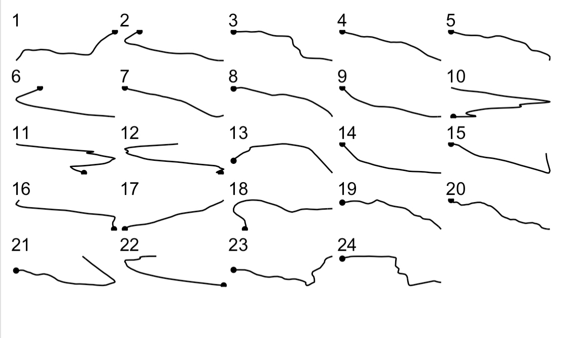
Here’s a visual impression of just the route:

Even this view is opinionated because the co-ordinates are projected to a particular co-ordinate system, albeit the one we are most familiar with when viewing online maps; but other projections are available.
Now here’s a more opinionated view of the route, with it cut into approximuately 1km segments:
Or the chart can express an opinion about where it things significant left and right hand corners are:

The following view has strong opinions about how to display each kilometer section: not only does it make claims about where it things significant right and left corners are, it also rotates each segment to so the start and end point of the section lay on the same horixontal line:

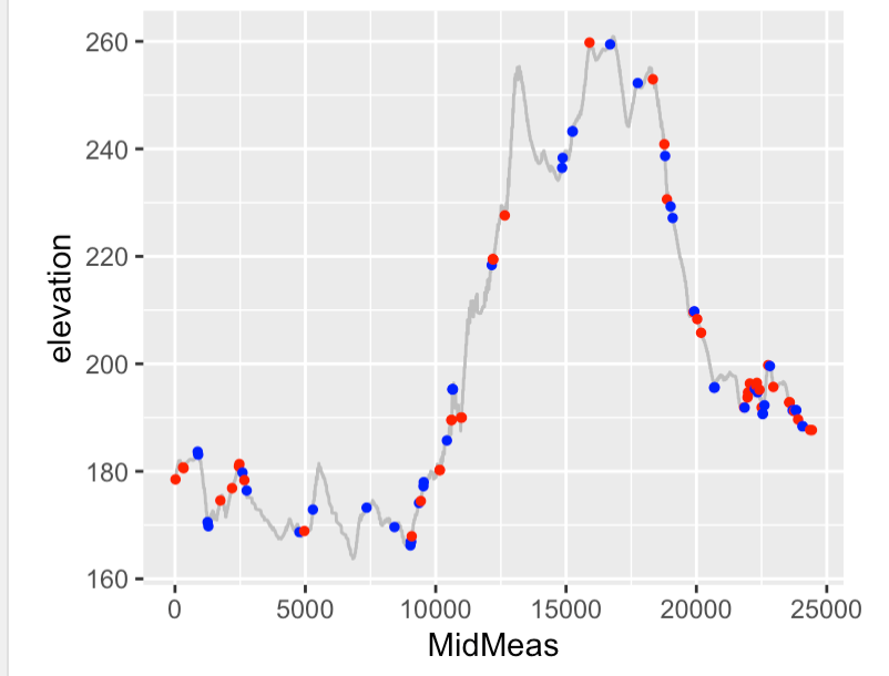
Another viewpoint brings in another dimension: elevation. It also transforms the flat 2D co-ordinates of each point along the route to a 1-D distance-along-route measure allowing us to plot the elevation against a 1-D representation of the route in a 2D (1D!) line chart.
Again, the chart expresses an opinion about where the significant right and left corners are. The chart also chooses not to be more helpful than it could be: if vertical grid lines corresponded to the start and end distace-into-stage values for the segmented plots, it would be easier to see how this chart relates to the 1km segmented sections.
At this point, you may say that the points are “facts” from the data, but again, they really aren’t. There are various ways of trying to define the intensity of a turn, and there may be various ways of calculating any particular measure that give slightly differnent results. Many definitions rely on particular parameter settings (for example, if you measure radius of curvature from three points on a route, how far should those points be apart? 1m? 10m? 20m? 50m?
The “result” is only a “fact” insofar as it represents the output of a particular calculation of a particular measure using a particular set of parameters, things that are typically not disclosed in chart labels, often aren’t mentioned in chart captions, and may or may not be disclosed in the surrounding text.
On the surface, the chart is simply expressing an opion about how tight any of the particular corners are. If we take it a face value, and trust its opinion is based on reasonable foundations, then we can accept (or not accept) the chart’s opinion aabout where the significant turns are.
If we were really motivated to understand the chart’s opinion further, if we had access to the code that generated it we could start to probe its definition of “significnant curvature” to see if we agree with the principles on which the chart has based its opinion. But in most cases, we don’t do that. We take the chart for what it is, typically accept it for what it appears to say, and ascribe some sort of truth to it.
But at the end of the day, it’s just an opinion.
The charts were generated using R based on ideas inspired by Visualising WRC Rally Stages With rayshader and R [repo].
R-bloggers.com offers daily e-mail updates about R news and tutorials about learning R and many other topics. Click here if you're looking to post or find an R/data-science job.
Want to share your content on R-bloggers? click here if you have a blog, or here if you don't.