
NBA’s All-Time Scoring Leaders Bar Chart Race Using R
Want to share your content on R-bloggers? click here if you have a blog, or here if you don't.

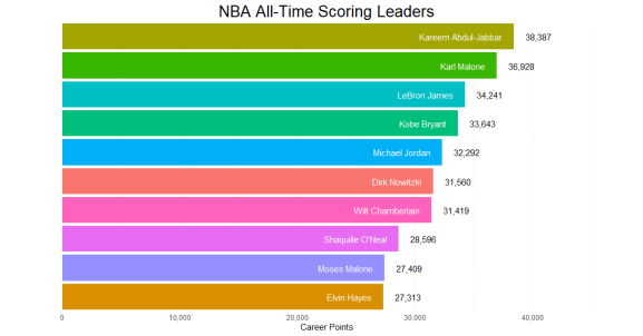
Kareem Abdul-Jabbar has sat atop the NBA’s leaderboard of career regular season scoring since taking the top spot from Wilt Chamberlain in 1984. LeBron James, who currently sits at #3, is the only active player currently in the top 10, and likely needs three more healthy seasons to surpass Kareem.
Bar chart races have become a somewhat controversial data visualization, with detractors decrying them as information overload. But one thing the haters can’t deny is that these charts are attention-grabbing, even captivating. Here’s how to make one using R.
The data needed to create the bar chart race can be found in this Google Sheet. Start by loading the necessary packages and reading in the data (I am using a csv saved locally with the same data that’s in the Google Sheet referenced above).
library(dplyr)
library(ggplot2)
library(gganimate)

chart_data <- readr::read_csv("yearly_totals.csv")
The dplyr and ggplot2 packages should be familiar to most R users. The third package, gganimate, is what is used to stitch together several static plots created with ggplot2 and turn them into an animated plot. Let’s start with how to create each individual static plot.
Creating a Static Plot
I’ll walk through a few intermediate steps before showing the more polished version of the chart to demonstrate how ggplot allows you to build plots iteratively. We can start by filtering for just one year of data and plotting the top 10 scorers. That can be accomplished using the code below:
chart_data %>%
  filter(YearEnd == 2020) %>%
  ggplot(aes(x = -Rank, y = CareerPts, fill = Player)) +
    geom_tile(aes(y = CareerPts / 2, height = CareerPts),
              width = 0.9) +
    coord_flip()
This basic plot uses geom_tile rather than geom_bar, which works better with the animation we will eventually be using. The way geom_tile works is that you specify the center of the tile (i.e. the midpoint of the rectangle, which is the height divided by two, hence CareerPts / 2) as well as the width and height. The call to coord_flip gives us horizontal bars rather than vertical bars (also note the x and y-axes are now flipped). The reason for specifying -Rank as the x aesthetic mapping is so that we get the top-ranking player at the top of the chart rather than the bottom.

Add Plot Labels
Next we’ll add the labels for the player names and point totals onto the bars. That can be accomplished with the following code:
  chart_data %>%
  filter(YearEnd == 2020) %>%
  ggplot(aes(x = -Rank, y = CareerPts, fill = Player)) +
    geom_tile(aes(y = CareerPts / 2, height = CareerPts),
              width = 0.9) +
    coord_flip() +
    # Add player labels to bars
    geom_text(aes(label = Player), col = "white",
              hjust = "right", nudge_y = -1000) +
    # Add point totals next to bars
    geom_text(aes(label = scales::comma(CareerPts, accuracy = 1)),
              hjust = "left", nudge_y = 1000)
The code above adds two calls to geom_text, the first of which adds the player labels in white, with the latter adding the point totals. These both inherit their x and y aesthetics from the original call to ggplot, which sets their position at the tip of the bars. The hjust argument makes the player labels right-justified and the point labels left-justified. The nudge_y argument offsets the player labels -1000 along the y-axis (remember our coordinates are flipped, so this is now a horizontal shift), and the point labels +1000. The call to scales::comma is for formatting the points labels.

Final Formatting
  chart_data %>%
  filter(YearEnd == 2020) %>%
  ggplot(aes(x = -Rank, y = CareerPts, fill = Player)) +
    geom_tile(aes(y = CareerPts / 2, height = CareerPts),
              width = 0.9) +
    geom_text(aes(label = Player), col = "white",
              hjust = "right", nudge_y = -1000) +
    geom_text(aes(label = scales::comma(CareerPts, accuracy = 1)),
              hjust = "left", nudge_y = 1000) +
    # Final formatting
    coord_flip(clip = "off", expand = FALSE) +
    ylab("Career Points") +
    ggtitle("NBA All-Time Scoring Leaders") +
    scale_x_discrete("") +
    scale_y_continuous(limits = c(-4000, 49000),
                       labels = scales::comma) +
    theme_minimal() +
    theme(plot.title = element_text(hjust = 0.5, size = 20),
          legend.position = "none",
          panel.grid.minor = element_line(linetype = "dashed"),
          panel.grid.major = element_line(linetype = "dashed"))
For the final formatting steps, we add the clip = "off" argument to coord_flip, which prevents the point labels from getting cut off as in the previous chart. The expand = FALSE argument prevents the chart from expanding beyond the specified x and y-limits. A title is added along with axis labels, with the x-axis (vertical) being set to blank with scale_x_discrete. The y-axis limits are set using scale_y_continuous and labels are given some nicer formatting using scales::comma. The final touches are added with theme_minimal, which removes the gray chart background, and additional theme elements to center the plot title, remove the legend, and use dashed gridlines.
Create Multiple Plots
Now that we have one polished plot created, we need to reproduce that across several years. You can create a visual of this across a few years using facet_wrap.
chart_data %>%
  filter(YearEnd >= 2018) %>%
  ggplot(aes(x = -Rank, y = CareerPts, fill = Player)) +
...
 + facet_wrap(~YearEnd)
Updating the filter(YearEnd == 2020) in the previous code to YearEnd >= 2018 and adding + facet_wrap(~YearEnd) to the end of that same code produces the following:
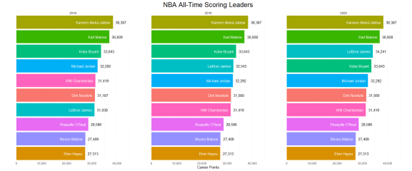
You can see that the only difference since 2018 is LeBron James moving from #7 in 2018 to #4 in 2019 and #3 in 2020. These plots are the building blocks for the animation. Once these are all set up, it’s time to bring in the gganimate functions.
Add Animation
Now we want to stitch together the plots created in the previous section and animate them using gganimate. We replace the facet_wrap function with transition_time(YearEnd). Let’s also update the filter to go back to 2010 to see how this works across a short but meaningful period of time.
chart_data %>%
  filter(YearEnd >= 2010) %>%
  ggplot(aes(x = -Rank, y = CareerPts, fill = Player)) +
...
 + transition_time(YearEnd) +
  labs(subtitle = "Top 10 Scorers as of {round(frame_time, 0)}") +
  theme(plot.subtitle = element_text(hjust = 0.5, size = 12))
The resulting animation should show Kobe Bryant, Dirk Nowitzki, and LeBron James moving up the rankings. A subtitle is also added, which references the frame_time, a handy property that you can access when using gganimate (try it without the round function wrapped to see how gganimate iterates through individual frames).
Putting it all together
If everything has worked up to this point, the final steps are to use the full data set, and set some animation parameters so that you can save it in a nice format.
anim <- chart_data %>%
  # Comment out the filter
  # filter(YearEnd >= 2010) %>%
  ggplot(aes(x = -Rank, y = CareerPts, fill = Player)) +
...
 + transition_time(YearEnd) +
  labs(subtitle = "Top 10 Scorers as of {round(frame_time, 0)}") +
  theme(plot.subtitle = element_text(hjust = 0.5, size = 12))

animate(anim, renderer = gifski_renderer(),
        end_pause = 50,
        nframes = 5*(2020-1950), fps = 10,
        width = 1080, height = 720, res = 150)

anim_save("NBA_Leading_Scorers.gif")
The animate function allows you to specify the details about the animation. The default renderer is the gifski_renderer, but you can also choose others like av_renderer or ffmpeg_renderer if you wanted to save a video instead of a gif. The end_pause parameter lets you have a nice pause at the end of the animation so that the gif doesn’t cycle back to the beginning right away. You set the number of frames and frames per second with nframes and fps respectively (you may need to tweak these arguments depending on how fast or slow you want the animation). The width, height, and res arguments let you specify device dimensions and resolution, which will determine the size and resolution of the gif in this case. Finally, the call to anim_save is how you save the animation to a file.
One footnote: I also had a mapping of team colors to make the color scheme a little more meaningful, which I declined to include in this walkthrough (that’s why the colors are different in the gif at the beginning of this post). When all’s said and done, you should have something like this:

Data for these charts was from basketball-reference.com. This is hopefully my first of many posts for R-bloggers.
R-bloggers.com offers daily e-mail updates about R news and tutorials about learning R and many other topics. Click here if you're looking to post or find an R/data-science job.
Want to share your content on R-bloggers? click here if you have a blog, or here if you don't.