
RObservations #6- #TidyTuesday – Analyzing data on the Australian Bush Fires
Want to share your content on R-bloggers? click here if you have a blog, or here if you don't.
Since April 2018 the R4DS community has been putting out unique datasets as part of its “Tidy Tuesday” series, which are open to explore and to hone your skills as a data scientist.
I know I’m quite late to the party, but now that I have some time I thought it would be a cool idea to explore one of these datasets myself. I decided to look at the dataset released in the beginning of 2020 with relevant information related to bushfires in Australia.
In this blog post I’m going to explore the available data to see if the results agree with the analysis written in the New York Times regarding the recent fires that happened in September 2019 to March 2020 and see if there is any other insight to glean from the incident.
Disclaimer
If you didn’t read my last blog, I mentioned that I started a Youtube Channel and have been making videos sharing my insights and making R related content in video form. I have currently been “going back to basics” by going through Hadley Wickham’s “R for Data Science” book, as a result influence of tidyvese is very present in the code written here. I like to see myself as more of a base R guy, but I am enjoying writing code with tidyverse; let’s see if this sticks!
Now, let’s get back to the blog.
The claims from the New York Times

The New York times gave the following reasons for why the fire season during this time was so brutal:
- A combination of record-breaking heat, drought and high wind conditions have dramatically amplified the recent fire season in Australia.
- The last month of 2019 saw particularly low rainfall and the country recorded its hottest day yet.
- Crystal A. Kolden, a wildfire researcher (formerly) at the University of Idaho says the combination of extremely dry and extremely hot conditions adds up to more powerful fires.
Lets see if these results match up with the data!
Our data
# Run once

tuesdata <- tidytuesdayR::tt_load('2020-01-07')
Our dataset consists of 11 files- but for the questions we’re interested in answering, we will be using the rainfall.csv and temperature.csv datasets.
Shaping our data
Since we are going to look at the relationship between temperature and rainfall we’re going to need to find a way to join these two datasets.
library(tidyverse)
rainfall <-tuesdata$rainfall
temperature<-tuesdata$temperature

glimpse(rainfall)


## Rows: 179,273
## Columns: 11
## $ station_code <chr> "009151", "009151", "009151", "009151", "009151", "009151", "009151", "009151", "...
## $ city_name    <chr> "Perth", "Perth", "Perth", "Perth", "Perth", "Perth", "Perth", "Perth", "Perth", ...
## $ year         <dbl> 1967, 1967, 1967, 1967, 1967, 1967, 1967, 1967, 1967, 1967, 1967, 1967, 1967, 196...
## $ month        <chr> "01", "01", "01", "01", "01", "01", "01", "01", "01", "01", "01", "01", "01", "01...
## $ day          <chr> "01", "02", "03", "04", "05", "06", "07", "08", "09", "10", "11", "12", "13", "14...
## $ rainfall     <dbl> NA, NA, NA, NA, NA, NA, NA, NA, NA, NA, NA, NA, NA, NA, NA, NA, NA, NA, NA, NA, N...
## $ period       <dbl> NA, NA, NA, NA, NA, NA, NA, NA, NA, NA, NA, NA, NA, NA, NA, NA, NA, NA, NA, NA, N...
## $ quality      <chr> NA, NA, NA, NA, NA, NA, NA, NA, NA, NA, NA, NA, NA, NA, NA, NA, NA, NA, NA, NA, N...
## $ lat          <dbl> -31.96, -31.96, -31.96, -31.96, -31.96, -31.96, -31.96, -31.96, -31.96, -31.96, -...
## $ long         <dbl> 115.79, 115.79, 115.79, 115.79, 115.79, 115.79, 115.79, 115.79, 115.79, 115.79, 1...
## $ station_name <chr> "Subiaco Wastewater Treatment Plant", "Subiaco Wastewater Treatment Plant", "Subi...


glimpse(temperature)


## Rows: 528,278
## Columns: 5
## $ city_name   <chr> "PERTH", "PERTH", "PERTH", "PERTH", "PERTH", "PERTH", "PERTH", "PERTH", "PERTH", "...
## $ date        <date> 1910-01-01, 1910-01-02, 1910-01-03, 1910-01-04, 1910-01-05, 1910-01-06, 1910-01-0...
## $ temperature <dbl> 26.7, 27.0, 27.5, 24.0, 24.8, 24.4, 25.3, 28.0, 32.6, 35.9, 33.9, 38.6, 35.1, 32.9...
## $ temp_type   <chr> "max", "max", "max", "max", "max", "max", "max", "max", "max", "max", "max", "max"...
## $ site_name   <chr> "PERTH AIRPORT", "PERTH AIRPORT", "PERTH AIRPORT", "PERTH AIRPORT", "PERTH AIRPORT...
Looking at these two datasets with the glimpse function, we see that we can possibly join our datasets by date and by city.
Before we can join our datasets by date, we are going to need to put our date data in the same form as the date field in the temperature dataset.
# Full date
rainfall$fulldate <- paste(rainfall$year,rainfall$month,rainfall$day, sep='-') %>% as.Date()

glimpse(rainfall)


## Rows: 179,273
## Columns: 12
## $ station_code <chr> "009151", "009151", "009151", "009151", "009151", "009151", "009151", "009151", "...
## $ city_name    <chr> "Perth", "Perth", "Perth", "Perth", "Perth", "Perth", "Perth", "Perth", "Perth", ...
## $ year         <dbl> 1967, 1967, 1967, 1967, 1967, 1967, 1967, 1967, 1967, 1967, 1967, 1967, 1967, 196...
## $ month        <chr> "01", "01", "01", "01", "01", "01", "01", "01", "01", "01", "01", "01", "01", "01...
## $ day          <chr> "01", "02", "03", "04", "05", "06", "07", "08", "09", "10", "11", "12", "13", "14...
## $ rainfall     <dbl> NA, NA, NA, NA, NA, NA, NA, NA, NA, NA, NA, NA, NA, NA, NA, NA, NA, NA, NA, NA, N...
## $ period       <dbl> NA, NA, NA, NA, NA, NA, NA, NA, NA, NA, NA, NA, NA, NA, NA, NA, NA, NA, NA, NA, N...
## $ quality      <chr> NA, NA, NA, NA, NA, NA, NA, NA, NA, NA, NA, NA, NA, NA, NA, NA, NA, NA, NA, NA, N...
## $ lat          <dbl> -31.96, -31.96, -31.96, -31.96, -31.96, -31.96, -31.96, -31.96, -31.96, -31.96, -...
## $ long         <dbl> 115.79, 115.79, 115.79, 115.79, 115.79, 115.79, 115.79, 115.79, 115.79, 115.79, 1...
## $ station_name <chr> "Subiaco Wastewater Treatment Plant", "Subiaco Wastewater Treatment Plant", "Subi...
## $ fulldate     <date> 1967-01-01, 1967-01-02, 1967-01-03, 1967-01-04, 1967-01-05, 1967-01-06, 1967-01-...
Now that we have that taken care of we have to format our city names so that they can be joined together. This can be accomplished with the stringr package’s str_to_title function.
library(stringr)

temperature$city_name_new<-temperature$city_name %>% str_to_title()

glimpse(temperature)


## Rows: 528,278
## Columns: 6
## $ city_name     <chr> "PERTH", "PERTH", "PERTH", "PERTH", "PERTH", "PERTH", "PERTH", "PERTH", "PERTH",...
## $ date          <date> 1910-01-01, 1910-01-02, 1910-01-03, 1910-01-04, 1910-01-05, 1910-01-06, 1910-01...
## $ temperature   <dbl> 26.7, 27.0, 27.5, 24.0, 24.8, 24.4, 25.3, 28.0, 32.6, 35.9, 33.9, 38.6, 35.1, 32...
## $ temp_type     <chr> "max", "max", "max", "max", "max", "max", "max", "max", "max", "max", "max", "ma...
## $ site_name     <chr> "PERTH AIRPORT", "PERTH AIRPORT", "PERTH AIRPORT", "PERTH AIRPORT", "PERTH AIRPO...
## $ city_name_new <chr> "Perth", "Perth", "Perth", "Perth", "Perth", "Perth", "Perth", "Perth", "Perth",...
Now before we do the join lets view the cities listed in both datasets.
unique(rainfall$city_name)


## [1] "Perth"     "Adelaide"  "Brisbane"  "Sydney"    "Canberra"  "Melbourne"


unique(temperature$city_name_new)


## [1] "Perth"     "Port"      "Kent"      "Brisbane"  "Sydney"    "Canberra"  "Melbourne"
The temperature dataset accounts for Port an Kent, which aren’t accounted for in the rainfall dataset; the rainfall dataset accounts for Adelaide which is not accounted for in the temperature dataset. Despite not having corresponding data, it would be insightful to look at the patterns for temperature and rainfall individually for these cities.
The challenge that I have with joining this data is that my machine is unable to allocate the memory to perform the join. So to slim down our data set lets filter our datasets to records from the 21st century. This way we can investigate the fires that took place from September 2019 to March 2020.
#' Datasets from the 21st Century and on

rainfall21<-filter(rainfall,fulldate >= "2000-01-01")
temperature21<-filter(temperature, date >= "2000-01-01")
Lets now join our data with using the full_join function from the dplyr package (this comes pre-loaded when we load tidyverse).
workingdf<-rainfall21[,c(2,6,7,8,11,12)] %>%
  full_join(temperature21,by=c("city_name"="city_name_new", "fulldate"="date")) %>%
  group_by(fulldate)

glimpse(workingdf)


## Rows: 119,220
## Columns: 10
## Groups: fulldate [7,311]
## $ city_name    <chr> "Perth", "Perth", "Perth", "Perth", "Perth", "Perth", "Perth", "Perth", "Perth", ...
## $ rainfall     <dbl> 0.0, 0.0, 0.0, 0.0, 0.0, 0.0, 0.0, 0.0, 0.0, 0.0, 0.0, 0.0, 0.0, 0.0, 0.0, 0.0, 0...
## $ period       <dbl> NA, NA, NA, NA, NA, NA, NA, NA, NA, NA, NA, NA, NA, NA, NA, NA, NA, NA, NA, NA, N...
## $ quality      <chr> "Y", "Y", "Y", "Y", "Y", "Y", "Y", "Y", "Y", "Y", "Y", "Y", "Y", "Y", "Y", "Y", "...
## $ station_name <chr> "Subiaco Wastewater Treatment Plant", "Subiaco Wastewater Treatment Plant", "Subi...
## $ fulldate     <date> 2000-01-01, 2000-01-01, 2000-01-02, 2000-01-02, 2000-01-03, 2000-01-03, 2000-01-...
## $ city_name.y  <chr> "PERTH", "PERTH", "PERTH", "PERTH", "PERTH", "PERTH", "PERTH", "PERTH", "PERTH", ...
## $ temperature  <dbl> 36.5, 20.7, 37.2, 21.0, 36.3, 18.3, 37.4, 19.7, 37.2, 22.8, 35.4, 22.4, 34.5, 16....
## $ temp_type    <chr> "max", "min", "max", "min", "max", "min", "max", "min", "max", "min", "max", "min...
## $ site_name    <chr> "PERTH AIRPORT", "PERTH AIRPORT", "PERTH AIRPORT", "PERTH AIRPORT", "PERTH AIRPOR...
Missing data
Having our joining and filtering taken care of doesn’t mean we’re done yet. Lets see what our missing data looks like. Thankfully the naniar package has a function that can help us with visualizing it, without being too labor intensive.
library(naniar)

vis_miss(workingdf,warn_large_data = FALSE)
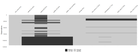
Lets see what our dataset looks like when we remove the cities that are not commonly shared.
workingdf2<- workingdf %>%
  filter(city_name!="Port" & city_name !="Kent" & city_name != "Adelaide") %>%
  group_by(fulldate)

vis_miss(workingdf2,warn_large_data = FALSE)

Based on the numbers listed in the visualization, 9.7% of the missing data can be attributed to the cities not commonly shared by the rainfall and temperature datasets.
It looks like we are missing data about rainfall for 2019. But looks can be decieving. Lets confirm if there is no data on our area of interest.
workingdf3<- workingdf %>% filter(fulldate>="2018-09-01")
workingdf3


## # A tibble: 5,374 x 10
## # Groups:   fulldate [493]
##    city_name rainfall period quality station_name    fulldate   city_name.y temperature temp_type site_name
##    <chr>        <dbl>  <dbl> <chr>   <chr>           <date>     <chr>             <dbl> <chr>     <chr>
##  1 Perth            0     NA N       Subiaco Wastew~ 2018-09-01 PERTH              19.3 max       PERTH AI~
##  2 Perth            0     NA N       Subiaco Wastew~ 2018-09-01 PERTH               9.1 min       PERTH AI~
##  3 Perth            0     NA N       Subiaco Wastew~ 2018-09-02 PERTH              20   max       PERTH AI~
##  4 Perth            0     NA N       Subiaco Wastew~ 2018-09-02 PERTH               6.6 min       PERTH AI~
##  5 Perth            0     NA N       Subiaco Wastew~ 2018-09-03 PERTH              20.5 max       PERTH AI~
##  6 Perth            0     NA N       Subiaco Wastew~ 2018-09-03 PERTH               4.9 min       PERTH AI~
##  7 Perth            6      1 N       Subiaco Wastew~ 2018-09-04 PERTH              18.3 max       PERTH AI~
##  8 Perth            6      1 N       Subiaco Wastew~ 2018-09-04 PERTH              11   min       PERTH AI~
##  9 Perth            5      1 N       Subiaco Wastew~ 2018-09-05 PERTH              16.2 max       PERTH AI~
## 10 Perth            5      1 N       Subiaco Wastew~ 2018-09-05 PERTH               9.7 min       PERTH AI~
## # ... with 5,364 more rows
Well, will you look at that! We actually have data on rainfall for 2019! I guess we learn from here that a picture can only tell so much, so always be sure to check the actual data to verify. Our visualization deceiving us can probably be due to the fact that our dataset is now only a little more than 5000 rows in a dataset which has 125,000. It probably is hard to scale this in a visualization, especially given the size of the data.
Understanding the nature of the data
What I really enjoy and find challenging about this dataset is that the data is multi-leveled. Thankfully we have the data dictionary (check out the readme.md) to look at for this dataset.
One of the variables that are important to note is the temp_type variable; this tells us what type of daily tempertature is recorded- be it the daily minimum or maximum; what is also important to see is that there is missing data present in this as well.
(Spoiler alert: I found a mistake in this blog before I published it)
Visualizing the raw data
With this in mind we will make the following visualizations to account for this discrepancy.
- plot minimum and maximum temperatures over time – faceting on city
- plot rainfall over time – faceting on city
- In addition to the above we will make some raw plots of the data on temperature and rainfall over time from the 21st Century.
ggplot(data=workingdf3,mapping=aes(x=fulldate,y=temperature,color=temp_type))+
  geom_point()+
  facet_wrap(~city_name)+
  ggtitle("Minimum and maximum daily temperatures from 2018/09/01-")

ggplot(data=workingdf3,mapping=aes(x=fulldate,y=rainfall))+
  geom_line()+
  facet_wrap(~city_name)+
  ggtitle("Daily rainfall from 2018/09/01-")

  ggplot(data = workingdf) +
    geom_line(mapping = aes(x = fulldate, y = temperature,color=temp_type)) +
    ggtitle("Minimum and Maximum Daily Temperatres From 2000/01/01-")+
    facet_wrap(~city_name)

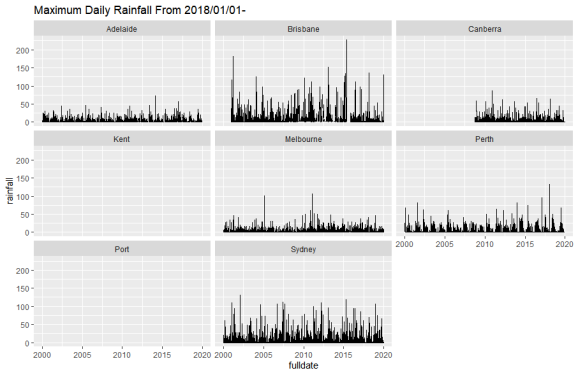
  ggplot(data = workingdf) +
    geom_line(mapping = aes(x = fulldate, y = rainfall)) +
    ggtitle("Maximum Daily Rainfall From 2000/01/01-")+
    facet_wrap(~city_name)
From the visualizations here, temperature doesn’t seem to be abnormal in 2019 over the years. This is because I’m looking at the general movement of the raw data and need to look at an annual and monthly statistic- like the mean- to note any abnormalities.
As far as rainfall is concerned, the given visualizations are not the best for showing if there has been a drop in rainfall. In this case too we will have to look at an annual/monthly statistic (like the mean) to see if there really has been a drop in rainfall during the time of the fires.
Looking at Annual measures of Temperature and Rainfall.
Statistical transformations
Before we plot our annual data, we are going to have to incorperate the year field into our dataset. Thankfully, we have this isolated in our original data set. But we can save time by using the lubridate package instead.
library(lubridate)

workingdf$year<- year(workingdf$fulldate)

glimpse(workingdf)


## Rows: 119,220
## Columns: 11
## Groups: fulldate [7,311]
## $ city_name    <chr> "Perth", "Perth", "Perth", "Perth", "Perth", "Perth", "Perth", "Perth", "Perth", ...
## $ rainfall     <dbl> 0.0, 0.0, 0.0, 0.0, 0.0, 0.0, 0.0, 0.0, 0.0, 0.0, 0.0, 0.0, 0.0, 0.0, 0.0, 0.0, 0...
## $ period       <dbl> NA, NA, NA, NA, NA, NA, NA, NA, NA, NA, NA, NA, NA, NA, NA, NA, NA, NA, NA, NA, N...
## $ quality      <chr> "Y", "Y", "Y", "Y", "Y", "Y", "Y", "Y", "Y", "Y", "Y", "Y", "Y", "Y", "Y", "Y", "...
## $ station_name <chr> "Subiaco Wastewater Treatment Plant", "Subiaco Wastewater Treatment Plant", "Subi...
## $ fulldate     <date> 2000-01-01, 2000-01-01, 2000-01-02, 2000-01-02, 2000-01-03, 2000-01-03, 2000-01-...
## $ city_name.y  <chr> "PERTH", "PERTH", "PERTH", "PERTH", "PERTH", "PERTH", "PERTH", "PERTH", "PERTH", ...
## $ temperature  <dbl> 36.5, 20.7, 37.2, 21.0, 36.3, 18.3, 37.4, 19.7, 37.2, 22.8, 35.4, 22.4, 34.5, 16....
## $ temp_type    <chr> "max", "min", "max", "min", "max", "min", "max", "min", "max", "min", "max", "min...
## $ site_name    <chr> "PERTH AIRPORT", "PERTH AIRPORT", "PERTH AIRPORT", "PERTH AIRPORT", "PERTH AIRPOR...
## $ year         <dbl> 2000, 2000, 2000, 2000, 2000, 2000, 2000, 2000, 2000, 2000, 2000, 2000, 2000, 200...
The real work takes place when we are using dplyr, thankfully I am able to shape the data the way I like it because of what I learned while making my video on the pipe operator (shameless plug).
workingdfmaxtemp<- workingdf %>% filter(temp_type=="max")
workingdfmintemp<- workingdf %>% filter(temp_type=="min")


maxtempannualdf <- workingdfmaxtemp %>%
  group_by(city_name, year) %>%
  summarize(
    mean_rain = mean(rainfall, na.rm = T),
    mean_temperature_max = mean(temperature, na.rm = T)
  )


mintempannualdf <- workingdfmintemp %>%
  group_by(city_name, year) %>%
  summarize(
    mean_rain = mean(rainfall, na.rm = T),
    mean_temperature_min = mean(temperature, na.rm = T)
  )


annualtempdf <- mintempannualdf %>%
  full_join(maxtempannualdf)

glimpse(annualtempdf)


## Rows: 140
## Columns: 5
## Groups: city_name [7]
## $ city_name            <chr> "Brisbane", "Brisbane", "Brisbane", "Brisbane", "Brisbane", "Brisbane", "...
## $ year                 <dbl> 2000, 2001, 2002, 2003, 2004, 2005, 2006, 2007, 2008, 2009, 2010, 2011, 2...
## $ mean_rain            <dbl> 1.966667, 2.976616, 1.895862, 2.337047, 3.230380, 2.097305, 2.175346, 1.9...
## $ mean_temperature_min <dbl> 15.084426, 15.183836, 15.074247, 15.109589, 15.322951, 15.936438, 15.4134...
## $ mean_temperature_max <dbl> 25.08798, 25.71836, 25.85644, 25.24082, 25.94699, 25.79644, 25.51370, 25....
What Happened to Adelaide?
Whilst proofreading this to be posted I noticed that Adelaide is nowhere to be seen in this dataset. I first was looking at my joins and thought I was doing something wrong, but then I realized- we partitioned our data based on the temp_type variable! While we gained some precision for our temperature data, we lost data on an entire city that doesn’t have any temperature data availible to it!
With this in mind we will have to make a separate analysis for Adelaide as we don’t have any information about the temperature. Below is the code I used to prepare rainfall data of Adelaide.
workingdfAdelaide<-workingdf %>% filter(city_name =="Adelaide")

rainfalldfAdelaide <- workingdfAdelaide %>%
  group_by(city_name,year) %>%
  summarize(
    mean_rain = mean(rainfall, na.rm = T),
  )

rainfalldfAdelaide


## # A tibble: 20 x 3
## # Groups:   city_name [1]
##    city_name  year mean_rain
##    <chr>     <dbl>     <dbl>
##  1 Adelaide   2000     1.53
##  2 Adelaide   2001     1.71
##  3 Adelaide   2002     0.996
##  4 Adelaide   2003     1.49
##  5 Adelaide   2004     1.41
##  6 Adelaide   2005     1.61
##  7 Adelaide   2006     0.757
##  8 Adelaide   2007     1.27
##  9 Adelaide   2008     1.03
## 10 Adelaide   2009     1.34
## 11 Adelaide   2010     1.53
## 12 Adelaide   2011     1.45
## 13 Adelaide   2012     1.51
## 14 Adelaide   2013     1.50
## 15 Adelaide   2014     1.42
## 16 Adelaide   2015     1.06
## 17 Adelaide   2016     2.36
## 18 Adelaide   2017     1.58
## 19 Adelaide   2018     1.24
## 20 Adelaide   2019     1.16
Visualizing our transformed data.
Now that we have shaped and calculated the available annual means for the cities listed in our dataset, we can come up with some visualizations.
library(gridExtra)

grid.arrange(
  ggplot(data = annualtempdf, mapping = aes(x = year, color = city_name)) +
    geom_point(mapping = aes(y = mean_temperature_max)) +
    geom_point(
      mapping = aes(y = mean_temperature_min),
      shape = 1
    ) +
    facet_wrap( ~ city_name) +
    ggtitle("Average Annual Max/Min Temperatures")+
    theme(legend.position = "none"),


  ggplot(data = annualtempdf, mapping = aes(x = year, color = city_name)) +
    geom_point(mapping = aes(y = mean_rain)) +
    geom_line(mapping = aes(y = mean_rain)) +
    facet_wrap( ~ city_name) +
    ggtitle("Average Annual Rainfall")+
    theme(legend.position = "none"),

  ncol=2
)

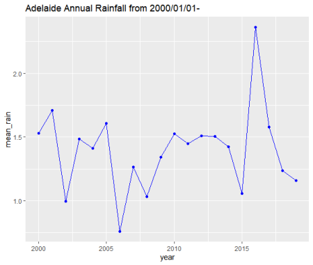
ggplot(data=rainfalldfAdelaide)+
  geom_point(mapping=aes(x=year,y=mean_rain),color="blue")+
  geom_line(mapping=aes(x=year,y=mean_rain),color="blue")+
  theme(legend.position = "none")+
  ggtitle("Adelaide Annual Rainfall")
It does look like that during this period all of our cities which we have data during this time experienced a jump in average annual maximum and minimum temperatures. Similarly with rainfall, while some cities did not experience an abnormally low average rainfall (like Sydney, Canberra, Brisbane and Adelaide), others did experience it (like Melbourne and Perth).
With this we have agreement with our first point that there was record breaking heat (at least in the past ~20 years) and drought present during the time of the fires. As far as high wind conditions, there is presently no data for that, so we can’t verify if that was present (comment if you have a datasource for wind conditions!).
Looking at monthly measures of Temperature and Rainfall.
Now that we have verified the first claim of the New York Times, lets move on to the second one.
“The last month of 2019 saw particularly low rainfall, and the country recorded its hottest day yet.”
Well to do this we’re going to have to group our data by month in a similar manner we grouped by year. Thankfully the lubridate package has the format_ISO8601() function (looks easy to remember) and to have that read as date data, we will pipe this to the ym() function.
workingdf$year_month<-workingdf$fulldate %>% format_ISO8601(precision = 'ym') %>% ym()
Now we just need to run this code through the same dplyr code we wrote earlier (in “Statistical transformations”) – but now grouping by city and year_month
# Because we are adding a new variable we need to rerun our maximum and minium temperature dataframes.

workingdfmaxtemp<- workingdf %>% filter(temp_type=="max")
workingdfmintemp<- workingdf %>% filter(temp_type=="min")


maxtempmonthdf <- workingdfmaxtemp %>%
  group_by(city_name, year_month) %>%
  summarize(
    mean_rain = mean(rainfall, na.rm = T),
    mean_temperature_max = mean(temperature, na.rm = T)
  )


mintempmonthdf <- workingdfmintemp %>%
  group_by(city_name, year_month) %>%
  summarize(
    mean_rain = mean(rainfall, na.rm = T),
    mean_temperature_min = mean(temperature, na.rm = T)
  )


# Add a filter to focus our dataset on data from 2019 and on

monthtempdf <- mintempmonthdf %>%
  full_join(maxtempmonthdf) %>%
  filter(year_month>= "2018-01-01")

glimpse(monthtempdf)


## Rows: 119
## Columns: 5
## Groups: city_name [7]
## $ city_name            <chr> "Brisbane", "Brisbane", "Brisbane", "Brisbane", "Brisbane", "Brisbane", "...
## $ year_month           <date> 2018-01-01, 2018-02-01, 2018-03-01, 2018-04-01, 2018-05-01, 2018-06-01, ...
## $ mean_rain            <dbl> 0.9923077, 13.5904762, 5.0000000, 1.2000000, 0.8933333, 0.9733333, 0.8322...
## $ mean_temperature_min <dbl> 21.2258065, 20.7678571, 20.5419355, 17.6666667, 13.0677419, 10.3900000, 9...
## $ mean_temperature_max <dbl> 30.53226, 28.63929, 27.60968, 26.56000, 23.81290, 21.57667, 21.92903, 22....
For Adelaide, we write the following script.
# Excuse the long name for the variable. I know its faux pas.

workingdfAdelaide$year_month<-workingdfAdelaide$fulldate %>%  format_ISO8601(precision = 'ym') %>% ym()

rainfalldfAdelaideMonthly<- workingdfAdelaide %>%
  group_by(city_name, year_month) %>%
  summarize(
    mean_rain = mean(rainfall, na.rm = T),
    mean_temperature_max = mean(temperature, na.rm = T)
  ) %>%
  filter(year_month >= "2018-01-01")
Now with that done lets get to visualizing our monthly data.
Visualizing our transformed data.
What is important to note from these visualizations is that we don’t have data on rainfall, or temperature for the end of 2019. So what we can only look at how things were before the end of 2019.
grid.arrange(
  ggplot(
    data = monthtempdf,
    mapping = aes(x = year_month, color = city_name)
  ) +
    geom_line(mapping = aes(y = mean_rain)) +
    facet_wrap( ~ city_name) +
    theme(legend.position = "none") +
    ggtitle("Average monthly rainfall from January 2018 - May 2019"),


  ggplot(
    data = monthtempdf,
    mapping = aes(x = year_month, color = city_name)
  ) +
    geom_point(mapping = aes(y = mean_temperature_max)) +
    geom_point(
      mapping = aes(y = mean_temperature_min),
      shape = 1
    ) +
    facet_wrap( ~ city_name) +
    theme(legend.position = "none") +
    ggtitle("Average monthly temperature from January 2018 - May 2019"),

  ncol = 2
)

For Adelaide we’ll make a seperate visualization for its monthly rainfall. It should be grouped with the other rainfall data, but the other data needing to be split by temperature measurements makes the join awkward.
(Clearly, this part is after the fact)
ggplot(data= rainfalldfAdelaideMonthly, mapping=aes(x=year_month,mean_rain))+
  geom_line(color="blue")+
  ggtitle("Adelaide average monthly rainfall from January 2018-January 2019 ")

Analysis
Before we begin our discussion lets look at the rain season present in our plotted cities:
(Disclaimer – I do not live in Austrailia and am relying on the internet to tell me when the rainy season is for these cities, if you see an error let me know!)
- Adelaide’s wet season lasts for 11 months, from January 22 to January 4 (source)
- Brisbane’s rainy season is from December to February (source)
- Canberra’s rainy season is from September to November (source)
- Melbourne’s rainy season appears to be from September to November, but seems to get a pretty even spread of rainfall throughout the year (source)
- Perth’s rainy season occurs from June to August (source)
- Sydney’s doesn’t really have a rainy season,but September and October are the months with the least amount of rain. (source)
Looking at the data, it apprears that Brisbane had significantly less rainfall in February 2019 (average 1.36 mm) than it did in 2018 (average 13.59 mm) which definitely looks telling even to someone without a background in meteorology of an onset to a drought. With Canberra, Melbourne, and Perth since we only have data up to March of 2019, we can’t really make any inference about evidence for the onset of a drought. For Sydney, April and May of 2019 were dramatically lower in their rainfall (averages 0.37 mm and 0.47 mm) than they were in the previous year (averages 0.77 mm and 0.74) with drops in average rainfall being around 48% and 64% which can also be telling of an onset of a drought.
While we don’t have any other data about the last month of 2019, we do have information about the onset of a drought occuring. I wish I could tell more, but thats what the data tells us!
As far as I can tell, with Adelaide, nothing looks off in terms of precipitation (do you see/know something? let me know!), the data that is plotted seems to agree with my internet search results.
One of the advantages of the Adelaide rainfall dataset is that we have data on rainfall going until the end of 2019. But as far as rainfall is concerned there is nothing abnormal to report as far as low rainfall is concerned.
Conclusion
As for the final claim from the New York times
“[Crystal A. Kolden, a wildfire researcher (formerly) at the University of Idaho] says the combination of extremely dry and extremely hot conditions adds up to more powerful fires.”
We do see that there was an increase in average temperature accross the Australian cities, and a drop in rainfall in cities like Brisbane and Sydney. So the statement made by Crystal agrees with our data.
How I would refine this statement (but I’m not an expert in this domain, so I’m sure there is a reason for her saying this) would be that the extremely hot conditions create a dry environment, which combined with the already extreme heat makes for more powerful fires!
Final Remarks
Wow! Working with this dataset was really cool! I only sought to verify the claims made by the New York times and it was really an adventure with wrangling our data and performing the appropriate transformations to get the results that they reported! Catching the omission of Adelaide made me jump, as leaving it out from our analysis wouldn’t give us a full picture of our data!
I’m sure there is much more to discover with the data here. I didn’t even touch the satellite dataset(s), but I’m sure there is what to uncover there.
Thanks for reading! I hope to do this again!
Did you like this content? Be sure to never miss an update and Subscribe!
R-bloggers.com offers daily e-mail updates about R news and tutorials about learning R and many other topics. Click here if you're looking to post or find an R/data-science job.
Want to share your content on R-bloggers? click here if you have a blog, or here if you don't.