Generalized Linear Models and Plots with edgeR – Advanced Differential Expression Analysis
Want to share your content on R-bloggers? click here if you have a blog, or here if you don't.
Generalized linear models (GLM) are a classic method for analyzing RNA-seq expression data. In contrast to exact tests, GLMs allow for more general comparisons.
The types of comparisons you can make will depend on the design of your study. In the following example we will use the raw counts of differentially expressed (DE) genes to compare the following Daphnia genotypes.

After normalization of the raw gene counts we will perform genewise quasi-likelihood (QL) F-tests using GLMs in edgeR. These tests allow us to perform ANOVA like tests for differences in the means within and between our grouping factors.
The hypotheses we will be testing:
- The means of the treatment factor are equal
- The means of the tolerance factor are equal
- There is no interaction between the two factors
Note that, we choose to use QL F-tests over likelihood ratio tests (LRT) since it maintains the uncertainty in estimating the dispersion for each gene.

QL F-Tests and Plotting Script – glmQLFTest_edgeR.r
The following R script will be used to prepare raw gene counts for QL F-tests in edgeR. Note that when working with RNA-seq reads you will first need to perform:
- Quality control – FastQC
- Trimming – Trimmomatic
- Alignment – Hisat2
- Sorting – Samtools
- Quantification –HTSeq
Alternatively to aligning the reads to a reference genome, you may wish to make a de novo assembly of your reads using a program such as Trinity. Also note that there are many programs available to achieve the previous steps. The programs you choose will depend on your data and study organism.
After the data has been processed, we can perform QL F-tests using GLMs in edgeR. We will use the following plotting functions to generate informative plots of our input data sets and ANOVA like test results with the edgeR and statmod libraries.
- barplot – Bar plots of sequence read library sizes
- plotMDS – Multi-dimensional scaling (MDS) scatterplot of distances between the samples
- plotBCV – Genewise biological coefficient of variation (BCV) plots against gene abundance
- plotMD – Mean difference (MD) plots of all log fold change (logFC) against average count size
- plotQLDisp – Plot of the genewise QL dispersion against the gene abundance (log2 CPM)
Script Inputs
A csv formatted file of raw gene counts is expected as the first input to the script. Below is an example subset of a raw gene count table, where columns represent samples and rows are genes.
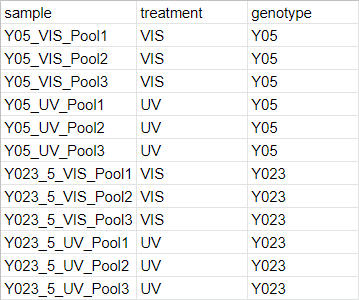
The second input to the script is expected to be a csv file describing the experimental design and grouping factors for each sample. Below is an example csv file describing the experimental design of our study.
R Script
First, we should add some comments to the top of the R script describing how to run the script. We should also add a comment with a reminder of the purpose of the script.
#!/usr/bin/env Rscript
#Usage: Rscript glmQLFTest_edgeR.r rawGeneCountsFile experimentalDesign
#Usage Ex: Rscript glmQLFTest_edgeR.r daphnia_rawGeneCounts_htseq.csv daphnia_experimentalDesign.csv
#R script to perform QL F-tests using generalized linear models in edgeR
Before proceeding we will need to install the edgeR and statmod libraries. These libraries will need to be installed only once.
#Install edgeR and statmod, this should only need to be done once
if (!requireNamespace("BiocManager", quietly = TRUE))
    install.packages("BiocManager")
BiocManager::install("edgeR")
install.packages("statmod")
The libraries we are using will need to be loaded each time we run the script using the library function.
#Load the edgeR and statmod libraries
library("edgeR")
library("statmod")
Next, we retrieve the input paths the the csv files for the raw gene counts and the experimental design.
#Retrieve inputs to the script
args = commandArgs(trailingOnly=TRUE)
Now we can import our data from the input file paths using the read.csv wrapper function. If the row names for your gene counts have a header, it needs to be specified with the row.names argument.
#Import gene count data and view the first few rows
countsTable <- read.csv(file=args[1], row.names="gene")
head(countsTable)
#Import grouping factor
targets <- read.csv(file=args[2], row.names="sample")
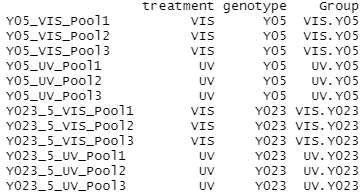
The grouping factors need to be added as a column to our experimental design before we can create a DGE list object. Here we use paste and factor to combine the factors (treatment and genotype) into one string (group) separated by a period for each sample. These strings are stored as a vector in the group data frame.
Using the imported raw gene counts and grouping factors, we can create a DGE list object that has the grouping factors assigned to the gene count samples using the DGEList function.
#Setup and view the grouping factors
group <- factor(paste(targets$treatment,targets$genotype,sep="."))
cbind(targets,Group=group)
#Create a DGE list object
list <- DGEList(counts=countsTable,group=group)
colnames(list) <- targets$sample
As a first step in the analysis, we will plot the library sizes of our sequencing reads before normalization using the barplot function. The resulting plot is saved to the glmQLF_plotLibrarySizes jpg file.
#Plot the library sizes before normalization
jpeg("glmQLF_plotLibrarySizes.jpg")
barplot(list$samples$lib.size*1e-6, names=1:ncol(list), ylab="Library size (millions)")
dev.off()
Next, we need to filter the raw gene counts by expression levels and remove counts of lowly expressed genes.
#Retain genes only if it is expressed at a minimum level
keep <- filterByExpr(list)
list <- list[keep, , keep.lib.sizes=FALSE]
#View a summary of the normalized counts
summary(keep)
The filtered raw counts are then normalized with calcNormFactors according to the weighted trimmed mean of M-values (TMM) to eliminate composition biases between libraries. The normalized gene counts in counts per million (CPM) are output to the glmQLF_normalizedCounts csv file using the write.table function.
#Use TMM normalization to eliminate composition biases
list <- calcNormFactors(list)
#Write normalized counts to file
normList <- cpm(list, normalized.lib.sizes=TRUE)
write.table(normList, file="glmQLF_normalizedCounts.csv", sep=",", row.names=TRUE)
Now that we have normalized gene counts for our samples we should generate some informative plots of our data.
First, we can verify the TMM normalization with a mean difference (MD) plot of all log fold change (logFC) against average count size. The resulting plot is saved to the glmQLF_plotNormalizedMD jpg file.
#Verify TMM normalization using a MD plot
jpeg("glmQLF_plotNormalizedMD.jpg")
plotMD(cpm(list, log=TRUE), column=1)
abline(h=0, col="red", lty=2, lwd=2)
dev.off()
Next, we will use plotMDS to display the relative similarities of the samples and view the differences between the expression profiles of different samples. The resulting plot is saved to the glmQLF_plotMDS jpg file.
A legend is added to the top left corner of the plot by specifying “topleft” in the legend command. The location of the legend may be changed by updating the first argument of the command.
Note that the data frames of the points and colors will need to be updated if you have a different number of sample sets than in our example. These data frames are used to set the pch and col arguments of the plotMDS function.
Here we have 2 Daphnia genotype sample sets, so the points for each sample are specified as the following pairs:
- 0 for empty square (Y023 UV treatment), 15 for filled in square (Y023 VIS treatment)
- 1 for empty circle (Y05 UV treatment), 16 for filled in circle (Y05 VIS treatment)
The colors for each sample point pair is specified as follows:
- blue (Y023 genotype)
- red (Y05 genotype)
#Use a MDS plot to visualizes the differences
 between samples
#Set the point shapes and colors
points <- c(0,1,15,16)
colors <- rep(c("blue", "red"), 2)
#Write plot with legend to file
jpeg("glmQLF_plotMDS.jpg")
plotMDS(list, col=colors[group], pch=points[group])
legend("topleft", legend=levels(group), pch=points, col=colors, ncol=2)
dev.off()
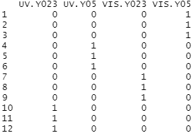
The design matrix for our data also needs to be specified before we can perform the F-tests. The experimental design is parametrized with a one-way layout and one coefficient is assigned to each group.
#Setup the design matrix
design <- model.matrix(~ 0 + group)
colnames(design) <- levels(group)
#View the design matrix
design
With the normalized gene counts and design matrix we can now generate the negative binomial (NB) dispersion estimates using the estimateDisp function. The NB dispersion estimates reflect the overall biological variability under the QL framework in edgeR.
This allows us to use the plotBCV function to generate a genewise biological coefficient of variation (BCV) plot of dispersion estimates. The resulting plot is saved to the glmQLF_plotBCV jpg file.
#Generate the NB dispersion estimates
list <- estimateDisp(list, design, robust=TRUE)
#View the common dispersion
list$common.dispersion
#Visualize the dispersion estimates with a BCV plot
jpeg("glmQLF_plotBCV.jpg")
plotBCV(list)
dev.off()
Next, we estimate the QL dispersions for all genes using the glmQLFit function. This detects the gene-specific variability above and below the overall level. The dispersion are then plotted with plotQLDisp, and the resulting plot is saved to the glmQLF_plotQLDisp jpg file.
#Estimate and view the QL dispersions
fit <- glmQLFit(list, design, robust=TRUE)
head(fit$coefficients)
#Plot to the QL dispersions and write to file
jpeg("glmQLF_plotQLDisp.jpg")
plotQLDisp(fit)
dev.off()
Now we are ready to begin defining and testing contrasts of our experimental design. The first comparison we will make is used to test our hypothesis that the means of the treatment factor are equal.
So, we will make a contrast that tests whether the average across all UV groups is equal to the average across all VIS groups using makeContrasts. Note that UV and VIS are the two levels in our treatment group.
#Design a contrast to test overall effect of the first factor
con.UVvsVIS <- makeContrasts(UVvsVIS = (UV.Y023 + UV.Y05)/2
  - (VIS.Y023 + VIS.Y05)/2,
  levels=design)
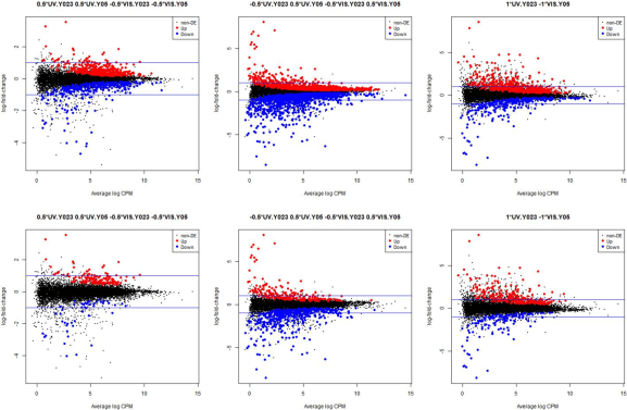
With the contrast defined we can use the glmQLFTest function to test the effect of our first factor. The DE genes in our test are plotted using plotMD and written to the glmQLF_UVvsVIS_plotMD jpg.
The top tags for the DE genes that are above a 0.05 false discovery rate (FDR) cutoff are written to the glmQLF_UVvsVIS_topTags csv. A FDR of 0.05 is used to filter the results to the most biologically relevant genes.
#Look at genes expressed across all UV groups
test.anov.one <- glmQLFTest(fit, contrast=con.UVvsVIS)
summary(decideTests(test.anov.one))
#Write plot to file
jpeg("glmQLF_UVvsVIS_plotMD.jpg")
plotMD(test.anov.one)
abline(h=c(-1, 1), col="blue")
dev.off()
#Write top tags table of DE genes to file
tagsTblANOVA.one <- topTags(test.anov.one, n=nrow(test.anov.one$table))$table
tagsTblANOVA.one.keep <- tagsTblANOVA.one$FDR <= 0.05
tagsTblANOVA.one.out <- tagsTblANOVA.one[tagsTblANOVA.one.keep,]
write.table(tagsTblANOVA.one.out, file="glmQLF_UVvsVIS_topTags.csv", sep=",", row.names=TRUE)
We can use the glmTreat function to filter out genes that have a low logFC and are therefore less significant to our analysis. In this example we will use a log2 FC cutoff of 1.2, since we see a relatively large number of DE genes from our test.
The DE genes from our filtered test results are plotted using plotMD and written to the glmQLF_UVvsVIS_plotMD_filtered jpg. The top tags for the DE genes are selected using the topTags function, which default ranks the genes by p-value. The top tags that are above a 0.05 false discovery rate (FDR) cutoff are written to the glmQLF_UVvsVIS_topTags_filtered csv.
#Look at genes with significant expression across all UV groups
treat.anov.one <- glmTreat(fit, contrast=con.UVvsVIS, lfc=log2(1.2))
summary(decideTests(treat.anov.one))
#Write plot to file
jpeg("glmQLF_UVvsVIS_plotMD_filtered.jpg")
plotMD(treat.anov.one)
abline(h=c(-1, 1), col="blue")
dev.off()
#Write tags table of DE genes to file
tagsTblANOVA.one.filtered <- topTags(treat.anov.one, n=nrow(treat.anov.one$table))$table
tagsTblANOVA.one.filtered.keep <- tagsTblANOVA.one.filtered$FDR <= 0.05
tagsTblANOVA.one.filtered.out <- tagsTblANOVA.one.filtered[tagsTblANOVA.one.filtered.keep,]
write.table(tagsTblANOVA.one.filtered.out, file="glmQLF_UVvsVIS_topTags_filtered.csv", sep=",", row.names=TRUE)
The second comparison we will make is used to test our hypothesis that the means of the tolerance factor are equal.
So, we will need to make a second contrast that tests whether the average across the Tolerant group (Y05 genotype) is equal to the average across the Not Tolerant group (Y023 genotype).
#Design a contrast to test overall effect of the first factor
con.TvsN <- makeContrasts(TvsN = (UV.Y05 + VIS.Y05)/2
  - (UV.Y023 + VIS.Y023)/2,
  levels=design)
With the second contrast defined we again use glmQLFTest to test the effect of our second factor. The DE genes in our second test are plotted using plotMD and written to the glmQLF_TvsN_plotMD jpg. The top tags for the DE genes that are above a 0.05 false discovery rate (FDR) cutoff are written to the glmQLF_TvsN_topTags csv.
#Look at genes expressed across all tolerant groups
test.anov.two <- glmQLFTest(fit, contrast=con.TvsN)
summary(decideTests(test.anov.two))
#Write plot to file
jpeg("glmQLF_TvsN_plotMD.jpg")
plotMD(test.anov.two)
abline(h=c(-1, 1), col="blue")
dev.off()
#Write tags table of DE genes to file
tagsTblANOVA.two <- topTags(test.anov.two, n=nrow(test.anov.two$table))$table
tagsTblANOVA.two.keep <- tagsTblANOVA.two$FDR <= 0.05
tagsTblANOVA.two.out <- tagsTblANOVA.two[tagsTblANOVA.two.keep,]
write.table(tagsTblANOVA.two.out, file="glmQLF_TvsN_topTags.csv", sep=",", row.names=TRUE)
Again we use glmTreat to filter out genes that have a low logFC. Then the DE genes from our filtered test results are plotted using plotMD and written to the glmQLF_TvsN_plotMD_filtered jpg. The top tags that are above 0.05 FDR are written to the glmQLF_TvsN_topTags_filtered csv.
#Look at genes with significant expression across all tolerant groups
treat.anov.two <- glmTreat(fit, contrast=con.TvsN, lfc=log2(1.2))
summary(decideTests(treat.anov.two))
#Write plot to file
jpeg("glmQLF_TvsN_plotMD_filtered.jpg")
plotMD(treat.anov.two)
abline(h=c(-1, 1), col="blue")
dev.off()
#Write tags table of DE genes to file
tagsTblANOVA.two.filtered <- topTags(treat.anov.two, n=nrow(treat.anov.two$table))$table
tagsTblANOVA.two.filtered.keep <- tagsTblANOVA.two.filtered$FDR <= 0.05
tagsTblANOVA.two.filtered.out <- tagsTblANOVA.two.filtered[tagsTblANOVA.two.filtered.keep,]
write.table(tagsTblANOVA.two.filtered.out, file="glmQLF_TvsN_topTags_filtered.csv", sep=",", row.names=TRUE)
The final comparison we will make is to test our hypothesis that there is no interaction between the two factors (treatment and tolerance). To make our last contrast we will test whether the mean effects of the two factors are equal.
#Test whether there is an interaction effect
con.Interaction <- makeContrasts(Interaction = ((UV.Y023 + UV.Y05)/2
  - (VIS.Y023 + VIS.Y05)/2)
  - ((UV.Y05 + VIS.Y05)/2
  - (UV.Y023 + VIS.Y023)/2),
  levels=design)
With the last contrast defined we use glmQLFTest to test the interaction effect. The DE genes in our final test are saved to the glmQLF_Interaction_plotMD jpg. The top tags above 0.05 FDR are written to the glmQLF_Interaction_topTags csv.
#Look at genes expressed across all tolerant groups
test.anov.Interaction <- glmQLFTest(fit, contrast=con.Interaction)
summary(decideTests(test.anov.Interaction))
#Write plot to file
jpeg("glmQLF_Interaction_plotMD.jpg")
plotMD(test.anov.Interaction)
abline(h=c(-1, 1), col="blue")
dev.off()
#Write tags table of DE genes to file
tagsTblANOVAInteraction <- topTags(test.anov.Interaction, n=nrow(test.anov.Interaction$table))$table
tagsTblANOVAInteraction.keep <- tagsTblANOVAInteraction$FDR <= 0.05
tagsTblANOVAInteraction.out <- tagsTblANOVAInteraction[tagsTblANOVAInteraction.keep,]
write.table(tagsTblANOVAInteraction.out, file="glmQLF_Interaction_topTags.csv", sep=",", row.names=TRUE)
Finally, the DE genes from our last filtered test results are saved to the glmQLF_Interaction_plotMD_filtered jpg. The top tags that are above 0.05 FDR are written to the glmQLF_Interaction_topTags_filtered csv.
#Look at genes with significant expression across all tolerant groups
treat.anov.Interaction <- glmTreat(fit, contrast=con.Interaction, lfc=log2(1.2))
summary(decideTests(treat.anov.Interaction))
#Write plot to file
jpeg("glmQLF_Interaction_plotMD_filtered.jpg")
plotMD(treat.anov.Interaction)
abline(h=c(-1, 1), col="blue")
dev.off()
#Write tags table of DE genes to file
tagsTblANOVAInteraction.filtered <- topTags(treat.anov.Interaction, n=nrow(treat.anov.Interaction$table))$table
tagsTblANOVAInteraction.filtered.keep <- tagsTblANOVAInteraction.filtered$FDR <= 0.05
tagsTblANOVAInteraction.filtered.out <- tagsTblANOVAInteraction.filtered[tagsTblANOVAInteraction.filtered.keep,]
write.table(tagsTblANOVAInteraction.filtered.out, file="glmQLF_Interaction_topTags_filtered.csv", sep=",", row.names=TRUE)
Example Outputs – glmQLFTest_edgeR.r
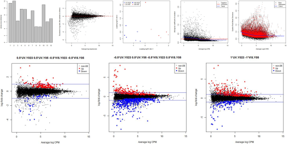
The following plots are example outputs from the above R script.

R-bloggers.com offers daily e-mail updates about R news and tutorials about learning R and many other topics. Click here if you're looking to post or find an R/data-science job.
Want to share your content on R-bloggers? click here if you have a blog, or here if you don't.


