NBA salaries
Want to share your content on R-bloggers? click here if you have a blog, or here if you don't.
I came across a dataset of NBA player salaries from the 1984-1985 season to the 2017-2018 season here, and I thought it would be a fun dataset to practice my tidyverse skills on. All the code for this post can be found here.
First, let’s import the tidyverse package, set the plotting theme, and read in the data files.
library(tidyverse)
theme_set(theme_bw())

# read in data
players <- read_csv("players.csv") %>% select(id, name)
salaries <- read_csv("salaries_1985to2018.csv") %>%
  inner_join(players, by = c("player_id" = "id"))
For all of the plots and text below, “year” will refer to the year that the season started. For example, year 2017 refers to the 2017-2018 season.
Sanity checks
Each line of the salaries dataframe corresponds to one player in one season. Let’s make a plot of the number of observations by year:
# no. of records by season
salaries %>% group_by(season_start) %>%
  count() %>%
  ggplot(aes(season_start, n)) +
  geom_col() +
  labs(x = "Year", y = "# of observations",
       title = "# of observations by year")

It looks like the number of players is slowly increasing over time, which could make sense since the number of NBA teams is increasing over time (albeit slowly). Some of the earlier years look like they are missing data, and year 2013 looks a little bit too low. For the remainder of this post, we will only look at salaries from 2000 onwards. (If we had more time, we would look into whether the 2013-2014 season data was complete.)
# we only look at salaries from 2000 onwards
# drop and rename some columns
salaries <- salaries %>% filter(season_start >= 2000) %>%
  select(player_id, name, salary, year = season_start, team)
Next, let’s check that the number of teams represented in the dataset each year is correct:
# count no. of teams by year
salaries %>% group_by(year) %>%
  summarize(n_teams = n_distinct(team)) %>%
  ggplot(aes(year, n_teams)) +
  geom_line() +
  geom_point() +
  ylim(c(0, 30)) +
  labs(x = "Year", y = "# of teams",
       title = "# of teams by year")

This is correct: according to this Wikipedia article, there were 29 teams in the few years before 2004 and 30 teams from 2004 onwards.
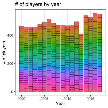
As our final sanity check, let’s look at the number of players in each team by year:
# count no. of players by year
# 2013 looks fishy, but we will ignore for now
salaries %>% group_by(year, team) %>%
  count() %>%
  ggplot(aes(year, n, fill = team)) +
  geom_col(col = "black", size = 0.2) +
  labs(x = "Year", y = "# of players",
       title = "# of players by year") +
  theme(legend.position = "none")

Each little rectangle in the plot above represents one team. There are no obvious discrepancies except for 2013, which we should really look into at some point in the future.
Team salary trends
Let’s look at the total salary paid out each year:
# total salary by year
salaries %>% group_by(year) %>%
  summarize(tot_salary = sum(salary)) %>%
  ggplot(aes(year, tot_salary)) +
  geom_point() + geom_line() +
  expand_limits(y = 0) +
  labs(x = "Year", y = "Total salary",
       title = "Total salary of all players by year")

Salaries are increasing, as expected, but is the rate at which they are increasing unusual? In the next plot, we add a reference line corresponding to 4% inflation for each year.
# compare with constant inflation
tot_2000 <- salaries %>% filter(year == 2000) %>%
  summarize(tot_salary = sum(salary)) %>% pull()
inflation_df <- data.frame(year = 2000:2017,
                           inflation_amt = tot_2000 * 1.04^(0:17))
salaries %>% group_by(year) %>%
  summarize(tot_salary = sum(salary)) %>%
  ggplot(aes(year, tot_salary)) +
  geom_point() + geom_line() +
  geom_line(aes(year, inflation_amt), data = inflation_df,
            col = "red", linetype = 2) +
  annotate("text", x = 2008, y = 2.6e9,
           label = c("4% increase/yr"), color="red") +
  expand_limits(y = 0) +
  labs(x = "Year", y = "Total salary",
       title = "Total salary of all players by year")

Looks like the early 2010s were “lean” years, while salaries took off after that.
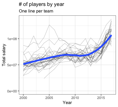
How do salary trends look like by team? In this next plot, each black line represents one team. The blue line is a smoothed version averaging across all teams.
# total salary by year by team
salaries %>% group_by(year, team) %>%
  summarize(tot_salary = sum(salary)) %>%
  ggplot(aes(year, tot_salary)) +
  geom_line(aes(group = team), size = 0.1) +
  geom_smooth(size = 2, se = FALSE) +
  expand_limits(y = 0) +
  labs(x = "Year", y = "Total salary",
       title = "# of players by year",
       subtitle = "One line per team") +
  theme(legend.position = "none")

The spread of the black line tells us that there is a fair amount of variation by team. The blue smoothed line reflects the overall salary trend we saw earlier.
Next, let’s compare the teams to each other: are there some teams that always spend more than others? For this next plot, we rank the teams by salary within each year, with smaller ranks paying out more salary. We then make a heatmap, with the teams ranked by their mean rank across years.
# team ranking comparison by total salary by year
salaries %>% group_by(year, team) %>%
  summarize(tot_salary = sum(salary)) %>%
  arrange(year, desc(tot_salary)) %>%
  mutate(rank = row_number()) %>%
  group_by(team) %>%
  mutate(overall_rank = mean(rank)) %>%
  ggplot(aes(year, fct_reorder(team, overall_rank, .desc = TRUE))) +
  geom_tile(aes(fill = rank)) +
  scale_fill_distiller(palette = "RdYlBu", direction = 1) +
  labs(x = "Year", y = NULL,
       title = "Teams ranked by total salary by year") +
  theme(legend.position = "bottom")

(If we had more time, we should merge the rows which represent the same team even though the team had a name change, e.g. Brooklyn Nets and New Jersey Nets.) Teams at the top of the heatmap tend to spend more than teams near the bottom. There appears to be some positive correlation between salary and how good the team is (by domain knowledge), but there are also clear aberrations (e.g. the team right on top).
Player salary trends
To satisfy everyone’s curiosity, here is the table of the top paid player in each year from 2000 onwards. I think all of the players here are either in the Hall of Fame (or will be a shoo-in for it).
# top paid player in each year
salaries %>% group_by(year) %>%
  top_n(salary, n = 1) %>%
  arrange(year)
# # A tibble: 18 x 5
# # Groups:   year [18]
#     player_id name               salary  year team
#     <chr>     <chr>               <dbl> <dbl> <chr>
#   1 garneke01 Kevin Garnett    19610000  2000 Minnesota Timberwolves
#   2 garneke01 Kevin Garnett    22400000  2001 Minnesota Timberwolves
#   3 garneke01 Kevin Garnett    25200000  2002 Minnesota Timberwolves
#   4 garneke01 Kevin Garnett    28000000  2003 Minnesota Timberwolves
#   5 onealsh01 Shaquille O'Neal 27696430  2004 Miami Heat
#   6 onealsh01 Shaquille O'Neal 20000000  2005 Miami Heat
#   7 garneke01 Kevin Garnett    21000000  2006 Minnesota Timberwolves
#   8 garneke01 Kevin Garnett    23750000  2007 Boston Celtics
#   9 garneke01 Kevin Garnett    24751934  2008 Boston Celtics
#  10 mcgratr01 Tracy McGrady    23239562  2009 New York Knicks
#  11 bryanko01 Kobe Bryant      24806250  2010 Los Angeles Lakers
#  12 bryanko01 Kobe Bryant      25244493  2011 Los Angeles Lakers
#  13 bryanko01 Kobe Bryant      27849149  2012 Los Angeles Lakers
#  14 bryanko01 Kobe Bryant      30453805  2013 Los Angeles Lakers
#  15 bryanko01 Kobe Bryant      23500000  2014 Los Angeles Lakers
#  16 bryanko01 Kobe Bryant      25000000  2015 Los Angeles Lakers
#  17 jamesle01 LeBron James     30963450  2016 Cleveland Cavaliers
#  18 curryst01 Stephen Curry    34682550  2017 Golden State Warriors
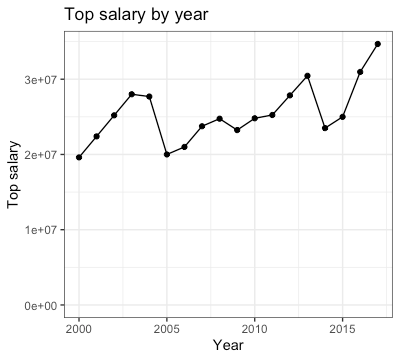
If you plot the top salary by year, you’ll see that it is generally rising but there is a fair amount of variation.
salaries %>% group_by(year) %>%
  top_n(salary, n = 1) %>%
  ggplot(aes(year, salary)) +
  geom_line() + geom_point() +
  expand_limits(y = 0) +
  labs(x = "Year", y = "Top salary",
       title = "Top salary by year")

For the rest of this post, we want to answer the question: have player salaries become more unequal over time? Let’s look at the distribution of players’ salaries for a few select years:
# histogram of player salaries for 4 years
salaries %>% filter(year %in% c(2000, 2005, 2010, 2015)) %>%
  ggplot(aes(log10(salary))) +
  geom_histogram() +
  facet_wrap(~ year) +
  labs(x = "log10(Salary)", y = "Count",
       title = "Histogram of player salaries for select years")

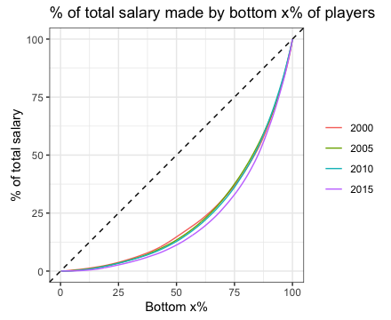
It’s hard to tell the difference between these 4 histograms. Another way we can approach this is to plot the Lorenz curve for each year. The curve shows the proportion of salary earned by the bottom x% of players. If all players got exactly the same salary, the curve would be the line. The more unequal salaries are, the closer the curve will be to the lower-right corner of the plot.
Here is the Lorenz curve for the 4 select years:
# Lorenz curve for 4 years
salaries %>% filter(year %in% c(2000, 2005, 2010, 2015)) %>%
  arrange(year, salary) %>%
  group_by(year) %>%
  mutate(cum_salary = cumsum(salary),
         tot_salary = sum(salary),
         cum_n = row_number(),
         tot_n = n()) %>%
  mutate(cum_salary_prop = cum_salary / tot_salary * 100,
         cum_n_prop = cum_n / tot_n * 100) %>%
  ggplot(aes(cum_n_prop, cum_salary_prop, col = factor(year))) +
  geom_line() +
  geom_abline(slope = 1, intercept = 0, linetype = 2) +
  labs(x = "Bottom x%", y = "% of total salary",
       title = "% of total salary made by bottom x% of players") +
  coord_equal() +
  theme(legend.title = element_blank())

The curves are almost all on top of each other, but if you look closely you will see that the curves are moving out ever so slightly to the bottom right.
Let’s plot the Gini coefficient (or Gini index) for each of the years. The Gini index is very closely related to the Lorenz curve (see the earlier link for details). Complete equality corresponds to a Gini index of 0, while complete inequality (one person with all the money) corresponds to a Gini index of 1. Below, we compute the Gini index for each year. I do it in a non-tidyverse way: would be happy to hear how one can do it in a more tidyverse-like manner.
# Gini index for each year
GetGini <- function(df) {
  x <- c(0, df$cum_n_prop) / 100
  y <- c(0, df$cum_salary_prop) / 100
  n <- length(x)
  1 - 2 * sum(sapply(1:(n-1),
                     function(i) 0.5 * (x[i+1] - x[i]) * (y[i+1] + y[i])))
}
temp <- salaries %>% arrange(year, salary) %>%
  group_by(year) %>%
  mutate(cum_salary = cumsum(salary),
         tot_salary = sum(salary),
         cum_n = row_number(),
         tot_n = n()) %>%
  mutate(cum_salary_prop = cum_salary / tot_salary * 100,
         cum_n_prop = cum_n / tot_n * 100)
gini_vec <- unlist(lapply(split(temp, temp$year), GetGini))
gini_df <- data.frame(year = as.numeric(names(gini_vec)), gini = gini_vec)
ggplot(gini_df, aes(year, gini)) +
  geom_line() + geom_point() +
  expand_limits(y = c(0, 1)) +
  labs(x = "Year", y = "Gini index",
       title = "Gini index of player salaries by year")

There does seem to be a slight increase in Gini index over time, but not too noticeable. For reference, based on the latest World Bank’s estimates for the Gini index by country, the lowest Gini index was 24.2 (Slovenia in 2017) and the highest was 63.0 (South Africa in 2014). (The latest Gini index estimate for the USA was 41.4 in 2016. As one might expect, NBA player salaries are very unequal!
Here is the linear regression result of Gini index on year. The slope is statistically significant at level 0.05.
# OLS of gini index on year
summary(lm(gini ~ year, data = gini_df))

# Call:
#   lm(formula = gini ~ year, data = gini_df)
#
# Residuals:
#       Min        1Q    Median        3Q       Max
# -0.057448 -0.010524  0.000716  0.013028  0.032470
#
# Coefficients:
#                 Estimate Std. Error t value Pr(>|t|)
#   (Intercept) -4.7569138  1.9592525  -2.428   0.0274 *
#   year         0.0026375  0.0009755   2.704   0.0156 *
#   ---
#   Signif. codes:  0 ‘***’ 0.001 ‘**’ 0.01 ‘*’ 0.05 ‘.’ 0.1 ‘ ’ 1
#
# Residual standard error: 0.02147 on 16 degrees of freedom
# Multiple R-squared:  0.3136,	Adjusted R-squared:  0.2707
# F-statistic: 7.311 on 1 and 16 DF,  p-value: 0.01565
R-bloggers.com offers daily e-mail updates about R news and tutorials about learning R and many other topics. Click here if you're looking to post or find an R/data-science job.
Want to share your content on R-bloggers? click here if you have a blog, or here if you don't.
