
Cyclists – Ladies, Gents and Lowly Dogs – Shiny Breakdown of London Ride 100 Results
Want to share your content on R-bloggers? click here if you have a blog, or here if you don't.
Introduction
The Prudential Ride London is an annual summer cycling weekend and within that I will focus on the Ride London-Surrey 100, a 100 mile route open to the public starting at the Stratford Olympic Park in East London and finishing in front of Buckingham Palace.
I wrote an initial analysis using R in 2016 and added the 2017 data, but while I was adding the 2018 data decided it added little. So instead I created a Shiny interactive app so that:
- I got to use R/Shiny and see if I could extract something interesting, and perhaps new from the data
- People who participated in the event could compare themselves with their peers/friends/club mates and see whereabouts on the course they made/lost time
- People riding in 2019 can use the Shiny page as a guide to expected finish times
- Those curious about the spread of abilities in the event can have a play
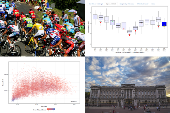
So this is below is an image of how it looks or if you just want to dive in and use the actual Shiny app, here is a link! Shiny App Link

The Shiny page allows a single rider to be highlighted by entering their “Bib Number”, but works fine without one. It is more interesting if you do enter one though so here is a list of some celebrity* Bib Numbers for 2018 so you can try a few.
This post will be a brief summary of the how I implemented each chart using Shiny/R as I want to share it on R-Bloggers, if you want a broader take on the data I direct you to my previous post. In case you are wondering about where the “Lowly Dogs” mentioned in the title appear, skip to the Wheel Suck Factor below.
General Notes about the Shiny App
I am using the free Shiny hosting option so I have chosen a few options to reduce server time as that has a monthly limit. These include; setting a short shutdown timeout on the server, caching of the data on server start-up, having a “Go” button rather than charts that automatically update and disabling the button while the server is working to prevent multiple clicks.
The Controls
There are filter controls for the year in which the event took place, gender, age group, start time and finish split. There is also a text box where a bib number can be entered to highlight a single rider.

Start Time vs. Finish Split (with “Group Riding Efficiency”)
A plot of the time riders started the event and how long they took to finish i.e. the duration from start to finish, not the time of day when the rider crossed the line . The Group Riding Efficiency indicates if a rider rode in a group and made use of the draft effect. For more detail on how the figure is calculated see the description of the Group Riding Efficiency plot below. On this chart the overall Group Riding Efficiency of the rider is indicated by the colour, blue showing that the rider was frequently riding in a big group while a red indicates a “solo” ride.
I experimented with adding a regression line to this plot but it was rather slow to plot, and misleading because many slower riders are omitted from the data because they took too long to finish (that is why the spread of finish splits is much narrower for later starters). Not being allowed to finish if you take too long is not an act of cruelty but necessity – the professional event finishes on the same roads so they have to be cleared of stragglers from the open event.

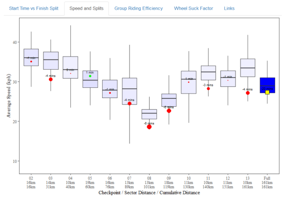
Speed and Splits
Perhaps the most useful chart for participants to see where they made or lost most time. The Y-axis of this boxplot shows the average speed for each sector i.e. the road between two checkpoints, with a sector category across the X-axis. The final sector shown is actually the full race distance. The two main reasons a sector has a slow average speed are that it contained either a hill and/or a rest stop.
If a rider is highlighted then the size and colour of the point indicates how much time was made/lost versus the median rider, the figure is also shown as floating text. The amount of time is not completely explained by the average speed as the sectors vary in length. To highlight the differences, longer sectors have a darker shaded box which is why the final “Full Distance” box is dark blue. To be able to show the sector and the full distance times on the same plot, the full distance time is shown as a yellow square of fixed size.
Group Riding Efficiency
Most of the effort in riding a bike is due to wind resistance. By riding close to the rider in front you can reduce your effort by about 30% for no cost. This is fundamental to the sport and for those not familiar, that’s why you often see riders at the Tour de France travelling in a huge group called the “peloton”.

This aerodynamic effect is known by many names; drafting , getting on the wheel, a pace line, getting a tow etc. I’ll stick to calling it drafting or draft effect.
I wanted to try and capture how well riders utilise the draft effect, which on the face of it was impossible given timings only accurate to the second for each checkpoint. To really know if people are riding together you would need a continuous feed of the gaps between riders. Maybe this is possible at the Tour de France using GPS, but not practical for 20,000 amateurs! All I can do is make an estimate.
The first step is to group the riders together by selecting riders who passed a checkpoint at the same time or within one second (the smallest unit of time available to me). It’s pretty crude, but if you are further than one second behind the rider in front, you are getting very little draft effect. The next problem is that riders crossing a checkpoint together are not necessarily riding in a group, one could simply be overtaking another. I counter that by only considering riders to be grouped if they pass two consecutive checkpoints together. I weight the size of the group up to a maximum of 10 riders. That’s a number of riders that if you added another rider there would not be much benefit. I could have developed a more sophisticated calculation but it would still have been a guess unless I lined up volunteers in a very large wind tunnel. The figures are centred and scaled using the R scale function.

Wheel-Suck Factor
This one is perhaps controversial, maybe a little mischievous. Given a group of riders of equal ability, the easiest position for a single rider is to sit behind the other riders for the whole course and sprint past them as they approach the finish line. In the amateur ranks this is considered “bad form” and people will grumble at you. If you are riding in a group usually your shared interest is in getting the group to the finish line as quickly as possible, therefore the best approach is to take turns riding “in the wind” at the front. Of course, this never happens perfectly (or even close) because the group contains a mix of abilities, experience, motivation, and dare I say, “Chivalry”. I have called the tendency for some riders to hide at the back the “Wheel-Suck Factor”. This is even harder to estimate than the Group Riding Efficiency and the calculation somewhat experimental/crude.
The first step is to group the riders in the same way as the GRE, then exclude any groups that do not have a discernible “front” and “back” i.e. only groups that took longer than one second to cross a checkpoint remain. As with the GRE, I only include groups that crossed consecutive checkpoints together. I take the mean of those scores for a Full Distance score (scaled/centred again). Nobody has a score for the final sector because many people “sprint for the line” so their position within the group would be a score of sprinting ability.
Because so much data is excluded many riders will have few (or none) WSF sector scores, but if they have five or more scores they get a WSF Category. There are 11 categories, including “Saint”, “Team Player”, “Lowly Dog” and a few references for people who follow road cycling to spot. It would have been good to add a probability to the final category but I’ve had enough of this for now.
Disclaimer – Given the obvious limitations of the method some people are bound to have been given an inappropriate WSF Category. It’s an estimate designed to provoke a bit of banter amongst friends and it might even encourage people to ride more collaboratively if they know they might get “stick” for it.

So that’s it. Please forward on to any cyclists you think might be interested. Thanks!
One final thing, if you’re interested in a few tips on how to improve your time, here is a short list of Top Tips.
R-bloggers.com offers daily e-mail updates about R news and tutorials about learning R and many other topics. Click here if you're looking to post or find an R/data-science job.
Want to share your content on R-bloggers? click here if you have a blog, or here if you don't.