
Time Series Analysis in R Part 3: Getting Data from Quandl
Want to share your content on R-bloggers? click here if you have a blog, or here if you don't.
This is part 3 of a multi-part guide on working with time series data in R. You can find the previous parts here: Part 1, Part 2.
Generated data like that used in Parts 1 and 2 is great for sake of example, but not very interesting to work with. So let’s get some real-world data that we can work with for the rest of this tutorial. There are countless sources of time series data that we can use including some that are already included in R and some of its packages. We’ll use some of this data in examples. But I’d like to expand our horizons a bit.
Quandl has a great warehouse of financial and economic data, some of which is free. We can use the Quandl R package to obtain data using the API. If you do not have the package installed in R, you can do so using:
install.packages('Quandl')
You can browse the site for a series of interest and get its API code. Below is an example of using the Quandl R package to get housing price index data. This data originally comes from the Yale Department of Economics and is featured in Robert Shiller’s book “Irrational Exuberance”. We use the Quandl function and pass it the code of the series we want. We also specify “ts” for the type argument so that the data is imported as an R ts object. We can also specify start and end dates for the series. This particular data series goes all the way back to 1890. That is far more than we need so I specify that I want data starting in January of 1990. I do not supply a value for the end_date argument because I want the most recent data available. You can find this data on the web here.
library(Quandl)
hpidata <- Quandl("YALE/NHPI", type="ts", start_date="1990-01-01")
plot.ts(hpidata, main = "Robert Shiller's Nominal Home Price Index")
Gives this plot:

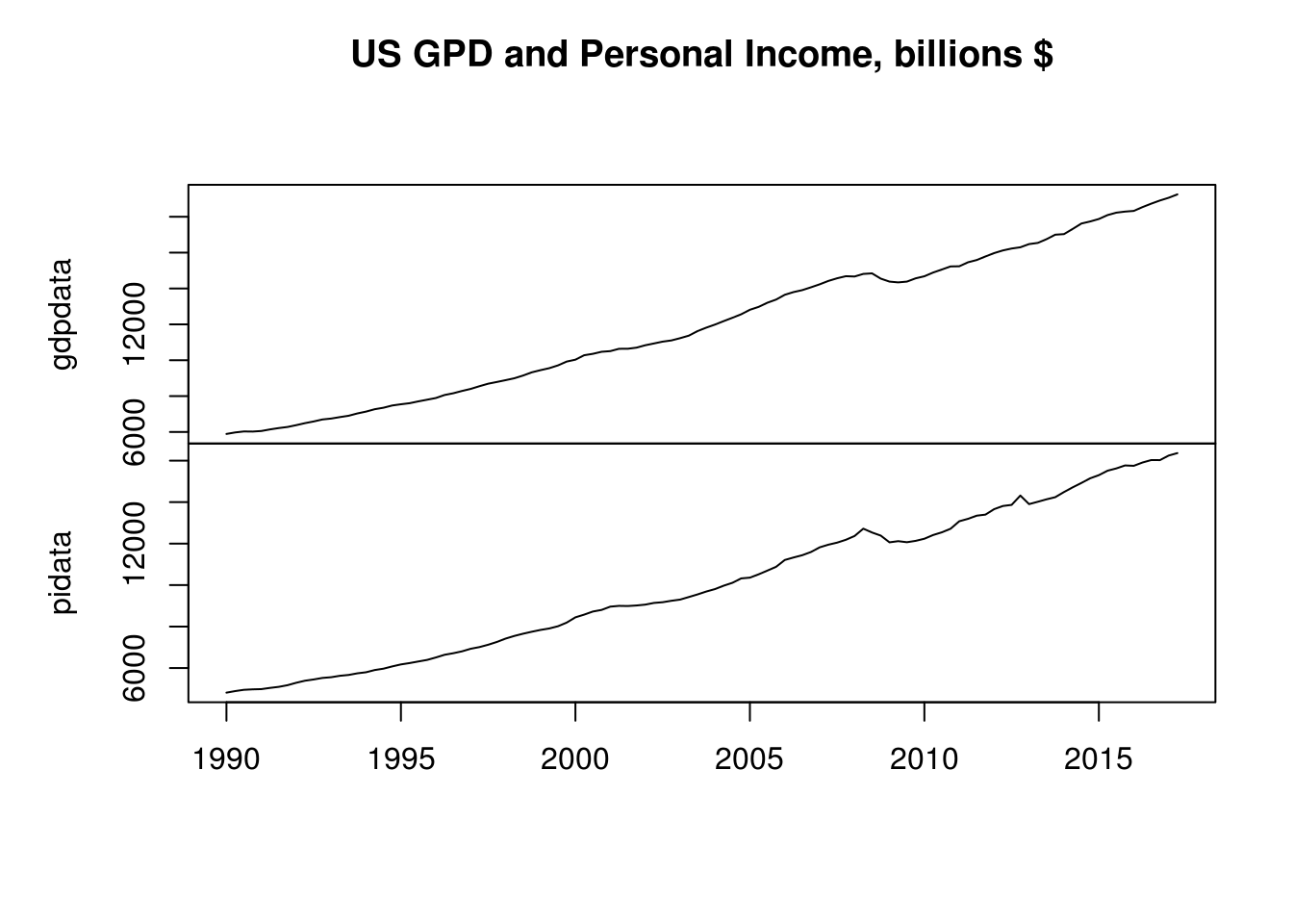
While we are here, let’s grab some additional data series for later use. Below, I get data on US GDP and US personal income, and the University of Michigan Consumer Survey on selling conditions for houses. Again I obtained the relevant codes by browsing the Quandl website. The data are located on the web here, here, and here.
gdpdata <- Quandl("FRED/GDP", type="ts", start_date="1990-01-01")
pidata <- Quandl("FRED/PINCOME", type="ts", start_date="1990-01-01")
umdata <- Quandl("UMICH/SOC43", type="ts")[, 1]
plot.ts(cbind(gdpdata, pidata),  main="US GPD and Personal Income, billions $")
Gives this plot:
plot.ts(umdata, main = "University of Michigan Consumer Survey, Selling Conditions for Houses")
Gives this plot:

The Quandl API also has some basic options for data preprocessing. The US GDP data is in quarterly frequency, but assume we want annual data. We can use the collapse argument to collapse the data to a lower frequency. Here we covert the data to annual as we import it.
gdpdata_ann <- Quandl("FRED/GDP", type="ts", start_date="1990-01-01", collapse="annual")
frequency(gdpdata_ann)
[1] 1
We can also transform our data on the fly as its imported. The Quandl function has a argument transform that allows us to specify the type of data transformation we want to perform. There are five options – “diff“, ”rdiff“, ”normalize“, ”cumul“, ”rdiff_from“. Specifying the transform argument as”diff” returns the simple difference, “rdiff” yields the percentage change, “normalize” gives an index where each value is that value divided by the first period value and multiplied by 100, “cumul” gives the cumulative sum, and “rdiff_from” gives each value as the percent difference between itself and the last value in the series. For more details on these transformations, check the API documentation here.
For example, here we get the data in percent change form:
gdpdata_pc <- Quandl("FRED/GDP", type="ts", start_date="1990-01-01", transform="rdiff")
plot.ts(gdpdata_pc * 100, ylab= "% change", main="US Gross Domestic Product, % change")
Gives this plot:

You can find additional documentation on using the Quandl R package here. I’d also encourage you to check out the vast amount of free data that is available on the site. The API allows a maximum of 50 calls per day from anonymous users. You can sign up for an account and get your own API key, which will allow you to make as many calls to the API as you like (within reason of course).
In Part 4, we will discuss visualization of time series data. We’ll go beyond the base R plotting functions we’ve used up until now and learn to create better-looking and more functional plots.
Related Post
- Pulling Data Out of Census Spreadsheets Using R
- Extracting Tables from PDFs in R using the Tabulizer Package
- Extract Twitter Data Automatically using Scheduler R package
- An Introduction to Time Series with JSON Data
- Get Your Data into R: Import Data from SPSS, Stata, SAS, CSV or TXT
R-bloggers.com offers daily e-mail updates about R news and tutorials about learning R and many other topics. Click here if you're looking to post or find an R/data-science job.
Want to share your content on R-bloggers? click here if you have a blog, or here if you don't.