
ggeffects: Create Tidy Data Frames of Marginal Effects for ‚ggplot‘ from Model Outputs #rstats
Want to share your content on R-bloggers? click here if you have a blog, or here if you don't.
Aim of the ggeffects-package
The aim of the ggeffects-package is similar to the broom-package: transforming “untidy” input into a tidy data frame, especially for further use with ggplot. However, ggeffects does not return model-summaries; rather, this package computes marginal effects at the mean or average marginal effects from statistical models and returns the result as tidy data frame (as tibbles, to be more precisely).
Since the focus lies on plotting the data (the marginal effects), at least one model term needs to be specified for which the effects are computed. It is also possible to compute marginal effects for model terms, grouped by the levels of another model’s predictor. The package also allows plotting marginal effects for two- or three-way-interactions, or for specific values of a model term only. Examples are shown below.
Consistent and tidy structure
The returned data frames always have the same, consistent structure and column names, so it’s easy to create ggplot-plots without the need to re-write the arguments to be mapped in each ggplot-call. x and predicted are the values for the x- and y-axis. conf.low and conf.high could be used as ymin and ymax aesthetics for ribbons to add confidence bands to the plot. group can be used as grouping-aesthetics, or for faceting.
Marginal effects at the mean
ggpredict() computes predicted values for all possible levels and values from a model’s predictors. In the simplest case, a fitted model is passed as first argument, and the term in question as second argument:
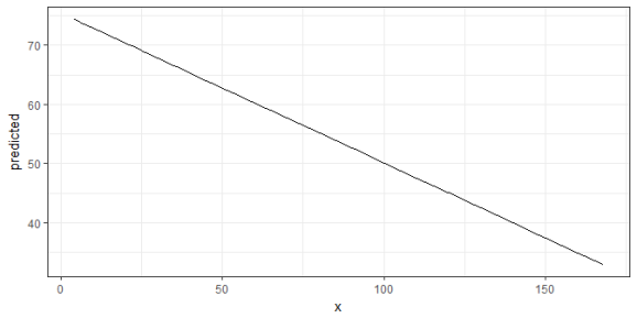
library(ggeffects)
data(efc)
fit <- lm(barthtot ~ c12hour + neg_c_7 + c161sex + c172code, data = efc)

ggpredict(fit, terms = "c12hour")
#> # A tibble: 62 × 5
#>        x predicted conf.low conf.high  group
#>
#>  1     4  74.43040 72.33073  76.53006      1
#>  2     5  74.17710 72.09831  76.25588      1
#>  3     6  73.92379 71.86555  75.98204      1
#>  4     7  73.67049 71.63242  75.70857      1
#>  5     8  73.41719 71.39892  75.43546      1
#>  6     9  73.16389 71.16504  75.16275      1
#>  7    10  72.91059 70.93076  74.89042      1
#>  8    11  72.65729 70.69608  74.61850      1
#>  9    12  72.40399 70.46098  74.34700      1
#> 10    14  71.89738 69.98948  73.80529      1
#> # ... with 52 more rows
The output shows the predicted values for the response at each value from the term c12hour. The data is already in shape for ggplot:
library(ggplot2)
theme_set(theme_bw())

mydf <- ggpredict(fit, terms = "c12hour")
ggplot(mydf, aes(x, predicted)) + geom_line()
Marginal effects at the mean for different groups
The terms-argument accepts up to three model terms, where the second and third term indicate grouping levels. This allows predictions for the term in question at different levels for other model terms:
ggpredict(fit, terms = c("c12hour", "c172code"))
#> # A tibble: 186 × 5
#>        x predicted conf.low conf.high                           group
#>
#>  1     4  74.45155 72.35552  76.54759 intermediate level of education
#>  2     4  73.73319 70.31769  77.14869          low level of education
#>  3     4  75.16991 71.84707  78.49275         high level of education
#>  4     5  74.19825 72.12300  76.27350 intermediate level of education
#>  5     5  73.47989 70.07989  76.87990          low level of education
#>  6     5  74.91661 71.60399  78.22923         high level of education
#>  7     6  73.94495 71.89013  75.99976 intermediate level of education
#>  8     6  73.22659 69.84181  76.61137          low level of education
#>  9     6  74.66331 71.36058  77.96603         high level of education
#> 10     7  73.69165 71.65690  75.72639 intermediate level of education
#> # ... with 176 more rows
Creating a ggplot is pretty straightforward: the colour-aesthetics is mapped with the group-column:
mydf <- ggpredict(fit, terms = c("c12hour", "c172code"))
ggplot(mydf, aes(x, predicted, colour = group)) + geom_line()

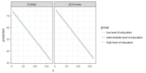
Finally, a second grouping structure can be defined, which will create another column named facet, which – as the name implies – might be used to create a facted plot:
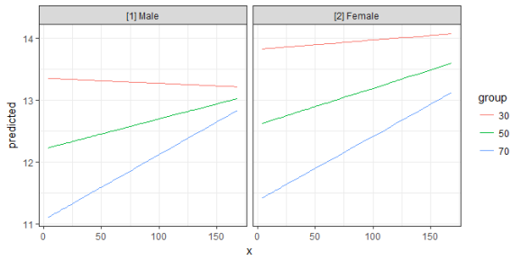
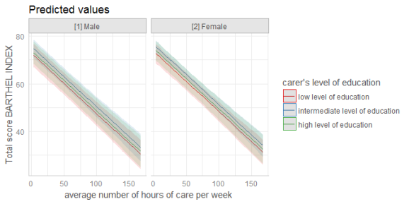
mydf <- ggpredict(fit, terms = c("c12hour", "c172code", "c161sex"))
mydf
#> # A tibble: 372 × 6
#>        x predicted conf.low conf.high                           group      facet
#>
#>  1     4  74.70073 72.38031  77.02114 intermediate level of education [2] Female
#>  2     4  73.98237 70.45711  77.50763          low level of education [2] Female
#>  3     4  75.41908 71.91747  78.92070         high level of education [2] Female
#>  4     4  73.65930 70.08827  77.23033 intermediate level of education   [1] Male
#>  5     4  72.94094 68.38540  77.49649          low level of education   [1] Male
#>  6     4  74.37766 70.05658  78.69874         high level of education   [1] Male
#>  7     5  74.44742 72.14644  76.74841 intermediate level of education [2] Female
#>  8     5  73.72907 70.21926  77.23888          low level of education [2] Female
#>  9     5  75.16578 71.67430  78.65726         high level of education [2] Female
#> 10     5  73.40600 69.84575  76.96625 intermediate level of education   [1] Male
#> # ... with 362 more rows
ggplot(mydf, aes(x, predicted, colour = group)) +
  geom_line() +
  facet_wrap(~facet)
Average marginal effects
ggaverage() compute average marginal effects. While ggpredict() creates a data-grid (using expand.grid()) for all possible combinations of values (even if some combinations are not present in the data), ggaverage() computes predicted values based on the given data. This means that different predicted values for the outcome may occure at the same value or level for the term in question. The predicted values are then averaged for each value of the term in question and the linear trend is smoothed accross the averaged predicted values. This means that the line representing the marginal effects may cross or diverge, and are not necessarily in paralell to each other.
mydf <- ggaverage(fit, terms = c("c12hour", "c172code"))
ggplot(mydf, aes(x, predicted, colour = group)) + geom_line()

Marginal effects at specific values or levels
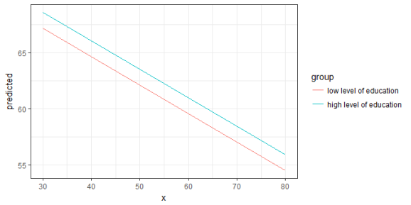
The terms-argument not only defines the model terms of interest, but each model term that defines the grouping structure can be limited to certain values. This allows to compute and plot marginal effects for terms at specific values only. To define these values, put them in square brackets directly after the term name: terms = c("c12hour [30, 50, 80]", "c172code [1,3]")
mydf <- ggpredict(fit, terms = c("c12hour [30, 50, 80]", "c172code [1,3]"))
mydf
#> # A tibble: 6 × 5
#>       x predicted conf.low conf.high                   group
#>
#> 1    30  67.14736 64.03737  70.25735  low level of education
#> 2    30  68.58408 65.41695  71.75120 high level of education
#> 3    50  62.08134 59.04764  65.11503  low level of education
#> 4    50  63.51805 60.30587  66.73023 high level of education
#> 5    80  54.48230 51.28288  57.68172  low level of education
#> 6    80  55.91902 52.38556  59.45247 high level of education
ggplot(mydf, aes(x, predicted, colour = group)) + geom_line()
Two- and Three-Way-Interactions
To plot the marginal effects of interaction terms, simply specify these terms in the terms-argument.
library(sjmisc)
data(efc)
# make categorical
efc$c161sex <- to_factor(efc$c161sex)
# fit model with interaction
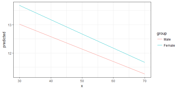
fit <- lm(neg_c_7 ~ c12hour + barthtot * c161sex, data = efc)
# select only levels 30, 50 and 70 from continuous variable Barthel-Index
mydf <- ggpredict(fit, terms = c("barthtot [30,50,70]", "c161sex"))
ggplot(mydf, aes(x, predicted, colour = group)) + geom_line()
Since the terms-argument accepts up to three model terms, you can also compute marginal effects for a 3-way-interaction.
To plot the marginal effects of interaction terms, simply specify these terms in the terms-argument.
# fit model with 3-way-interaction
fit <- lm(neg_c_7 ~ c12hour * barthtot * c161sex, data = efc)

# select only levels 30, 50 and 70 from continuous variable Barthel-Index
mydf <- ggpredict(fit, terms = c("c12hour", "barthtot [30,50,70]", "c161sex"))

ggplot(mydf, aes(x, predicted, colour = group)) +
  geom_line() +
  facet_wrap(~facet)
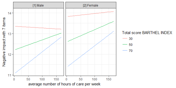
Labelling the data
ggeffects makes use of the sjmisc-package and supports labelled data. If the data from the fitted models is labelled, the value and variable label attributes are usually copied to the model frame stored in the model object. ggeffects provides various getter-functions to access these labels, which are returned as character vector and can be used in ggplot’s lab()– or scale_*()-functions.
get_title()– a generic title for the plot, based on the model family, like “predicted values” or “predicted probabilities”get_x_title()– the variable label of the first model term interms.get_y_title()– the variable label of the response.get_legend_title()– the variable label of the second model term interms.get_x_labels()– value labels of the first model term interms.get_legend_labels()– value labels of the second model term interms.
The data frame returned by ggpredict() or ggaverage() must be used as argument to one of the above function calls.
get_x_title(mydf)
#> [1] "average number of hours of care per week"
get_y_title(mydf)
#> [1] "Negative impact with 7 items"

ggplot(mydf, aes(x, predicted, colour = group)) +
  geom_line() +
  facet_wrap(~facet) +
  labs(
    x = get_x_title(mydf),
    y = get_y_title(mydf),
    colour = get_legend_title(mydf)
  )
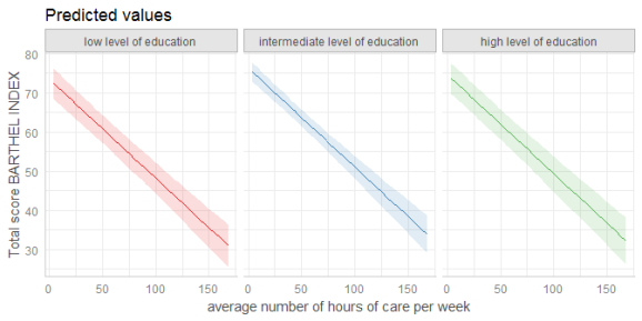
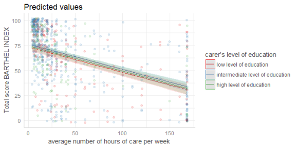
plot()-method
If you don’t want to write your own ggplot-code, ggeffects has a plot()-method with some convenient defaults, which allows quickly creating ggplot-objects. plot() has only a few arguments to keep this function small and simple. For instance, ci allows you to show or hide confidence bands (or error bars, for discrete variables), facets allows you to create facets even for just one grouping variable, or colors allows you to quickly choose from some color-palettes, including black & white colored plots. Use rawdata to add the raw data points to the plot.
data(efc)
efc$c172code <- to_label(efc$c172code)
fit <- lm(barthtot ~ c12hour + neg_c_7 + c161sex + c172code, data = efc)

# facet by group
dat <- ggpredict(fit, terms = c("c12hour", "c172code"))
plot(dat, facet = TRUE)
# don't use facets, b/w figure, w/o confidence bands
plot(dat, colors = "bw", ci = FALSE)

# plot raw data
dat <- ggpredict(fit, terms = c("c12hour", "c172code"))
plot(dat, rawdata = TRUE)
# for three variables, automatic facetting
dat <- ggpredict(fit, terms = c("c12hour", "c172code", "c161sex"))
plot(dat)
# categorical variables have errorbars
dat <- ggpredict(fit, terms = c("c172code", "c161sex"))
plot(dat)

Tagged: ggplot2, R, regression, regression analysis, rstats, Statistik

R-bloggers.com offers daily e-mail updates about R news and tutorials about learning R and many other topics. Click here if you're looking to post or find an R/data-science job.
Want to share your content on R-bloggers? click here if you have a blog, or here if you don't.