
From Points to (Messy) Lines
Want to share your content on R-bloggers? click here if you have a blog, or here if you don't.
A week or so ago, I came up with a new chart type – race concordance charts – for looking at a motor circuit race from the on-track perspective of a particular driver. Here are a couple of examples from the 2017 F1 Grand Prix:

 The gap is the time to the car on track ahead (negative gap, to the left) or behind (to the right). The colour indicates whether the car is on the same lap (light blue), on the lap behind (orange to red), or a lap ahead (dark blue).
In the dots, we can “see” lines relating to the relative progress of particular cars. But what if we actually plot the progress of each of those other cars as a line? The colours represent different cars.


Here’s another view of the track from Hulkenberg’s perspective with a wider window, whoch by comparison with the previous chart suggests I need to handle better cars that do not drop off the track but do fall out of the display window… (At the moment, I only grab data for cars in the specified concordance window):
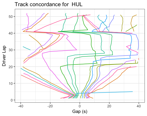
Note that we need to do a little bit of tidying up of the data so that we don’t connect lines for cars that flow off the left hand edge, for example, and then return several laps later from the right hand edge:
#Get the data for the cars, as before
inscope=sqldf(paste0('SELECT l1.code as code,l1.acctime-l2.acctime as acctimedelta,
                       l2.lap-l1.lap as lapdelta, l2.lap as focuslap
                       FROM lapTimes as l1 join lapTimes as l2
                       WHERE l1.acctime < (l2.acctime + ', abs(limits[2]), ') AND l1.acctime > (l2.acctime - ', abs(limits[1]),')
                       AND l2.code="',code,'";'))

  #If consecutive rows for same driver are on more than one focuslap apart, break the line
  inscope=ddply(inscope,.(code),transform,g=cumsum(c(0,diff(focuslap)>1)))
  #Continuous line segments have the same driver code and "group" number

  g = ggplot(inscope)

  #The interaction splits up the groups based on code and the contiguous focuslap group number
  #We also need to ensure we plot acctimedelta relative to increasing focuslap
  g=g+geom_line(aes(x=focuslap, y=acctimedelta, col=code,group=interaction(code, g)))
  #...which means we then need to flip the axes
  g=g+coord_flip()
There may still be some artefacts in the line plotting based on lapping… I can’t quite think this through at the moment:-(
So here’s my reading:
- near horizontal lines that go slightly up and to the right, and where a lot of places in the window are lost in a single lap are a result of pit stop by the car that lost the places; if we have access to pit information, we could perhaps dot these lines?
- the “waist” in the chart for HUL shows cars coming together for a safety car, and then HUL losing pace to some cars whilst making advances on others;
- lines with a constant gradient show a consistent gain or loss of time, per lap, over several laps;
- a near vertical line shows a car keeping pace, and neither making nor losing time compared to the focus car.

R-bloggers.com offers daily e-mail updates about R news and tutorials about learning R and many other topics. Click here if you're looking to post or find an R/data-science job.
Want to share your content on R-bloggers? click here if you have a blog, or here if you don't.