
Use R to Combine Multiple Columns of Data into a Single Column Spread Out Across Rows
Want to share your content on R-bloggers? click here if you have a blog, or here if you don't.
I work a lot with Pivot Tables in Microsoft Excel. A problem I often encounter is trying to analyze a spreadsheet in which data from a single variable has been spread out over many columns. In particular, this happens rather frequently with longitudinal data.
If you are trying to look at data spread out across multiple years, it can be difficult to use a Pivot Table when each year has a designated column. What you want instead is to have a single column with the header “Year” and all of the data placed in the adjacent column as a “Values” column. Let me show you what I mean…
Let’s take this data set showing the population of all countries between 1980 and 2010, taken from data.gov, and try to look at it within a pivot table.
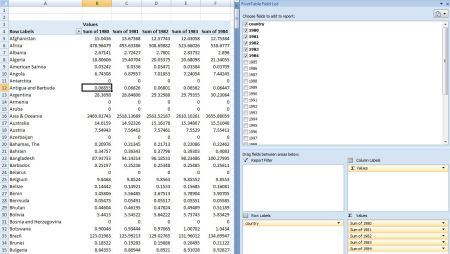
Here’s what the raw data looks like (I added the “country” header” for simplicity):

In Excel, you can easily make a simple graph using the data as it’s currently displayed. However, if you want to drop it into a pivot table for dynamic filtering, analysis, and visualization, it can get tricky. To include all the data in your Pivot Table, you have to drop each year individually into the “values” field of the pivot table. Then, if you want to exclude any of the years, you’ll have to manually remove them. This can be extremely time consuming, and it prevents you from performing many of the calculations available in the pivot table (i.e. “year over year percentage change”).
So, how can you get all of those columns into a single “Year” column so that you can analyze the data more efficiently in a pivot table? In R, there is a simple way to do this. Using the tidyr package, we can “gather” all of those columns into a single column under one variable. Let’s take a look at the code…
### install and load tidyr package
install.packages("tidyr")
library(tidyr)

### import population by country by year from data.gov
pop_wide <- read.csv("http://en.openei.org/doe-opendata/dataset/a7fea769-691d-4536-8ed3-471e993a2445/resource/86c50aa8-e40f-4859-b52e-29bb10166456/download/populationbycountry19802010millions.csv", stringsAsFactors = FALSE, check.names=FALSE)

### assign column name to the first column
colnames(pop_wide)[1] <- "country"

### combine the year columns into a single column with separate rows for each year; assign to new vector
pop_long <- gather(pop_wide,year,population,-country)

### download the new csv to your working directory
write.csv(pop_long,"population_data.csv")
After you import and load the tidyr package, simply import the file and give the column of countries a name. Then, use the gather() function to pull all of those columns into a single column with adjacent values.
The first argument is the data frame you are working in (‘pop_wide’ in our case), the second argument is what you want the variable column to be (‘year’ in our case), and the third argument is what you want the values column to be (‘population’ in our case). The last argument consists of the columns you want to be combined. You can also select instead the columns you don’t want to combine using the ‘-‘ sign, which is what we did with the ‘country’ column.
After we send the file back to our computer with write.csv, we can open the file up in Excel to see how it looks.

Now, the spreadsheet is going to list every country’s population for 1980, then 1981, then 1982, and so on. In general, this is how you want your raw data to look. If, however, you want the high level summary you started with, you can split the data back into multiple columns with tidyr’s spread() function. But, for now, let’s see how this looks in a pivot table…

If you look at the pivot table “Values” field, you’ll see that it’s a lot less messy. Now, you can manipulate the data much more easily. Want to create a pivot chart showing the increase in population within North America from 1980 to 2010? You can now do this in just a few seconds…


R-bloggers.com offers daily e-mail updates about R news and tutorials about learning R and many other topics. Click here if you're looking to post or find an R/data-science job.
Want to share your content on R-bloggers? click here if you have a blog, or here if you don't.