
Visualizing Arkansas traffic fatalities, Part 3
Want to share your content on R-bloggers? click here if you have a blog, or here if you don't.
This is the latest post in a series analyzing Arkansas traffic fatalities. Please take a look at part 1 (a map of 2015 traffic deaths) and part 2 (a heat map of all fatalities, both nationwide and in Arkansas, from 200-2015) if you haven’t already.
Visualizations
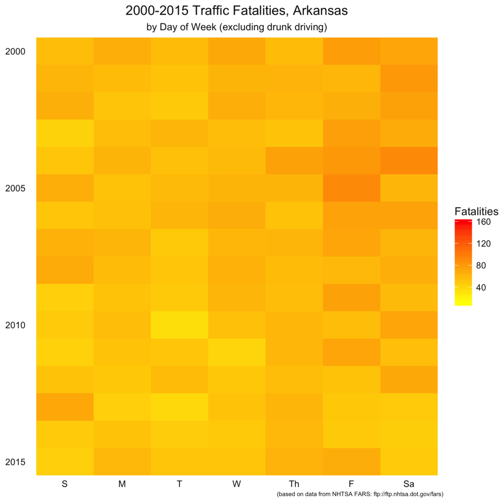
Today’s visualization piggybacks off part 2, in that we further explore the relationship of the day of the week to traffic fatalities, both nationwide and in Arkansas. The first set of visualizations maps the raw number of traffic fatalities in the US by the day of the week. You can click to zoom the image. Each band represents a single year between 2000 and 2015. Each row within the band is a year, and the column represents the band. From left to right (or top to bottom on small devices), you have drunk driving fatalities, non-drunk driving fatalities, and total fatalities.
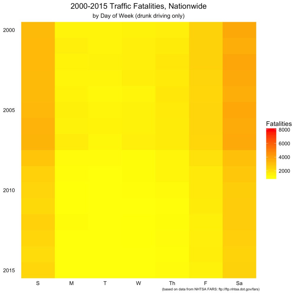


There are a couple of things that stand out here. As we saw in the previous post, weekends are far higher for drunk driving fatalities than during the week. A couple of things we couldn’t easily see in the previous post is that non-drunk-driving fatalities are pretty evenly spread throughout the week. Finally, moving from top to bottom in the charts, it looks like traffic fatalities may have gone down somewhat over the past 15 years.
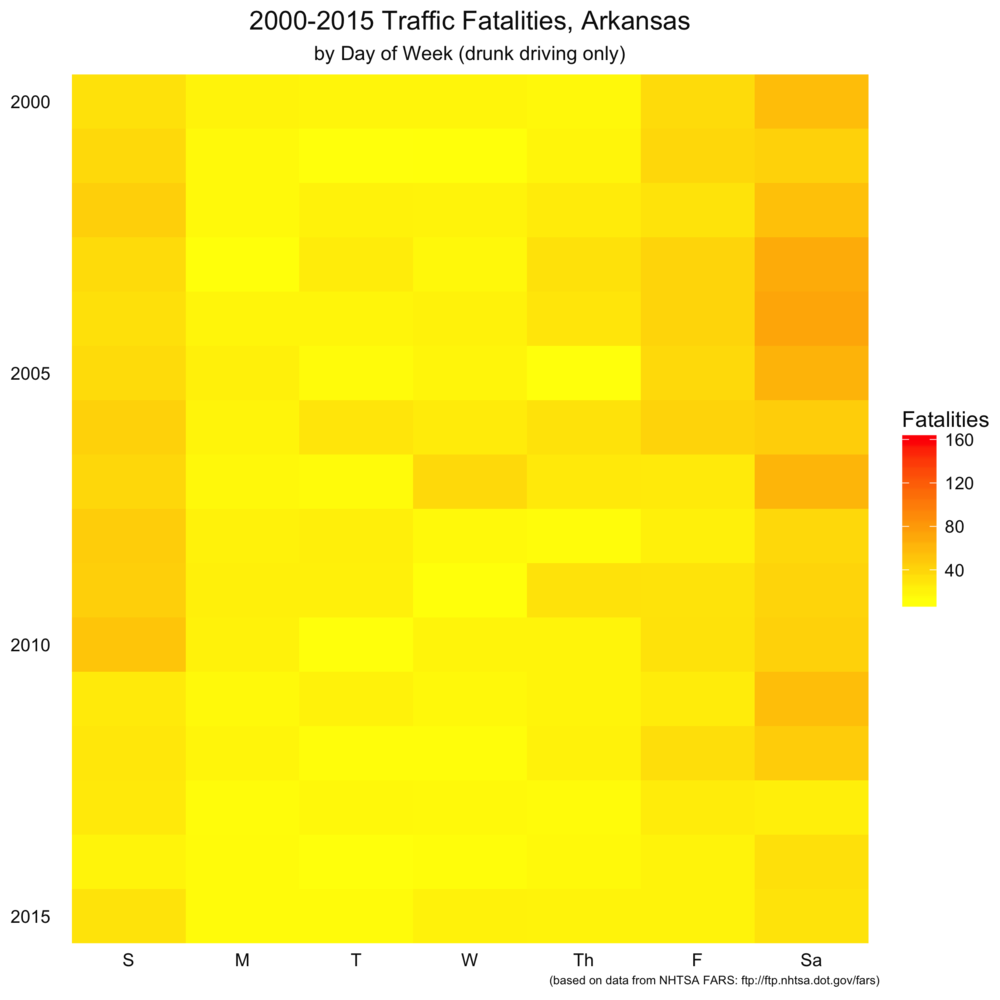
As I will with the remaining posts, I repeated the same analysis on Arkansas-specific wreck information. Again, the same trends appear to hold, although the bands aren’t as smoothly colored (that tells us the data is a little noiser due to fewer data points). Note that this scale is different than the nationwide set.

Code
We’ll be using the same FARS data we used in the previous two posts. Let’s set up our libraries, import the data into R, and get moving. For a more detailed explanation of what we’re doing here, please refer to part 2.
library(foreign)
library(ggplot2) # 2.1.0.9000
library(plyr)
library(zoo)

data.dir <- "/path/to/your/dir/"

# Read select columns from datasets
accidents_2015 <- read.dbf(paste(data.dir, "Data/FARS2015NationalDBF/accident.dbf", sep=""))[,c("STATE", "COUNTY", "DAY", "MONTH", "YEAR", "FATALS", "DRUNK_DR")]
accidents_2014 <- read.dbf(paste(data.dir, "Data/FARS2014NationalDBF/accident.dbf", sep=""))[,c("STATE", "COUNTY", "DAY", "MONTH", "YEAR", "FATALS", "DRUNK_DR")]
accidents_2013 <- read.dbf(paste(data.dir, "Data/FARS2013NationalDBF/accident.dbf", sep=""))[,c("STATE", "COUNTY", "DAY", "MONTH", "YEAR", "FATALS", "DRUNK_DR")]
accidents_2012 <- read.dbf(paste(data.dir, "Data/FARS2012/accident.dbf", sep=""))[,c("STATE", "COUNTY", "DAY", "MONTH", "YEAR", "FATALS", "DRUNK_DR")]
accidents_2011 <- read.dbf(paste(data.dir, "Data/FARS2011/accident.dbf", sep=""))[,c("STATE", "COUNTY", "DAY", "MONTH", "YEAR", "FATALS", "DRUNK_DR")]
accidents_2010 <- read.dbf(paste(data.dir, "Data/FARS2010/accident.dbf", sep=""))[,c("STATE", "COUNTY", "DAY", "MONTH", "YEAR", "FATALS", "DRUNK_DR")]
accidents_2009 <- read.dbf(paste(data.dir, "Data/FARS2009/accident.dbf", sep=""))[,c("STATE", "COUNTY", "DAY", "MONTH", "YEAR", "FATALS", "DRUNK_DR")]
accidents_2008 <- read.dbf(paste(data.dir, "Data/FARS2008/accident.dbf", sep=""))[,c("STATE", "COUNTY", "DAY", "MONTH", "YEAR", "FATALS", "DRUNK_DR")]
accidents_2007 <- read.dbf(paste(data.dir, "Data/FARS2007/accident.dbf", sep=""))[,c("STATE", "COUNTY", "DAY", "MONTH", "YEAR", "FATALS", "DRUNK_DR")]
accidents_2006 <- read.dbf(paste(data.dir, "Data/FARS2006/accident.dbf", sep=""))[,c("STATE", "COUNTY", "DAY", "MONTH", "YEAR", "FATALS", "DRUNK_DR")]
accidents_2005 <- read.dbf(paste(data.dir, "Data/FARS2005/accident.dbf", sep=""))[,c("STATE", "COUNTY", "DAY", "MONTH", "YEAR", "FATALS", "DRUNK_DR")]
accidents_2004 <- read.dbf(paste(data.dir, "Data/FARS2004/accident.dbf", sep=""))[,c("STATE", "COUNTY", "DAY", "MONTH", "YEAR", "FATALS", "DRUNK_DR")]
accidents_2003 <- read.dbf(paste(data.dir, "Data/FARS2003/accident.dbf", sep=""))[,c("STATE", "COUNTY", "DAY", "MONTH", "YEAR", "FATALS", "DRUNK_DR")]
accidents_2002 <- read.dbf(paste(data.dir, "Data/FARS2002/accident.dbf", sep=""))[,c("STATE", "COUNTY", "DAY", "MONTH", "YEAR", "FATALS", "DRUNK_DR")]
accidents_2001 <- read.dbf(paste(data.dir, "Data/FARS2001/accident.dbf", sep=""))[,c("STATE", "COUNTY", "DAY", "MONTH", "YEAR", "FATALS", "DRUNK_DR")]
accidents_2000 <- read.dbf(paste(data.dir, "Data/FARSDBF00/ACCIDENT.dbf", sep=""))[,c("STATE", "COUNTY", "DAY", "MONTH", "YEAR", "FATALS", "DRUNK_DR")]

# Merge all data
accidents <- rbind(accidents_2015, accidents_2014, accidents_2013, accidents_2012, accidents_2011, accidents_2010, accidents_2009, accidents_2008, accidents_2007, accidents_2006, accidents_2005, accidents_2004, accidents_2003, accidents_2002, accidents_2001, accidents_2000)

# Subset Arkansas wrecks
# Comment out the following line for nationwide chart
accidents <- subset(accidents, STATE == 5)

# Add date column
accidents$date <- as.Date(paste(accidents$YEAR, accidents$MONTH, accidents$DAY, sep='-'), "%Y-%m-%d")

# Divide and aggregate data into drunk/not drunk
accidents_drunk <- accidents$DRUNK_DR > 0
accidents_not_drunk <- accidents$DRUNK_DR == 0
summary <- aggregate(FATALS ~ date, accidents, sum)
summary_not_drunk <- aggregate(FATALS ~ date, accidents, sum, subset=accidents_not_drunk)
summary_drunk <- aggregate(FATALS ~ date, accidents, sum, subset=accidents_drunk)
Now, since this is a weekly analysis, we'll add in some information about each date itself.
# Date calculations
summary_not_drunk <- transform(summary_not_drunk,
week = as.numeric(format(date, "%U")),
day = as.numeric(format(date, "%d")),
wday = as.numeric(format(date, "%w"))+1,
month = as.POSIXlt(date)$mon + 1,
year = as.POSIXlt(date)$year + 1900)

summary_drunk <- transform(summary_drunk,
week = as.numeric(format(date, "%U")),
day = as.numeric(format(date, "%d")),
wday = as.numeric(format(date, "%w"))+1,
month = as.POSIXlt(date)$mon + 1,
year = as.POSIXlt(date)$year + 1900)

summary <- transform(summary,
week = as.numeric(format(date, "%U")),
day = as.numeric(format(date, "%d")),
wday = as.numeric(format(date, "%w"))+1,
month = as.POSIXlt(date)$mon + 1,
year = as.POSIXlt(date)$year + 1900)
This gives us the weekday and year (along with some other information we're not using here), which will form the x- and y-axis for our visualizations.
Next, we'll aggregate the data by year and day of week we created in the previous step. We'll also take the min and max so that we can use consistent scale colors across the three visualizations.
# Aggregation
data_not_drunk <- ddply(summary_not_drunk, .(wday, year), summarize, sum = sum(FATALS))
data_drunk <- ddply(summary_drunk, .(wday, year), summarize, sum = sum(FATALS))
data <- ddply(summary, .(wday, year), summarize, sum = sum(FATALS))
max <- max(c(max(data$sum), max(data_not_drunk$sum), max(data_drunk$sum)))
min <- min(c(min(data$sum), min(data_not_drunk$sum), min(data_drunk$sum)))
The next step is a user-experience step of changing the day of the week from a number to a more-familiar text abbreviation.
# Apply factors for days of week
data_not_drunk$weekday<-factor(data_not_drunk$wday,levels=1:7,labels=c("S","M","T","W","Th","F","Sa"),ordered=TRUE)
data_drunk$weekday<-factor(data_drunk$wday,levels=1:7,labels=c("S","M","T","W","Th","F","Sa"),ordered=TRUE)
data$weekday<-factor(data$wday,levels=1:7,labels=c("S","M","T","W","Th","F","Sa"),ordered=TRUE)
That's it for data wrangling. Now, we just need to plot the data. Again, we'll define a theme so that the charts look pretty and incorporate the same color scale.
# Define theme
heat_map_theme <- theme(
panel.grid.major.y = element_blank(),
panel.grid.minor.y = element_blank(),
panel.grid.minor.x = element_blank(),
panel.grid.major.x = element_blank(),
panel.spacing.x = unit(0, "points"),
panel.spacing.y = unit(1, "points"),
strip.background = element_rect(fill="gray90", color=NA),
strip.text = element_text(color="gray5"),
axis.ticks = element_blank(),
axis.text.x = element_text(color="gray5", size=9),
axis.text.y = element_text(color="gray5", size=9),
axis.title.x = element_blank(),
axis.title.y = element_blank(),
legend.text = element_text(color="gray5"),
legend.title = element_text(color="gray5"),
plot.title = element_text(color="gray5", hjust=0.5),
plot.subtitle = element_text(color="gray5", hjust=0.5),
plot.caption = element_text(color="gray5", hjust=1, size=6),
panel.background = element_rect(fill="transparent", color=NA),
legend.background = element_rect(fill="transparent", color=NA),
plot.background = element_rect(fill="transparent", color=NA),
legend.key = element_rect(fill=alpha("white", 0.33), color=NA)
)
Next, we'll define a data directory to save the output.
imagedir <- "~/PATH/TO/YOUR/SAVE/DIRECTORY/Images/"
Now, we'll simply plot and save the output.
# Plot drunk and save
ggplot(data_drunk, aes(weekday, year)) +
geom_tile(aes(fill=sum), na.rm = FALSE) +
scale_fill_gradient(name="Fatalities", low="yellow", high="red", na.value = alpha("white", 0.25), limits=c(min,max)) +
scale_y_reverse(expand=(c(0,0))) +
labs(title = "2000-2015 Traffic Fatalities, Nationwide", x="", y="", subtitle="by Day of Week (drunk driving only)", caption = "(based on data from NHTSA FARS: ftp://ftp.nhtsa.dot.gov/fars)") +
heat_map_theme

filename <- paste(c(imagedir, "2000-2015_fatalities_calendar DOW (nationwide, drunk).png"), collapse="")
ggsave(filename, bg = "transparent")

# Plot not drunk and save
ggplot(data_not_drunk, aes(weekday, year)) +
geom_tile(aes(fill=sum), na.rm = FALSE) +
scale_fill_gradient(name="Fatalities", low="yellow", high="red", na.value = alpha("white", 0.25), limits=c(min,max)) +
scale_y_reverse(expand=(c(0,0))) +
labs(title = "2000-2015 Traffic Fatalities, Nationwide", x="", y="", subtitle="by Day of Week (excluding drunk driving)", caption = "(based on data from NHTSA FARS: ftp://ftp.nhtsa.dot.gov/fars)") +
heat_map_theme

filename <- paste(c(imagedir, "2000-2015_fatalities_calendar DOW (nationwide, not drunk).png"), collapse="")
ggsave(filename, bg = "transparent")

# Plot all and save
ggplot(data, aes(weekday, year)) +
geom_tile(aes(fill=sum), na.rm = FALSE) +
scale_fill_gradient(name="Fatalities", low="yellow", high="red", na.value = alpha("white", 0.25), limits=c(min,max)) +
scale_y_reverse(expand=(c(0,0))) +
labs(title = "2000-2015 Traffic Fatalities, Nationwide", x="", y="", subtitle="by Day of Week", caption = "(based on data from NHTSA FARS: ftp://ftp.nhtsa.dot.gov/fars)") +
heat_map_theme

filename <- paste(c(imagedir, "2000-2015_fatalities_calendar DOW (nationwide, all).png"), collapse="")
ggsave(filename, bg = "transparent")
Conclusion
We've seen using a couple of different metrics that drunk driving fatalities seem to occur more often on the weekend. In the next post, we'll look at another set of heat maps that break down when driving fatalities occur during the week even further: by time of day.
R-bloggers.com offers daily e-mail updates about R news and tutorials about learning R and many other topics. Click here if you're looking to post or find an R/data-science job.
Want to share your content on R-bloggers? click here if you have a blog, or here if you don't.