
The importance of Data Visualization
Want to share your content on R-bloggers? click here if you have a blog, or here if you don't.
Before we perform any analysis and come up with any assumptions about the distributions of and relationships between variables in our datasets, it is always a good idea to visualize our data in order to understand their properties and identify appropriate analytics techniques. In this post, let’s see the dramatic differences in conclutions that we can make based on (1) simple statistics only, and (2) data visualization.
The four data sets
The Anscombe dataset, which is found in the base R datasets packege, is handy for showing the importance of data visualization in data analysis. It consists of four datasets and each dataset consists of eleven (x,y) points.
anscombe

   x1 x2 x3 x4    y1   y2    y3    y4
1  10 10 10  8  8.04 9.14  7.46  6.58
2   8  8  8  8  6.95 8.14  6.77  5.76
3  13 13 13  8  7.58 8.74 12.74  7.71
4   9  9  9  8  8.81 8.77  7.11  8.84
5  11 11 11  8  8.33 9.26  7.81  8.47
6  14 14 14  8  9.96 8.10  8.84  7.04
7   6  6  6  8  7.24 6.13  6.08  5.25
8   4  4  4 19  4.26 3.10  5.39 12.50
9  12 12 12  8 10.84 9.13  8.15  5.56
10  7  7  7  8  4.82 7.26  6.42  7.91
11  5  5  5  8  5.68 4.74  5.73  6.89
Let’s make some massaging to make the data more convinient for analysis and plotting
Create four groups: setA, setB, setC and setD.
library(ggplot2)
library(dplyr)
library(reshape2)

setA=select(anscombe, x=x1,y=y1)
setB=select(anscombe, x=x2,y=y2)
setC=select(anscombe, x=x3,y=y3)
setD=select(anscombe, x=x4,y=y4)
Add a third column which can help us to identify the four groups.
setA$group ='SetA'
setB$group ='SetB'
setC$group ='SetC'
setD$group ='SetD'

head(setA,4)  # showing sample data points from setA
   x    y group
1 10 8.04  SetA
2  8 6.95  SetA
3 13 7.58  SetA
4  9 8.81  SetA
Now, let’s merge the four datasets.
all_data=rbind(setA,setB,setC,setD)  # merging all the four data sets
all_data[c(1,13,23,43),]  # showing sample

    x    y group
1  10 8.04  SetA
13  8 8.14  SetB
23 10 7.46  SetC
43  8 7.91  SetD
Compare their summary statistics
summary_stats =all_data%>%group_by(group)%>%summarize("mean x"=mean(x),
                                       "Sample variance x"=var(x),
                                       "mean y"=round(mean(y),2),
                                       "Sample variance y"=round(var(y),1),
                                       'Correlation between x and y '=round(cor(x,y),2)
                                      )
models = all_data %>%
      group_by(group) %>%
      do(mod = lm(y ~ x, data = .)) %>%
      do(data.frame(var = names(coef(.$mod)),
                    coef = round(coef(.$mod),2),
                    group = .$group)) %>%
dcast(., group~var, value.var = "coef")

summary_stats_and_linear_fit = cbind(summary_stats, data_frame("Linear regression" =
                                    paste0("y = ",models$"(Intercept)"," + ",models$x,"x")))

summary_stats_and_linear_fit

group mean x Sample variance x mean y Sample variance y Correlation between x and y
1  SetA      9                11    7.5               4.1                         0.82
2  SetB      9                11    7.5               4.1                         0.82
3  SetC      9                11    7.5               4.1                         0.82
4  SetD      9                11    7.5               4.1                         0.82
  Linear regression
1      y = 3 + 0.5x
2      y = 3 + 0.5x
3      y = 3 + 0.5x
4      y = 3 + 0.5x
If we look only at the simple summary statistics shown above, we would conclude that these four data sets are identical.
What if we plot the four data sets?
 ggplot(all_data, aes(x=x,y=y)) +geom_point(shape = 21, colour = "red", fill = "orange", size = 3)+
    ggtitle("Anscombe's data sets")+geom_smooth(method = "lm",se = FALSE,color='blue') +
    facet_wrap(~group, scales="free")
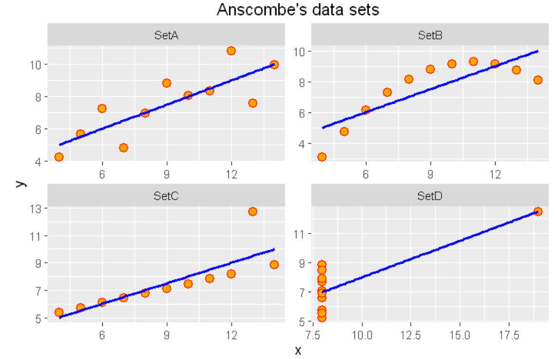
As we can see from the figures above, the datasets are very different from each other. The Anscombe’s quartet is a good example that shows that we have to visualize the relatonships, distributuions and outliers of our data and we shoul not rely only on simple statistics.
Summary
We should look at the data graphically before we start analysis. Further, we should understand that basic statistics properties can often fail to capture real-world complexities (such as outliers, relationships and complex distributions) since summary statistics do not capture all of the complexities of the data.
Related Post
- ggplot2 themes examples
- Map the Life Expectancy in United States with data from Wikipedia
- What can we learn from the statistics of the EURO 2016 – Application of factor analysis
- Visualizing obesity across United States by using data from Wikipedia
- Plotting App for ggplot2 – Part 2
R-bloggers.com offers daily e-mail updates about R news and tutorials about learning R and many other topics. Click here if you're looking to post or find an R/data-science job.
Want to share your content on R-bloggers? click here if you have a blog, or here if you don't.