
Using R to Create Ternary Diagrams: An Example Using 2016 Presidential Polling Data
Want to share your content on R-bloggers? click here if you have a blog, or here if you don't.
An R Tutorial by D. M. Wiig
In previous tutorials I have discussed the basics of creating a ternary plot using the ggtern package using a simple hypothetical data frame containing five values. In a subsequent tutorial I discussed the application by creating a ternary graph using election results from the British House of Commons from the last half of the 20th century. This type of plot creates a very nice visual of the effects of a third party on the election outcome.
In this tutorial I will discuss using the same technique as applied to recent polling data from the ongoing 2016 U.S. presidential campaign. Before discussing the current election campaign I am going to refresh your memory relative to using the ggtern package.
Before running the script in this tutorial make sure that the packages ggplot, ggplot2, and ggtern are loaded into your R environment. Please also note the you will need a recent version of R that is version 3.1.x or newer. A very basic graph can be easily constructed. I will the use theoretical quantities XA , XB , and XC to demonstrate a basic ternary diagram. In this simple example I will create a sample of n=5 by entering the data from the keyboard into a data frame ‘sampfile.’ To invoke the editor use the following code:
###################################################
#create a sample file of n=5
###################################################
sampfile <-data.frame(Xa=numeric(0),Xb=numeric(0),Xc=numeric(0))
sampfile <-edit(sampfile)
###################################################
This will open up a data entry sheet with three columns labeled Xa, Xb, and Xc. The number that are entered do not matter for purposes of this illustration. The table I entered is as follows:
Xa Xb Xc
1 100 135 250
2 90 122 210
3 98 44 256
4 100 97 89
5 90 75 89
To produce a very basic ternary diagram with the above data set use the code segment:
##################################################
#do basic graph with sample data
##################################################
ggtern(data=sampfile, aes(x=Xa,y=Xb, z=Xc)) + geom_point()
##################################################
This produces the graph seen below:
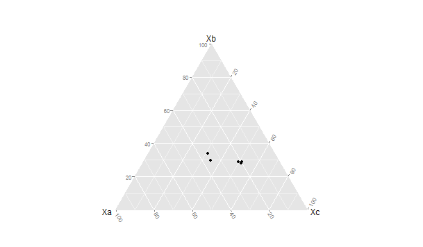
The triangular representation of the dimensions Xa →Xb, Xc → Xa and Xb →Xc allow each case to be represented as a single point located relative to each of the three vectors. There are a large number of additions, modifications and tweaks that can be done to this basic pattern. In the next tutorial I will discuss generating a more elaborate ternary diagram using polling data from the current U.S. presidential campaign.
Thu US has a two party dominant system with several minor parties that regularly contest elections. In the current presidential election campaign there are the two major party candidates as well as two minor party candidates for the Libertarian and Green parties that are being included in the numerous public opinion polls that are being done nationally.
For purposes of this example I have added the percentages for these two minor parties together. This results in three variables that are being plotted, the percentage for Clinton (Democrat), Trump (Republican), and for the combined Johnson (Libertarian) and Stein (Green). By plotting the three variables over time on a ternary diagram we can visualize any changes in the mixture of support indicated for the candidates.
The poll data used in this project were taken from the web site RealClearPolitics.com for the time period from July 29 to August 18.¹ It should be noted that the poll numbers were not necessarily from the same polling organization for each date but all polls used were listed as being national in scope with a Clinton v. Trump v. Johnson v. Stein format.
Before working through this tutorial make sure that you have the ggplot, ggplot2, and ggtern packages loaded into your R environment.² I originally created the table shown above using Excel and then converted it into a *cvs format before importing it into R studio for analysis.³ The data can be entered directly via the R data editor as shown in the previous example. The code segment below was used to load the *csv format file:
####################################################Enter data into spreadsheet and save a a *csv file
#Load the data into a table using the read.table function
polldata <- read.table(“d:/16electiondata.csv”, header = TRUE, sep=”,”)
#Make sure the table is ok
View(polldata)
###################################################
date clinton trump johnson/stein
17-Aug 41 35 10
16-Aug 43 37 15
14-Aug 42 37 12
11-Aug 43 40 10
10-Aug 44 40 13
9-Aug 44 38 14
8-Aug 50 37 9
7-Aug 45 37 12
5-Aug 39 35 17
4-Aug 43 34 15
2-Aug 42 38 13
1-Aug 45 37 14
30-Jul 46 41 8
29-Jul 37 37 6
25-Jul 39 41 15
21-Jul 38 35 0
19-Jul 39 40 15
18-Jul 45 43 6
17-Jul 42 37 18
Once the data set is loaded use the following code to create the ternary diagram. Note that in this diagram we are using the base code as shown in the first tutorial with some additions that make the diagram easier to interpret such as the vector arrows and legend. The code segment is:
###################################################
#create ternary plot using percentage polled for each candidate for each polling period
#uses enhanced formatting for easier interpretation
#results of ggtern function are placed in variable ‘plot’ for rendering
###################################################
plot <- ggtern(data = polldata, aes(x = clinton, y = trump, z = johnson.stein)) +
geom_point(aes(fill = date),
size = 6,
shape = 21,
color = “black”) +
ggtitle(“2016 U.S. Presidential Election Polls”) +
labs(fill = “Date”) +
theme_rgbw() +
theme(legend.position = c(0,1),
legend.justification = c(1, 1))
###################################################
To show the diagram simply use:
###################################################
#now plot the diagram
###################################################
plot
###################################################
The resulting ternary diagram is:
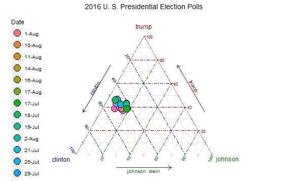
Each point on the graph represents the percentage of support for each of the three candidates by the location of the point on the 3-way graph axes. This R routine provides a quick and straightforward method for representing a 3-dimensional relationship in two dimensions.
Code segments in this article were written using R Studio Version 0.98.993 running R version 3.1.1 in a Windows 7 environment.
Notes:
¹As indicated above the poll data used in this tutorial was located at http://realclearpolitics.com. This website is an excellent source of information about all aspects of American electoral politics.
² For additional information about ternary graphs see the website http://www.ggtern.com. See also the CRAN website at http://cran.r-project.org/web/packages/ggtern/ggtern.pdf.
³For information about using the IDE R Studio see the website https://www.rstudio.com.

R-bloggers.com offers daily e-mail updates about R news and tutorials about learning R and many other topics. Click here if you're looking to post or find an R/data-science job.
Want to share your content on R-bloggers? click here if you have a blog, or here if you don't.