
Learning from data science competitions- baby steps
Want to share your content on R-bloggers? click here if you have a blog, or here if you don't.
Off lately a considerable number of winner machine learning enthusiasts have used XGBoost as their predictive analytics solution. This algorithm has taken a preceedence over the traditional tree based algorithms like Random Forests and Neural Networks.
The acronym Xgboost stands for eXtreme Gradient Boosting package. The creators of this algorithm presented its implementation by winning the Kaggle Otto Group competition. Another interesting tutorial is listed here and the complete documentation can be seen here. This page lists a comprehensive list of awesome tutorials on it and this one shows feature importance It is a classification algorithm and the reasons of its superior efficiency are,
- It’s written in C++
- It can be multithreaded on a single machine
- It preprocesses the data before the training algorithm.
Unlike its previous tree based predecessors it takes care of many of the inherent problems associated with tree based classification. For example, “By setting the parameter early_stopping,xgboost will terminate the training process if the performance is getting worse in the iteration.” [1]
As with all machine learning algorithms, xgboost works on numerical data. If categorical data is there then use one-hot encoding from the R caret package to transform the categorical data (factors) to numerical dummy variables that can be used by the algorithm. Here is a good SO discussion on one-hot encoding in R. This Quora thread discusses the question on “when should you be using one-hot encoding in data science?”.
Okay, enough of background information. Now let’s see some action.
Problem Decription
The objective is to predict whether a donor has donated blood in March 2007. To this effect, the dataset for this study is derived from DrivenData which incidentally is also hosting a practice data science competition on the same.
Problem Type: Classification.
And how did I figure this out? Well, one has to read the problem description carefully as well as the submission format. In this case, the submission format categorically states that the response variable to be either 1 or 0 which is proof enough that this is a classification problem.
Choice of predictive algorithm
Boy, that really let my head spinning for some time. You see I was torn between the traditionalist approach and the quickie (get it out there) approach. First, I thought let me learn and explore what story is the data trying to tell me (traditionalist approach) but then I gave up on this idea because of my past experiences. Once I venture this path, I get stuck somewhere or keep digging in a quest to perfect my solution and time slips away. So this time, I said to myself, “Enough! let me try the quickie approach that is get it (read the solution) out of the lab as quickly as possible. And I can later continue to improve the solution”. So following this intuition and a very much required self-morale boost (that is what happens to you when you are out in the laboratory all by yourself) I decided to choose XGBoost as the preliminary predictive classification algorithm. Being neck deep into clustering algorithms (which is my research area) and if truth be told I never really had a penchant for supervised algorithms (once again a gut feeling that they were too easy because you already know the outcome. Damm! I was so wrong)
Choice of tool
For sometime now, I had been juggling between the choice of being a pythonist or an R user, “To be or not to be, that is the question”. The worldwide web has some great resources on this discussion and you can take your pick. In my case, I decided to chose and stick with R because of two reasons, primarily its a statistical programming language and two predictive analytics or machine learning has its roots in statistics.
The Strategy
“Visualize it, Clean it, Smoothe it, Publish it”.
After reading the data in R, my first step was to plot as many meaningful graphs as possible to detect a trend or a relationship. I started with line plots but before I get into that, a brief about the dataset. The dataset was pre-divided into training and testing data. The training data had 576 observations in 6 continuous variables of which the last variable was the response. Similarly, the test data had 200 observations in 5 continuous variables.
# Read in the data
train.data<-read.csv("data//blood_donation_train.csv", sep = ",", header=TRUE)
test.data<-read.csv("data//blood_donation_test.csv", sep = ",", header=TRUE) # Check the data structure > str(train.data)
'data.frame': 576 obs. of 6 variables:
$ ID : int 619 664 441 160 358 335 47 164 736 436 ...
$ Months.since.Last.Donation : int 2 0 1 2 1 4 2 1 5 0 ...
$ Number.of.Donations : int 50 13 16 20 24 4 7 12 46 3 ...
$ Total.Volume.Donated..c.c..: int 12500 3250 4000 5000 6000 1000 1750 3000 11500 750 ...
$ Months.since.First.Donation: int 98 28 35 45 77 4 14 35 98 4 ...
$ Made.Donation.in.March.2007: int 1 1 1 1 0 0 1 0 1 0 ...

> str(test.data)
'data.frame': 200 obs. of 5 variables:
$ ID : int 659 276 263 303 83 500 530 244 249 728 ...
$ Months.since.Last.Donation : int 2 21 4 11 4 3 4 14 23 14 ...
$ Number.of.Donations : int 12 7 1 11 12 21 2 1 2 4 ...
$ Total.Volume.Donated..c.c..: int 3000 1750 250 2750 3000 5250 500 250 500 1000 ...
$ Months.since.First.Donation: int 52 38 4 38 34 42 4 14 87 64 ...
a. Data Visualization
I first started with the base R graphics library, you know commands like hist() or plot() but honestly speaking the visualization was draconian, awful. You see it did not appeal to me at all and thus my grey cells slumbered. Then, I chose the ggplot2 library. Now, that was something. The visualizations were very appealing inducing the grey mater to become active.
Learning note: So far, I have not done any data massaging activity like centering or scaling. Why? The reason is one will find patterns in the raw data and not in a centered or scaled data.
Off the numerous graphs I plotted, I finally settled on the ones that displayed some proof of variablity. I wanted to see if there was a cohort of people who were donating more blood than normal. I was interested in this hypothesis because there are some cool folks out there (pun intended) for whom blood donation is a business. Anyway, if you look at the line plot 1 that explores my perceived hypothesis, you will notice a distinct cluster of people who donated between 100 cc to 5000 cc in approx 35 months range.
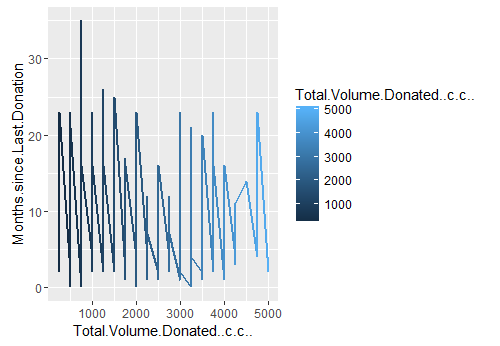
Line plot 1: Distribution of total blood volume donated in year 2007-2010
highDonation2<- subset(train.data, Total.Volume.Donated..c.c..>=100 & Total.Volume.Donated..c.c..<=5000 & Months.since.Last.Donation<=35)
p5<- ggplot() +geom_line(aes(x=Total.Volume.Donated..c.c.., y=Months.since.Last.Donation, colour=Total.Volume.Donated..c.c..),size=1 ,data=highDonation2, stat = "identity")
p5

highDonation2.3<- subset(train.data, Total.Volume.Donated..c.c..>800 & Total.Volume.Donated..c.c..<=5000 & Months.since.Last.Donation<=35)
str(highDonation2.3)
p6.3<- ggplot() +geom_line(aes(x=Total.Volume.Donated..c.c.., y=Months.since.Last.Donation, colour=Total.Volume.Donated..c.c..),size=1 ,data=highDonation2.3, stat = "identity")
p6.3

highDonation2.4<- subset(train.data, Total.Volume.Donated..c.c..>2000 & Total.Volume.Donated..c.c..<=5000 & Months.since.Last.Donation<=6)
p6.2<- ggplot() +geom_line(aes(x=Total.Volume.Donated..c.c.., y=Months.since.Last.Donation, colour=Total.Volume.Donated..c.c..),size=1 ,data=highDonation2.4, stat = "identity")
p6.2
I then took a subset of these people and I noticed that total observations was 562 which is just 14 observations less than the original dataset. Hmm.. maybe I should narrow my range down a bit more. so then I narrowed the range between 1000 cc to 5000 cc of blood donated in the 1 year and I find there are 76 people and when I further narrow it down to between 2000-5000 cc of blood donation in 6 months, there are 55 people out of 576 as shown in line plot 2.
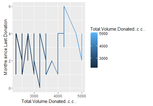
Line plot 2: Distribution of total blood volume (in cc) donated in 06 months of 2007
If you look closely at the line plot 2, you will notice a distinct spike between 4 and 6 months. (Ohh baby, things are getting soo hot and spicy now, I can feel the mounting tension). Let’s plot it. And lo behold there are 37 good folks who have donated approx 2000 cc to 5000 cc in the months of May and June, 2007.
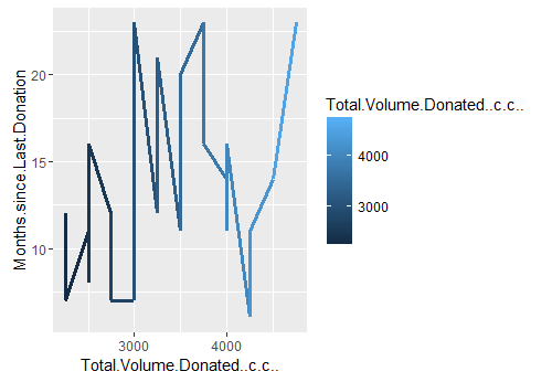
Line plot 3: Distribution of total blood volume (in cc) donated in May & June of 2007
I finally take this exploration one step further wherein I search for a pattern or a group of people who had made more than 20 blood donations in six months of year 2007. And they are 08 such good guys who were hyperactive in blood donation. This I show in line plot 4.
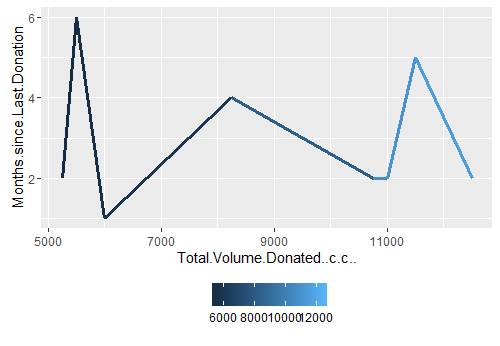
Line plot 4: Distribution of high blood donors in six months of year 2007
This post is getting too long now. I thin it will not be easier to read and digest it. So I will stop here and continue it in another post.
Key Takeaway Learning Points
A few important points that have helped me a lot.
- A picture is worth a thousand words. Believe in the power of visualizations
- Always, begin the data exploration with a hypothesis or question and then dive into the data to prove it. You will find something if not anything.
- Read and regurgiate on the research question, read material related to it to ensure that the data at hand is enough to answer your questions.
- If you are a novice, don’t you dare make assumptions or develop any preconceived notions about knowledge nuggets (for example, my initial aversion towards supervised learning as noted above) that you have not explored.
- Get your fundamentals strong in statistics, linear algebra and probability for these are the base of data science.
- Practice programming your learnings and it will be best if create an end to end project. Needless to mention, the more you read, the more you write and the more you code, you will get better in your craft.And stick to one programming tool.
- Subscribe to data science blogs like R-bloggers, kaggle, driven data etc. Create a blog which will serve as your live portfolio.
- I think to master the art of story telling with data takes time and a hell lot of reading and analysis.
In the next part of this post, I will elaborate and discuss on my strategy that i undertook to submit my initial entry for predicting blood donor, competition hosted at driven data.
References
[1] “An Introduction To Xgboost R Package”. R-bloggers.com. N.p., 2016. Web. 23 Aug. 2016.
Featured Image Credit: https://standstill.me/2015/01/16/principle-2-take-it-easy/
Filed under: classification techniques, Data Science Competition, exploratory data analysis Tagged: Machine Learning, R


R-bloggers.com offers daily e-mail updates about R news and tutorials about learning R and many other topics. Click here if you're looking to post or find an R/data-science job.
Want to share your content on R-bloggers? click here if you have a blog, or here if you don't.