
San Francisco Crime Data Analysis Part 1
Want to share your content on R-bloggers? click here if you have a blog, or here if you don't.
Hello. Today I will analyze the San Francisco Crime Data which can be found at Kaggle. In another post, I will plot the data onto the San Francisco map. Are you ready to discover how crime is taking place in this beautiful city?
NOTE: In my heat maps, if the plotted values are calculated within aparticular variable, across all the other variables (rather than both variables which is the usual case in heat maps), then to distinguish the particular variable I draw grey (horizontal or vertical) lines. I prefer this kind of heat maps when analyzing two variables, and their joint behavior (instead of say faceted plots), since in some cases having heat maps is easier to distinguish and provides a clearer big picture.
library(data.table)
library(ggplot2)
library(lubridate)
library(plotly)

trn = fread('train.csv')

##
Read 67.2% of 878049 rows
Read 878049 rows and 9 (of 9) columns from 0.119 GB file in 00:00:03


str(trn)

## Classes 'data.table' and 'data.frame':   878049 obs. of  9 variables:
##  $ Dates     : chr  "2015-05-13 23:53:00" "2015-05-13 23:53:00" "2015-05-13 23:33:00" "2015-05-13 23:30:00" ...
##  $ Category  : chr  "WARRANTS" "OTHER OFFENSES" "OTHER OFFENSES" "LARCENY/THEFT" ...
##  $ Descript  : chr  "WARRANT ARREST" "TRAFFIC VIOLATION ARREST" "TRAFFIC VIOLATION ARREST" "GRAND THEFT FROM LOCKED AUTO" ...
##  $ DayOfWeek : chr  "Wednesday" "Wednesday" "Wednesday" "Wednesday" ...
##  $ PdDistrict: chr  "NORTHERN" "NORTHERN" "NORTHERN" "NORTHERN" ...
##  $ Resolution: chr  "ARREST, BOOKED" "ARREST, BOOKED" "ARREST, BOOKED" "NONE" ...
##  $ Address   : chr  "OAK ST / LAGUNA ST" "OAK ST / LAGUNA ST" "VANNESS AV / GREENWICH ST" "1500 Block of LOMBARD ST" ...
##  $ X         : num  -122 -122 -122 -122 -122 ...
##  $ Y         : num  37.8 37.8 37.8 37.8 37.8 ...
##  - attr(*, ".internal.selfref")=


summary(trn)

##     Dates             Category           Descript
##  Length:878049      Length:878049      Length:878049
##  Class :character   Class :character   Class :character
##  Mode  :character   Mode  :character   Mode  :character
##
##
##
##   DayOfWeek          PdDistrict         Resolution
##  Length:878049      Length:878049      Length:878049
##  Class :character   Class :character   Class :character
##  Mode  :character   Mode  :character   Mode  :character
##
##
##
##    Address                X                Y
##  Length:878049      Min.   :-122.5   Min.   :37.71
##  Class :character   1st Qu.:-122.4   1st Qu.:37.75
##  Mode  :character   Median :-122.4   Median :37.78
##                     Mean   :-122.4   Mean   :37.77
##                     3rd Qu.:-122.4   3rd Qu.:37.78
##                     Max.   :-120.5   Max.   :90.00


trn[, DayOfWeek:=factor(DayOfWeek, ordered=TRUE, levels=c("Monday", "Tuesday", "Wednesday", "Thursday", "Friday", "Saturday", "Sunday"))]
The train set has 878049 rows, and 9 columns. The DayOfWeek is also converted into an ordered factor. This is important if you want the days to be shown properly on plots.
Let’s check address real quick. I do not think that address will be that important regarding plotting data and making predictions, since we already have latitude and longitude data.
trn[, .N, by = Address][order(N, decreasing = T)][1:10]

##                      Address     N
##  1:   800 Block of BRYANT ST 26533
##  2:   800 Block of MARKET ST  6581
##  3: 2000 Block of MISSION ST  5097
##  4: 1000 Block of POTRERO AV  4063
##  5:   900 Block of MARKET ST  3251
##  6:       0 Block of TURK ST  3228
##  7:        0 Block of 6TH ST  2884
##  8:    300 Block of ELLIS ST  2703
##  9:    400 Block of ELLIS ST  2590
## 10:     16TH ST / MISSION ST  2504
It is interesting that some streets really have very high crime rate. 800 block of Bryant St and Market St pop out from the rest.
Let’s see how Category and Description fares. These must be highly correlated.
d=trn[, .N, by = Category][order(N, decreasing = T)]
ggplot(d, aes(x = reorder(Category, -N), y = N, fill = N)) +
    geom_bar(stat = 'identity') +
    coord_flip() +
    scale_fill_continuous(guide=FALSE) +
    labs(x = '', y = 'Total Number of Crimes', title = 'Total Count of Crimes per Category')

trn[, .N, by = Descript][order(N, decreasing = T)]

##                                               Descript     N
##   1:                      GRAND THEFT FROM LOCKED AUTO 60022
##   2:                                     LOST PROPERTY 31729
##   3:                                           BATTERY 27441
##   4:                                 STOLEN AUTOMOBILE 26897
##   5:             DRIVERS LICENSE, SUSPENDED OR REVOKED 26839
##  ---
## 875:                       PLANTING/CULTIVATING PEYOTE     1
## 876:                               REFUSAL TO IDENTIFY     1
## 877:                      SHOOTING BY JUVENILE SUSPECT     1
## 878:            DESTROYING JAIL PROPERTY-$200 OR UNDER     1
## 879: EMBEZZLEMENT, GRAND THEFT PUBLIC/PRIVATE OFFICIAL     1
There are 39 crime categories, and 879 unique descriptions. The descriptions are like categories with finer details. It could be useful to break down the descriptions into words, and use them as predictors.
Let’s now have a look at police districts, resolution and some heat maps with previous variables.
d = trn[, .N, by = PdDistrict][order(N, decreasing = T)]
ggplot(d, aes(x = reorder(PdDistrict, -N), y = N, fill = PdDistrict)) +
    geom_bar(stat = 'identity') +
    coord_flip() +
    guides(fill = F) +
    labs(x = '', y = 'Total Number of Crimes', title = 'Total Number of Crimes per District')

d = trn[, .N, by = Resolution][order(N, decreasing = T)]
ggplot(d, aes(x = reorder(Resolution, -N), y = N, fill = Resolution)) +
    geom_bar(stat = 'identity') +
    coord_flip() +
    guides(fill = F) +
    labs(x = '', y = 'Total Number of Crimes', title = 'Total Number of Crimes per Resolution Type')

So we have 17 unique resolutions for comes, and 10 unique districts, with the Southern District being the top crime area. I wonder whether the crime rich streets fall within this district.
trn[i= Address =='800 Block of BRYANT ST', .N, by = PdDistrict]

##    PdDistrict     N
## 1:   SOUTHERN 26533
Yes, indeed it does. There is an easier way actually. Let’s check the top 10 streets and their districts.
trn[,.N, by =.(Address, PdDistrict)][order(N, decreasing = T)][1:10]

##                      Address PdDistrict     N
##  1:   800 Block of BRYANT ST   SOUTHERN 26533
##  2:   800 Block of MARKET ST   SOUTHERN  6581
##  3: 2000 Block of MISSION ST    MISSION  5090
##  4: 1000 Block of POTRERO AV    MISSION  4063
##  5:   900 Block of MARKET ST   SOUTHERN  3251
##  6:       0 Block of TURK ST TENDERLOIN  3228
##  7:        0 Block of 6TH ST   SOUTHERN  2884
##  8:    300 Block of ELLIS ST TENDERLOIN  2703
##  9:    400 Block of ELLIS ST TENDERLOIN  2589
## 10:     16TH ST / MISSION ST    MISSION  2504
By holding the first position in number of crimes, and having 4 contenders in the top 10, Southern District is the winner.
Now it is time to analyze how variables interact with each other. Let’s check how each district’s preferred resolution is.
d = trn[, .N, by =.(PdDistrict, Resolution)][order(N, decreasing = T)]
g = ggplot(d, aes(x = PdDistrict, y = Resolution, fill = N)) +
    geom_tile() +
    scale_fill_distiller(palette = 'RdYlGn') +
    theme(axis.title.y = element_blank(),
          axis.title.x = element_blank(),
          axis.text.x = element_text(angle = 45, hjust = 1))
ggplotly(g)

We see that ‘None’ resolution dominates all the others, so taking it out will make the plot more useful.
d = trn[, .N, by =.(PdDistrict, Resolution)][order(N, decreasing = T)][i= !Resolution %in% c('NONE')]
g = ggplot(d, aes(x = PdDistrict, y = Resolution, fill = N)) +
    geom_tile() +
    scale_fill_distiller(palette = 'RdYlGn') +
    theme(axis.title.y = element_blank(),
          axis.title.x = element_blank(),
          axis.text.x = element_text(angle = 45, hjust = 1))
ggplotly(g)
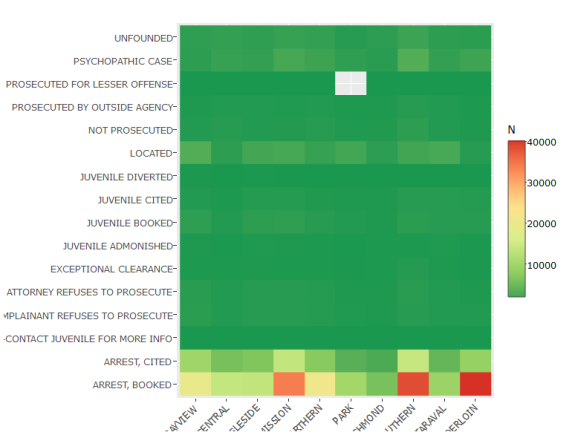
Arrest-Booked sticks out from the rest as top crime type, happening the most in top three crime districts, namely Southern, Mission, and Tenderloin.
How about plotting the same heat map, but now the percentages of each district within the resolution types?
d = trn[, .N, by =.(PdDistrict, Resolution)][,Percentage:=N/sum(N)*100, by = Resolution][order(N, decreasing = T)]
g = ggplot(d, aes(x = PdDistrict, y = Resolution, fill = Percentage)) +
    geom_tile() +
    geom_hline(yintercept=seq(0.5, 30, by=1), size = 1, color = 'grey') +
    scale_fill_distiller(palette = 'RdYlGn') +
    theme(axis.title.y = element_blank(),
          axis.title.x = element_blank(),
          axis.text.x = element_text(angle = 45, hjust = 1))
ggplotly(g)

# g = ggplot(d, aes(x = PdDistrict, y = Percentage, fill = Percentage)) +
#     geom_bar(stat = 'identity') +
#     # geom_tile() +
#     # geom_hline(yintercept=seq(0.5, 30, by=1), size = 1) +
#     facet_grid(.~Resolution) +
#     scale_fill_distiller(palette = 'RdYlGn') +
#     theme(axis.title.y = element_blank(),
#           axis.text.y = element_blank(),
#           axis.text.x = element_blank())
# g
We can see that each crime type is distributed evenly over the districts in most cases. Exceptional clearance, psychopathic case is happening the most in Southern District. I have added horizontal grey lines to make it clear that the percentages over the districts sum up to 100% for a particular Resolution.
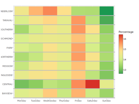
Does the day affect crime type and volume? First let's order the days of the week, starting from Monday, and then plot a heat map.
d = trn[, .N, by =.(PdDistrict, DayOfWeek)][,Percentage:=N/sum(N)*100]
g = ggplot(d, aes(x = DayOfWeek, y = PdDistrict, fill = Percentage)) +
    geom_tile() +
    scale_fill_distiller(palette = 'RdYlGn') +
    theme(axis.title.y = element_blank(),
          axis.title.x = element_blank())
ggplotly(g)

Again we can confirm that Southern District being the least safe place, while Richmond and Park being the best place in terms of crime. Friday and Saturday seems to be highest crime days compared to the rest of the week.
Now, let's see whether certain days have more crime rate.
d = trn[, .N, by =.(PdDistrict, DayOfWeek)][,Percentage:=N/sum(N)*100, by = DayOfWeek]
#d[,sum(Percentage),by= DayOfWeek]

g = ggplot(d, aes(x = DayOfWeek, y = PdDistrict, fill = Percentage)) +
    geom_tile() +
    geom_vline(xintercept=seq(0.5, 10, by=1), size = 1, color = 'grey') +
    scale_fill_distiller(palette = 'RdYlGn') +
    theme(axis.title.y = element_blank(),
          axis.title.x = element_blank())
ggplotly(g)

Above, we try to see whether on a given day, the crime rate differs across the districts. As was shown before, Southern District is the most crime rich area. We can also see whether on certain days, the ordering of districts changes or not. The crime rate over the districts does not change with day of week, and is quite stable.
d = trn[, .N, by =.(PdDistrict, DayOfWeek)][,Percentage:=N/sum(N)*100, by = PdDistrict]
#d[,sum(Percentage),by= PdDistrict]

g = ggplot(d, aes(x = DayOfWeek, y = PdDistrict, fill = Percentage)) +
    geom_tile() +
    geom_hline(yintercept=seq(0.5, 10, by=1), size = 1, color = 'grey') +
    scale_fill_distiller(palette = 'RdYlGn') +
    theme(axis.title.y = element_blank(),
          axis.title.x = element_blank())
ggplotly(g)
With the above plot we can see whether crime rate changes within a police district based on the day. We can see that Friday is the day with highest crime rate, and Sunday is the lowest. Wednesday is also seemingly high. Another interesting fact is that Tenderloin is relatively a safer neighborhood to be at on Fridays.
How about day-crime type relation? Do you think day would affect the behavior of the criminals? Let's see.
d = trn[, .N, by =.(Category, DayOfWeek)][,Percentage:=N/sum(N)*100, by = DayOfWeek][order(N, decreasing = T)]
g = ggplot(d, aes(x = DayOfWeek, y = Category, fill = Percentage)) +
    geom_tile() +
    geom_vline(xintercept=seq(0.5, 10, by=1), size = 1, color = 'grey') +
    scale_fill_distiller(palette = 'RdYlGn') +
    theme(axis.title.y = element_blank(),
          axis.title.x = element_blank())
ggplotly(g)

The distribution of crime categories stay the same in each day, with Fridays and Saturdays being a little more crowded. Also, some classes behave opposite to each other. Theft and crimes-other for example, have negative relationship. It seems like on Fridays and Saturdays Theft is preferred more, and on the other days 'other' crimes.
Does the crime rates with respect to categories change over days? It is very much possible that some days, some crimes might be more proffered compared to the rest. For this I'll calculate the percentages within each category.
d = trn[, .N, by =.(Category, DayOfWeek)][,Percentage:=N/sum(N)*100, by = Category][order(N, decreasing = T)]
#d[,sum(Percentage),by= Category]

g = ggplot(d, aes(x = DayOfWeek, y = Category, fill = Percentage)) +
    geom_tile() +
    geom_hline(yintercept=seq(0.5, 40, by=1), size = 1, color = 'grey') +
    scale_fill_distiller(palette = 'RdYlGn') +
    theme(axis.title.y = element_blank(),
          axis.title.x = element_blank())
ggplotly(g)
![]https://datacademy.files.wordpress.com/2016/06/unnamed-chunk-14-11.png)
Indeed we can clearly some crimes being more prevalent on certain days. Gambling for example is mostly done on Fridays, while drunkenness is mostly at the weekends.
# Convert date
trn[, Dates := parse_date_time(Dates, "ymd HMS")]
trn[, `:=`(Year = year(Dates),
           Month = month(Dates),
           Hour = hour(Dates))]

trn[, `:=`(Year = as.factor(Year), Month = as.factor(Month))]
d = trn[,.N,by=Year]
g = ggplot(d, aes(x = Year, y = N)) + geom_bar(stat = 'identity')
ggplotly(g)

d = trn[, .N, by=.(Month, Year)][order(Year,Month, decreasing = T)]
d[1:12]

##     Month Year    N
##  1:     5 2015 2250
##  2:     4 2015 6609
##  3:     3 2015 6851
##  4:     2 2015 6008
##  5:     1 2015 5866
##  6:    12 2014 5391
##  7:    11 2014 6471
##  8:    10 2014 7303
##  9:     9 2014 6667
## 10:     8 2014 6147
## 11:     7 2014 5808
## 12:     6 2014 5992


d = d[,.N, by = Year]
d

##     Year  N
##  1: 2015  5
##  2: 2014 12
##  3: 2013 12
##  4: 2012 12
##  5: 2011 12
##  6: 2010 12
##  7: 2009 12
##  8: 2008 12
##  9: 2007 12
## 10: 2006 12
## 11: 2005 12
## 12: 2004 12
## 13: 2003 12
We can see that overall the number of crimes committed per year stayed about the same. However, 2015 is very low. What suddenly happened in 2015? Well this info is already given on the data site, but let's find out ourselves. Suspecting not the same amount of data was collected in 2015, I have created the table showing each month and year combination, and then the number of months from each year data was collected. Indeed, in 2015 data in the first 5 months was collected. Taking that into account, 2015 is also about the same with the other years.
Now let's see whether crime categories changed over the years, or stayed the same. 2015 will be taken out from the data since it has only 5 months. I will also take out Trea since it is present only recently, and the occurrences are very few.
d = trn[i=Year!=2015 & Category != 'TREA', .N, by = .(Category, Year)][,Percentage:=N/sum(N)*100, by=Category]
g = ggplot(d, aes(x = Year, y = Category, fill = Percentage)) +
    geom_tile() +
    geom_hline(yintercept=seq(0.5, 40, by=1), size = 1, color = 'grey') +
    scale_fill_distiller(palette = 'RdYlGn') +
    theme(axis.title.y = element_blank(),
          axis.title.x = element_blank())
ggplotly(g)

By holding the category constant and calculating the percentage of crime over the years, we see that some categories have some changes over the years. Loitering was higher during 2007 and 2008 with close to 18%, while it decreased to 2% in 2014. Vehicle theft also decreased by more than 50% from 17% in 200, to 7% in 2014.
d = trn[i=Year!=2015 & Category != 'TREA', .N, by =.(Category, Year)][,Percentage:=N/sum(N)*100, by = Year]
g = ggplot(d, aes(x = Year, y = Category, fill = Percentage)) +
    geom_tile() +
    geom_vline(xintercept=seq(0.5, 40, by=1), size = 1, color = 'grey') +
    scale_fill_distiller(palette = 'RdYlGn') +
    theme(axis.title.y = element_blank(),
          axis.title.x = element_blank())
ggplotly(g)

The above plot let's us see the percentage of each crime type within certain a year, and also let's us realize any trends if there is any. Very quickly it can be seen that drug, burglary, assault, larceny/theft are the most common type of crimes. Also, the weight of larceny/theft within a year increased from 18% in 2003 to 26% in 2014. This can help the SFPD to look into this situation and take more precautions. Vehicle theft on the other hand decreased from 13% in 2005 to 5% in 2014.
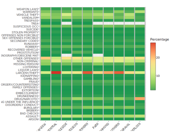
I am also very much interested in seeing the relation between the crime types and districts. It might be that some crime types are more prevalent in certain areas.
d = trn[, .N, by =.(Category, PdDistrict)][,Percentage:=N/sum(N)*100]
g = ggplot(d, aes(x = PdDistrict, y = Category, fill = Percentage)) +
    geom_tile() +
    scale_fill_distiller(palette = 'RdYlGn') +
    theme(axis.title.y = element_blank(),
          axis.title.x = element_blank(),
          axis.text.x = element_text(angle = 45, hjust = 1))
ggplotly(g)

Looking at the overall heat map we can see that some crime types stick out in some areas.
d = trn[, .N, by =.(Category, PdDistrict)][,Percentage:=N/sum(N)*100, by = Category]
g = ggplot(d, aes(x = PdDistrict, y = Category, fill = Percentage)) +
    geom_tile() +
    geom_hline(yintercept=seq(0.5, 40, by=1), size = 1, color = 'grey') +
    scale_fill_distiller(palette = 'RdYlGn') +
    theme(axis.title.y = element_blank(),
          axis.title.x = element_blank(),
          axis.text.x = element_text(angle = 45, hjust = 1))
ggplotly(g)

When the category is held constant, we can see that prostitution happens most in mission district with 50% among all the districts, drug happens most in Tenderloin with 33%, and loitering in Southern with 35% among all the districts. So it is a fact that some crime types happen to choose some areas more than the others.
d = trn[, .N, by =.(Category, PdDistrict)][,Percentage:=N/sum(N)*100, by = PdDistrict]
g = ggplot(d, aes(x = PdDistrict, y = Category, fill = Percentage)) +
    geom_tile() +
    geom_vline(xintercept=seq(0.5, 40, by=1), size = 1, color = 'grey') +
    scale_fill_distiller(palette = 'RdYlGn') +
    theme(axis.title.y = element_blank(),
          axis.title.x = element_blank(),
          axis.text.x = element_text(angle = 45, hjust = 1))
ggplotly(g)
By checking the distribution of crime types within each area, we can see that they are mostly stable with about the same percentage within each district. However, larceny/theft happens to be significantly more prevalent in Central, Northern, and Southern.
In this post I have analyzed the San Francisco Crime Data. Although this analysis can provide insight into the relation between crime, district, weekday, and some other variables, it is by no way complete without maps. That’s exactly what I’ll be doing in my next post. See you then!
Ilyas Ustun


R-bloggers.com offers daily e-mail updates about R news and tutorials about learning R and many other topics. Click here if you're looking to post or find an R/data-science job.
Want to share your content on R-bloggers? click here if you have a blog, or here if you don't.