
Cheatsheet – Selecting Graphs for Statistical Analysis
Want to share your content on R-bloggers? click here if you have a blog, or here if you don't.
One of the first steps with any statistical analysis, whether for hypothesis testing or predictive analytics or even a Kaggle competition, is checking the relationship between different variables. Checking if a pattern exists.
Graphs are a fantastic and visual way of identifying such relationships.
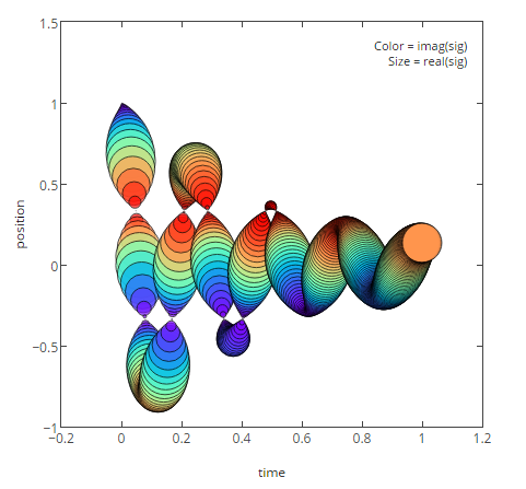
MATPLOTLIB Graph
However, numerous readers kept getting stuck while selecting graphs for categorical variables and many friends asked if there was a standard rule for graph selection. With that in mind, please see below a cheatsheet for graphical selection for both quantitative (numeric) and categorical ( character -gender, disease type, etc.) variables.
| No. |
Axis1 |
Axis2 |
Chart type |
| 1. |
Single quant |
Histograms, Density plot, Box plot | |
| 2. |
Single categorical |
Bar chart (freq/ count), Pie chart (freq/ count/%) | |
| 2. |
Categorical |
Quant |
Bar chart, pie chart, frequency table, line chart |
| 3. |
Quant |
Quant |
Scatterplot |
| 4. |
Categorical |
Categorical |
Stacked Column Chart, combination chart (typical bar chart with trendlines) |
| 5. |
2 categorical |
Quant |
Stacked or side-by-side bar charts, heat maps. Any basic graph, with Color/shape code for one of the quant variables. |
| 6. |
1 categorical |
2 Quant |
Stacked or side-by-side bar charts, Scatter plots. Any basic graph, with Color/shape code for one of the quant variables. |
| 7. |
3+ variables of any type |
Please check if you really need so many variables in a single graph. Side-by-side graphs may be a better option, or graphs with filters (if possible based on the programming language) | |
These are merely guidelines and are language-agnostic, so you may choose to implement them in your choice of programming language ( R, Python, SAS, MATLAB, etc.) . However, if you prefer, code implementations in R and Python are provided in the links below:
- Charts in R :
- Charts in Python :
- This link contains code and images to create stunning graphs (box plots, histograms, heatmaps, bubble charts, etc) using MATPLOTLIB library, like the one shown above.
Hope you find this cheatsheet useful! Feel free to share your thoughts and comments. Adieu!
Filed under: data analytics, learning resources, R, SAS, statistics Tagged: learning resources, r-projects, statistics


R-bloggers.com offers daily e-mail updates about R news and tutorials about learning R and many other topics. Click here if you're looking to post or find an R/data-science job.
Want to share your content on R-bloggers? click here if you have a blog, or here if you don't.