
Push it to the limit: SOM + Clustering + Networks
Want to share your content on R-bloggers? click here if you have a blog, or here if you don't.
What is the highest dimensional visualization you can think of? Now imagine it being interactive. The following details a Frankenstein visualization packing a smorgasbord of multivariate goodness.
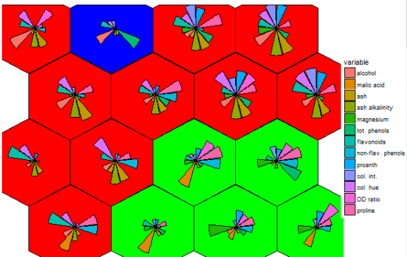
Enter first, self-organizing maps (SOM). I first fell into a love dream with SOMs after using the kohonen package. The wines data set example is a beautiful display of information.

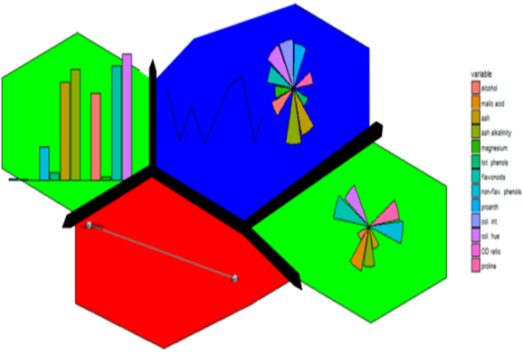
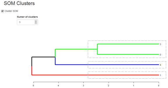
Eloquently, making the visualization above is relatively easy. SOM is used to organize the data into related groups on a grid. Hierarchical cluster analysis (HCA) is used to classify the SOM codes into three groups.
HCA cluster information is mapped to the SOM grid using hexagon background colors. The radial bar plots show the variable (wine compounds’) patterns for samples (wines).
The goal for this project was to reproduce the kohonen.plot using ggplot2 and make it interactive using shiny.
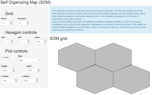
The main idea was to use SOM to calculated the grid coordinates, geom_hexagon for the grid packing and any ggplot for the hexagon-inset sub plots. Some basic inset plots could be bar or line plots.


Part of the beauty is the organization of any ggplot you cant think of (optionally grouping the input data or SOM codes) based on the SOM unit classification.
A Pavlovian response might be; does it network?
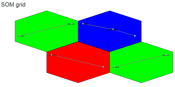
Yes we can (network). Above is an example of different correlation patterns between wine components in related groups of wines. For example the green grid points identify wines showing a correlation between phenols and flavanoids (probably reds?). Their distance from each other could be explained (?) by the small grid size (see below).
The next question might be, does it scale?
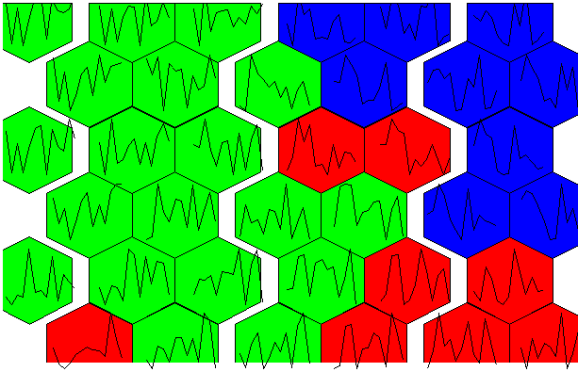
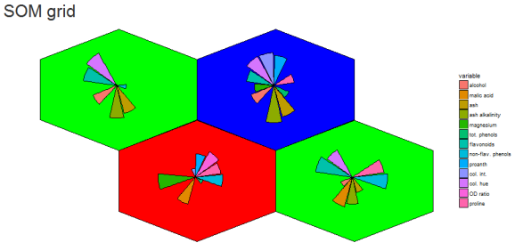
There is potential. The 4 x 4 grid shows radial bar plot patterns for 16 sub groups among the 3 larger sample groups. The next next 6 x 6 plot shows wine compound profiles for 36 ~related subsets of wines.
A useful side effect is that we can use SOM quality metrics to give us an extra-dimensional view into tuning the visualization. For example we can visualize the number of samples per grid point or distances between grid points (dissimilarity in patterns).
This is useful to identify parts of the somClustPlot showing the number of mapped samples and greatest differences.


One problem I experienced was getting the hexagon packing just right. I ended making controls to move the hexagons ~up/down and zoom in/out on the plot. It is not perfect but shows potential (?) for scaffolding highly multivariate visualizations? Some of my other concerns include the stochastic nature of SOM and the need for som random initialization for the embedding. Make sure to use it with set.seed() to make it reproducible, and might want to try a few seeds. Maybe someone out there knows how to make this aspect of SOM more robust?
R-bloggers.com offers daily e-mail updates about R news and tutorials about learning R and many other topics. Click here if you're looking to post or find an R/data-science job.
Want to share your content on R-bloggers? click here if you have a blog, or here if you don't.