
Plotting Twitter Data
Want to share your content on R-bloggers? click here if you have a blog, or here if you don't.
I’ve only just come to realize some social media sites allow you to download your entire historical activity in one large data file. I don’t know about other sites, but i’m aware that twitter does give you the option to download a data file showing all your tweets, retweets, when you tweeted them, who you retweeted, and who you’ve replied to. All of this also includes any links you might have included in the tweet, along with all the date/timestamps.
I went ahead and downloaded my data using the instructions here and started messing around with the data to see on which days i normally tweet the most and how is my twitter activity look overall since i started working.
I named the CSV file tweets, loaded it in RStudio, and started fooling around.
library(dplyr)
library(stringr)
library(ggplot2)

times = tweets[,"timestamp"]
stringr::str_replace_all(times, " \\+0000", "") -> times

as.POSIXct(times) %>%
  weekdays() %>% table() %>%
  data.frame() -> days

names(days) = c("Days", "Count")
days = days[c(2,6,7,5,1,3,4),]

days %>% ggplot(aes(Days, Count, fill = Count)) + geom_bar(stat = "identity") +
  scale_x_discrete(limits = c("Monday", "Tuesday", "Wednesday",
                              "Thursday", "Friday", "Saturday", "Sunday")) +
  ggtitle("Total Number of Tweets on Each Day of the Week") +
  theme(plot.title=element_text(face="bold")) + guides(fill=FALSE)

Judging from the graph above which shows how many tweets i’ve sent on each day since early 2011, it’s safe to say that i’m not a big fan of tweeting on Mondays, but i do get pretty hyped up on weekends since Sat and Sun show the highest level of tweets; unsurprisingly.
But i would like to see a graph that’s a little bit more comprehensive. I’m thinking something along the lines of the number of tweets for each day, each month, since the beginning of 2011 – which was when i opened an account on twitter.
as.POSIXct(times) %>%
  months() -> x

as.POSIXct(times) %>%
  weekdays() -> y

substr(times, 0, 4) -> z

tDates = data.frame(x,y,z)

names(tDates) = c("Month", "Day", "Year")

s_tDates = summarise(group_by(tDates,Day, Month, Year), Count = length(Year))

s_tDates$Month = factor(s_tDates$Month, levels = c("January", "February", "March", "April",
                                             "May", "June", "July", "August", "September",
                                             "October", "November", "December"))

o_days = c("Monday", "Tuesday", "Wednesday",
           "Thursday", "Friday", "Saturday", "Sunday")

ggplot(s_tDates, aes(Day, Count, fill = Year)) + geom_bar(stat = "identity") +
  facet_wrap(~Month) + scale_x_discrete(limits = o_days) +
  theme(axis.text.x = element_text(angle = 30, hjust = 1)) +
  scale_fill_brewer(palette = "Set2") +
  theme(axis.text.y=element_text(face = "bold", color = "black"),
        axis.text.x=element_text(face = "bold", color = "black"))

To make some sense of this graph, it’s worth noting that i got my first job in May of 2012. This would perhaps explain why from January to April, the bars are covered in orange (2012), but then the orange suddenly almost disappears from sight starting from May. That’s because i was mainly slaving at this new job, and it didn’t allow much time to do anything else.
The graph does also seem to show that i’ve dialed back on the tweets since getting a full time job. A graph showing the overall trend in tweets should finally help confirm this.
summarise(group_by(tDates, Month, Year), Count = length(Year)) -> s_tDates

o_months = c("January", "February", "March", "April", "May", "June",
             "July", "August", "September", "October", "November", "December")

ggplot(s_tDates, aes(Month, Count, fill = Count)) + geom_bar(stat = "identity") +
  facet_wrap(~Year, nrow = 1) + theme(axis.text.x = element_text(angle = 45, hjust = 1)) +
  scale_x_discrete(limits = o_months) + scale_fill_gradient(low="Black", high="Blue") +
  guides(fill=FALSE) + theme(axis.text.y=element_text(face = "bold", color = "black"),
                               axis.text.x=element_text(face = "bold", color = "black"))
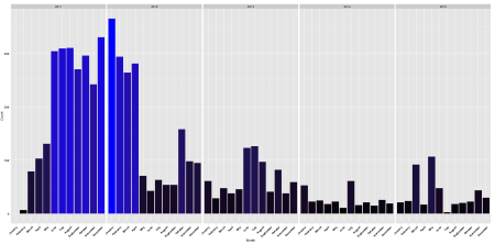
Yup. That pretty much confirms any doubts. The huge dip in tweet activity in the month of May 2012 indicates that my twitter account has been gathering an awful amount of dust since then.
With this new information, i’d also like to know at what hour do i normally tweet these days VS at what hour i used to tweet before i got my first job.
substring(times, 12, nchar(times[1])) -> hours
as.integer(substring(hours, 0,2)) -> hours

adj_hours = hours + 8

for(i in 1:length(adj_hours)){

  if(adj_hours[i] > 23){adj_hours[i] = adj_hours[i] - 24}

}

hours_df = data.frame(hours, z)
names(hours_df) = c("Hour", "Year")

summarise(group_by(hours_df, Hour, Year), Count = length(Year)) -> hours_df

Breaks = seq(1,23, by=1)

ggplot(hours_df, aes(Hour, Count, color = Year)) + geom_line(size = 1.1) +
  scale_x_discrete(limits = Breaks) + geom_point(size=2, color = "black") +
  ggtitle("Hour In Which Tweets Were Sent") + theme(plot.title=element_text(face="bold")) +
  scale_y_continuous(breaks=seq(0,200,10)) + theme(axis.text.y=element_text(face = "bold", color = "black"),
                                                   axis.text.x=element_text(face = "bold", color = "black"))
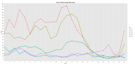
In, 2011, it would seem that i usually start tweeting an awful lot from 11AM to 1PM. The same spike that appears in 2012 must be mainly from the first 4 months, because i started work in May. Every subsequent year doesn’t seem to any patterns on what time i normally tweet.
I guess there might be more ways in which a person’s twitter data file can be analyzed. In my example, i guess it’s very much possible to plot which users i retweet the most, which i reply to the most, which sources i link to, etc. But since i keep a pretty uninteresting twitter account, i don’t think that sort of information will be of much value. But you can definitely try it out on your own data, and it might just give you an insight into your social media activity.
Tagged: data, media, programming, r, rstats, social, twitter

R-bloggers.com offers daily e-mail updates about R news and tutorials about learning R and many other topics. Click here if you're looking to post or find an R/data-science job.
Want to share your content on R-bloggers? click here if you have a blog, or here if you don't.