
Big or small-lets save them all- Visualizing Data
Want to share your content on R-bloggers? click here if you have a blog, or here if you don't.
I am revisiting the research question once again, “Can alcohol consumption increase the risk of breast cancer in working class women? and the variables to explore are;
- ‘alcconsumption’- average alcohol consumption, adult (15+) per capita consumption in litres pure alcohol
- ‘breastcancerper100TH’- Number of new cases of breast cancer in 100,000 female residents during the certain year
- ‘femaleemployrate’- Percentage of female population, age above 15, that has been employed during the given year
From the research question, the dependent variable or the response or the outcome variable is breast cancer per 100th women and the independent variables are alcohol consumption and female employ rate
Let us now look at the measures of center and spread of the aforementioned variables. This will help us to better understand our quantitative variables. In python, to measure the mean, median, mode, minimum and maximum value, standard deviation and percentiles of a quantitative variable can be computed using the describe() function as shown below
#using the describe function to get the standard deviation and other descriptive statistics of our variables
desc1=data['breastcancerper100th'].describe()
desc2=data['femaleemployrate'].describe()
desc3=data['alcconsumption'].describe()
print "\nBreast Cancer per 100th person\n", desc1
print "\nfemale employ rate\n", desc2
print "\nAlcohol consumption in litres\n", desc3
and the result will be
Breast Cancer per 100th person
count    173.000000
mean      37.402890
std       22.697901
min        3.900000
25%       20.600000
50%       30.000000
75%       50.300000
max      101.100000
So, on an average there are 37 women per 100th in whom breast cancer is reported with a standard deviation of +- 22.
Similarly, I next find the mean and standard deviation of the variable, ‘femalemployrate’
female employ rate
count    178.000000
mean      47.549438
std       14.625743
min       11.300000
25%       38.725000
50%       47.549999
75%       55.875000
max       83.300003
I can say that on an average there are 47% women employed in a given year with a deviation of +-15.
Finally, I find the mean and deviation of the variable, ‘alcconsumption’ given as
Alcohol consumption in litres
count    187.000000
mean       6.689412
std        4.899617
min        0.030000
25%        2.625000
50%        5.920000
75%        9.925000
max       23.010000
This can be interpreted as among adults (15+) the average alcohol consumption in liters per capita income is 7 liters (rounding off) with a standard deviation of +-5 (rounding off).
Therefore the inference will be that in 47% (+-15) employed women in a given year the average alcohol consumption is 7 liters (+-5) per capita and the number of breast cancer cases reported on an average are 37 (+-22) per 100th female residents.
Another, alternative method of finding descriptive statistic for your variables is to use the describe() on the dataframe which in this case is called ‘data’ as given
data.describe()
I now provide the univariate data analysis of the individual variables
# Now plotting the univariate quantitative variables using the distribution plot
sub5=sub4.copy()
sns.distplot(sub5['alcconsumption'].dropna(),kde=True)
plt.xlabel('Alcohol consumption in litres')
plt.title('Breast cancer in working class women')
plt.show()

'''Note: Although there is no need to use the show() method for ipython notebook as %matplotlib inline does the trick but I am adding it here because matplotlib inline does not work for an IDE like Pycharm and for that i need to use plt.show'''
And the barchart is
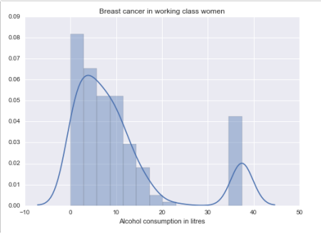
Bar Chart 1: Alcohol consumption in liters
Notice, we have two peaks in bar chart 1. So it is a bimodal distribution which means that there are two distinct groups of data. The two groups are evident from the bar chart 1, where the first group (or the first peak) is centered at 5 liters of alcohol consumption and the second group (or the second peak) is centered at 35 liters of alcohol consumption
sns.distplot(sub5['breastcancerper100th'].dropna(),kde=True)
plt.xlabel('Breast cancer per 100th women')
plt.title('Breast cancer in working class women')
plt.show()
And the barchart is
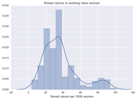
Bar Chart 2: Breast cancer per 100th women
Similarly, in bar chart 2, there are two peaks so it is a bimodal distribution where the first group is centered at 35 cases of new breast cancer reported and the second group is centered at 86 cases of new breast cancer reported.
sns.distplot(sub5['femaleemployrate'].dropna(),kde=True)
plt.xlabel('Female employee rate')
plt.title('Breast cancer in working class women')
plt.show()
And the bar chart is
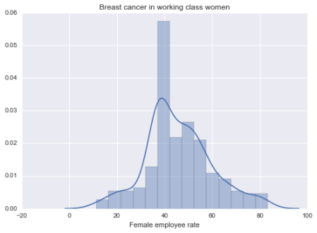
Bar Chart 3: Female Employed Rate above 15+ (in %age) in a given year
In bar chart 3 we see a unimodal distribution where there is one group with maximum number of 42.
Now that we have seen the individual variable visually, I will now come back to the research question to see if there is any relationship between the research questions. Recall, for this study the various hypotheses were;
H0 (Null Hypothesis) = Breast cancer is not caused by alcohol consumption
H1 (Alternative Hypothesis) = Alcohol consumption causes breast cancer
H2 (Alternative Hypothesis) = Female employee are susceptible to increased risk of breast cancer.
So, let’s check if there is any relationship between the breast cancer and alcohol consumption.
Please note here that since all the variables of this study are quantitative in nature so I will be using the scatter plot to visualize them.
Note that a histogram is not a bar chart. Histograms are used to show distributions of variables while bar charts are used to compare variables. Histograms plot quantitative data with ranges of the data grouped into bins or intervals while bar charts plot categorical data. For Dell Statistica, you can take a look here for the graphical data visualization and in Python it can be done using matplotlib library as shown here and a good SO question here
- When visualizing a categorical to categorical relationship we use a Bar Chart.
- When visualizing a categorical to quantitative relationship we use a Bar Chart.
- When visualizing a quantitative to quantitative relationship we use a Scatter Plot.
Also, please note that it is very important to bear in mind when plotting association between two variables, the independent or the explanatory variable is ‘X’ plotted on the x-axis and the dependent or the response variable is ‘Y’ plotted on the y-axis
So to check if the relationship exist or not, I code it in python as follows
# using scatter plot the visulaize quantitative variable.
# if categorical variable then use histogram
scat1= sns.regplot(x='alcconsumption', y='breastcancerper100th', data=data)
plt.xlabel('Alcohol consumption in liters')
plt.ylabel('Breast cancer per 100th person')
plt.title('Scatterplot for the Association between Alcohol Consumption and Breast Cancer 100th person')
And the corresponding scatter plot is 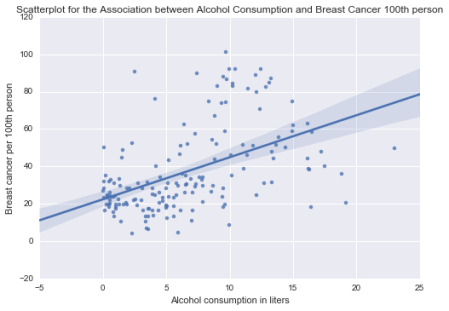
Scatter Plot 1
From the scatter plot 1, its evident that we have a positive relationship between the two variables. And this proves the alternative hypothesis (H1) that higher alcohol consumption by women has increased chances of breast cancer in them. Thus we can safely reject the null hypothesis that alcohol consumption does not cause breast cancer in women. Also, the points on the scatter plot are densely scattered around the linear line therefore the strength of the relationship is strong. This means that we have a statistically significant and strong positive relationship between higher alcohol consumption causing increased number of breast cancer patients in women.
Now, let us check if the other alternative hypothesis (H2), “Female employee are susceptible to increased risk of breast cancer” is true or not. To verify this claim, I code it as
scat2= sns.regplot(x='femaleemployrate', y='breastcancerper100th', data=data)
plt.xlabel('Female Employ Rate')
plt.ylabel('Breast cancer per 100th person')
plt.title('Scatterplot for the Association between Female Employ Rate and Breast Cancer per 100th Rate')
And the scatter plot is 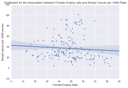
Scatter Plot 2
From scatter plot 2, we can see that there is a negative relationship between the two variables. That means as the number of female employment count increases the number of breast cancer patients in employed women decreases. Also the strength of this relationship is weak as the number of points are sparsely located on the linear line. So, I will say that although the relationship is statistically significant but it is weak thus its safe to conclude that female employment rate does not necessarily contribute to breast cancer in women.
I now come to the conclusion of this analytical series. After performing descriptive and exploratory data analysis on the gapminder dataset using python as a programming tool, I have been successful in determining that higher alcohol consumption by women increases the chance of breast cancer in them. I have also been successful in determining that breast cancer occurrence in employed females has a weak correlation. Perhaps, there are other factors that could prove this.
Finally, to conclude this exploratory data analysis series of posts has been very fruitful and immensely captivating to me. In the next post, I will discuss on the statistical relationships between the variables and testing the hypotheses in the context of Analysis of Variance (when you have one quantitative variable and one categorical variable). And since the dataset that I chose does not have any categorical variable, I will also show how to categorize a quantitative variable.
The complete python code is listed on my GitHub account here
Cheers!
R-bloggers.com offers daily e-mail updates about R news and tutorials about learning R and many other topics. Click here if you're looking to post or find an R/data-science job.
Want to share your content on R-bloggers? click here if you have a blog, or here if you don't.