
What can global temperature data tell us?
Want to share your content on R-bloggers? click here if you have a blog, or here if you don't.
Debates about anthropogenic climate change often centre around data on changes in global temperatures over the last few decades. There are good scientific reasons to look at this data, but it also plays a prominent role in political advocacy, sometimes fairly, sometimes not so fairly. This is the first in a series of posts in which I’ll discuss what this data can and cannot tell us, and examine some recent papers concerning whether or not there has been a “pause” in global warming over the last 10 to 20 years, and if so, what it might mean.
I will focus on anthropogenic warming that results, via the mis-named `greenhouse effect’, from CO2 produced by burning fossil fuels. There are other human-generated `greenhouse gasses’, and other human influences on climate, such as changes in land use, but the usual estimates of their effects are smaller than that of CO2, and in any case, they would call for different policy responses than reducing fossil fuel consumption. Other possible anthropogenic influences are, however, a possible complication when trying to determine the effects of CO2 by looking at temperature data.
What I’ll call the `warmer’ view of the effect of CO2 is what is accepted (at least verbally) by most governments, and is more-or-less found in the reports of the Intergovernmental Panel on Climate Change (IPCC) — that burning of fossil fuels increases CO2 in the atmosphere, resulting in a global increase in temperatures large enough to have quite substantial harmful effects on humans and the environment. The contrasting `no-warmer’ view is that increases in CO2 cause little or no warming, either (implausibly) because CO2 has no warming effect, or (somewhat more plausibly) because strong negative feedbacks limit its effects. In between is the `lukewarmer’ view — CO2 has some warming effect, but it is not large enough to be a major cause for worry, and does not warrant imposition of costly policies aimed at reducing fossil fuel consumption. This is the predominant view at some `skeptical’ web sites such as Watts Up With That.
There is also the `extreme-warmer’ view, that the effects of CO2 will be so large as to `fry the planet’, leading to the extinction of humans, and perhaps all life, which is surprisingly common among the general public, despite being utterly implausible. Of course, they are encouraged in this belief by alarmist papers such as `Mathematical Modelling of Plankton–Oxygen Dynamics Under the Climate Change‘ by Sekerci and Petrovskii, who apparently don’t understand that any arbitrary system of differential equations has a good chance of producing unstable behaviour, and that calling such a system a `model of a coupled plankton–oxygen dynamics’ does not make it a good model. It is very, very unlikely that life on earth would have lasted for over three billion years if the global ecosystem were really as unstable as is suggested in this paper.
The `warmer’ and `lukewarmer’ views are sufficiently plausible that it’s worth asking whether global temperature data has anything to say about which is closer to the truth. An alternative source of evidence is physical theory, embodied in computer simulations. Unfortunately, earth’s climate system is too complex to be simulated without various simplifications and approximations being made, so simulation cannot provide definitive answers, and must ultimately be checked against observations. Observations also have a rhetorical role, being potentially convincing to those who may put no trust in theory and simulation, but who naively think that measuring global temperature is a simple matter of reading thermometers.
Unfortunately, measuring global temperature is not so simple. Earth is a big place, with few observing stations, and every observing station is subject to biases from factors such as changes in the nature of its surroundings and in the time of day when observations are made. Measurements of temperature from space are indirect, and have potential biases from factors such as decaying satellite orbits. All time series of global temperatures are therefore the result of complex processing of raw data, whose appropriateness can be questioned.
It should come as no surprise to those aware of the political nature of this debate that supporters of the `warmer’ and `lukewarmer’ views tend to favour different global temperature datasets, which show different temperature trends in recent years. A favourite of the warmers is NASA’s GISS data, whose land-ocean version combines land temperature observations with sea surface temperature data. This data set was recently revised, with the new version showing a larger upward trend in temperature in recent years. The lukewarmers tend to favour the UAH data from satellite observations, also recently revised, with the new version showing a lower trend than before.
One should note that these two data sets are not measuring the same thing, or even trying to. GISS measures an ill-defined combination of water temperature near the top of the ocean and air temperature a few feet above the ground, in some variety of surroundings. UAH measures temperature in the lower part of the atmosphere, up to about 8000 metres above the surface. So it’s conceivable that the different trends in these two data sets both accurately reflect reality, though if so it’s hard to see how these different trends could continue indefinitely.
I’ll first show the monthly GISS global land-ocean temperatures (retrieved 2015-11-30) from 1880 to the end of 2014. (That’s when some other data I’ll be looking at ends; 2015 is so far mostly warmer than 2014.) These temperatures are expressed as `anomalies’ (in degrees Celsius) with respect to a base period (separately for each month of the year), since absolute values are meaningless given the arbitrary nature of what GISS is measuring. Here they are:
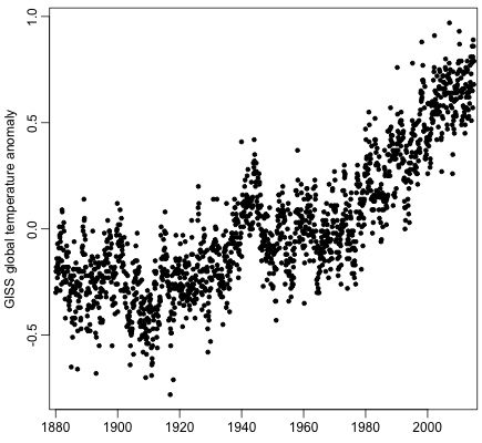
This graph is often portrayed (to the public) as convincing evidence that CO2 causes global warming. Look at that upward trend from about 1910! However, the rise from 1910 to 1940 can’t really be due to CO2. The direct warming effect of CO2 is generally accepted to be proportional to the logarithm of its concentration, with a doubling of CO2 producing roughly one degree Celsius of warming, which might be amplified (or diminished) by feedbacks. Here is a plot of the log base 2 of CO2 over the period above (data from here):
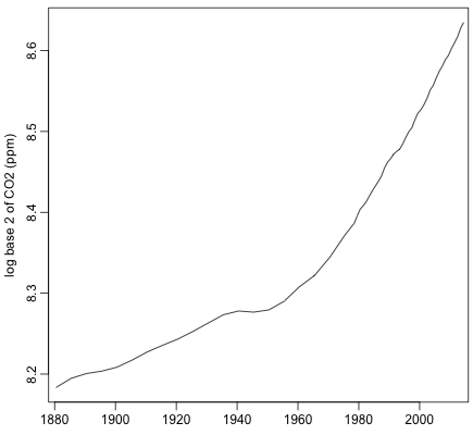
The increase from 1910 to 1940 is only about 0.05, which even with a generous factor of four allowance for positive feedback would give only 0.2 degrees Celsius of warming, compared to the warming of about 0.5 degrees in the GISS data. And if the 1910-1940 warming was really due to CO2, the warming from 1970-2000 should have been even greater than it was. Furthermore, part of the effect of CO2 is expected to be delayed by decades, making it an even less likely explanation of the 1910-1940 warming, since CO2 is thought to have been more-or-less constant before 1880.
Clearly, there are other influences on temperature than CO2. Once one realizes this, the upward temperature trend from 1970 to 2000 becomes less convincing as evidence of a warming effect of CO2. Furthermore, since CO2 has been increasing pretty much monotonically for over a hundred years, it is highly confounded with everything else that has been increasing over that period, as well as with long-period cycles. So any really persuasive argument regarding the effect of CO2 must be based on physical theory and on more detailed measurements that can confirm the effects of CO2 at a greater level of detail than a simple global average of temperature. This is the subject of `attribution’ studies, the critique of which is beyond the scope of this blog post (and beyond my expertise).
Nevertheless, there seems to be value in trying to better understand the global temperature data, partly as a `sanity check’ on claims based on more complex, and perhaps more questionable, analyses, and also to see whether there is any evidence of the data being wrong.
To lukewarmers, an aspect of the data that provides evidence of other factors being comparable in importance to CO2 is the `pause’ in warming (or at least a `slowdown’) that one can visually see in the plot above from about 2002. For a closer look, here is the same GISS data, but going back only to 1979:

The UAH satellite temperature data starts in 1979, so we can now compare with it (version 6.0beta4, downloaded 2015-11-30):
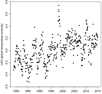
The base period for the anomalies in the UAH plot is different from GISS, so only the changes are comparable. (I’ve made the vertical scales match in that respect.)
Both data sets seem visually to show a slowdown or `pause’ around 2002, with this being more prominent in the UAH data (in which one might see the pause as going back as far as 1995). To lukewarmers, the significance of this pause is not that global warming has stopped, showing that CO2 has no effect, since they think that CO2 does have at least some small effect. Rather, they see it as evidence that other effects are large, sometimes large enough to cancel any underlying warming trend from CO2, and sometimes making any such trend appear larger than it actually is — and hence the warming in the 1970-2000 period cannot be taken as indicative of the magnitude of the warming due to CO2, or of what to expect in future.
As alluded to above, simple linear least squares fits to the GISS and UAH data for 1979-2014 show a greater trend for GISS (1.59 degrees C per century) than for UAH (1.12 degrees C per century). But if there is actually a change around 2002, a single trend line is of course largely meaningless.
Reactions to the `pause’ (or `hiatus’) from the warmer camp have taken several forms:
- Claims that the pause is an artifact of poorly adjusted temperature measurements, that disappears when adjustments are done properly.
- Claims that the visual appearance of a pause is deceiving — that the `pause’ is just chance variation, which the human eye overinterprets.
- Claims that if one subtracts changes due to known effects, such as volcanic eruptions, the pause disappears, showing that the underlying trend due to CO2 continues unabated. (Note that depending on the size of the underlying trend that is revealed, this would not necessarily be contrary to lukewarmer views.)
- Claims that warming from CO2 continues at a substantial rate, but that the heat is going somewhere that escapes measurement in global temperature data sets.
I will leave claims in category (4) for others to critique.
Claims in category (3) include a blog post by `tamino’. I plan to present my own analysis of this sort in a future blog post, and compare to that of `tamino’.
Two recent papers making claims in category (2) are `Debunking the climate hiatus‘, by Rajaratnam, Romano, Tsiang, and Diffenbaugh, and `On the definition and identifiability of the alleged “hiatus” in global warming‘, by Lewandowsky, Risbey, and Oreskes. Both of these papers look at (or say they look at) the GISS land-ocean temperature data, displayed above, but before the recent revision. I plan to comment on these papers in my next blog post.
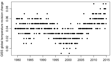
Regarding (1), the GISS temperatures displayed above show a less prominent `pause’ than the version of GISS land-ocean temperatures distributed prior to July 2015 (obtained from the wayback machine’s version of 2015-04-18, stored here), which is shown below:

The revision results in a greater upward trend during the `pause’ period, as shown by the following plot of differences (with enlarged vertical scale):
To tell whether or not this revision was justified, one would need to examine in depth the temperature adjustments done for the GISS data set, which I haven’t done.
However, it’s not too hard to see some interesting things by examining the GISS land-ocean temperature data in more detail. I’ll look only at the most recent version (accessed 2015-11-30) .
First, one can look separately at the Northern Hemisphere:

and Southern Hemisphere:
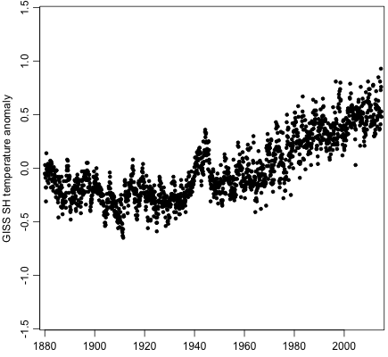
The difference is rather striking. One would expect some overall difference due to the greater amount of ocean in the Southern Hemisphere, and the different nature of the polar regions. But that doesn’t explain the abrupt increase in the scatter of Southern Hemisphere data points after about 1955.
We can also look at each month of the year separately. Here’s the Northern Hemisphere:

And here’s the Southern Hemisphere:

In the Northern Hemisphere, variability is obviously greater in winter than in summer. The variability in the Southern Hemisphere winter seems slightly greater than in summer, but much less so than in the Northern Hemisphere. These are differences that I’ll take account of when modeling this data later.
I’ve marked 1955 by a short line at the bottom. In the Northern Hemisphere, the dip in January temperatures from 1955 to 1975 seems odd, since it doesn’t show up in December and February, but it’s hard to be sure that it’s not a real climatic effect. Something does happen around 1955 in the Southern Hemisphere plots, which increases the variance in May and August, and maybe June, July, and September. This can be confirmed by looking at plots for each of the 12 months of the year that show the difference of the anomaly for that month from the average anomaly for that month in the three preceding and three following years:

May through September seem to have higher variability in the years after 1955, and this is very clear for at least May and August. In contrast, similar plots for the Northern Hemisphere show no change in variance, or perhaps a slight decline after 1955 for May and June. It’s hard to see how this Southern Hemisphere variance change can reflect a real change in climate, given its abrupt onset, and that it does not appear in the Northern Hemisphere. More likely, it is an artifact of how the data is processed. A rapid improvement in quality of measurements after World War II might also be a possible explanation (though one would expect that to lead to less variability, rather than more).
Whatever the reason, it seems that relying on GISS data before 1955 might be unwise. In my later analyses, I will look at data only from 1959, since that is when some other related data sets begin, or from 1979 when comparing to the UAH data.
I note that obtaining all but the most recent GISS data is difficult. Some versions can be accessed at the wayback machine, but many versions apparently saved there produce an ‘access denied’ error. UAH has an extensive archive, but even it seems not to have all the versions that were distributed. GISS distributes the programs they use, but only the current version. I can’t find any programs at the UAH website. Both GISS and UAH ought to have a public repository that uses a source-code control system such as git, which would allow all versions of programs, raw data, and processed data to be accessed, with documentation of all changes.
To reproduce the results in this post, you will first need to download the data using this shell script (which downloads other data too, that I will use for later blog posts), or manually download from the URLs it lists if you don’t have wget. You then need to download my R script for reading these files, and my R script for making the plots (and rename them to .r from the .doc that wordpress requires). Finally, run the second script in R as described in its opening comments.

R-bloggers.com offers daily e-mail updates about R news and tutorials about learning R and many other topics. Click here if you're looking to post or find an R/data-science job.
Want to share your content on R-bloggers? click here if you have a blog, or here if you don't.