
Visualizing (generalized) linear mixed effects models, part 2 #rstats #lme4
Want to share your content on R-bloggers? click here if you have a blog, or here if you don't.
In the first part on visualizing (generalized) linear mixed effects models, I showed examples of the new functions in the sjPlot package to visualize fixed and random effects (estimates and odds ratios) of (g)lmer results. Meanwhile, I added further features to the functions, which I like to introduce here. This posting is based on the online manual of the sjPlot package.
In this posting, I’d like to give examples for diagnostic and probability plots of odds ratios. The latter examples, of course, only refer to the sjp.glmer function (generalized mixed models). To reproduce these examples, you need the version 1.59 (or higher) of the package, which can be found at GitHub. A submission to CRAN is planned for the next days…
Fitting example models
The following examples are based on two fitted mixed models:
# fit model
library(lme4)
# create binary response
sleepstudy$Reaction.dicho <- sju.dicho(sleepstudy$Reaction,
                                       dichBy = "md")
# fit first model
fit <- glmer(Reaction.dicho ~ Days + (Days | Subject),
             sleepstudy,
             family = binomial("logit"))

data(efc)
# create binary response
efc$hi_qol <- sju.dicho(efc$quol_5)
# prepare group variable
efc$grp = as.factor(efc$e15relat)
levels(x = efc$grp) <- sji.getValueLabels(efc$e15relat)
# data frame for 2nd fitted model
mydf <- na.omit(data.frame(hi_qol = as.factor(efc$hi_qol),
                           sex = as.factor(efc$c161sex),
                           c12hour = as.numeric(efc$c12hour),
                           neg_c_7 = as.numeric(efc$neg_c_7),
                           grp = efc$grp))
# fit 2nd model
fit2 <- glmer(hi_qol ~ sex + c12hour + neg_c_7 + (1|grp),
              data = mydf,
              family = binomial("logit"))
Summary fit1
Formula: Reaction.dicho ~ Days + (Days | Subject)
   Data: sleepstudy

     AIC      BIC   logLik deviance df.resid
   158.7    174.7    -74.4    148.7      175

Scaled residuals:
    Min      1Q  Median      3Q     Max
-4.2406 -0.2726 -0.0198  0.2766  2.9705

Random effects:
 Groups  Name        Variance Std.Dev. Corr
 Subject (Intercept) 8.0287   2.8335
         Days        0.2397   0.4896   -0.19
Number of obs: 180, groups:  Subject, 18

Fixed effects:
            Estimate Std. Error z value Pr(>|z|)
(Intercept)  -3.8159     1.1728  -3.254 0.001139 **
Days          0.8908     0.2347   3.796 0.000147 ***
---
Signif. codes:  0 ‘***’ 0.001 ‘**’ 0.01 ‘*’ 0.05 ‘.’ 0.1 ‘ ’ 1

Correlation of Fixed Effects:
     (Intr)
Days -0.694
Summary fit2
Formula: hi_qol ~ sex + c12hour + neg_c_7 + (1 | grp)
   Data: mydf

     AIC      BIC   logLik deviance df.resid
  1065.3   1089.2   -527.6   1055.3      881

Scaled residuals:
    Min      1Q  Median      3Q     Max
-2.7460 -0.8139 -0.2688  0.7706  6.6464

Random effects:
 Groups Name        Variance Std.Dev.
 grp    (Intercept) 0.08676  0.2945
Number of obs: 886, groups:  grp, 8

Fixed effects:
             Estimate Std. Error z value Pr(>|z|)
(Intercept)  3.179036   0.333940   9.520  < 2e-16 ***
sex2        -0.545282   0.178974  -3.047  0.00231 **
c12hour     -0.005148   0.001720  -2.992  0.00277 **
neg_c_7     -0.219586   0.024108  -9.109  < 2e-16 ***
---
Signif. codes:  0 ‘***’ 0.001 ‘**’ 0.01 ‘*’ 0.05 ‘.’ 0.1 ‘ ’ 1

Correlation of Fixed Effects:
        (Intr) sex2   c12hor
sex2    -0.410
c12hour -0.057 -0.048
neg_c_7 -0.765 -0.009 -0.116
Diagnostic plots
Two new functions are added to both sjp.lmer and sjp.glmer, hence they apply to linear and generalized linear mixed models, fitted with the lme4 package. The examples only refer to the sjp.glmer function.
Currently, there are two type options to plot diagnostic plots: type = "fe.cor" to plot a correlation matrix between fixed effects and type = "re.qq" to plot a qq-plot of random effects.
Correlation matrix of fixed effects
To plot a correlation matrix of the fixed effects, use type = "fe.cor".
# plot fixed effects correlation matrix
sjp.glmer(fit2, type = "fe.cor")

qq-plot of random effects
Another diagnostic plot is the qq-plot for random effects. Use type = "re.qq" to plot random against standard quantiles. The dots should be plotted along the line.
# plot qq-plot of random effects
sjp.glmer(fit, type = "re.qq")

Probability curves of odds ratios
These plotting functions have been implemented to easier interprete odds ratios, especially for continuous covariates, by plotting the probabilities of predictors.
Probabilities of fixed effects
With type = "fe.pc" (or type = "fe.prob"), probability plots for each covariate can be plotted. These probabilties are based on the fixed effects intercept. One plot per covariate is plotted.
The model fit2 has one binary and two continuous covariates:
# plot probability curve of fixed effects
sjp.glmer(fit2, type = "fe.pc")

Probabilities of fixed effects depending on grouping level (random intercept)
With type = "ri.pc" (or type = "ri.prob"), probability plots for each covariate can be plotted, depending on the grouping level from the random intercept. Thus, for each covariate a plot for each grouping levels is plotted. Furthermore, with the show.se the standard error of probabilities can be shown. In this example, only the plot for one covariate is shown, not for all.
# plot probability curves for each covariate
# grouped by random intercepts
sjp.glmer(fit2,
          type = "ri.pc",
          show.se = TRUE)
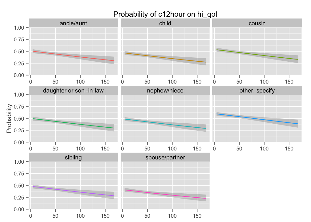
Instead of faceting plots, all grouping levels can be shown in one plot:
# plot probability curves for each covariate
# grouped by random intercepts
sjp.glmer(fit2,
          type = "ri.pc",
          facet.grid = FALSE)

Outlook
These will be the new features for the next package update. For later updates, I’m also planning to plot interaction terms of (generalized) linear mixed models, similar to the existing function for visualizing interaction terms in linear models.
Tagged: data visualization, ggplot, lme4, mixed effects, R, rstats

R-bloggers.com offers daily e-mail updates about R news and tutorials about learning R and many other topics. Click here if you're looking to post or find an R/data-science job.
Want to share your content on R-bloggers? click here if you have a blog, or here if you don't.