
Fracking in your neighborhood? Shale- Oil and Gas Economic Impact Map
Want to share your content on R-bloggers? click here if you have a blog, or here if you don't.
I have been working on a visualisation to highlight the results from my paper Fracking Growth, to highlight the local economic impact of the recent oil and gas boom in the US. There are two key insights. First, there are strong spillover effects from the oil and gas sector. I estimate that every oil and gas sector job created roughly 2.17 other jobs, mainly in the transport, construction and local service sectors. Given that aggregate employment in the oil and gas sector has more than doubled between 2004 and 2013 , increasing from 316,700 to 581,500. Given the estimated multiplier effect, this suggests that aggregate employment increased by between 500,000 to 600,000 .
The second insight from my paper is that oil and gas boom induced structural transformations away from tradable goods sectors need not happen. The classical argument in the development literature is simple: a resource boom drives up local prices, which is a problem for all those sectors of the economy that can’t pass higher input costs on to their final goods consumers (Corden and Neary, 1982). In development economics, such mechanisms are also described by the term “Dutch disease”. I argue that such structural transformations need not occur, if there are significant trade costs for the extracted resource.

I thought it would be nice to visualise these econometric results through an interactive shiny application. This allows you to see where fracking is happening, and what are its local economic impacts.
North Dakota: An Interactive Visualisation of the two findings
To illustrate the two results from my research, I developed this shiny app that allows you to study key economic aggregates at the county level and compare them to nation wide averages or levels. This is essentially what the difference-in-difference estimators do in my paper, while controlling for a whole lot of fixed-effects.
In the shiny app, if you zoom – for example – into North Dakota, you will see a lot of blue dots. Each dot represents an unconventional oil or gas well. The panel shows the time-variation in the number of wells constructed. Overall employment of all counties visible at the zoom level in the oil and gas sector has gone up from around 3169 in the early 2004 to more than 25,000 by 2012. Employment in the non-oil and gas sectors follows suit, but increases more smoothly. The average weighted unemployment rates of the visible counties looks dramatically different when compared to the rest of the US: unemployment rates in North Dakota, are hovering around 3 percent, while they are above 7 percent in the rest of the US in 2012. The recession did only marginally increase unemployment in North Dakota. The boom in the oil and gas industry implied that there was little effect of the recession to be felt there. This highlights the first finding of my paper. There are significant spillovers from the mining sector into the non-mining sectors.
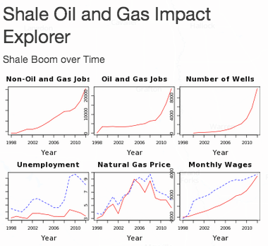
The second finding from my research can be illustrated using the case of North Dakota as well. While monthly average wages have increased significantly, catching up with the US wide average, natural gas prices in North Dakota have significantly gone down, with the average natural gas price for industrial use in North Dakota now being about 20-30% cheaper than in the rest of the US. This highlights the second case made in my paper.
But enough of that, lets turn to the Shiny app itself.
Shiny App using the Leaflet Javascript Library
I was inspired by the interactive map that visualises the super-zip codes and I use a lot of the code from there. The key feature of the shiny app is a reactive function that returns summary statistics for the county centroids that are currently visible given the users zoom level.
countiesInBounds <- reactive({
    if (is.null(input$map_bounds))
      return(EMP[FALSE,])
    bounds <- input$map_bounds
    latRng <- range(bounds$north, bounds$south)
    lngRng <- range(bounds$east, bounds$west)

    EMP[longitude >= latRng[1] & longitude <= latRng[2] &  latitude >= lngRng[1] & latitude <= lngRng[2]]
  })
This function takes the map-bounds as currently set by the zoom level inn the input object and uses it to subset the data object EMP, which contains most of the statistics that are displayed.
There is a second similar function for the number of wells in the bounds. This function is called by the functions that create the plot panels.
The server.R file is the pasted here:
library(shiny)

#toinst<-c('jcheng5/leaflet-shiny','trestletech/ShinyDash')
#sapply(toinst, function(x) devtools::install_github(x))

library(leaflet)
library(ShinyDash)
library(RColorBrewer)
library(scales)
library(lattice)
library(plyr)
require(maps)
shinyServer(function(input, output, session) {

## Interactive Map ###########################################

# Create the map
map <- createLeafletMap(session, "map")

# A reactive expression that returns the set of zips that are
# in bounds right now
wellsInBounds <- reactive({
if (is.null(input$map_bounds))
return(WELLS.data[FALSE,])
bounds <- input$map_bounds
latRng <- range(bounds$north, bounds$south)
lngRng <- range(bounds$east, bounds$west)

subset(WELLS.data,
latitude >= latRng[1] & latitude <= latRng[2] &
longitude >= lngRng[1] & longitude <= lngRng[2])
})

countiesInBounds <- reactive({
if (is.null(input$map_bounds))
return(EMP[FALSE,])
bounds <- input$map_bounds
latRng <- range(bounds$north, bounds$south)
lngRng <- range(bounds$east, bounds$west)

EMP[longitude >= latRng[1] & longitude <= latRng[2] & latitude >= lngRng[1] & latitude <= lngRng[2]]

})

output$plotSummaryLocal <- renderPlot({
LOCAL<-countiesInBounds()[,list(NonMiningEmpC=sum(NonMiningEmpC, na.rm=TRUE), EmpCClean21=sum(EmpCClean21, na.rm=TRUE)), by=c("year")]
WELLS<-wellsInBounds()[,.N, by=c("year")][order(year)]
WELLS<-data.table(cbind("year"=WELLS$year,"N"=cumsum(WELLS$N)))
LOCAL<-join(LOCAL,WELLS)
if(any(!is.na(LOCAL$EmpCClean21)) & any(!is.na(LOCAL$N))) {
par(mfrow=c(1,3),oma=c(0,0,0,0),mar=c(4,1,3,0))

plot(LOCAL[,c("year","NonMiningEmpC"),with=F], xlab="Year",main="Non-Mining Sector",type="l",col="red",cex.main=1.5,cex.lab=1.5)
plot(LOCAL[,c("year","EmpCClean21"),with=F], xlab="Year",main="Oil and Gas Sector",type="l",col="red",cex.main=1.5,cex.lab=1.5)
plot(LOCAL[,c("year","N"),with=F], xlab="Year",main="Number of Wells",type="l",col="red",cex.main=1.5,cex.lab=1.5)
}
else {

paste("Please zoom out")

}

})

output$plotSummaryMacro <- renderPlot({
par(mfrow=c(1,3),oma=c(0,0,0,0),mar=c(4,1,3,0))
###plot unemployment rate, earnings per worker,

LOCAL<-countiesInBounds()[,list(indgasprice=sum(indgasprice * overallemp,na.rm=TRUE)/sum(overallemp,na.rm=TRUE), unemploymentrate=100*sum(unemploymentrate*labourforce,na.rm=TRUE)/sum(labourforce,na.rm=TRUE), EarnS=sum(EarnS*labourforce, na.rm=TRUE)/sum(labourforce,na.rm=TRUE)), by=c("year")]
LOCAL<-join(NATIONAL,LOCAL)
if(any(!is.na(LOCAL$unemploymentrate))) {
plot(LOCAL[,c("year","unemploymentrate"),with=F], ylim=c(min(min(LOCAL$unemploymentrate),min(LOCAL$natunemploymentrate)), max(max(LOCAL$unemploymentrate),max(LOCAL$natunemploymentrate))), xlab="Year",main="Unemployment",type="l",col="red",cex.main=1.5,cex.lab=1.5)
lines(LOCAL[,c("year","natunemploymentrate"),with=F], col="blue", lty=2)
plot(LOCAL[,c("year","indgasprice"),with=F], ylim=c(min(min(LOCAL$indgasprice),min(LOCAL$natindgasprice)), max(max(LOCAL$indgasprice),max(LOCAL$natindgasprice))), xlab="Year",main="Natural Gas Price",type="l",col="red",cex.main=1.5,cex.lab=1.5)
lines(LOCAL[,c("year","natindgasprice"),with=F], col="blue", lty=2)
plot(LOCAL[,c("year","EarnS"),with=F], ylim=c(min(min(LOCAL$EarnS),min(LOCAL$natEarnS)), max(max(LOCAL$EarnS),max(LOCAL$natEarnS))), xlab="Year",main="Monthly Wages",type="l",col="red",cex.main=1.5,cex.lab=1.5)
lines(LOCAL[,c("year","natEarnS"),with=F], col="blue", lty=2)
} else {
paste("Please zoom out")

}
})

####FOR DATA EXPLORER
output$datatable <- renderDataTable({
EMP[, c("year","Area","population","shaleareashare","TPI_CI","EarnS","unemploymentrate","EmpCClean21","NonMiningEmpC","indgasprice","peind"),with=F]
})

session$onFlushed(once=TRUE, function() {
paintObs <- observe({

# Clear existing circles before drawing
map$clearShapes()
# Draw in batches of 1000; makes the app feel a bit more responsive
chunksize <- 1000
wellplot<-wellsInBounds()
if(nrow(wellplot)>0) {
if(nrow(wellplot)>5000) {
wellplot<-wellplot[WID %in% sample(wellplot$WID,5000)]
}
for (from in seq.int(1, nrow(wellplot), chunksize)) {
to <- min(nrow(wellplot), from + chunksize)
chunkplot <- wellplot[from:to,]
# Bug in Shiny causes this to error out when user closes browser
# before we get here
try(
map$addCircle(
chunkplot$latitude, chunkplot$longitude
)
)
}
}
})

# TIL this is necessary in order to prevent the observer from
# attempting to write to the websocket after the session is gone.
session$onSessionEnded(paintObs$suspend)
})

showWellPopup <- function(event) {
content <- as.character(paste(event, collapse=","))
map$showPopup(event$lat, event$lng, content)
}
# When map is clicked, show a popup with city info
clickObs <- observe({
map$clearPopups()
event <- input$map_shape_click
if (is.null(event))
return()

isolate({
showWellPopup(event)
})
})

session$onSessionEnded(clickObs$suspend)
})
The UI.r
library(leaflet)
library(shiny)
library(ShinyDash)
shinyUI(navbarPage("Fracking Growth", id="nav",

tabPanel("Interactive map",
div(class="outer",

tags$head(
# Include our custom CSS
includeCSS("styles.css"),
includeScript("gomap.js")
),

leafletMap("map", width="450", height="100%",
initialTileLayer = "//{s}.tiles.mapbox.com/v3/jcheng.map-5ebohr46/{z}/{x}/{y}.png",
initialTileLayerAttribution = HTML('Maps by <a href="http://www.mapbox.com/">Mapbox</a>'),
options=list(
center = c(37.45, -93.85),
zoom = 5, maxZoom=9,
maxBounds = list(list(15.961329,-129.92981), list(52.908902,-56.80481)) # Show US only
)
),

absolutePanel(id = "controls", class = "modal", fixed = TRUE, draggable = TRUE,
top = 60, left = "auto", right = 20, bottom = "auto",
width = 450, height = "auto",

h2("Shale Oil and Gas Impact Explorer"),

# selectInput("color", "Color", vars),
# selectInput("size", "Size", vars, selected = "welltype"),
h4("Shale Boom over Time"),
plotOutput("plotSummaryLocal", height = 150) ,
plotOutput("plotSummaryMacro", height = 150) ,
p("Note that all plots and summary statistics are calculated for the wells- or county centroid visible in your current zoom-level")
),

tags$div(id="cite",
'Data compiled for ', tags$a('Fracking Growth',href="http://www.trfetzer.com/fracking-growth/"), ' by Thiemo Fetzer.'
)
)
) ,

tabPanel("Data explorer",
hr(),
dataTableOutput("datatable")
)
)

)
R-bloggers.com offers daily e-mail updates about R news and tutorials about learning R and many other topics. Click here if you're looking to post or find an R/data-science job.
Want to share your content on R-bloggers? click here if you have a blog, or here if you don't.