
Visualising Pandas DataFrames With IPythonBlocks – Proof of Concept
Want to share your content on R-bloggers? click here if you have a blog, or here if you don't.
A few weeks ago I came across IPythonBlocks, a Python library developed to support the teaching of Python programming. The library provides an HTML grid that can be manipulated using simple programming constructs, presenting the outcome of the operations in a visually meaningful way.
As part of a new third level OU course we’re putting together on databases and data wrangling, I’ve been getting to grips with the python pandas library. This library provides a dataframe based framework for data analysis and data-styled programming that bears a significant resemblance to R’s notion of dataframes and vectorised computing. pandas also provides a range of dataframe based operations that resemble SQL style operations – joining tables, for example, and performing grouping style summary operations.
One of the things we’re quite keen to do as a course team is identify visually appealing ways of illustrating a variety of data manipulating operations; so I wondered whether we might be able to use ipythonblocks as a basis for visualising – and debugging – pandas dataframe operations.
I’ve posted a demo IPython notebook here: ipythonblocks/pandas proof of concept [nbviewer preview]. In it, I’ve started to sketch out some simple functions for visualising pandas dataframes using ipythonblocks blocks.
For example, the following minimal function finds the size and shape of a pandas dataframe and uses it to configure a simple block:
def pBlockGrid(df):
    (y,x)=df.shape
    return BlockGrid(x,y)
We can also colour individual blocks – the following example uses colour to reveal the different datatypes of columns within a dataframe:

A more elaborate function attempts to visualise the outcome of merging two data frames:
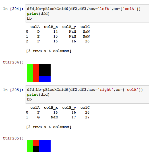
The green colour identifies key columns, the red and blue cells data elements from the left and right joined dataframes respectively, and the black cells NA/NaN cells.
One thing I started wondering about that I have to admit quite excited me (?!;-) was whether it would be possible to extend the pandas dataframe itself with methods for producing ipythonblocks visual representations of the state of a dataframe, or the effect of dataframe based operations such as .concat() and .merge() on source dataframes.
If you have any comments on this approach, suggestions for additional or alternative ways of visualising dataframe transformations, or thoughts about how to extend pandas dataframes with ipythonblocks style visualisations of those datastructures and/or the operations that can be applied to them, please let me know via the comments:-)

R-bloggers.com offers daily e-mail updates about R news and tutorials about learning R and many other topics. Click here if you're looking to post or find an R/data-science job.
Want to share your content on R-bloggers? click here if you have a blog, or here if you don't.