
The ‘Deutsche Bahn’ (German Railway Corp.) is always late!!1! Or is it? And if, why?
[This article was first published on Rcrastinate, and kindly contributed to R-bloggers]. (You can report issue about the content on this page here)
Want to share your content on R-bloggers? click here if you have a blog, or here if you don't.
The biggest German railway company, the ‘Deutsche Bahn’, is subject of frequent emotional discussions about being late all the time. A big German newspaper, the Süddeutsche Zeitung built the so-called ‘train monitor’ (Zugmonitor). The data is (or was) made available in cooperation with OpenDataCity: http://www.opendatacity.de/zugmonitor-api/Want to share your content on R-bloggers? click here if you have a blog, or here if you don't.
This API provided information about trains up until September, 29th 2013. After that, no data is available because the Deutsche Bahn changed its system.
Due to ‘heavy commuting’, I own a BahnCard 100 now, which means that I can take (almost) every train in Germany free of charge for one year (but don’t ask about the price of the BahnCard 100!). During my travels from and to the workplace, I thought about some analyses concerning delays of the trains.
First, some words about the dataset: I converted the available JSON data into a large dataframe with over 2 million rows (all nationwide trains running in 2013 up until 2013-09-29). One row is one station of one train. So, trains travelling over more stations get more rows in the dataset. From this dataset, I derived a smaller dataset with one train being one row. Here, I use the mean delay over all stations of a train. So, as soon as the train is delayed at one station, it gets a value greater than zero for the mean delay. Let’s start with an obvious question: How many trains were delayed from January till September 2013? To be more precise: What is the percentage of trains being delayed at at least one station during its run?
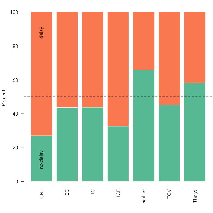
(click to enlarge)
The bars are grouped into different types of trains:
- CNL: CityNightLine (Night travel trains in Europe)
- EC: EuroCity (international InterCitys)
- IC: InterCity (Slower, older trains)
- ICE: InterCityExpress (The fastest trains of the Deutsche Bahn)
- RailJet (Austrian trains running in Germany)
- TGV: Train à grande vitesse (French SNCF trains running in Germany)
- Thalys (European high speed train serving mainly Benelux countries)
It doesn’t look to good… Only for RailJet and Thalys trains running in Germany, there are more trains always on time than delayed trains. The supposed flagship of the Deutsche Bahn, the ICE, is late at at least one station around 70% of the time! But things look better if we plot stations, and not trains. This measure is much less strict, because a train does not count as delayed as soon as it is delayed at one station during its travel. Now, one case is one station of each train.

Here, the ratios are the other way around: There are considerably more stations where the trains are on time than stations where trains are delayed – and this holds for all train types. You can decide for yourself which statistic you’ll refer to in your next discussion about the Deutsche Bahn.
How do delays distribute over months? We’re gonna plot mean delay times over the months January till September.

June was no good month to travel by train. But where do these elevated delays come from? In June 2013, there was a flood that flooded large parts of Germany. So maybe, this is reflected in elevated delays due to bad weather (“Unwetter” in German)…

Indeed, there is a very sharp rise of delays due to “Unwetter” in June. There are almost 30 times more bad weather delays in June than in May!
Now, let us have a look at the causes of delays. We only gonna look at delayed trains. For those, we’ll plot the top ten causes. I excluded the cause ‘Halt entfällt’ (stop ommited), because it is not a real cause but rather a consequence of delay. Causes are taken from the API itself, so they are in German, but I’ll try to translate them under the graph.

From left to right, the causes are:
– Verspätung vorausfahrender Zug: Delay of train running ahead
– Technische Störung am Zug: Technical problems with the train
– Bauarbeiten: Construction works
– Verzögerungen im Betriebsablauf: Delays in operating schedule (kinda generic, I know)
– Technische Störung an der Strecke: Technical problems with the track
– Warten auf weitere Reisende: Waiting for further travellers
– Signalstörung: Signal dysfunction
– Verspätete Bereitstellung: Delayed provision of train
– Verspätung im Ausland: Delay abroad
– Verspätung aus vorheriger Fahrt: Delay from previous run
I know, I know, don’t ask me about the difference between delays from previous runs and delays in the operating schedule – but that’s what the API gives us.
Obviously, the top cause is a delay of a train running ahead. If there is a delayed train in your way, your train will also be delayed – and this in turn affects other trains as well. Also, there are quite a few technical problems – with trains and tracks.
So, which delays are the worst? We can assess this by plotting mean delay time by cause of delay. I only use the top 10 delay causes we identified above.

Well, that makes sense: If your train is broken, it’s gonna be REALLY late. Delays of trains running ahead aren’t that bad (but remember that it is the number one cause). Also, it obviously doesn’t take too much time to wait for other travellers.
No, let us examine the causes of delays a little bit further and split them by train type. The plot gets a little bit more complicated. At least, it gets quite colorful!

Uh oh, as you saw above, the Thalys is quite good at being on time. But if it breaks down, it seems to take REALLY long to get fixed. Maybe, that’s because there are not that many engineers available in Germany that are able to fix Thalys trains?!? The CityNightLine also seems to be especially prone to long delays due to technical difficulties with the train, the track and signals.
Well, that’s that for now. Below, I provide the code for getting information from the API, generating different datasets and the graphs. Take care and I hope your trains are always on time!
=== FUNCTION DEFINITIONS AND PACKAGES ===
library(rjson)
library(RCurl)
library(data.table)
library(RColorBrewer)
library(sciplot)
library(lubridate)
create.dates <- function (start.year = 2013, start.month = 1,
end.year = 2013, end.month = 9) {
dates <- c()
for (year.i in start.year:end.year) {
for (month.i in start.month:end.month) {
for (day.i in 1:31) {
dates[length(dates)+1] <- paste(year.i, sprintf("%02d", month.i), sprintf("%02d", day.i), sep = "-")
}
}
}
dates
}
build.url <- function (date.ch) {
paste0(” “, date.ch)
}
get.day <- function (date.ch) {
result <- try(fromJSON(getURL(build.url(date.ch))))
if (class(result) == “try-error”) {
NULL }
else {
result
}
}
make.df.from.train <- function (train.list, date) {
res <- data.frame()
train.id <- train.list$train_nr
train.type <- strsplit(train.id, " ", fixed = T)[[1]][1]
train.n.stations <- length(train.list$stations)
for (station.ii in 1:length(train.list$stations)) {
station.i <- train.list$stations[[station.ii]]
station.n <- station.ii
station.id <- station.i$station_id
station.departure <- station.i$departure
if (is.null(station.departure)) station.departure <- NA
station.arrival <- station.i$arrival
if (is.null(station.arrival)) station.arrival <- NA
station.delay <- station.i$delay
if (is.null(station.delay)) station.delay <- 0
station.delay.cause <- station.i$delay_cause
if (is.null(station.delay.cause)) station.delay.cause <- NA
new.row <- data.frame(date = date,
train.id = train.id,
type = train.type,
n.stations = train.n.stations,
station.n = station.n,
station.id = station.id,
arrival = station.arrival,
departure = station.departure,
delay = station.delay,
delay.cause = station.delay.cause
)
res <- rbind(res, new.row)
}
res
}
make.df.from.day <- function (day.list, date, use.pb = F) {
return.df <- data.frame()
if (use.pb) pb <- txtProgressBar(min = 1, max = length(day.list), style = 3)
if (length(day.list) != 0) {
for (el.i in 1:length(day.list)) {
if (use.pb) setTxtProgressBar(pb, el.i)
el <- day.list[[el.i]]
res <- make.df.from.train(el, date)
return.df <- rbind(return.df, res)
}
}
return.df
}
=== GETTING API INFORMATION ===
dates <- create.dates()
pb <- txtProgressBar(min = 1, max = length(dates), style = 3)
res.list <- list()
for (date.i in 1:length(dates)) {
setTxtProgressBar(pb, date.i)
cur.date <- dates[date.i]
day.data <- get.day(cur.date)
if (!is.null(day.data)) {
res.list[[length(res.list)+1]] <- make.df.from.day(day.data, cur.date)
}
}
trains <- rbindlist(res.list)
=== CREATING THE TRAIN-WISE DATASET ===
trains$delay <- as.numeric(trains$delay)
# Note: NAs are generated. That’s correct.
trains2 <- trains[,list(mean.delay = mean(delay)), by = list(date, train.id, type)]
# Plot: delay by type (train-wise)
tab3 <- table(trains2$mean.delay > 0, trains2$type)
tab3 <- tab3[,2:8]
tab3.sums <- sapply(1:7, FUN = function (x) {
sum(tab3[,x])
})
colnames(tab3) <- c("CNL", "EC", "IC", "ICE", "RailJet",
“TGV”, “Thalys”)
par(family = “avenir”, mar = c(5,4,2,0)+0.1)
barplot(tab3 / (rbind(tab3.sums, tab3.sums))*100, las = 2, ylab = “Percent”,
col = brewer.pal(n=2, “Set2”), border = F) -> bp1
text(labels = c(“no delay”, “delay”), x = 0.7, y = c(13, 88), srt = 90)
abline(h = 50, lty = 2, lwd = 2, col = “black”)
# Plot: delay by type (station-wise)
tab4 <- table(trains$delay > 0, trains$type)
tab4 <- tab4[,2:8]
tab4.sums <- sapply(1:7, FUN = function (x) {
sum(tab4[,x])
})
colnames(tab4) <- c("CNL", "EC", "IC", "ICE", "RailJet",
“TGV”, “Thalys”)
par(family = “avenir”, mar = c(5,4,2,0)+0.1)
barplot(tab4 / (rbind(tab4.sums, tab4.sums))*100, las = 2, ylab = “Percent”,
col = brewer.pal(n=3, “Set2”), border = F) -> bp2
text(labels = c(“no delay”, “delay”), x = 0.7, y = c(13, 88), srt = 90)
abline(h = 50, lty = 2, lwd = 2, col = “black”)
# Plot: Delay causes (and some coding stuff)
cause.tab1 <- sort(table(trains$delay.cause2), decr = T)
cause.tab1 <- cause.tab1[grep("Halt entfällt|Fährt weiter", names(cause.tab1), invert = T)]
cause.tab1 <- cause.tab1[names(cause.tab1) != ""]
sum.causes <- sum(cause.tab1)
cause.tab2 <- cause.tab1 / sum.causes * 100
names(cause.tab2)[1] <- "Verspätung vorausfahrender Zug"
par(mar = c(11,4,2,0)+0.1)
barplot(head(cause.tab2, 10), las = 2, cex.names = 0.7, border = F,
col = brewer.pal(n=3, “Set2”)[1], ylab = “Percent”) -> bp3
text(x=bp3[,1], y = 1, labels = paste(round(head(cause.tab2, 10), 0), “%”), cex = 0.7)
# Plots: Delay by cause and delay by cause and type
top10causes <- names(cause.tab1)[1:10]
trains.top10causes <- trains[trains$delay.cause2 %in% top10causes,]
trains.top10causes$delay.cause2 <- factor(trains.top10causes$delay.cause2, levels = top10causes)
levels(trains.top10causes$delay.cause2)[1] <- "Verspätung vorausfahrender Zug"
par(mar = c(11,4,2,0)+0.1)
bargraph.CI(delay.cause2, delay, data = trains.top10causes, las = 2, col = brewer.pal(7, “Set2”)[1],
border = F, cex.names = .7, err.width = 0.1, ylab = “Mean delay in minutes”)
mtext(“(Error bars = 1 SE)”, 3, cex = .7)
layout(matrix(c(1,2), ncol = 2), widths=c(.9,.1))
par(mar = c(11,4,2,0)+0.1)
bargraph.CI(delay.cause2, delay, type, data = trains.top10causes, las = 2, col = brewer.pal(7, “Set2”),
border = F, cex.names = .7, err.width = 0, ylab = “Mean delay in minutes”)
mtext(“(Error bars = 1 SE)”, 3, cex = .7)
par(mar = c(0,0,0,0))
plot.new()
legend(x=”center”, legend = c(“CNL”, “EC”, “IC”, “ICE”, “RailJet”, “TGV”, “Thalys”),
fill = brewer.pal(7, “Set2”), bty = “n”, border = F, cex = .7)
# Plots: Delay by month and bad weather by month
trains$month <- substr(trains$date, 6, 7)
trains2$month <- substr(trains2$date, 6, 7)
bargraph.CI(month, mean.delay, data = trains2, col = brewer.pal(7, “Set2”)[1],
border = F, names.arg = c(“Jan”, “Feb”, “Mar”, “Apr”, “May”, “Jun”, “Jul”, “Aug”, “Sep”),
ylab = “Mean delay in minutes”, xlab = “Month in 2013”)
barplot(table(trains$delay.cause == “Unwetter”, trains$month)[2,], bty = “n”,
ylab = “n ‘bad weather'”, xlab = “Month of 2013”, border = F,
col = brewer.pal(7, “Set2”)[1],
names.arg = c(“Jan”, “Feb”, “Mar”, “Apr”, “May”, “Jun”, “Jul”, “Aug”, “Sep”)) -> bp4
text(x=bp4[,1], y = 500, labels = table(trains$delay.cause == “Unwetter”, trains$month)[2,], cex = 0.7)
To leave a comment for the author, please follow the link and comment on their blog: Rcrastinate.
R-bloggers.com offers daily e-mail updates about R news and tutorials about learning R and many other topics. Click here if you're looking to post or find an R/data-science job.
Want to share your content on R-bloggers? click here if you have a blog, or here if you don't.