Mapping Australian electoral divisions with ggplot2
Want to share your content on R-bloggers? click here if you have a blog, or here if you don't.
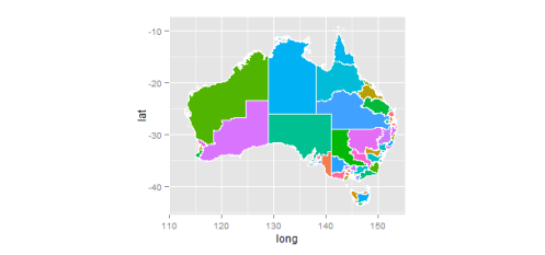
I’ve seen some creative visualisations of issues surrounding the Australian election recently though not as many maps as I expected. ‘ggplot2′ is the go-to package for plotting in R so I thought I’d see if I could plot the Australian electoral divisions with ggplot2. By using the Australian Electoral Commission’s GIS mapping coordinates and mutilating Hadley Whickam’s tutorial it was a pretty easy process.
1. Download the AEC boundary GIS data (warning 24mb).
2. Extract the file to your R working directory.
3. Run code…
The data.frame this process creates has 2.5m observations so mapping can take a while. I’m sure there are much more effective ways to map GIS data but I wanted to stick to ggplot2 in this instance.
require("rgdal") # requires sp, will use proj.4 if installed
require("maptools")
require("ggplot2")
require("plyr")
require("rgeos")

#I upped my memory limit as the file we are going to map is pretty large
memory.limit(6000)

australia = readOGR(dsn=".", layer="COM20111216_ELB_region")
australia@data$id = rownames(australia@data)
#This step isn't in the tutorial, need to do this due to a couple of errors in the AEC GIS data.
australia.buffered = gBuffer(australia, width=0, byid=TRUE)
australia.points = fortify(australia.buffered, region="id")
australia.df = join(australia.points, australia@data, by="id")

#This will show you the variables in the dataset
head(australia@data)

ggplot(australia.df) +
aes(long,lat,group=group,fill=ELECT_DIV)+
#Don't want a legend with 150 variables so suppress the legend
geom_polygon(show_guide = FALSE ) +
  geom_path(color="white") +
  #for some reason it maps too much ocean so limit coords (EDIT: due to Christmas Island)
  coord_equal(xlim=c(110,155))
This gives you
While it’s a nice picture, it’s of little use as it is impossible to see small electorates.
State by state mapping. might be more useful Here is some code to map the ACT. I suggest anyone experimenting should play around with mapping the ACT data as it doesn’t take long to process.
ggplot(subset(australia.df, STATE == "ACT")) +
  aes(long,lat,group=group,fill=ELECT_DIV)+
  geom_polygon() +
  geom_path(color="white") +
  #include limits to remove Jervis bay plotting
  coord_equal(xlim=c(148.5,149.5))
To include your own data for mapping just add it to the australia@data data.frame, merging by australia@data$ELECT_DIV. The charts look good, but to make them really eye-catching I suggest you take them into inkscape.
R-bloggers.com offers daily e-mail updates about R news and tutorials about learning R and many other topics. Click here if you're looking to post or find an R/data-science job.
Want to share your content on R-bloggers? click here if you have a blog, or here if you don't.


