Examples for sjPlotting functions, including correlations and proportional tables with ggplot #rstats
Want to share your content on R-bloggers? click here if you have a blog, or here if you don't.
Sometimes people ask me how the examples of my plotting functions I show here can be reproduced without having a SPSS data set (or at least, without having the data set I use because it’s not public yet). So I started to write some examples that run “out of the box” and which I want to present you here. Furthermore, two new plotting functions are introduced: plotting correlations and plotting proportional tables on a percentage scale.
As always, you can find the latest version of my R scripts on my download page.
Following plotting functions will be described in this posting:
- Plotting proportional tables: sjPlotPropTable.R
- Plotting correlations: sjPlotCorr.R
- Plotting frequencies: sjPlotFrequencies.R
- Plotting grouped frequencies: sjPlotGroupFrequencies.R
- Plotting linear model: sjPlotLinreg.R
- Plotting generalized linear models: sjPlotOdds.R
Please note that I have changed function and parameter names in order to have consistent, logical names across all functions!
At the end of this posting you will find some explanation on the different parameters that allow you to fit the plotting results to your needs…
Please note that additional packages besides ggplot2 maybe have to be installed!
You may need following packages, depending on which script you run:
Plotting proportional tables: sjPlotPropTable.R
The idea for this function came up when I saw the distribution of categories (or factor levels) within one group or variable, that sum up to 100% – typically shown as stacked bars. So I wrote a script that shows the cross tabulation of two variables and either show column or row percentage calculations.
First, load the script and create two random variables:
source("sjPlotPropTable.R")
grp <- sample(1:4, 100, replace=T)
y <- sample(1:3, 100, replace=T)
The simplest way to produce a plot is following (note that, due to random sampling, your plots my look different!):
sjp.xtab(y, grp)
You can specify axis and legend labels:
sjp.xtab(y, grp,
         axisLabels.x=c("low", "mid", "high"),
         legendLabels=c("Grp 1", "Grp 2", "Grp 3", "Grp 4"))

Proportional table, column percentages, with assigned labels. The “Total” legend label is automatically added.
If you want row percentages, you can use stacked bars because each group sums up to 100%:
sjp.xtab(y, grp,
         tableIndex="row",
         barPosition="stack",
         flipCoordinates=TRUE)
Plotting correlations: sjPlotCorr.R
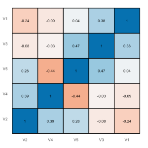
A very quick way of plotting a correlation heat map can be found in this blog. I had a similar idea in mind for some time and decided to write a small function that allows some tweaking of the produced plot like different colors indicating positive or negative correlations and so on.
Again, at first load the script and create a random sample:
source("sjPlotCorr.R")
df <- as.data.frame(cbind(rnorm(10),
                    rnorm(10),
                    rnorm(10),
                    rnorm(10),
                    rnorm(10)))
You can either pass a data frame as parameter or a computed correlation object as well. If you use a data frame, following correlation will be computed:
cor(df, method="spearman"
    use="pairwise.complete.obs")
The simple function call is:
sjp.corr(df)
This gives you a correlation map with both circle size and color intensity indicating the strength of the correlations. You can also plot tiles, which looks more like a heat map, if you prefer:
sjp.corr(df, type="tile", theme="none")
Plotting frequencies: sjPlotFrequencies.R
There is already a posting which demonstrates this script, however, since it uses a SPSS data set, I want to give short examples that run out of the box here.
Load the script:
source("sjPlotFrequencies.R")
A simple bar chart:
sjp.frq(ChickWeight$Diet)
A box plot:
sjp.frq(ChickWeight$weight, type="box")
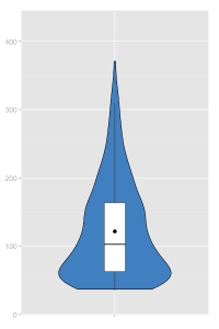
A violin plot:
sjp.frq(ChickWeight$weight, type="v")
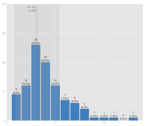
And finally, a histrogram with mean and standard deviation:
sjp.frq(discoveries, type="hist", showMeanIntercept=TRUE)
Plotting grouped frequencies: sjPlotGroupFrequencies.R
The grouped frequencies script has also been described in a separate posting.
Load the script:
source("sjPlotGroupFrequencies.R")
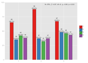
Grouped bars using the ChickenWeight data set. Note that due to random sampling, your figure may look different:
sjp.grpfrq(sample(1:3, length(ChickWeight$Diet), replace=T),
           as.numeric(ChickWeight$Diet),
           barSpace=0.2)
Grouped box plots. Note that this plot automatically computes the Mann-Whitney-U-test for the relation of each two subgroups. The tested groups are indicated by the subscriped numbers after the “p”:
sjp.grpfrq(ChickWeight$weight,
           as.numeric(ChickWeight$Diet),
           type="box")
Grouped histogram:
sjp.grpfrq(discoveries,
           sample(1:3, length(discoveries), replace=T),
           type="hist",
           showValueLabels=FALSE,
           showMeanIntercept=TRUE)

Grouped histogram of “Discoveries”, divided into three random subgroups, including mean intercepts for each group. Value labels for each bar are hidden.
Plotting linear model: sjPlotLinreg.R
Plotting (generalized) linear models have also already been described in a posting, so I will keep it short here and just give a running example:
source("sjPlotLinreg.R")
fit <- lm(airquality$Ozone ~ airquality$Wind +
          airquality$Temp +
          airquality$Solar.R)
sjp.lm(fit, gridBreaksAt=2)
Plotting generalized linear models: sjPlotOdds.R
source("sjPlotOdds.R")
y <- ifelse(swiss$Fertility<median(swiss$Fertility), 0, 1)
fitOR <- glm(y ~ swiss$Examination +
             swiss$Education +
             swiss$Catholic +
             swiss$Infant.Mortality,
             family=binomial(link="logit"))
sjp.glm(fitOR, transformTicks=TRUE)
Which parameters can be changed?
There is, depending on the function, a long list of parameters that can be changed to tweak the figure you want to produce. If you use editors like RStudio, you can press ctrl+space inside a function call to access a list of all available parameters of a function. All available parameters are documented at the beginning of each script (and if not, please let me know so I can complete the documentation).
Three examples of what you can modify in your plot:
Labels
Axis labels can be changed with the axisLabel.x or axisLabel.y parameter, depending on where labels appear (for instance, if you have frequencies, you use the .x, if you plot linear models, you use .y to change the labels). The size and color of labels can be changed with axisLabelSize and axisLabelColor. Value labels (labels inside the diagram), however, are manipulated with valueLabels, valueLabelSize and valueLabelColor. The same pattern applies to legend labels.
Showing / hiding elements
Many labels, values or graphical elements can be shown or hidden. showAxisLabels.x shows/hides the variable labels on the x-axis. showValueLabels shows/hides the value labels inside a diagram etc.
Diagram type
With the type parameter you can specifiy the type of diagram. E.g. the sjPlotFrequencies offers histograms, bars, box plots etc. Just specifiy the desired type with this parameter.
Last remarks
In case you want to apply the above shown functions on your (imported) data sets, you also may find this posting helpful.
Tagged: data visualization, ggplot, R, rstats, Statistik
R-bloggers.com offers daily e-mail updates about R news and tutorials about learning R and many other topics. Click here if you're looking to post or find an R/data-science job.
Want to share your content on R-bloggers? click here if you have a blog, or here if you don't.


