
gRaphics! 2012-05-12 14:07:00
[This article was first published on gRaphics!, and kindly contributed to R-bloggers]. (You can report issue about the content on this page here)
Want to share your content on R-bloggers? click here if you have a blog, or here if you don't.
Want to share your content on R-bloggers? click here if you have a blog, or here if you don't.
My own version of bubble plot (part 1)
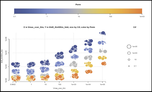
During one of my projects, I found myself in need of visualizing more than 3 dimensions at once. Three-dimensional graphs are not a good solution, usually – they will need to be properly oriented, for a start, ad that’s tricky.
So, I started looking at bubble plots. The size of the bubble can show one property, as illustrated by the nice post at FlowingData – then you can show one more property defined by a color scale (continuous below, but nothing stops it from being categorical)

I decided to push it and have two properties: look at the example below – the redder the color, the higher the value on the property ApKUpt (or whatever you want). The greener, the higher ApVUpt. I moved the color legend to a square on the extreme right to achieve a better use of the available space.

I tried three colors but it turns out that it just doesn’t work. Even when your eyes don’t interpret every rgb triplet as a completely different color, the amount of redness, greeness or blueness is difficult to estimate. Also, it gets tricky to show the color grading in a legend… One has to resort to slices of the three-dimensional color space. See what I mean?

Of course, one can define an ad-hoc color scale, such as the one used below, vaguely inspired by the colors that Mathematica uses to paint its surfaces. Many thanks to my colleague Pär for teaching me how to define these kind of color scales, and much else.
Here follows the code for the one, two and three colors plot:It’s messy and not at all clean – but it gets the job done. This routine is also dependent from several others which define colorscale and other accessory functions… feel free to drop me a line in the comments if you want the lot… Similar plots can be obtained with ggplot2 in much fewer lines, although right now I’m less expert at it so they’re much less customised.
To leave a comment for the author, please follow the link and comment on their blog: gRaphics!.
R-bloggers.com offers daily e-mail updates about R news and tutorials about learning R and many other topics. Click here if you're looking to post or find an R/data-science job.
Want to share your content on R-bloggers? click here if you have a blog, or here if you don't.