Pareto Charts in R
Want to share your content on R-bloggers? click here if you have a blog, or here if you don't.
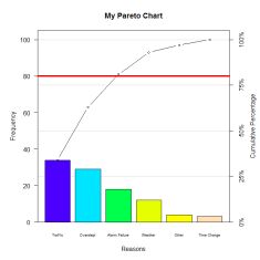
 A Pareto Chart is a sorted bar chart that displays the frequency (or count) of occurrences that fall in different categories, from greatest frequency on the left to least frequency on the right, with an overlaid line chart that plots the cumulative percentage of occurrences. The vertical axis on the left of the chart shows frequency (or count), and the vertical axis on the right of the chart shows the cumulative percentage. A Pareto Chart is typically used to visualize:
- Primary types or sources of defects
- Most frequent reasons for customer complaints
- Amount of some variable (e.g. money, energy usage, time) that can be attributed to or classified according to a certain category
The Pareto Chart is typically used to separate the “vital few” from the “trivial many” using the Pareto principle, also called the 80/20 Rule, which asserts that approximately 80% of effects come from 20% of causes for many systems. Pareto analysis can thus be used to find, for example, the most critical types or sources of defects, the most common complaints that customers have, or the most essential categories within which to focus problem-solving efforts.
To find out how to implement a Pareto Chart in R, download my PDF at http://nicoleradziwill.com/r/pareto-charts-75-925-copy.pdf —>
R-bloggers.com offers daily e-mail updates about R news and tutorials about learning R and many other topics. Click here if you're looking to post or find an R/data-science job.
Want to share your content on R-bloggers? click here if you have a blog, or here if you don't.
