
Fun with R: Clustering and MDS
[This article was first published on The Prince of Slides, and kindly contributed to R-bloggers]. (You can report issue about the content on this page here)
Want to share your content on R-bloggers? click here if you have a blog, or here if you don't.
I’ve seen K-means clustering, PCA, etc. done some over at Beyond the Boxscore and Baseball Analysts (and the now defunct Statspeak), but I thought I’d just check out some clustering on the young fantasy season using the traditional 5×5 categories with some visualizations. I use a Multidimensional Scaling approach to visualize the data, with colors representing each group. Nothing breakthrough here, just feeding my intellectual curiosity. Using a simple k-means clustering with 3 groups (for about 170 players with a reasonably large number of At Bats), I got the following averages for each group (through May 2), with my description of each group below (please excuse the crappy Blogger formatting):Want to share your content on R-bloggers? click here if you have a blog, or here if you don't.
Group: R/HR/RBI/SB/BA
1: 10.5/2.7/11.9/1.1/.274
2: 13.2/1.0/6.7/4.6/.270
3: 16.8/5.4/18.0/1.8/.300
All: 13.0/3.1/12.5/2.1/.281
Group 1 (Black): Average players in Power/RBI without much Speed or Run Scoring
Group 2 (Red): Players that get value through SB/Run Scoring
Group 3 (Green): Top Tier players in the first month with HR/RBI potential
(click on the image to enlarge it)
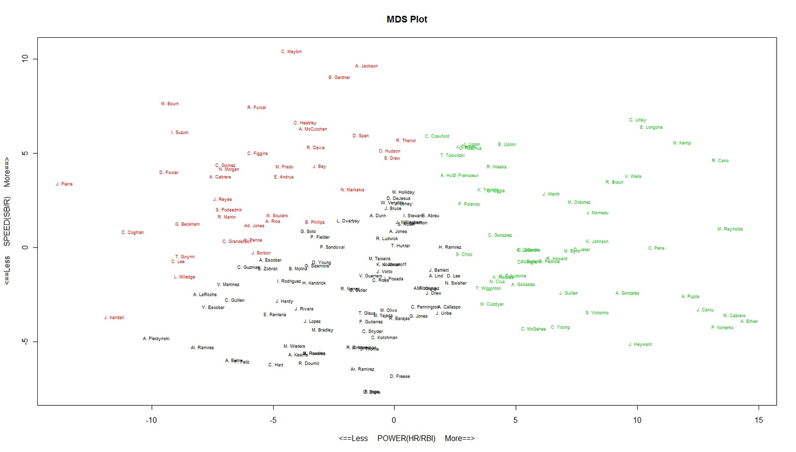
So, looking at the plot, it seems that going from the bottom left to the top right orders the overall 5×5 fantasy contribution of each player (left to right, the x-axis is correlated with AVG as well, but not as distinctly as HR and RBI). Like I said, nothing surprising here, but fun to look at. Don’t worry about the number scale on each axis, as it really means nothing practical other than what I’ve described already.
So what anomolies do we find? Well, the Prince Fielder and Geovany Soto positions are interesting. Fielder is off to a slow start, so it’s not surprising to find him toward the left of the Power/RBI scale. He scores runs in his lineup at a decent rate, which keeps him from being at the bottom of the Run/SB scale. On the other hand, Soto has started hot, but his position toward the bottom of the Cubs lineup hasn’t provided him with much opportunity for RBIs. With his lack of speed, he ends up right around the middle as well. Shane Victorino is in a strange place given his skill set, but remember that he’s already hit 5 HR this year!
Not surprisingly, the starts of Jason Kendall, A.J. Pierzynski, and Alexei Ramirez put them at the bottom left of the plot. We also find Carlos Lee in the speed group. This is a product of his lack of power to start the season, with 0 HR and 5 RBI. He has stolen a base, however, which keeps him from the very bottom of the y-axis scale.
Just a quick intro to these techniques, as they’re a lot of fun to play with when it comes to baseball statistics. Probably, using PCA and a ‘Biplot’ would be more isntructive than MDS, but it did a great job of showing the separated clusters. We could always try to cluster more groups, depending on how we think it should be done, but I think 3 does the job pretty well.
On another note, I have the first part of an article up at FBJ that describes the variability in HR hitting for different types of players, and how we can utilize this to understand trade value in H2H leagues that count categories. Gotta love implementing R in fantasy articles 🙂
To leave a comment for the author, please follow the link and comment on their blog: The Prince of Slides.
R-bloggers.com offers daily e-mail updates about R news and tutorials about learning R and many other topics. Click here if you're looking to post or find an R/data-science job.
Want to share your content on R-bloggers? click here if you have a blog, or here if you don't.