
Whilst reading John Hempton’s post on shorting $HLF I…
Want to share your content on R-bloggers? click here if you have a blog, or here if you don't.

only the most active trading days $HLF (HerbaLife weight-loss supplements / MLM)

$HLF regular history

big loss days and big volume days for $HLF. “Ackman” should instead read “Einhorn”.
Whilst reading John Hempton’s post on shorting $HLF I decided to follow along in quantmod.
Bronte Capital: It was the night before Christmas… falsifying Bill Ackman’s Herbalife thesis http://t.co/XcumfvytFx) $HLF (no positions)
— Kid Dynamite (@KidDynamiteBlog)
Long story short, HerbaLife sells weight-loss supplements through a multilayer marketing business model which Bill Ackman contends is an unsustainable, illegal pyramid scheme. Ackman calls it “the only billion-dollar brand no-one’s ever heard of” and Hempton posts some very unflattering Craigslist marketing adverts:


thus undermining its credibility.
I should mention that I got some internet ads from Pershing Square Capital Management when I googled for herbalife information. In other words the shorts are spreading the word around to the common man to jump on this short! Destroy this pyramid scheme! You could read this as similar to a penny-stock email, but I view it simply as credible self-interest: I already put my shorts on for what I believe are rational reasons. It’s obviously in my self-interest to convince you to do the same but I do in fact believe that $HLF will and should go down and you know I do because I put my money where my mouth is. Whether that’s an ideal confluence of honesty, moral high ground, and selfishness—capitalism at its best—or some overpowerful hedgies using their marketing dollars to bring down a solid company, I’ll leave up to you.
Anyway, on to the quantmod stuff.
Here’s how to generate the 2007–present view:
require(quantmod); getSymbols('HLF'); setDefaults(chartSeries, up.col="gold", dn.col="#2255aa", color.vol=FALSE); chartSeries(HLF)
Now here’s the interesting part.

(…”Ackman” should read “Einhorn” in red there…)
You can notice in red that trades per day (volume) have risen to 10, 20 times normal levels during 2013—which maybe we can attribute to the “buzz” generated by Pershing Square, @KidDynamite, Bronte Capital, and whoever else is calling $HLF a pyramid scheme.
median(Vo(HLF)) tells me the halfway split between “high” and “low” trading volume for this stock. It’s roughly 2 million trades per day. Then with quantmod I can plot those hi-lo subsets with chartSeries(subset(HLF, Vo(HLF)2e6)) to get a visual on “calm days” versus “heavy days”. That’s something you can’t do with Google Charts.
Here’s calm (under 2 million trades/day)

upper half of heavy trading days (over 2 million/day)

and what I’ll call “pirate days” (over 10 million trades/day)—with plunderers swarming the stock, battling with swords between their teeth
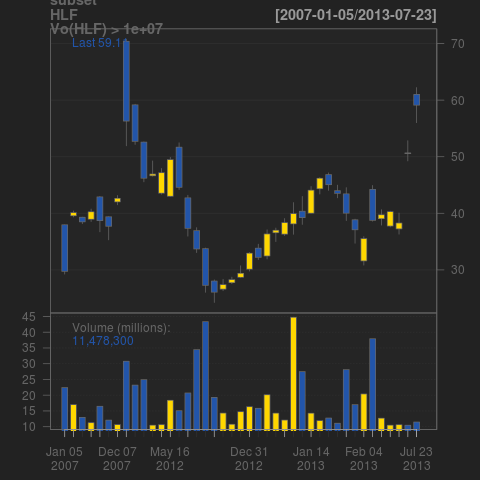
wherein it’s visually clear that very heavy trading skewed blue over gold—i.e. $HLF closed lower than it opened on that day: the heavy trading volume was taking the price downward.
But more precisely what happened on those days? This is a good job for the stem-and-leaf plot. Notice, by the way, that reality here looks nothing like a bell curve. Sorry, pet peeve. Anyway here is the stem plot of heavy trading days:
> hi.volume <- subset(HLF, Vo(HLF)>1e7)
> stem(Cl(hi.volume)-Op(hi.volume))

  The decimal point is at the |

  -14 | 1
  -12 |
  -10 |
   -8 | 2
   -6 | 1554
   -4 | 542
   -2 | 430
   -0 | 988761851
    0 | 345667780388
    2 | 058699
    4 | 1
    6 | 5
I love stem plots because they give you precision and the general picture at once. From the way the ink lies you get the same pic as the kernel density plot( density( Cl(hi.volume) - Op(hi.volume) ), col="#333333" , ylab="", main="Volume at least 10 million $HLF", yaxt="n", xlab="Price Movement over the Trading Day"); polygon( density( Cl(hi.volume) - Op(hi.volume) ), col="#333333", border="#333333" ) 
but you can also see actual numbers in the stem plot. For example the ones to the right of +0 are pretty interesting. Slight gains on many of those pirate days, but not enough to bash back a 14-point loss on a single day.
R-bloggers.com offers daily e-mail updates about R news and tutorials about learning R and many other topics. Click here if you're looking to post or find an R/data-science job.
Want to share your content on R-bloggers? click here if you have a blog, or here if you don't.