
Visualizing transitions with the transitionPlot function
Want to share your content on R-bloggers? click here if you have a blog, or here if you don't.
As an orthopaedic surgeon I’m often interested in how a patient is doing after surgery compared to before. I call this as a transition between states, e.g. severe pain to moderate pain, and in order to better illustrate these transitions I’ve created something that I call a transition plot. It’s closely related to the plotMat for plotting networks but aimed at less complex relations with only a one-way relation between two groups of states.
This project started by me posting a question on Stack Overflow, the answers were (as always) excellent, but didn’t really satisfy my needs. What I wanted was a graphically appealing plot that I could control in extreme detail. Thanks to Paul Murrell’s excellent grid package I was able to generate a truly customizeable transition plot.
In this post I’ll give a short introduction with examples to what you can do with the transitionPlot()-function. I’ll try to walk you through simple transitions to more complex ones with group proportions and highlighted arrows.
Simulate some data
To illustrate a simple example we’ll generate some data, imagine having a questionnaire for pre- and postoperative pain graded none, moderate, or major. We have the two variables in our data set, and to see the relation we just do a three-by-three table:
1 2 3 4 5 6 7 8 9 10 11 12 13 14 | library(Gmisc)
library(Gmisc)
# Generate some fake data
set.seed(9730)
b4 <- sample(1:3, replace = TRUE, size = 500, prob = c(0.1, 0.4, 0.5))
after <- sample(1:3, replace = TRUE, size = 500, prob = c(0.3, 0.5, 0.2))
b4 <- factor(b4, labels = c("None", "Moderate", "Major"))
after <- factor(after, labels = c("None", "Moderate", "Major"))
# Create the transition matrix
transition_mtrx <- table(b4, after)
# Create a table with the transitions
htmlTable(transition_mtrx, title = "Transitions", ctable = TRUE) |
| Transitions | None | Moderate | Major |
|---|---|---|---|
| None | 13 | 33 | 8 |
| Moderate | 50 | 107 | 30 |
| Major | 78 | 131 | 50 |
Simple example
This is interpretable, but understanding the flow can be challenging and time-consuming. Visualizing it using the transition plot gives a quick and more intuitive understanding:
1 | transitionPlot(transition_mtrx) |
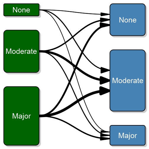
Here you can see the thick lines representing the transition from that particular group into the next. So far I’ve used the graph for the same measure on left and right side but I guess your imagination sets the limit. It can just as well be two or more treatment arms with some discrete outcomes.
Simple with a twist
In my previous post I documented how I created an arrow that allows perfect control over start, stop and width. Another annoying detail in the default bezier line, is that the arrows are perpendicular to each box, thus not following the line contour as expected. If we change the arrow type to my alternative arrow we get a nicer plot:
1 2 3 4 | # Note that when using my arrow type you need to specify exact unit width
# since I wasn't certain how the lwd should be translated.
transitionPlot(transition_mtrx, overlap_add_width = 1.3, type_of_arrow = "simple",
min_lwd = unit(2, "mm"), max_lwd = unit(10, "mm")) |

Note that I’ve also added a white background to each arrow in order to visually separate the arrows (the overlay order can be customized with the overlap_order parameter). To further enhance the transition feeling I have added the option of a color gradient. To do this you need to specify arrow_type = “gradient”:
1 2 3 4 | # Note that when using my arrow type you need to specify exact unit width
# since I wasn't certain how the lwd should be translated.
transitionPlot(transition_mtrx, overlap_add_width = 1.3, type_of_arrow = "gradient",
min_lwd = unit(2, "mm"), max_lwd = unit(10, "mm")) |

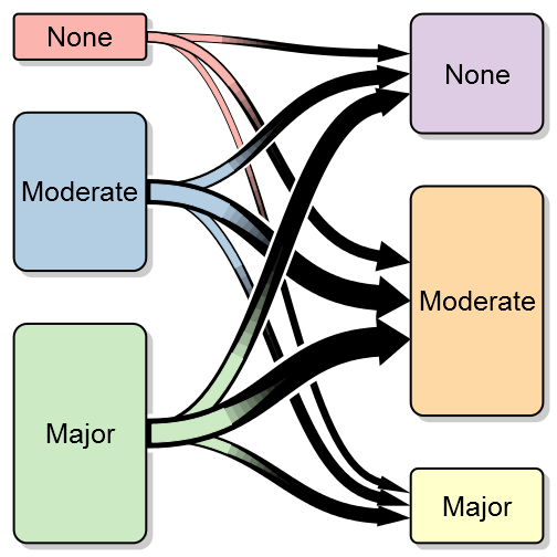
More complex coloring
Additionally you can choose different colors for your boxes:
1 2 3 4 5 6 | library(RColorBrewer)
transitionPlot(transition_mtrx, txt_start_clr = "black", txt_end_clr = "black",
fill_start_box = brewer.pal(n = 3, name = "Pastel1"),
fill_end_box = brewer.pal(n = 6, name = "Pastel1")[4:6],
overlap_add_width = 1.3, type_of_arrow = "gradient",
min_lwd = unit(2, "mm"), max_lwd = unit(10, "mm")) |
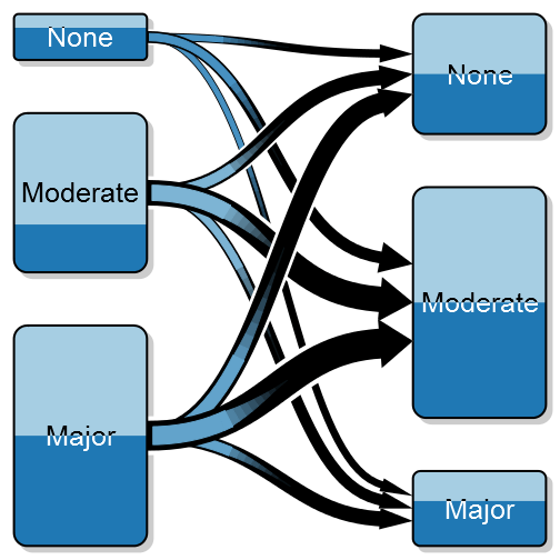
Split boxes into proportions
Sometimes you might want to split the color of each box into two colors, illustrating a proportion, for instance if we do wrist fracture surgery it might be interesting to explore if the left:right ratio differs. Note that the gradient color is a blend between the two proportions:
1 2 3 4 5 6 7 | transitionPlot(transition_mtrx,
box_prop = cbind(c(0.3, 0.7, 0.5), c(0.5, 0.5, 0.4)),
txt_start_clr = c("black", "white"), txt_end_clr = c("black", "white"),
fill_start_box = brewer.pal(n = 3, name = "Paired")[1:2],
fill_end_box = brewer.pal(n = 3, name = "Paired")[1:2],
overlap_add_width = 1.3, type_of_arrow = "gradient",
min_lwd = unit(2, "mm"), max_lwd = unit(10, "mm")) |
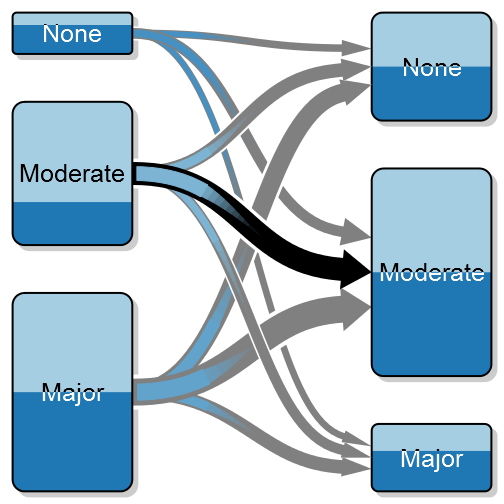
Highlighting certain arrows
Another interesting option may be to highlight a certain transition:
1 2 3 4 5 6 7 8 9 10 11 12 | arr_clrs <- c(rep(grey(0.5), times = 3),
c(grey(0.5), "black", grey(0.5)),
rep(grey(0.5), times = 3))
transitionPlot(transition_mtrx, arrow_clr = arr_clrs,
overlap_order = c(1, 3, 2),
box_prop = cbind(c(0.3, 0.7, 0.5), c(0.5, 0.5, 0.4)),
txt_start_clr = c("black", "white"), txt_end_clr = c("black", "white"),
fill_start_box = brewer.pal(n = 3, name = "Paired")[1:2],
fill_end_box = brewer.pal(n = 3, name = "Paired")[1:2],
overlap_add_width = 1.3, type_of_arrow = "gradient", min_lwd = unit(2, "mm"),
max_lwd = unit(10, "mm")) |
Summary
Even though it may seem like a very simple plot, after some tweaking I believe the data-per-ink ratio turns out quite OK. I hope you’ll find it as useful as I have. As always, don’t hesitate to comment. The function transitionPlot is included in my Gmisc-package.
R-bloggers.com offers daily e-mail updates about R news and tutorials about learning R and many other topics. Click here if you're looking to post or find an R/data-science job.
Want to share your content on R-bloggers? click here if you have a blog, or here if you don't.