
Textual Healing Part II
Want to share your content on R-bloggers? click here if you have a blog, or here if you don't.
Yesterday’s post showed a number of quick coding options for changing text in a basic ggplot. Here’s another two tricks for fine-tuning faceted plots. Again, let’s load our made up data about tooth growth (a real dataset in R, ToothGrowth, has the real data if you’re interested).
As usual, we begin with creating our dataset:
First plot:

Now, say we want to change something about the facet strip text. Specifically we want to highlight them with a yellow background and change the text size.
Plot.1 + theme(strip.text.x = element_text(size=16, face=”bold”) ,
strip.background = element_rect(fill=”yellow”)
) + theme(axis.text.x = element_text(colour=”black”,
size = 11,
face = “bold.italic”,
angle=45,
vjust=1,
hjust=1))

Now, what if we wanted I, II and III to be meaningful; perhaps I corresponds to one half dose, II to Five CCs and III to ‘A lot’… I know this isn’t a great choice of specific labels and we could just have gone back and recreated the data from scratch. This is intentionally done to show how to overcome another problem. Below we create a factor variable that does this and then plot the result.
text.plots$DOSE2 <- c()
text.plots$DOSE2[text language=”.plots$DOSE==”I””][/text] <- “One Half Dose”
text.plots$DOSE2[text language=”.plots$DOSE==”II””][/text] <- “Five CCs”
text.plots$DOSE2[text language=”.plots$DOSE==”III””][/text] <- “A Lot”
Plot.2 <- ggplot( text.plots, aes( x = SUPP, y = LENGTH , fill = SUPP ) ) +
geom_boxplot( alpha = 0.6, outlier.colour = c(“grey40”) , outlier.size=3.5
) + scale_fill_manual(values=c(“cadetblue”, “orange”, “orangered3”)) +
facet_wrap(~DOSE2) + theme_bw() +labs(title=”Tooth Growth in Guinea Pigs \n”,
x=”\n Treatment”, y=”Change in Length (mm) \n”) + guides(fill = guide_legend(“\n Supplement”)) +geom_hline(y=0, lty=2)
Plot.3 <- Plot.2 + scale_y_continuous(breaks=seq(-4, 24, by=4))
Plot.3
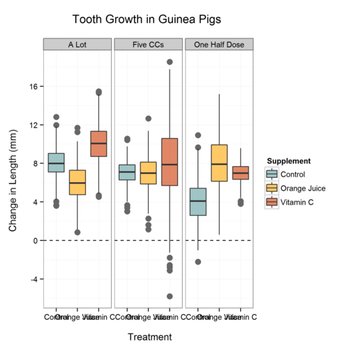
As many of you have probably experienced, this is in the “wrong” order due to how factors are treated (alphabetically). One ‘hack’ is to simply add spaces to the variable names, another way is to do something like this:
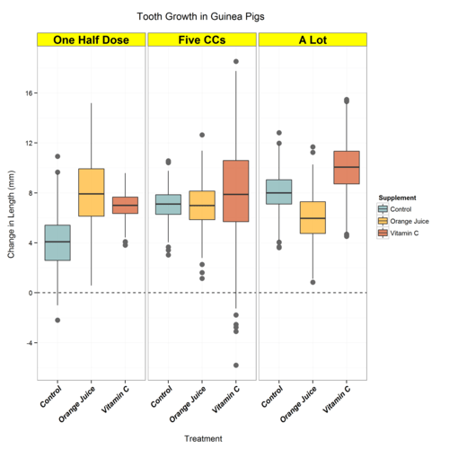
text.plots$DOSE2 <- factor(text.plots$DOSE2)
text.plots$DOSE2 <- factor(text.plots$DOSE2,
levels= levels(text.plots$DOSE2)[c language=”(3,2,1)”][/c])
Now our plot looks like this:

Now they’re in their “right” order, not just alphabetical, and we can adjust the plot as we have in previous posts… voila:
Full Code Below:
R-bloggers.com offers daily e-mail updates about R news and tutorials about learning R and many other topics. Click here if you're looking to post or find an R/data-science job.
Want to share your content on R-bloggers? click here if you have a blog, or here if you don't.