
Plotting grouped data vs time with error bars in R
[This article was first published on Quantitative Ecology, and kindly contributed to R-bloggers]. (You can report issue about the content on this page here)
Want to share your content on R-bloggers? click here if you have a blog, or here if you don't.
This is my first blog since joiningR-bloggers. I’m quite excited to be part of this group and apologize if I boreany experienced R users with my basic blogs for learning R or offendprogrammers with my inefficient, sloppy coding. Hopefully writing for this mostexcellent community will help improve my R skills while helping other novice Rusers.Want to share your content on R-bloggers? click here if you have a blog, or here if you don't.
I have a dataset from my dissertationresearch were I repeatedly counted salamanders from some plots and removedsalamanders from other plots. I was interested in plotting the captures overtime (sensu Hairston 1987). As with all statistics and graphs in R, there are avariety of ways to create the same or similar output. One challenge I alwayshave is dealing with dates. Another challenge is plotting error bars on plots.Now I had the challenge of plotting the average captures per night or month ±SE for two groups (reference and depletion plots – 5 of each on each night) vs.time. This is the type of thing that could be done in 5 minutes on graph paperby hand but took me a while in R and I’m still tweaking various plots. Below Iexplore a variety of ways to handle and plot this data. I hope it’s helpful forothers. Chime in with comments if you have any suggestions or similarexperiences.
> ####################################################################
> # Summary of Count and RemovalData
> # Dissertation Project 2011
> # October 25, 2011
> # Daniel J. Hocking
>####################################################################
>
> Data <- read.table('/Users/Dan/…/AllCountsR.txt',header = TRUE, na.strings = "NA")
>
> str(Data)
‘data.frame’: 910obs. of 32 variables:
$ dates : Factor w/ 91 levels “04/06/09″,”04/13/11”,..: 1214 15 16 17 18 19 21 22 23 …
You’ll notice that when importing atext file created in excel with the default date format, R treats the datevariable as a Factor within the data frame. We need to convert it to a dateform that R can recognize. Two such built-in functions are as.Date andas.POSIXct. The latter is a more common format and the one I choose to use(both are very similar but not fully interchangeable). To get the data in thePOSIXct format in this case I use the strptime function as seen below. I alsocreate a couple new columns of day, month, and year in case they become usefulfor aggregating or summarizing the data later.
>
> dates<-strptime(as.character(Data$dates), "%m/%d/%y") # Change date from excel storage tointernal R format
>
> dim(Data)
[1] 910 32
> Data = Data[,2:32] # remove
> Data = data.frame(date = dates,Data) #this is now the date in useful fashion
>
> Data$mo <- strftime(Data$date,"%m")
> Data$mon <-strftime(Data$date, "%b")
> Data$yr <- strftime(Data$date,"%Y")
>
> monyr <- function(x)
+ {
+ x <- as.POSIXlt(x)
+ x$mday <- 1
+ as.POSIXct(x)
+ }
>
> Data$mo.yr <- monyr(Data$date)
>
> str(Data)
‘data.frame’: 910obs. of 36 variables:
$ date : POSIXct, format: “2008-05-17” “2008-05-18” …
$ mo : chr “05””05″ “05” “05” …
$ mon : chr “May””May” “May” “May” …
$ yr : chr “2008””2008″ “2008” “2008” …
$ mo.yr : POSIXct, format: “2008-05-01 00:00:00” “2008-05-0100:00:00” …
>
As you can see the date is now in the internalR date form of POSIXct (YYYY-MM-DD).
Now I use a custom function to summarizeeach night of counts and removals. I forgot offhand how to call to a customfunction stored elsewhere to I lazily pasted it in my script. I found this nicelittle function online but I apologize to the author because I don’t rememberwere I found it.
> library(ggplot2)
> library(doBy)
>
> ## Summarizes data.
> ## Gives count, mean, standarddeviation, standard error of the mean, and confidence interval (default 95%).
> ## If there are within-subjectvariables, calculate adjusted values using method from Morey (2008).
> ## measurevar: the name of a column that contains thevariable to be summariezed
> ## groupvars: a vector containing names of columns thatcontain grouping variables
> ## na.rm: a boolean that indicates whether to ignore NA’s
> ## conf.interval: the percent range of the confidenceinterval (default is 95%)
> summarySE <- function(data=NULL,measurevar, groupvars=NULL, na.rm=FALSE, conf.interval=.95) {
+ require(doBy)
+
+ # New version of length which can handleNA’s: if na.rm==T, don’t count them
+ length2 <- function (x, na.rm=FALSE) {
+ if (na.rm)sum(!is.na(x))
+ else length(x)
+ }
+
+ # Collapse the data
+ formula <- as.formula(paste(measurevar,paste(groupvars, collapse=" + "), sep=" ~ "))
+ datac <- summaryBy(formula, data=data,FUN=c(length2,mean,sd), na.rm=na.rm)
+
+ # Rename columns
+ names(datac)[ names(datac) ==paste(measurevar, “.mean”, sep=””) ] <- measurevar
+ names(datac)[ names(datac) ==paste(measurevar, “.sd”, sep=””) ] <-"sd"
+ names(datac)[ names(datac) ==paste(measurevar, “.length2″, sep=””) ] <- "N"
+
+ datac$se <- datac$sd /sqrt(datac$N) # Calculate standarderror of the mean
+
+ # Confidence interval multiplier forstandard error
+ # Calculate t-statistic for confidenceinterval:
+ # e.g., if conf.interval is .95, use .975(above/below), and use df=N-1
+ ciMult <- qt(conf.interval/2 + .5,datac$N-1)
+ datac$ci <- datac$se * ciMult
+
+ return(datac)
+ }
>
> # summarySE provides the standarddeviation, standard error of the mean, and a (default 95%) confidence interval
> gCount <- summarySE(Count,measurevar="count", groupvars=c("date","trt"))
>
Now I’m ready to plot. I’ll start with aline graph of the two treatment plot types.
> ### Line Plot ###
> # Ref: Quick-R
>
> # convert factor to numeric forconvenience
> gCount$trtcode <-as.numeric(gCount$trt)
> ntrt <- max(gCount$trtcode)
>
> # ranges for x and y axes
> xrange <- range(gCount$date)
> yrange <- range(gCount$count)
>
> # Set up blank plot
> plot(gCount$date, gCount$count, type= “n”,
+ xlab = “Date”,
+ ylab = “Mean number of salamandersper night”)
>
> # add lines
> color <- seq(1:ntrt)
> line <- seq(1:ntrt)
> for (i in 1:ntrt){
+ Treatment <- subset(gCount, gCount$trtcode==i)
+ lines(Treatment$date, Treatment$count, col =color[i])#, lty = line[i])
+ }

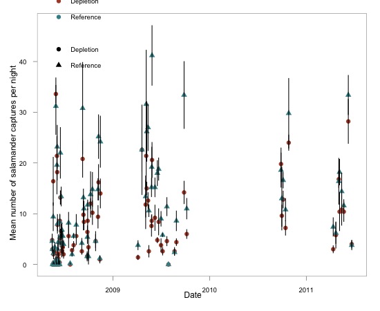
As you can see this is not attractive butit does show that I generally caught more salamander in the reference (redline) plots. This makes it apparent that a line graph is probably a bit messyfor this data and might even be a bit misleading because data was not collectedcontinuously or at even intervals (weather and season dependent collection).So, I tried a plot of just the points using the scatterplot function from the“car” package.
> ### package car scatterplot bygroups ###
> library(car)
>
> # Plot
> scatterplot(count ~ date + trt, data= gCount,
+ smooth = FALSE, grid = FALSE, reg.line = FALSE,
+ xlab=”Date”, ylab=”Mean number ofsalamanders per night”)
>
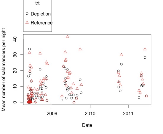
This was nice because it was very simpleto code. It includes points from every night but I would still like tosummarize it more. Before I get to that, I would like to try having breaksbetween the years. The lattice package should be useful for this.
> library(lattice)
>
> # Add year, month, and day todataframe
> chardate <- as.character(gCount$date)
> splitdate <- strsplit(chardate,split = "-")
> gCount$year <-as.numeric(unlist(lapply(splitdate, "[", 1)))
> gCount$month <-as.numeric(unlist(lapply(splitdate, "[", 2)))
> gCount$day <-as.numeric(unlist(lapply(splitdate, "[", 3)))
>
>
> # Plot
> xyplot(count ~ trt + date | year,
+ data = gCount,
+ ylab=”Daily salamandercaptures”, xlab=”date”,
+ pch = seq(1:ntrt),
+ scales=list(x=list(alternating=c(1, 1,1))),
+ between=list(y=1),
+ par.strip.text=list(cex=0.7),
+ par.settings=list(axis.text=list(cex=0.7)))
>
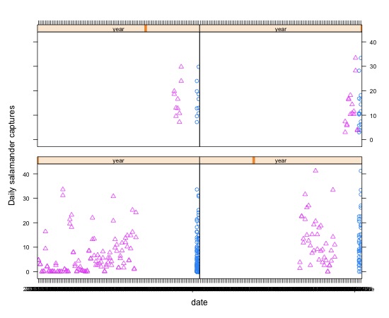
Obviously there is a problem with this. Iam not getting proper overlaying of the two treatments. I tried adjusting theequation (e.g. count ~ month | year*trt), but nothing was that enticing and Idecided to go back to other plotting functions. The lattice package is greatfor trellis plots and visualizing mixed effects models.
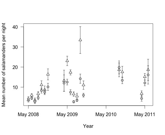
I now decided to summarize the data by month rather than byday and add standard error bars. This goes back to using the base plot function.
> ### Line Plot ###
> # Ref:http://personality-project.org/r/r.plottingdates.html
>
> # summarySE provides the standarddeviation, standard error of the mean, and a (default 95%) confidence interval
> mCount <- summarySE(Count,measurevar="count", groupvars=c("mo.yr","trt"))
> refmCount <- subset(mCount,mCount$trt == "Reference")
> depmCount <- subset(mCount,mCount$trt == "Depletion")
>
>daterange=c(as.POSIXct(min(mCount$mo.yr)),as.POSIXct(max(mCount$mo.yr)))
>
> # determine the lowest and highestmonths
> ylims <- c(0, max(mCount$count +mCount$se))
> r <-as.POSIXct(range(refmCount$mo.yr), "month")
>
> plot(refmCount$mo.yr,refmCount$count, type = “n”, xaxt = “n”,
+ xlab = “Date”,
+ ylab = “Mean number ofsalamanders per night”,
+ xlim = c(r[1], r[2]),
+ ylim = ylims)
> axis.POSIXct(1, at = seq(r[1], r[2],by = “month”), format = “%b”)
> points(refmCount$mo.yr,refmCount$count, type = “p”, pch = 19)
> points(depmCount$mo.yr,depmCount$count, type = “p”, pch = 24)
> arrows(refmCount$mo.yr,refmCount$count+refmCount$se, refmCount$mo.yr, refmCount$count-refmCount$se,angle=90, code=3, length=0)
> arrows(depmCount$mo.yr,depmCount$count+depmCount$se, depmCount$mo.yr, depmCount$count-depmCount$se,angle=90, code=3, length=0)
>
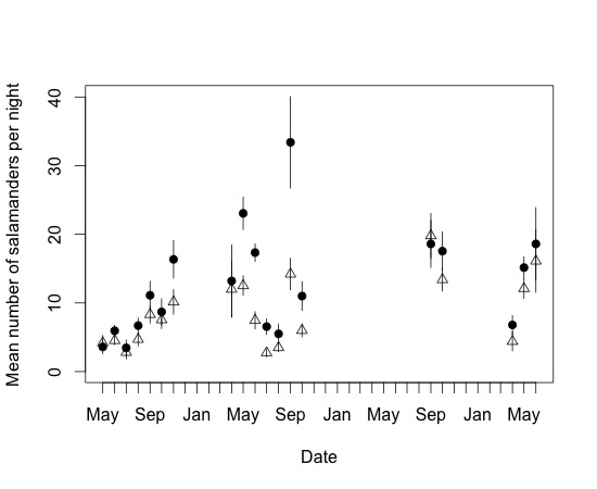
Now that’s a much better visualization ofthe data and that’s the whole goal of a figure for publication. The only thingI might change would be I might plot by year with the labels of Month-Year(format = %b $Y). I might add a legend but with only two treatments I mightjust include the info in the figure description.
Although that is probably going to be myfinal product for my current purposes, I wanted to explore a few other graphingoptions for visualizing this data. The first is to use box plots. I use the add= TRUE option to add a second group after subsetting the data.
> ### Boxplot ###
> # Ref:http://personality-project.org/r/r.plottingdates.html
>
> # as.POSIXlt(date)$mon #gives the months in numeric order mod 12with January = 0 and December = 11
>
> refboxplot <- boxplot(count ~date, data = Count, subset = trt == "Reference",
+ ylab = “Mean number of salamanders per night”,
+ xlab = “Date”) #show the graph and save the data
> depboxplot <- boxplot(count ~date, data = Count, subset = trt == "Depletion", col = 2, add = TRUE)
>
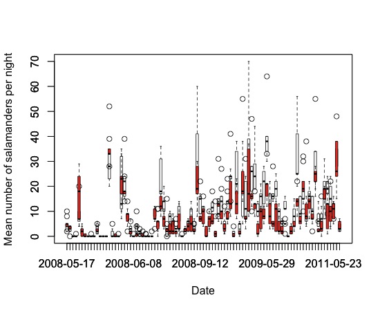
Clearly this is a mess and not useful.But you can imagine that with some work and summarizing by month or season itcould be a useful and efficient way to present the data. Next I tried thepopular package ggplot2.
> ### ggplot ###
> # Refs:http://learnr.wordpress.com/2010/02/25/ggplot2-plotting-dates-hours-and-minutes/
> # http://had.co.nz/ggplot2/
> #http://wiki.stdout.org/rcookbook/Graphs/Plotting%20means%20and%20error%20bars%20%28ggplot2%29
>
> library(ggplot2)
>
> ggplot(data = gCount, aes(x = date,y = count, group = trt)) +
+ #geom_point(aes(shape = factor(trt))) +
+ geom_point(aes(colour = factor(trt), shape= factor(trt)), size = 3) +
+ #geom_line() +
+ geom_errorbar(aes(ymin=count-se,ymax=count+se), width=.1) +
+ #geom_line() +
+ # scale_shape_manual(values=c(24,21)) + #explicitly have sham=fillable triangle, ACCX=fillable circle
+ #scale_fill_manual(values=c(“white”,”black”))+ # explicitly have sham=white, ACCX=black
+ xlab(“Date”) +
+ ylab(“Mean number of salamandercaptures per night”) +
+ scale_colour_hue(name=”Treatment”, # Legend label, use darkercolors
+ l=40) + # Use darkercolors, lightness=40
+ theme_bw() + # make the themeblack-and-white rather than grey (do this before font changes, or it overridesthem)
+
+ opts(legend.position=c(.2, .9), # Positionlegend inside This must go after theme_bw
+ panel.grid.major = theme_blank(), # switch off major gridlines
+ panel.grid.minor = theme_blank(), # switch off minor gridlines
+ legend.title= theme_blank(), # switch off the legend title
+ legend.key =theme_blank()) # switch off the rectangle around symbols in the legend
>
This plot could work with some finetuning, especially with the legend(s) but you get the idea. It wasn’t as easyfor me as the plot function but ggplot is quite versatile and probably a goodpackage to have in your back pocket for complicated graphing.
Next up was the gplots package for theplotCI function.
> library(gplots)
>
> plotCI(
+ x = refmCount$mo.yr,
+ y = refmCount$count,
+ uiw = refmCount$se, # error bar length (default is toput this much above and below point)
+ pch = 24, # symbol (plotting character) type: seehelp(pch); 24 = filled triangle pointing up
+ pt.bg = “white”, # fill colour for symbol
+ cex = 1.0, # symbol size multiplier
+ lty = 1, # error bar line type: see help(par) – notsure how to change plot lines
+ type = “p”, # p=points, l=lines, b=both,o=overplotted points/lines, etc.; see help(plot.default)
+ gap = 0, # distance from symbol to error bar
+ sfrac = 0.005, # width of error bar as proportion of xplotting region (default 0.01)
+ xlab = “Year”, # x axis label
+ ylab = “Mean number of salamanders pernight”,
+ las = 1, # axis labels horizontal (default is 0 foralways parallel to axis)
+ font.lab = 1, # 1 plain, 2 bold, 3 italic, 4 bolditalic, 5 symbol
+ xaxt = “n”) # Don’t print x-axis
> )
> axis.POSIXct(1, at = seq(r[1], r[2], by =”year”), format = “%b %Y”) # label the x axis bymonth-years
>
> plotCI(
+ x=depmCount$mo.yr,
+ y = depmCount$count,
+ uiw=depmCount$se, # error bar length (default is toput this much above and below point)
+ pch=21, # symbol (plotting character) type: seehelp(pch); 21 = circle
+ pt.bg=”grey”, # fill colour for symbol
+ cex=1.0, # symbol size multiplier
+ lty=1, # line type: see help(par)
+ type=”p”, # p=points, l=lines, b=both,o=overplotted points/lines, etc.; see help(plot.default)
+ gap=0, # distance from symbol to error bar
+ sfrac=0.005, # width of error bar as proportion of xplotting region (default 0.01)
+ xaxt = “n”,
+ add=TRUE # ADD this plot to the previous one
+ )
>
Now this is a nice figure. I must saythat I like this. It is very similar to the standard plot code and graph but itwas a little easier to add the error bars.
So that’s it, what a fun weekend I had!Let me know what you think or if you have any suggestions. I’m new to this andlove to learn new ways of coding things in R.
To leave a comment for the author, please follow the link and comment on their blog: Quantitative Ecology.
R-bloggers.com offers daily e-mail updates about R news and tutorials about learning R and many other topics. Click here if you're looking to post or find an R/data-science job.
Want to share your content on R-bloggers? click here if you have a blog, or here if you don't.