Ontario First Nations Libraries Compared Using Ontario Open Data
Want to share your content on R-bloggers? click here if you have a blog, or here if you don't.
I recently downloaded a very cool dataset on Ontario libraries from the Ontario Open Data Catalogue. The dataset contains 142 columns of information describing 386 libraries in Ontario, representing a fantastically massive data collection effort for such important cultural institutions (although the most recent information available is as of 2010). One column which particularly caught my interest was “Library Service Type”, which breaks the libraries down into:
- Public or Union Library (247)
- LSB Library (4)
- First Nations Library (43)
- County, County co-operative or Regional Municipality Library (13)
- Contracting Municipality (49)
- Contracting LSB (14)
I saw the First Nations Library type and thought it would be really educational for me to compare First Nations libraries against all the other library types combined and see how they compare based on some interesting indicators. To make these comparisons in this post, I use a few violin plots; where you see more bulkiness in the plot, it tells you that the value on the y axis is more likely for a library compared to the thinner parts.
Our first comparison, shown below, reveals that local population sizes are a LOT more variable amongst the “Other” library types compared to First Nations libraries. From first to third quartile, First Nations libraries tend to have around 250 to 850 local residents, whereas Other libraries tend to have around 1,110 to 18,530 local residents!
             isFN.Library 0%    25%  50%   75%    100%
1         Other Libraries 28 1113.5 5079 18529 2773000
2 First Nations Libraries 55  254.5  421   857   11297
Considering the huge difference in the population sizes that these libraries were made to serve, comparisons between library types need to be weighted according to those sizes, so that the comparisons are made proportionate. In that spirit, the next plot compares the distribution of the number of cardholders per resident by library type. Thinking about this metric for a moment, it’s possible that a person not living in the neighbourhood of the library can get a card there. If all the residents of the library’s neighbourhood have a card, and there are people outside of that neighbourhood with cards, then a library could have over 1 cardholder per resident.
Looking at the plot, a couple of things become apparent: Firstly, First Nations libraries appear more likely to to be overloaded with cardholders (more cardholders than there are local residents, 14% of First Nations libraries, vs. 4% of Other libraries). On the lower end of the spectrum, First Nations libraries show a slight (non-significant) tendency of having fewer cardholders per resident than Other libraries.
             isFN.Library 0%  25%  50%  75% 100%
1         Other Libraries  0 0.20 0.37 0.55  2.1
2 First Nations Libraries  0 0.19 0.32 0.77  2.8
Next we’ll look at a very interesting metric, because it looks so different when you compare it in its raw form to when you compare it in proportion to population size. The plot below shows the distribution of English titles in circulation by library type. It shouldn’t be too surprising that Other libraries, serving population sizes ranging from small to VERY large, also vary quite widely in the number of English titles in circulation (ranging from around 5,600 to 55,000, from first to third quartile). On the other hand we have First Nations libraries, serving smaller population sizes, varying a lot less in this regard (from around 1,500 to 5,600 from first to third quartile).

_
             isFN.Library 0%    25%   50%   75%   100%
1         Other Libraries  0 5637.5 21054 54879 924635
2 First Nations Libraries  0 1500.0  3800  5650  25180
Although the above perspective reveals that First Nations libraries tend to have considerably fewer English titles in circulation, things look pretty different when you weight this metric by the local population size. Here, the plot for First Nations libraries looks very much like a Hershey’s Kiss, whereas the Other libraries plot looks a bit like a toilet plunger. In other words, First Nations libraries tend to have more English titles in circulation per resident than Other libraries. This doesn’t say anything about the quality of those books available in First Nations libraries. For that reason, it would be nice to have a measure even as simple as median/average age/copyright date of the books in the libraries to serve as a rough proxy for the quality of the books sitting in each library. That way, we’d know whether the books in these libraries are up to date, or antiquated.

_
             isFN.Library 0%       25%      50%       75%      100%
1         Other Libraries  0 0.9245169 2.698802  5.179767 119.61462
2 First Nations Libraries  0 2.0614922 7.436399 13.387416  51.14423
For the next plot, I took all of the “per-person” values, and normed them. That is to say, for any given value on the variables represented below, I subtracted from that value the minimum possible value, and then divided the result by the range of values on that measure. Thus, any and all values close to 1 are the higher values, and those closer to 0 are the lower values. I then took the median value (by library type) for each measure, and plotted below. Expressed this way, flawed though it may be, we see that First Nations Libraries tend to spend more money per local resident, across areas, than Other libraries. The revenue side looks a bit different. While they tend to get more revenue per local resident, they appear to generate less self-generated revenue, get fewer donations, and get less money in local operating grants, all in proportion to the number of local residents. The three areas where they are excelling (again, this is a median measure) are total operating revenue, provincial operating funding, and especially project grants.

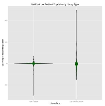
Here I decided to zero in on the distributional differences in net profit per resident by library type. Considering that libraries are non-profit institutions, you would expect to see something similar to the plot shown for “Other” libraries, where the overwhelming majority are at or around the zero line. It’s interesting to me then, especially since I work with non-profit institutions, to see the crazy variability in the First Nations libraries plot. The upper end of this appears to be from some outrageously high outliers, so I decided to take them out and replot.

In the plot below, I’ve effectively zoomed in, and can see that there do seem to be more libraries showing a net loss, per person, than those in the net gain status.

_
             isFN.Library      0%    25%   50%  75%   100%
1         Other Libraries -149.87  -0.49  0.00 1.16  34.35
2 First Nations Libraries  -76.55 -17.09 -0.88 0.40 250.54
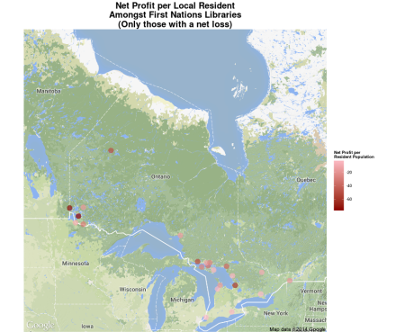
I wanted to see this net profit per person measure mapped out across Ontario, so I used the wonderful ggmap package, which to my delight is Canadian friendly! Go Canada! In this first map, we see that First Nations libraries in Southern Ontario (the part of Ontario that looks like the head of a dragon) seem to be “okay” on this measure, with one library at the “neck” of the dragon seeming to take on a little more red of a shade, one further west taking on a very bright green, and a few closer to Manitoba appearing to be the worst.
 To provide more visual clarity on these poorly performing libraries, I took away all libraries at or above zero on this measure. Now there are fewer distractions, and it’s easier to see the worst performers.
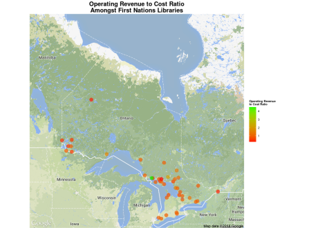
Finally, as a sanity check, I re-expressed the above measure into a ratio of total operating revenue to total operating expenditure to see if the resulting geographical pattern was similar enough. Anything taking on a value of less than 1 is spending more than they are making in revenue, and are thus “in the red”. While there are some differences in how the colours are arrayed across Ontario, the result is largely the same.
That’s all for now! I’ll get my code up on here ASAP, so that I can share my work, as usual. If you have any questions, or ideas for further analysis, don’t hesitate to drop me a line 🙂
As a final note, I think that it’s fantastic that this data collection was done, but the fact that the most recent data available is as of 2010 is very tardy. What happened here? Libraries are so important across the board, so please, Ontario provincial government, keep up the data collection efforts!
R-bloggers.com offers daily e-mail updates about R news and tutorials about learning R and many other topics. Click here if you're looking to post or find an R/data-science job.
Want to share your content on R-bloggers? click here if you have a blog, or here if you don't.


