
Has there been a ‘pause’ in global warming?
Want to share your content on R-bloggers? click here if you have a blog, or here if you don't.
As I discussed in my previous post, records of global temperatures over the last few decades figure prominently in the debate over the climate effects of CO2 emitted by burning fossil fuels. I am interested in what this data says about which of the reasonable positions in this debate is more likely to be true — the `warmer’ position, that CO2 from burning of fossil fuels results in a global increase in temperatures large enough to have quite substantial (though not absolutely catastrophic) harmful effects on humans and the environment, or the `lukewarmer’ position, that CO2 has some warming effect, but this effect is not large enough to be a major cause for worry, and does not warrant imposition of costly policies aimed at reducing fossil fuel consumption.
A recent focus of this debate has been whether temperature records show a `pause’ (or `hiatus’) in global warming over the last 10 to 20 years (or at least a `slowdown’ compared to the previous trend), and if so, what it might mean. Lukewarmers might interpret such a pause as evidence that other factors are comparable in importance to CO2, and can temporarily mask or exaggerate its effects, and hence that naively assuming the warming from 1970 to 2000 is primarily due to CO2 could lead one to overestimate the effect of CO2 on temperature.
Whether you sees a pause might, of course, depend on which data set of global temperatures you look at. These data sets are continually revised, not just by adding the latest observations, but by readjusting past observations.
Here are the yearly average land-ocean temperature anomaly data from 1955 to 2014 from the Goddard Institute for Space Studies (GISS), in the version before and after July of this year:
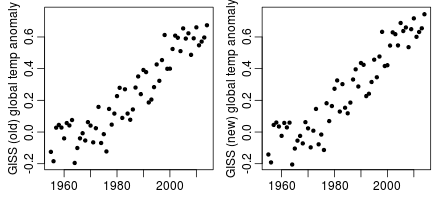
The old version shows signs of a pause or slowdown after about 2000, which has largely disappeared in the new version. Unsurprisingly, the revision has engendered some controversy. I should note that the difference is not really due to GISS itself, but rather to NOAA, from whom GISS gets the sea surface temperatures used.
Many people pointing to a pause look at the satellite temperature data from UAH, which starts in 1979. Below, I show it on the right, with the new GISS data from 1979 on the left, both in yearly (top) and monthly (bottom) forms:
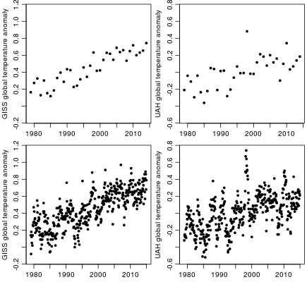
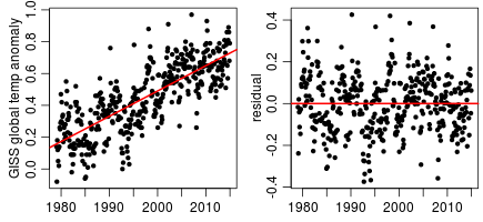
Two things can be noted from these plots. First, the yearly UAH data (top right) can certainly be seen as showing roughly constant temperatures since somewhere between 1995 and 2000, apart from short-term variability. However, if one so wishes, one can also see it as showing a pretty much constant upward trend, again with short-term variability. Looking at the monthly UAH data (bottom right) gives a much stronger impression of a pause, since fitting a straight line to the monthly data leads to most points after about 2007 being under the line, while those before then back to about 2001 are mostly above the line, which is what one would expect if there is a pause at the end — see the plot below of the least-squares fitted line and its residuals:

The (new) GISS data also gives more of an impression of a slowdown with monthly rather than yearly data:
There are two issues with looking at monthly data, however. The first is that although both GISS and UAH data effectively have a seasonal adjustment — anomalies for each month are from a baseline for that month in particular — the seasonal effects actually vary over the years, introducing possible confusion. I’ll try fitting a model that handles this in a later post, but for now sticking to the yearly data avoids the problem. The second issue is that one can see a considerable amount of `autocorrelation’ in the monthly data. This brings us to the crucial question of what one should really be asking when considering whether there is a pause (or a slowdown) in the temperature data.
To some extent, talk of a `pause’ by lukewarmers is for rhetorical effect — look, no warming for 15 years! — as a counter to the rhetoric of the warmers — see how much the planet has warmed since 1880! — with such rhetoric by both sides being only loosely related to any valid scientific argument. However, one should try as much as possible to interpret both sides as making sensible arguments.
In this respect, note that the lukewarmers are certainly not claiming that the pause shows that although CO2 had a warming effect up until the year 2000, it stopped having a warming effect after 2000, so we don’t have to worry now. I doubt that anyone in the entire world believes such a thing (which is saying a lot considering what some people do believe).
Instead, the sensible lukewarmer interpretation of a `pause’ would be that the departures from the underlying trend in the temperature time series have a high degree of positive autocorrelation — that the departure from trend in one year is likely to be similar to the departures from trend of recent years. (Alternatively, some lukewarmers might think that there are deterministic or stochastic cycles, with periods of decades or more.) The effect of high autocorrelation is to make it harder to infer the magnitude of the true underlying trend from a relatively short series of observations.
The problem can be illustrated with simulated data sets, which I’ve arranged to look vaguely similar to the GISS data from 1955 to 2014 (though to avoid misleading anyone, I label the x-axis from 1 to 60 rather than 1955 to 2014).
I start by generating a series of 20000 values with high autocorrelation that will be added as residuals to a linear trend. I do this by summing a Gaussian series with autocorrelations that slowly decline to zero at lag 70, a slightly non-Gaussian series with autocorrelations that decline more quickly, and a series of independent Gaussian values. The R code is as follows:
set.seed(1)

n0 <- 20069

fa <- c(1,0.95,0.9,0.8/(1:67)^0.8); fa <- fa/sum(fa)

fb <- exp(-(0:69)/2.0); fb <- fb/sum(fb)

xa <- filter(rnorm(n0),fa); xa <- xa[!is.na(xa)]

xb <- filter(rt(n0,5),fb); xb <- xb[!is.na(xb)]

xc <- rnorm(length(xb))

xresid <- 0.75*xa + 0.08*xb + 0.06*xc
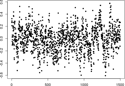
Here are the first 1500 values of this residual series:
Here are the autocorrelations estimated from the entire simulated residual series:
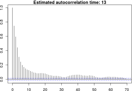
The `autocorrelation time’ shown above is one plus twice the sum of autocorrelations at lag 1 and up. It is the factor by which the effective sample size is less than it would be if the points were independent. With an autocorrelation time of 13 as above, for example, a data set of 60 points is equivalent to about 5 independent points.
I then split this long residual series into chunks of length 60, to each of which I added a trend with slope 0.01, and then shifted it to have sample mean of zero. Here are the first twenty of the 333 series that resulted:
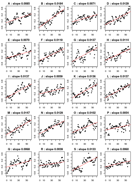
The slope of the least-squares fit line is shown above each plot. As one can see, some slope estimates are almost twice the underlying trend of 0.01, while other slopes are much less than the underlying trend. Here is the histogram of slope estimates from all 333 series of length 60, along with the lower bound of the 95% confidence interval for the slope, computed assuming no autocorrelation:

Ignoring autocorrelation results in the true slope of 0.01 being below the lower bound of the 95% confidence interval 24% of the time (ten times what should be the case).
What is even more worrying is that looking at the residuals from the regression often shows only mild autocorrelation. Here are the autocorrelation (and autocorrelation time) estimates for the first 20 series:

One can compare these estimates with the plot of true residual autocorrelation above, and the true autocorrelation time of 13.
To see the possible relevance of this simulation to global temperature data, here are old and new GISS global temperature anomaly series (from 1955), centred and relabeled as for the simulated series, along with simulated series B and L from above:
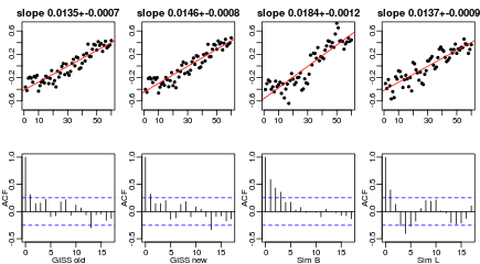
It is worrying that the GISS series do not appear much different from the simulated series, which substantially overestimate the trend.
The real significance of a `pause’ or `slowdown’ in temperatures is that it would be evidence of such high autocorrelation, whose physical basis could be internal variability in the climate system, or the influence of external factors that themselves exhibit autocorrelation. Looking for a `pause’ may not be the best way of assessing whether autocorrelation is a big problem. But direct estimation of long-lag autocorrelations from relative short series is not an easy problem, and may be impossible without making strong prior assumptions regarding the form of the autocorrelation function.
Accordingly, I’ll now go back to looking at whether one can see a pause in the GISS and UAH temperature data, while keeping in mind that the point of this is to see whether high autocorrelation is a problem. I’ll look only at the yearly data, though as noted above, a pause or slowdown may be more evident in the monthly data.
Here are the old and new versions of the GISS data, from 1955 through 2014, with least-squares regression lines fitted separately to data before 1970, from 1970 to 2001, and after 2001. In the top plots, the fits are required to join up; in the bottom plots, there may jumps as well as slope changes at 1970 and 2001.
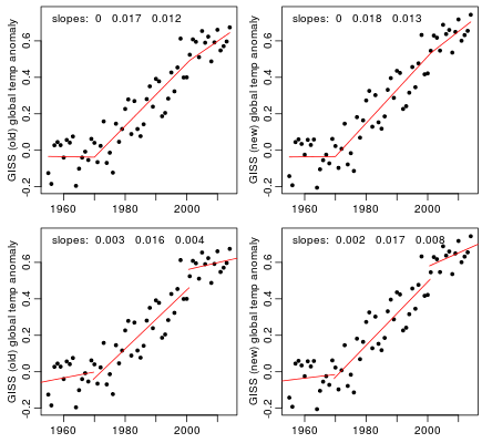
In the two top plots, the estimated slopes after 2001 are smaller than the slopes from 1970 to 2001, but the differences are not statistically significant (p-values about 0.3, assuming independent residuals). In the bottom two plots, the slopes before and after 2001 differ substantially, with the differences being significant (p-values of 0.003 and 0.018, assuming independent residuals). However, one might wonder whether the abrupt jumps are physically plausible.
Next, let’s look at the UAH data, which starts in 1979, along with the (new) GISS data from that date for comparison, and again consider a change in slope and/or a jump in 2001:

Omitting the data from 1970 to 1978 decreases the pre-2001 slope of the GISS data, lessening the contrast with the post-2001 slope. For the UAH data, the difference in slopes before and after 2001 is quite noticeable. However, for the top UAH plot, the difference is not statistically significant (p-value 0.19, assuming independent residuals). For the bottom plot, the two-sided p-value is 0.08. Based on the comparison with the GISS data, however, one might think that both differences would have been significant if data back to 1970 had been available.
There is a `cherry-picking’ issue with all the above p-values, however. The selection of 2001 as the point where the slope changes was made by looking at the data. One could try correcting for this by multiplying the p-values by the number of alternative choices of year, but this number is not clear. In a long series one would expect the slope to change at other times as well, as indeed seems to have happened in 1970. One could try fitting a general model of multiple `change-points’, but this seems inappropriately elaborate, given that the entire exercise is a crude way of testing for long-lag autocorrelation.
I have, however, tried out a Bayesian analysis, comparing a model with a single linear trend, a model with a trend that changes slope at an unknown year (between 1975 and 2010), a model with both a change in slope and a jump (at an unknown year), and a model in which the trend is a constant apart from a jump (at an unknown year). I selected informative priors for all the parameters, as is essential when comparing models in the Bayesian way by marginal likelihood, and computed the marginal likelihoods (and posterior quantities) by importance sampling from the prior (a feasible method for this small-scale problem). See the R code linked to below for details.
Here are the results of these four Bayesian models, shown as the posterior average trend lines:
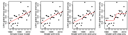
In the last plot, note that the model has an abrupt step up at some year, but the posterior average shows a more gradual rise, since the year of the jump is uncertain. The log marginal likelihoods for the four models above are 16.0, 15.4, 15.7, and 14.4. If one were to (rather artificially) assume that these are the only four possible models, and that they have equal prior probabilities, the posterior probabilities of the four models would be 39%, 23%, 30%, and 9%.
I emphasize again that the exercise of looking for a `pause’ or `slowdown’ is really a crude way of looking for evidence of long-lag autocorrelation. The quantitative results should not be taken too seriously. Nevertheless, the conclusion I reach is that this data does not produce a definitive yes or no answer to whether there is a pause, even in the UAH data, for which a pause seems most evident. A few years more data might (or might not) be enough to make the situation clearer. Analysis of monthly data might also give a more definite result. Note, however, that `lack of definite evidence of a pause’ is not the same as `no pause’. It is not reasonable to assume a lack of long-lag autocorrelation absent definite evidence to the contrary, since the presence of such autocorrelation is quite plausible a priori.
In my previous post, I had said that this next post would examine two papers `debunking’ the pause, but it’s gotten too long already, so I’ll leave that for the post after this. I’ll then look at what can be learned by looking at monthly data, and by modeling some known effects on temperature (such as volcanic activity).
The results above can be reproduced by first downloading the data using this shell script (which downloads other data too, that I will use for later blog posts), or manually download from the URLs it lists if you don’t have wget. You then need to download my R script for reading these files, and my R script for the above analysis (and rename them to .r from the .doc that wordpress requires). Finally, run the second script in R as described in its opening comments.
UPDATE: You’ll also need this R source file.

R-bloggers.com offers daily e-mail updates about R news and tutorials about learning R and many other topics. Click here if you're looking to post or find an R/data-science job.
Want to share your content on R-bloggers? click here if you have a blog, or here if you don't.