ggplot2: Creating a custom plot with two different geoms
[This article was first published on Data and Analysis with R, at Work, and kindly contributed to R-bloggers]. (You can report issue about the content on this page here)
Want to share your content on R-bloggers? click here if you have a blog, or here if you don't.
Want to share your content on R-bloggers? click here if you have a blog, or here if you don't.
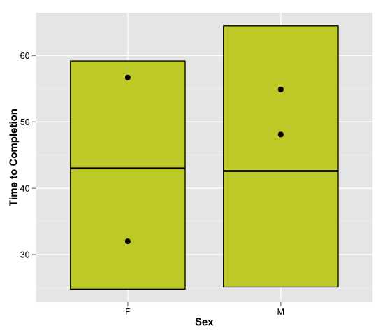
This past week for work I had to create some plots to show the max, min, and median of a measure across the levels of a qualitative variable, and show the max and min of the same variable within a subgroup of the dataset. To illustrate what I mean, I took a fun dataset from the data and story library and recreated the plot that I made at work.
The data are supposed to represent the results of a study done on how long it took subjects to complete a pen and paper maze while they were either smelling a floral scent or not. Other than the time to completion (the main variable of interest), some other variables are recorded, like sex and whether or not the subject is a smoker.
I represent the min, max, and median completion time that it took men and women to complete the maze with the “crossbar” geom, which show obvious overlap in performance across the genders (however it’s apparent that men were a bit more variable in their performance than women). The seemingly interesting result is represented by the dots. The dots show the min and max values for the smokers within each gender. While smoking doesn’t appear to have an effect on performance amongst the women, it seems to be correlated with much slower performance amongst the men in the study. Then again, I just re-checked the data, which show that there are only 2 male smokers and 6 female smokers, so the comparison seems pretty unreliable.
Stepping away from the study itself, what I like here is that you can call up several geoms in the same plot, passing different data subsets to each geom. It allows for useful customization so that you can tackle problems that aren’t so cut and dried.
Finally, I realize that before putting this kind of graph into a report, I really should create a little legend that shows the reader that the ends of the boxes are max and mins, and the middle lines represent medians, and the dots represent max and mins of the subset.
Following is the code and the plot I created:
To leave a comment for the author, please follow the link and comment on their blog: Data and Analysis with R, at Work.
R-bloggers.com offers daily e-mail updates about R news and tutorials about learning R and many other topics. Click here if you're looking to post or find an R/data-science job.
Want to share your content on R-bloggers? click here if you have a blog, or here if you don't.

