
Critique of ‘Debunking the climate hiatus’, by Rajaratnam, Romano, Tsiang, and Diffenbaugh
Want to share your content on R-bloggers? click here if you have a blog, or here if you don't.
Records of global temperatures over the last few decades figure prominently in the debate over the climate effects of CO2 emitted by burning fossil fuels, as I discussed in my first post in this series, on What can global temperature data tell us? One recent controversy has been whether or not there has been a `pause’ (also referred to as a `hiatus’) in global warming over the last 15 to 20 years, or at least a `slowdown’ in the rate of warming, a question that I considered in my second post, on Has there been a `pause’ in global warming?
As I discussed in that post, the significance of a pause in warming since around 2000, after a period of warming from about 1970 to 2000, would be to show that whatever the warming effect of CO2, other factors influencing temperatures can be large enough to counteract its effect, and hence, conversely, that such factors could also be capable of enhancing a warming trend (eg, from 1970 to 2000), perhaps giving a misleading impression that the effect of CO2 is larger than it actually is. To phrase this more technically, a pause, or substantial slowdown, in global warming would be evidence that there is a substantial degree of positive autocorrelation in global temperatures, which has the effect of rendering conclusions from apparent temperature trends more uncertain.
Whether you see a pause in global temperatures may depend on which series of temperature measurements you look at, and there is controversy about which temperature series is most reliable. In my previous post, I concluded that even when looking at the satellite temperature data, for which a pause seems most visually evident, one can’t conclude definitely that the trend in yearly average temperature actually slowed (ignoring short-term variation) in 2001 through 2014 compared to the period 1979 to 2000, though there is also no definite indication that the trend has not been zero in recent years.
Of course, I’m not the only one to have looked at the evidence for a pause. In this post, I’ll critique a paper on this topic by Bala Rajaratnam, Joseph Romano, Michael Tsiang, and Noah S. Diffenbaugh, Debunking the climate hiatus, published 17 September 2015 in the journal Climatic Change. Since my first post in this series, I’ve become aware that `tamino’ has also commented on this paper, here, making some of the same points that I will make. I’ll have more to say, however, some of which is of general interest, apart from the debate on the `pause’ or `hiatus’.
First, a bit about the authors of the paper, and the journal it is published in. The authors are all at Stanford University, one of the world’s most prestigious academic institutions. Rajaratnam is an Assistant Professor of Statistics and of Environmental Earth System Science. Romano is a Professor of Statistics and of Economics. Diffenbaugh is an Associate Professor of Earth System Science. Tsiang is a PhD student. Climatic Change appears to be a reputable refereed journal, which is published by Springer, and which is cited in the latest IPCC report. The paper was touted in popular accounts as showing that the whole hiatus thing was mistaken — for instance, by Stanford University itself.
You might therefore be surprised that, as I will discuss below, this paper is completely wrong. Nothing in it is correct. It fails in every imaginable respect.
To start, here is the data they analyse, taken from plots in their Figure 1:
The second plot is a closeup of data from the first plot, for years from 1998 to 2013.
Rajaratnam, et al. describe this data as “the NASA-GISS global mean land-ocean temperature index”, which is a commonly used data set, discussed in my first post in this series. However, the data plotted above, and which they use, is not actually the GISS land-ocean temperature data set. It is the GISS land-only data set, which is less widely used, since as GISS says, it “overestimates trends, since it disregards most of the dampening effects of the oceans”. They appear to have mistakenly downloaded the wrong data set, and not noticed that the vertical scale on their plot doesn’t match plots in other papers showing the GISS land-ocean temperature anomalies. (They also apply their methods to various other data sets, claiming similar results, but only results from this data are shown in the paper.)
GISS data sets continually change (even for past years), and I can’t locate the exact version used in this paper. For the 1998 to 2013 data, I manually digitized the plot above, obtaining the following values:
1998 1999 2000 2001 2002 2003 2004 2005 2006 2007 2008 2009 2010 2011 2012 2013
0.84 0.59 0.57 0.68 0.80 0.78 0.69 0.88 0.78 0.86 0.65 0.79 0.93 0.78 0.76 0.82
In my analyses below, I will use these values when only post-1998 data is relevant, and otherwise use the closest matching GISS land-only data I can find.
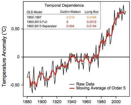
Before getting into details, we need to examine what Rajaratnam, et al. think are the questions that need to be addressed. In my previous post, I interpreted debate about a `pause’, or `hiatus’, or `slowdown’ as really being about the degree of long-term autocorrelation in the temperature series. If various processes unrelated to CO2 affect temperatures for periods of decades or more, judging the magnitude of the effect of CO2 will be more difficult, and in particular, the amount of recent warming since 1970 might give a misleadingly high impression of how much effect CO2 has on temperature. A hiatus of over a decade, following a period of warming, while CO2 continues to increase, would be evidence that such other effects, operating on long time scales, can be large enough to temporarily cancel the effects of CO2.
Rajaratnam, et al. seem to have some awareness that this is the real issue, since they say that the perceived hiatus has “inspired valuable scientific insight into the processes that regulate decadal-scale variations of the climate system”. But they then ignore this insight when formulating and testing four hypotheses, each of which they see as one possible way of formalizing a claim of a hiatus. In particular, they emphasize that they “attempt to properly account for temporal dependence”, since failure to do so can “lead to erroneous scientific conclusions”. This would make sense if they were accounting only for short-term auto-correlations. Accounting for long-term autocorrelation makes no sense, however, since the point of looking for a pause is that it is a way of looking for evidence of long-term autocorrelation. To declare that there is no pause on the grounds that it is not significant once long-term autocorrelation is accounted for would miss the entire point of the exercise.
So Rajaratnam, Romano, Tsiang, and Diffenbaugh are asking the wrong questions, and trying to answer them using the wrong data. Let’s go on to the details, however.
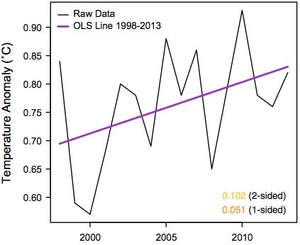
The first hypothesis that Rajaratnam, et al. test is that temperature anomalies from 1998 to 2013 have zero or negative trend. Here are the anomalies for this period (data shown above), along with a trend line fit by least-squares, and a horizontal line fit to the mean:
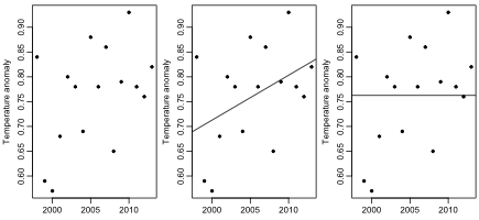
Do you think one can confidently reject the hypothesis that the true trend during this period is zero (or negative) based on these 16 data points? I think one can get a good idea with only a few seconds of thought. The least-squares fit must be heavily influenced by the two low points at 1999 and 2000. If there is actually no trend, the fact that both these points are in the first quarter of the series would have to be ascribed to chance. How likely is that? The answer is 1/4 times 1/4, which is 1/16, which produces a one-sided p-value over 5%. As Rajaratnam, et al. note, the standard regression t-test of the hypothesis that the slope is zero gives a two-sided p-value of 0.102, and a one-sided p-value of 0.051, in rough agreement.
Yet Rajaratnam, et al. conclude that there is “overwhelming evidence” that the slope is positive — in particular, they reject the null hypothesis based on a two-sided p-value of 0.019 (though personally I would regard this as somewhat less than overwhelming evidence). How do they get the p-value to change by more than a factor of five, from 0.102 to 0.019? By accounting for autocorrelation.
Now, you may not see much evidence of autocorrelation in these 16 data points. And based on the appearance of the rest of the series, you may think that any autocorrelation that is present will be positive, and hence make any conclusions less certain, not more certain, a point that the authors themselves note on page 24 of the supplemental information for the paper. What matters, however, is autocorrelation in the residuals — the data points minus the trend line. Of course, we don’t know what the true trend is. But suppose we look at the residuals from the least-squares fit. We get the following autocorrelations (from Fig. 8 in the supplemental information for the paper):

As you can see, the autocorrelation estimates at lags 1, 2, and 3 are negative (though the dotted blue lines show that the estimates are entirely consistent with the null hypothesis that the true autocorrelations at lags 1 and up are all zero).
Rajaratnam, et al. first try to account for such autocorrelation by fitting a regression line using an AR(1) model for the residuals. I might have thought that one would do this by finding the maximum likelihood parameter estimates, and then employing some standard method for estimating uncertainty such as looking at the observed information matrix. But Rajaratham, et al. instead find estimates using a method devised by Cochrane and Orcutt in 1949, and then estimate uncertainty by using a block bootstrap procedure. They report a two-sided p-value of 0.075, which of course makes the one-sided p-value significant at the conventional 5% level.
In the supplemental information (page 24), one can see that the reported p-value of 0.075 was obtained using a block size of 5. Oddly, however, a smaller p-value of 0.005 was obtained with a block size of 4. One might suspect that the procedure becomes more dubious with larger block sizes, so why didn’t they report the more significant result with the smaller block size (or perhaps report the p-value of 0.071 obtained with a block size of 3)?
The paper isn’t accompanied by code that would allow one to replicate its results, and I haven’t tried to reproduce this method myself, partly because they seem to regard it as inferior to their final method.
This final method of testing the null hypothesis of zero slope uses a circular block bootstrap without an AR(1) model, and yields the two-sided p-value of 0.019 mentioned above, which they regard as overwhelming evidence against the slope being zero (or negative). I haven’t tried reproducing their result exactly. There’s no code provided that would establish exactly how their method works, and exact reproduction would anyway be impossible without knowing what random number seed they used. But I have implemented my interpretation of their circular bootstrap method, as well as a non-circular block bootstrap, which seems better to me, since considering this series to be circular seems crazy.
I get a two-sided p-value of 0.023 with a circular bootstrap, and 0.029 with a non-circular bootstrap, both using a blocksize of 3, which is the same as Rajaratnam, et al. used to get their p-value of 0.019 (supplementary information, page 26). My circular bootstrap result, which I obtained using 20000 bootstrap replications, is consistent with their result, obtained with 1000 bootstrap replications, because 1000 replications is not really enough to obtain an accurate p-value (the probability of getting 0.019 or less if the true p-value is 0.023 is 23%).
So I’ve more-or-less confirmed their result that using a circular bootstrap on residuals of a least-squares fit produces a p-value indicative of a significant positive trend in this data. But you shouldn’t believe that this result is actually correct. As I noted at the start, just looking at the data one can see that there is no significant trend, and that there is no noticeable autocorrelation that might lead one to revise this conclusion. Rajaratam, et al. seem devoid of such statistical intuitions, however, concluding instead that “applying progressively more general statistical techniques, the scientific conclusions have progressively strengthened from “not significant,” to “significant at the 10 % level,” and then to “significant at the 5 % level.” It is therefore clear that naive statistical approaches can possibly lead to erroneous scientific conclusions.”
One problem with abandoning such “naive” approaches in favour of complex methods is that there are many complex methods, not all of which will lead to the same conclusion. Here, for example, are the results of testing the hypothesis of zero slope using a simple permutation test, and permutation tests based on permuting blocks of two successive observations (with two possible phases):

The simple permutation test gives the same p-value of 0.102 as the simple t-test, and looking at blocks of size two makes little difference. And here are the results of a simple bootstrap of the original observations, not residuals, and the same for block bootstraps of size two and three:

We again fail to see the significant results that Rajaratnam, et al. obtain with a circular bootstrap on residuals.
I also tried three Bayesian models, with zero slope, unknown slope, and unknown slope and AR(1) residuals. The log marginal likelihoods for these models were 11.2, 11.6, and 10.7, so there is no strong evidence as to which is better. The two models with unknown slope gave posterior probabilities of the slope being zero or negative of 0.077 and 0.134. Interestingly, the posterior distribution of the autoregressive coefficient in the model with AR(1) residuals showed a (slight) preference for a positive rather than a negative coefficient.
So how do Rajaratnam, et al. get a significant non-zero slope when all these other methods don’t? To find out, I tested my implementations of the circular and non-circular residual bootstrap methods on data sets obtained by randomly permuting the observations in the actual data set. I generated 200 permuted data sets, and applied these methods (with 20000 bootstrap samples) to each, then plotted a histogram of the 200 p-values produced. I also plotted the lag 1 autocorrelations for each series of permuted observations and each series of residuals from the least-squares fit to those permuted observations. Here are the results:

Since the observations are randomly permuted, the true trend is of course zero in all these data sets, so the distribution of p-values for a test of a zero trend ought to be uniform over (0,1). It actually has a pronounced peak between 0 and 0.05, which amplifies the probability of a `significant’ result by a factor of more than 3.5. If one adjusts the p-values obtained on the real data for this non-uniform distribution, the adjusted p-values are 0.145 and 0.130 for the non-circular and circular residual bootstrap methods. The `significant’ results of Rajaratnam, et al. are a result of the method they use being flawed.
One possible source of the wrong results can be seen in the rightmost plot above. On randomly permuted data, the lag-1 autocorrelations are biased towards negative values, more so for the residuals than for the observations themselves. This effect should be negligible for larger data sets. Using a block bootstrap method with only 16 observations may be asking for trouble.
Finally, if one looks at the context of these 16 data points, it becomes clear why there are two low temperature anomaly values in 1999 and 2000, and consequently a positive (albeit non-significant) trend in the data. Here are the values of the Multivariate ENSO Index over the last few decades:
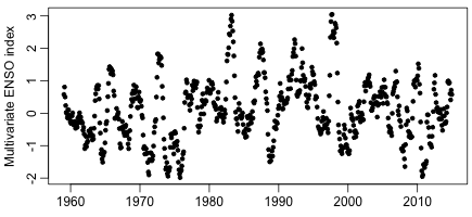
Note the peak index value in the El Nino year of 1998, which explains the relatively high temperature anomaly that year, and the drop for the La Nina years thereafter, which explains the low temperature anomalies in 1999 and 2000. The ENSO index shows no long-term trend, and is probably not related to any warming from CO2. Any trend based on these two low data points being near the beginning of some time period is therefore meaningless for any discussion of warming due to CO2.
The second hypothesis that Rajaratnam, et al. test is that the trend from 1998 to 2013 is at least as great as the trend from 1950 to 1997. Rejection of this hypothesis would support the claim of a `slowdown’ in global warming in recent years. They find estimates and standard errors (assuming independent residuals) for the slopes in separate regressions for 1950-1997 and for 1998-2013, which they then combine to obtain a p-value for this test. The (one-sided) p-value they obtain is 0.210. They therefore claim that there is no statistically signficant slowdown in the recent trend (since 1998).
I can’t replicate this result exactly, since I can’t find the exact data set they used, but on what seems to be a similar version of the GISS land-only data, I get a one-sided p-value of 0.173, which is similar to their result.
This result is meaningless, however. As one can see in the plot from their paper shown above, there was a `pause’ in the temperature from 1950 to 1970, which makes the slope from 1950 to 1997 be less than it was in the decades immediately before 1998. Applying the same procedure but with the first period being from 1970 to 1997, I obtain a one-sided p-value of 0.027, which one might regard as statistically significant evidence of a slowdown in the trend.
Rajaratnam, et al. are aware of the sensitivity of their p-value to the start date of the first period, since in a footnote on page 27 of the supplemental information for the paper they say
Changing the reference period from 1950-1997 to 1880-1997 only strengthens the null hypothesis of no difference between the hiatus period and before. This follows from the fact that the trend during 1880-1997 is more similar to the trend in the hiatus period. Thus the selected period 1950-1997 can be regarded as a lower bound on p-values for tests of difference in slopes.
Obviously, it is not actually a lower bound, since the 1970-1997 period produces a lower value.
Perhaps they chose to start in 1950 because that is often considered the year by which CO2 levels had increased enough that one might expect to see a warming effect. But clearly (at least in this data set) there was no warming until around 1970. One might consider that only in 1970 did warming caused by CO2 actually start, in which case comparing to the trend from 1950 to 1997 (let alone 1880 to 1997) is deceptive. Alternatively, one might think that CO2 did have an effect starting in 1950, in which case the lack of any increase in temperatures from 1950 to 1970 is an early instance of a `pause’, which strengthens, rather than weakens, the claim that the effect of CO2 is weak enough that other factors can sometimes counteract it, and at other times produce a misleadingly large warming trend that should not all be attributed to CO2.
Rajaratnam, et al. also test this second hypothesis another way, by seeing how many 16-year periods starting after 1950 and ending before 1998 have a trend at least as small as the trend over 1998-2013. The results are summarized in these plots, from their Fig. 2:
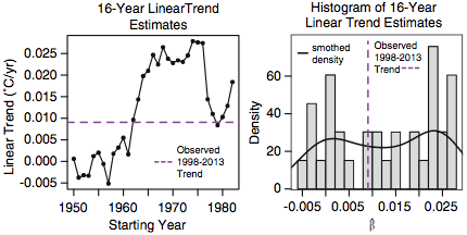
Since 13 of these 33 periods have lower trends than that of 1998-2013, they arrive at a p-value of 13/33=0.3939, and conclude that “the observed trend during 1998–2013 does not appear to be anomalous in a historical context”.
However, in the supplemental information (page 29) they say
Having said this, from Figure 2 there is a clear pattern in the distribution of 16 year linear trends over time: all 16 year trends starting at 1950 all the way to 1961 are lower than the trend during hiatus period, and all 16 year linear trends starting at years 1962 all the way to 1982 are higher than the trend during the hiatus period, with the exception of the 1979-1994 trend.
That is the end of their discussion. It does not appear to have occurred to them that they should use 1970 as the start date, which would produce a p-value of 1/13=0.077, which would be at least some weak evidence of a slowdown starting in 1998.
The third hypothesis tested by Rajaratnam, et al. is that the expected global temperature is the same at every year from 1998 on — that global warming has `stalled’. Of course, as they briefly discuss in the supplemental information (page 31), this is the same as their first hypothesis — that the global temperature has a linear trend with slope zero from 1998 on. Their discussion of this hypothesis, and why it isn’t really the same as the first, makes no sense to me, so I will say no more about it, except to note that strangely no numerical p-values are given for the tests of this hypothesis, only `reject’ or `retain’ descriptions.
The fourth, and final, hypothesis tested in the paper is that the distribution of year-to-year differences in temperature is the same after 1998 as during the period from 1950 to 1998. Here also, their discussion of their methods is confusing and incomplete, and again no numerical p-values are given. It is clear, however, that their methods suffer from the same unwise choice of 1950 as the start of the comparison period as was the case for their test of the second hypothesis. Their failure to find a difference in the distribution of differences in the 1998-2013 period compared to the 1950-1997 period is therefore meaningless.
Rajaratnam, Romano, Tsiang, and Diffenbaugh conclude by summarizing their results as follows:
Our rigorous statistical framework yields strong evidence against the presence of a global warming hiatus. Accounting for temporal dependence and selection effects rejects — with overwhelming evidence — the hypothesis that there has been no trend in global surface temperature over the past ≈15 years. This analysis also highlights the potential for improper statistical assumptions to yield improper scientific conclusions. Our statistical framework also clearly rejects the hypothesis that the trend in global surface temperature has been smaller over the recent ≈ 15 year period than over the prior period. Further, our framework also rejects the hypothesis that there has been no change in global mean surface temperature over the recent ≈15 years, and the hypothesis that the distribution of annual changes in global surface temperature has been different in the past ≈15 years than earlier in the record.
This is all wrong. There is not “overwhelming evidence” of a positive trend in the last 15 years of the data — they conclude that only because they used a flawed method. They do not actually reject “the hypothesis that the trend in global surface temperature has been smaller over the recent ≈ 15 year period than over the prior period”. Rather, after an incorrect choice of start year, they fail to reject the hypothesis that the trend in the recent period has been equal to or greater than the trend in the prior period. Failure to reject a null hypothesis is not the same as rejecting the alternative hypothesis, as we try to teach students in introductory statistics courses, sometimes unsuccessfully. Similarly, they do not actually reject “the hypothesis that the distribution of annual changes in global surface temperature has been different in the past ≈15 years than earlier in the record”. To anyone who understands the null hypothesis testing framework, it is obvious that one could not possibly reject such a hypothesis using any finite amount of data.
Those familiar with the scientific literature will realize that completely wrong papers are published regularly, even in peer-reviewed journals, and even when (as for this paper) many of the flaws ought to have been obvious to the reviewers. So perhaps there’s nothing too notable about the publication of this paper. On the other hand, one may wonder whether the stringency of the review process was affected by how congenial the paper’s conclusions were to the editor and reviewers. One may also wonder whether a paper reaching the opposite conclusion would have been touted as a great achievement by Stanford University. Certainly this paper should be seen as a reminder that the reverence for “peer-reviewed scientific studies” sometimes seen in popular expositions is unfounded.
The results above can be reproduced by first downloading the data using this shell script (which downloads other data too, that I use in other blog posts), or manually download from the URLs it lists if you don’t have wget. You then need to download my R script for the above analysis and this R source file (renaming them to .r from the .doc that wordpress requires), and then running the script in R as described in its opening comments (which will take quite a long time).

R-bloggers.com offers daily e-mail updates about R news and tutorials about learning R and many other topics. Click here if you're looking to post or find an R/data-science job.
Want to share your content on R-bloggers? click here if you have a blog, or here if you don't.