Checking (G)LM model assumptions in R
Want to share your content on R-bloggers? click here if you have a blog, or here if you don't.
(Generalized) Linear models make some strong assumptions concerning the data structure:
- Independance of each data points
- Correct distribution of the residuals
- Correct specification of the variance structure
- Linear relationship between the response and the linear predictor
For simple lm 2-4) means that the residuals should be normally distributed, the variance should be homogenous across the fitted values of the model and for each predictors separately, and the y’s should be linearly related to the predictors. In R checking these assumptions from a lm and glm object is fairly easy:
# testing model assumptions some simulated data
x <- runif(100, 0, 10)
y <- 1 + 2 * x + rnorm(100, 0, 1)
m <- lm(y ~ x)

par(mfrow = c(2, 2))
plot(m)
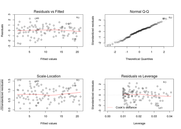
The top-left and top-right graphs are the most important one, the top-left graph check for the homogeneity of the variance and the linear relation, if you see no pattern in this graph (ie if this graph looks like stars in the sky), then your assumptions are met. The second graphs check for the normal distribution of the residuals, the points should fall on a line. The bottom-left graph is similar to the top-left one, the y-axis is changed, this time the residuals are square-root standardized (?rstandard) making it easier to see heterogeneity of the variance. The fourth one allow detecting points that have a too big impact on the regression coefficients and that should be removed. These graphs from simulated data are extremely nice, in applied statistics you will rarely see such nice graphs. Now many people new to linear modelling and used to strict p-values black and white decision are a bit lost not knowing when there model is fine and when it should be rejected. Below is an example of a model that is clearly wrong:
# some wrong model
y <- 1 + 2 * x + 1 * x^2 - 0.5 * x^3
m <- lm(y ~ x)

par(mfrow = c(2, 2))
plot(m)
These two example are easy, life is not. Real-life models are sometimes hard to assess, the bottom-line is you should always check your model assumptions and be truthfull. Reporting and interpreting models that do not meet their assumptions is bad science and close to falsification of the results. Now let’s see a real life example where it is tricky to decide if the model meet the assumptions or not, the dataset is in the ggplot2 library just look at ?mpg for a description:
# a real life dataset
library(ggplot2)
head(mpg)

##   manufacturer model displ year cyl      trans drv cty hwy fl   class
## 1         audi    a4   1.8 1999   4   auto(l5)   f  18  29  p compact
## 2         audi    a4   1.8 1999   4 manual(m5)   f  21  29  p compact
## 3         audi    a4   2.0 2008   4 manual(m6)   f  20  31  p compact
## 4         audi    a4   2.0 2008   4   auto(av)   f  21  30  p compact
## 5         audi    a4   2.8 1999   6   auto(l5)   f  16  26  p compact
## 6         audi    a4   2.8 1999   6 manual(m5)   f  18  26  p compact

m <- lm(cty ~ displ + factor(cyl), mpg)

par(mfrow = c(2, 2))
plot(m)
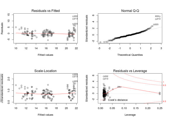
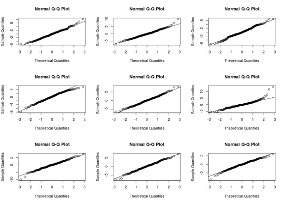
The residuals vs fitted graphs looks rather ok to me, there is some higher variance for high fitted values but this does not look too bad to me, however the qqplot (checking the normality of the residuals) looks pretty awfull with residuals on the right consistently going further away from the theoretical line. A nice way to see if the patterns are different from those expected under the model conditions is to derive new response values from the fitted coefficient and the residual variance, you can then derive 8 new plots and randomly allocate the real plot to a position, if you are able to find the real plot and if its pattern are different from the other then the model do not meet its assumptions:
# randomizing to see if the patterns are different from expected
modmat <- model.matrix(~displ + factor(cyl), data = mpg)
mus <- modmat %*% coef(m)
set.seed(1246)
# the position of the real plot in a 3x3 panel
s <- sample(1:9, size = 1)

par(mfrow = c(3, 3))
for (i in 1:9) {
    if (i == s) {
        # the real plot
        qqnorm(resid(m))
        qqline(resid(m))
    } else {
        # draw new y values from the fitted values with the residuals standard
        # deviation
        y <- rnorm(dim(mpg)[1], mus, sd(resid(m)))
        y <- y - fitted(m)
        qqnorm(y)
        qqline(y)
    }
}
Are you able to find in which panel the real plot is? I can it is on the second row, third column. The other qqplot do not look that different from the real one, there are however a few points that are definitevely away from what we expect under the model assumptions. A next step would be to look at these points and understand where these discrepency might come from (measurement error, special case…) We can also derive such plots for checking the first graph.
Resources on model checking:
- A nice response on stackoverflow: http://stats.stackexchange.com/questions/32285/assumptions-of-generalised-linear-model
- Zuur books: http://highstat.com/books.htm
- R tutorial: http://rtutorialseries.blogspot.de/2009/12/r-tutorial-series-graphic-analysis-of.html
- Type “Model checking linear regression r” in youtube and you will find some nice videos
Filed under: R and Stat Tagged: GLM, LM, R
R-bloggers.com offers daily e-mail updates about R news and tutorials about learning R and many other topics. Click here if you're looking to post or find an R/data-science job.
Want to share your content on R-bloggers? click here if you have a blog, or here if you don't.


