
Are students’ teaching evaluations influenced by instructors’ looks?
[This article was first published on eKonometrics, and kindly contributed to R-bloggers]. (You can report issue about the content on this page here)
Want to share your content on R-bloggers? click here if you have a blog, or here if you don't.
Are students’ teaching evaluations influenced by instructors’ looks? ggplot2 may help find the answer.Want to share your content on R-bloggers? click here if you have a blog, or here if you don't.
The recent release of RcmdrPlugin.KMggplot2 has made ggplot2 available to those who prefer GUI to the command line interface. With the new plugin for Rcmdr, one can simply point and click and within seconds can have an amazing publish-quality graph.
I test drove the plugin and liked it very much accept the glaring omission: it does not provide for faceting for scatter plots, which is a key strength of ggplot2. Let me illustrate this with an example.

Using Rcmdr and the ggplot2 plug-in I quickly draw the graph, which is presented to the right. The blue triangles represent women and the red dots represent male instructors. The Y-axis is a normalized measure of instructor’s looks and teaching evaluations are presented on the x-axis.
It appears from the scatter plot that good looks are correlated with higher teaching evaluations.
Now let’s add two more dimensions to account for the following. First, is there a difference in teaching evaluations for tenured instructors versus the non-tenured instructors. And second, do students evaluate instructors belonging to visible minorities groups any different from the rest.
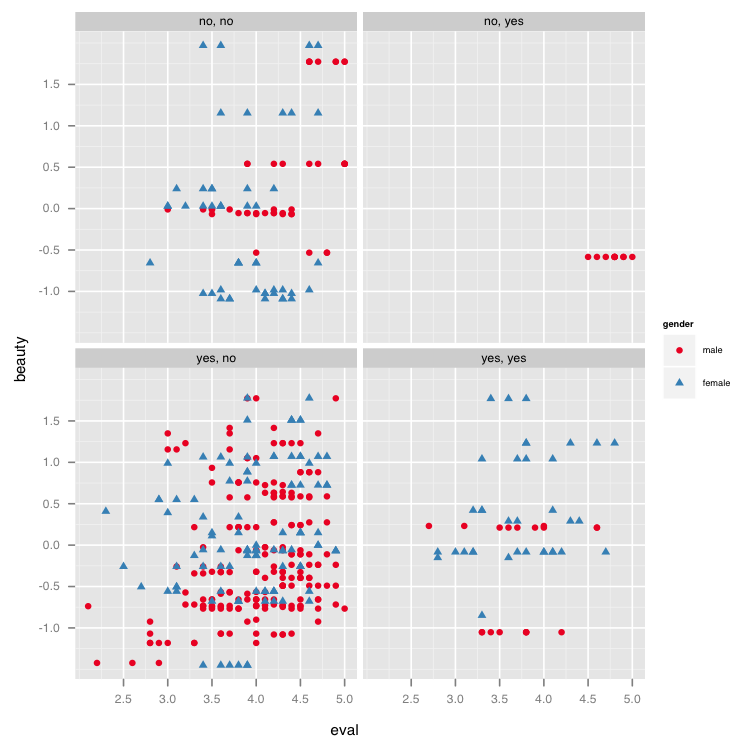
Using faceting in ggplot2, I draw the new graph that is presented to the right. Notice that the graph has four quadrants capturing the 2 x 2 possible combination for tenured (yes/no) and minority group (yes/no).
Let’s focus on the top right quadrant, which shows that non-tenured, visible minority faculty members happen to be exclusively males receiving low beauty evaluations, but higher teaching evaluations.
The bottom right quadrant however shows that most tenured visible minority instructors are females who receive a higher teaching and beauty evaluation.
The second graph was produced by tweaking the command generated by the plug-in to illustrate that with faceting one can quickly plot multi-dimensional graphs. I hope that the next version of the plug-in incorporates faceting for scatter plots.
Below is the code used to generate the second graph.
data(TeachingRatings, package=”AER”)
tr<-TeachingRatings
.df <- data.frame(x = tr$eval,y = tr$beauty,z = tr$gender, z1=tr$tenure, z2=tr$minority)
.plot1 <- ggplot(data = .df, aes(x = x, y = y, colour = z, shape = z)) + geom_point() +
scale_colour_brewer(palette=”Set1″) +facet_wrap(z1~z2) + xlab(“eval”) + ylab(“beauty”) + labs(colour = “gender”, shape = “gender”) + kmg2_theme_gray(10, “sans”) + opts(legend.position =
“right”)
print(.plot1)
rm(.df, .plot1)
To leave a comment for the author, please follow the link and comment on their blog: eKonometrics.
R-bloggers.com offers daily e-mail updates about R news and tutorials about learning R and many other topics. Click here if you're looking to post or find an R/data-science job.
Want to share your content on R-bloggers? click here if you have a blog, or here if you don't.