
WHO Tuberculosis Data & ggplot2
Want to share your content on R-bloggers? click here if you have a blog, or here if you don't.
So it has been a while since my previous post on some data taken from the UNHCR database. This post we’ll bring it back to the topic of infectious diseases (check out my other posts on the SIR model and MRSA typing). For this post, as similar to previous ones, I give a guide through the process I took to organize the data, a nifty function I created to search the documentation and a visualization of the data using ggplot2.
What is Tuberculosis?
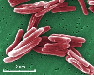
Tuberculosis (TB) is a nasty disease caused by the bacterium Mycobacterium tuberculosis. It was first described by Hippocrates and has a history concurrent with human civilization. Individuals infected with TB usually do not develop active disease but if they develop active TB, they can on average infect 8-10 people. Most of the time when we hear of TB, we think of the infection within the lungs, but I learned during my time volunteering in a medical clinic in Peru that TB can manifest in other sites of the body (extra-pulmonary TB). This bacterium has infected roughly a third of the world’s population and is a top 10 cause of death around the globe.
There are two major modern concerns with TB…
- TB and HIV co-infection, where there is a disproportionate mortality rate by TB with HIV infected individuals. HIV infects CD4+ T-cells, which are essential for an appropriate immune response to combat TB. This relationship has been reported in patients.
- Multi-drug resistant TB (MDR-TB) is a growing public health concern that threatens the control of TB infection throughout the world. There have been reports of extensive-drug resistant TB (XDR-TB) which is resistant to the standard treatment of isoniazid and rifampin alongside any fluoroquinolone and at least one secondary-treatment drug. Fewer treatment options put patients under rigorous and strenuous regimens and present a risk of transmission to others.
Data Retrieval
The data I used for this post is taken from the World Health Organization from this link to the TB data. Specifically I used the data dictionary and TB burden estimates. When you click these links, they generate a comma-delimited file (.csv) and date-stamp the file. I downloaded these files back in February 2016. Just remember where you save these in your local directory so you can read them into R for the near future.
Getting Started
The code I use for my posts can be found on my GitHub account, open for free use and adaptation. I’m always open to comments and suggestions on how to improve my code or even a completely different method to reach the same goal. Optimization of R programming is something I am working towards bit by bit.
After setting up your working directory, read your comma-delimited files using the read.csv() function. The WHO files are conveniently formatted so there is no need for elaborate arguments for headers, field separators or assigning missing values.
TB.burden <- read.csv("TB_burden_countries_2016-02-18.csv") #TB burden dataset
TB.dic <- read.csv("TB_data_dictionary_2016-02-18.csv") #TB documentation dictionary
Customized Search Function
While completing an R assignment for one of my classes, I ran into the readline() function which allows for some interactive functionality within R. The reason I created this interactive custom search function is because of the fact that the column variables in the TB burden .csv file are not completely straightforward and it’s annoying to manually search through the file itself in Microsoft Excel. So instead of memorizing all of them (only to forget after I write 10 lines of code), I decided to create this function whenever I start to write code for a new plot and need to remind myself the exact description of the variable I am working with…
TB.search <- function (x){ #
look <- names(x) #assign the names/column names of the subsetted data
message("Matching variable names found in the documentation files")
TB.d <- as.character(TB.dic[,4]) # conversion to character to have "clean" output
out <- look[look %in% TB.dic[,1]] #assignment of vector: which names of the selected subset are in the documentation file
print(out) #check which variable names from dictionary match the input
message("Above includes all names for variable names found in the documentation files") #message prompt for output

z <- readline("Search Variable Definition (CASE-SENSITIVE): ") #interactive read-in of variable name
if (z %in% out){ # NEED TO MAKE THE CONDITION TO SEPARATE integer(0) from real integer values
print(TB.d[grep(paste0("^(",z,"){1}?"),TB.dic[,1])]) #print the definition found in TB.d
}else{

repeat{ #repeat the line below for readline() if exact match of doesn't exist
y<-readline("Please re-input (press 'ESC' to exit search): ") #second prompt
if (y %in% out) break # the condition that ends the repeat, that the input matches a name in the documentation
}
print(TB.d[grep(paste0("^",y,"{1}?"),TB.dic[,1])]) #print the definition found in documentation file TB.dic
}
}
I’m only going to highlight a couple things in the code above. I converted the definitions found in the documentation file because the original data type was a factor. This was a problem with the print output because it would show all the unnecessary information on the number of factors and values of the factors I had no interest in. Secondly I ended up using a repeat in my if statement to prompt the user if they incorrectly typed in a variable name in the console. This link provides some helpful information on the repeat loop. Other then that, I used regular expression to specify the search to match what was actually in the documentation file.
Cleaning Data
As with all data, it doesn’t come in the form that you always want it in. Luckily the WHO TB data wasn’t in bad shape and I just converted all integer valued columns into numeric types using a simple loop. (Comment if you know how to do this using the apply family!)
for (k in 1:length(names(TB.burden))){ #convert all the rows with type 'integer' to 'numeric
if (is.integer(TB.burden[,k])){
TB.burden[,k] <- as.numeric(TB.burden[,k])
}
}
After that, I used the mapvalues function from the plyr package to change the levels in the country variable. I used this because the basic functions in R require me to specify all the levels in the factor and using 219 country names seemed tedious. Quite simply, I just listed the old names I wanted to change and created a respective character vector of the the new country names.
library(plyr) TB.burden$country <- (mapvalues((TB.burden$country), from = c( "Bolivia (Plurinational State of)", "Bonaire, Saint Eustatius and Saba", "China, Hong Kong SAR", "China, Macao SAR", "Democratic People's Republic of Korea", "Democratic Republic of the Congo", "Iran (Islamic Republic of)", "Lao People's Democratic Republic", "Micronesia (Federated States of)", "Republic of Korea", "Saint Vincent and the Grenadines", "Sint Maarten (Dutch part)", "The Former Yugoslav Republic of Macedonia", "United Kingdom of Great Britain and Northern Ireland", "United Republic of Tanzania", "Venezuela (Bolivarian Republic of)", "West Bank and Gaza Strip") , to = c( "Bolivia", "Caribbean Netherlands", "Hong Kong", "Macao", "North Korea", "DRC", "Iran", "Laos", "Micronesia", "South Korea", "St. Vincent &amp;amp; Grenadines", "Sint Maarten", "Former Yugoslav (Macedonia)", "UK &amp;amp; Northern Ireland", "Tanzania", "Venezuela", "West Bank and Gaza") ))
I threw in some random subsetting into the code to pull out values for specific questions (ie. what was the estimated prevalence per 100,000 people of TB in Peru during 2014). You can see it in the actual code in the GitHub repository.
Visualizing Data
I was interested in what estimated rates of TB were by WHO region, so I ran a simple loop to assign new variable names to each region (this is not the best practice IMO but it does the trick).
for (i in levels(TB.burden$g_whoregion)){ #selection of the WHO regions (AFR, AMR, EMR, EUR, SEA, WPR)
nam <- paste0(i,"_whoregion") #creation of the name based on acronyms from levels
assign(nam, subset(TB.burden,TB.burden$g_whoregion %in% paste(i))) #assigning each level a subset based on the region
}
ls() #just to show what variables are stored...
#look for AFR_whoregion, AMR_whoregion, EMR_whoregion, EUR_whoregion, SEA_whoregion, WPR_whoregion
Now we set up the themes we want to use for ggplot2. I set the year scale for the legends, customized the text on the axes and assigned dark_t to be a dark, black-grey background and light_t as a simple, white-grey background theme.
ctext <- theme(axis.ticks = element_blank(),
plot.title=element_text(family="Verdana"),
axis.text.x=element_text(size=9,family="Verdana"), #http://www.cookbook-r.com/Graphs/Fonts/#table-of-fonts
axis.title.x=element_text(size=10)
axis.text.y=element_text(size=7.5,family="Verdana"),
axis.title.y-element_text(size=10,family="Verdana"),
legend.title=element_text(size=9,family="Verdana",vjust=0.5), #specify legend title color
legend.text=element_text(size=7,family="Verdana",face="italic"),
)

dark_t <- theme_minimal()+
theme(
plot.background = element_rect(fill="#191919"), #plot background
panel.border = element_blank(), #removes border
panel.background = element_rect(fill = "#000000",colour="#000000",size=2), #panel background and border
panel.grid = element_line(colour = "#333131"), #panel grid colours
panel.grid.major = element_line(colour = "#333131"), #panel major grid color
panel.grid.minor = element_blank(), #removes minor grid

plot.title=element_text(size=16, face="bold",family="Verdana",hjust=0,vjust=1,color="#E0E0E0"), #set the plot title
plot.subtitle=element_text(size=12,face=c("bold","italic"),family="Verdana",hjust=0.01,color="#E0E0E0"), #set subtitle

axis.text.x = element_text(size=9,angle = 0, hjust = 0.5,vjust=1,margin=margin(r=10),colour="#E0E0E0"), # axis ticks
axis.title.x = element_text(size=11,angle = 0,colour="#E0E0E0"), #axis labels from labs() below
axis.text.y = element_text(size=9,margin = margin(r=5),colour="#E0E0E0"), #y-axis labels

legend.title=element_text(size=11,face="bold",vjust=0.5,colour="#E0E0E0"), #specify legend title color
legend.background = element_rect(fill="#262626",colour="#383838", size=.5), #legend background and cborder
legend.text=element_text(colour="#E0E0E0")) + #legend text colour
# plot.margin=unit(c(t=1,r=1.2,b=1.2,l=1),"cm")) #custom margins
ctext

light_t <- theme(legend.background = element_rect(fill="grey95",colour="grey70", size=.5),
plot.title=element_text(size=16, face="bold",family="Verdana",hjust=0,vjust=1), #set the plot title
plot.subtitle=element_text(size=12,face=c("bold","italic"),family="Verdana",hjust=0.01), #set subtitle

panel.grid.minor = element_blank()) + #removes minor grid)
ctext

# specify scale for year variable
year.scale <- c(1990,1995,2000,2005,2010,2014) # used for breaks below
For the next plots, I’ll only be focusing on the WHO Region of Africa. Two notes on the code below for the plots: 1) I used the forcats package to reverse the order of the countries on the y-axis. This package is useful when using ggplot2 for categorical data. 2) For the legend scales, I used the comma() function in the scales package to include the comma’s for every thousand. The following code displays the estimated prevalence, mortality and incidence (per 100,000 people) for cases from each country in the WHO Africa Region.
#PREVALENCE per 100k
library(forcats) #https://blog.rstudio.org/2016/11/14/ggplot2-2-2-0/
pAFR <-ggplot(AFR_whoregion,aes(y=fct_rev(country),x=e_prev_100k)) + # prevalence (100k)
labs(title="WHO | Tuberculosis Data",
subtitle="Africa Region", x="Estimated Prevalence (per 100,000)",y="",colour="#E0E0E0") +
geom_point(shape=20,aes(colour=year,fill=year),alpha=0.6,size=3) +
scale_y_discrete(expand=c(0.002, 1))+
scale_x_continuous(limits=c(0,1500),labels=scales::comma)+
scale_fill_gradient(guide_legend(title="Year"),breaks=year.scale,low="#F9FA00",high="#8C00E6") + #assigns colours to fill in aes
scale_colour_gradient(guide_legend(title="Year"),breaks=year.scale,low="#F9FA00",high="#8C00E6") + #assigns colours to colour in aes
dark_t

#MORTALITY (including HIV) per 100k e_inc_tbhiv_100k
mAFR <- ggplot(AFR_whoregion,aes(y=fct_rev(country),x= e_mort_exc_tbhiv_100k)) + # Mortality exclude HIV (100k)
labs(title="WHO | Tuberculosis Data",
subtitle="Africa Region",x="Estimated Mortality excluding HIV (per 100,000)",y="",colour="#E0E0E0")+
geom_point(shape=20,aes(colour=year,fill=year),alpha=0.6,size=3) +
scale_y_discrete(expand=c(0.002, 1)) +
#scale_x_continuous(limits=c(0,250),labels=scales::comma) +
scale_fill_gradient(guide_legend(title="Year"),breaks=year.scale,low="#F9FA00",high="#8C00E6") + #assigns colours to fill in aes
scale_colour_gradient(guide_legend(title="Year"),breaks=year.scale,low="#F9FA00",high="#8C00E6") + #assigns colours to colour in aes
dark_t

#INCIDENCE per 100k
iAFR <- ggplot(AFR_whoregion,aes(y=fct_rev(country),x= e_inc_100k)) + # Mortality exclude HIV (100k)
labs(title="WHO | Tuberculosis Data",
subtitle="Africa Region",x="Estimated Incidence (per 100,000)",y="",colour="#E0E0E0")+
geom_point(shape=20,aes(colour=year,fill=year),alpha=0.6,size=3) +
scale_y_discrete(expand=c(0.002, 1)) +
scale_x_continuous(limits=c(0,1500),labels=scales::comma) +
scale_fill_gradient(guide_legend(title="Year"),breaks=year.scale,low="#F9FA00",high="#8C00E6") + #assigns colours to fill in aes
scale_colour_gradient(guide_legend(title="Year"),breaks=year.scale,low="#F9FA00",high="#8C00E6") + #assigns colours to colour in aes
dark_t
Now the plots in the order of estimated prevalence, incidence and mortality… (you can click them to open the full images)
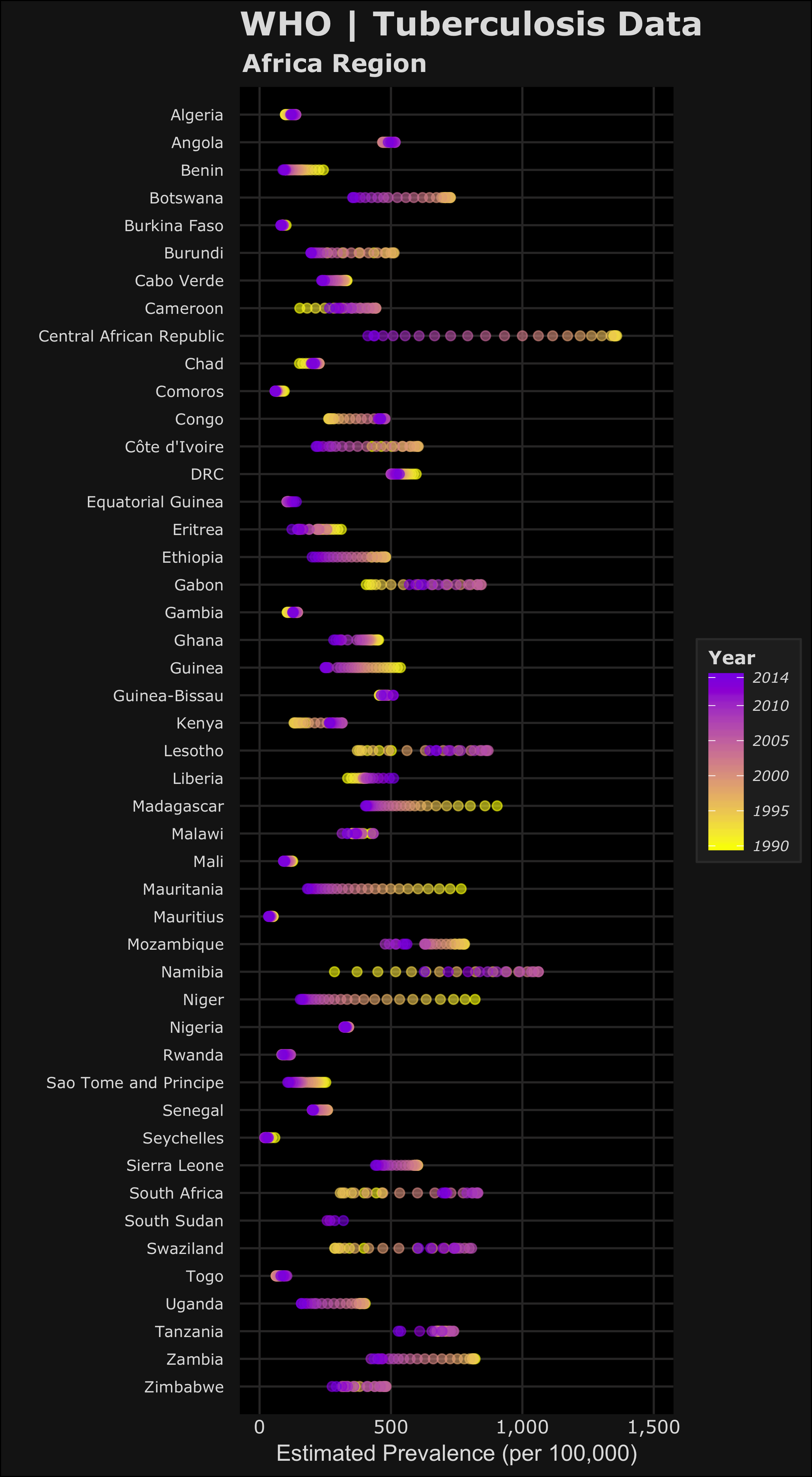


In the plots, the color yellow refers to a year closer to 1990 where purple is more recent towards 2014. Based on this we can see the relative changes over time on the estimated TB prevalence, incidence and mortality. Let’s focus on the prevalence and incidence plots – we can see most of the countries have lower estimated TB prevalences over time. The most drastic decreases can be seen in Central African Republic and Niger. We can also see that Lesotho, South Africa and Swaziland have increased estimated TB prevalence during the 1990-2014 time period. Namibia is an interesting one because it seems that the estimated TB prevalence increased then decreased roughly half way. To accurately visualize this trend in Namibia, we would need a choose a different method to better visualize this (a simple line plot).
Remember these plots are just a simple qualitative way to compare trends but doesn’t capture the full picture. I’ve learned that your method of visualizing data depends on which narrative of the data you want to highlight. These graphics could be used to see which countries have had the largest changes over time or as an example, identify countries who have improved (or failed) their national TB control, using estimated TB incidence as a proxy. Are TB control or prevention systems working in these countries? Based on allocated resources or programs, are the changes in line with the goals to reduce the global burden of TB.
You can tinker with the code to select which countries or regions you want to compare. I only displayed the plots for the WHO Africa Region but the other regions also looked interesting. You can adapt this code for the other WHO regions to see what the trends look like.
Closing thoughts: I hope this post was informative and you learned something about TB around the world. Despite this disease being preventable and curable, it remains a real threat for many people around the world. There are groups fighting TB around the world, just one close to Boston is the endTB partnership. Check out their website and see the groups (PIH, MSF) involved in the work of combating MDR-TB.
As always I’m open to comments and suggestions on improving my code and graphics. If anyone has questions related to the code – send me a message, I’ll be more than happy to help. I’ve learned so much from online resources and communities like StackOverflow and would always want to help those new to using R.

R-bloggers.com offers daily e-mail updates about R news and tutorials about learning R and many other topics. Click here if you're looking to post or find an R/data-science job.
Want to share your content on R-bloggers? click here if you have a blog, or here if you don't.