
Steps to Perform Survival Analysis in R
[This article was first published on R-posts.com, and kindly contributed to R-bloggers]. (You can report issue about the content on this page here)
Want to share your content on R-bloggers? click here if you have a blog, or here if you don't.
Want to share your content on R-bloggers? click here if you have a blog, or here if you don't.
Another way of analysis?
When there are so many tools and techniques of prediction modelling, why do we have another field known as survival analysis? As one of the most popular branch of statistics, Survival analysis is a way of prediction at various points in time. This is to say, while other prediction models make predictions of whether an event will occur, survival analysis predicts whether the event will occur at a specified time. Thus, it requires a time component for prediction and correspondingly, predicts the time when an event will happen. This helps one in understanding the expected duration of time when events occur and provide much more useful information. One can think of natural areas of application of survival analysis which include biological sciences where one can predict the time for bacteria or other cellular organisms to multiple to a particular size or expected time of decay of atoms. Some interesting applications include prediction of the expected time when a machine will break down and maintenance will be requiredHow hard does it get..
It is not easy to apply the concepts of survival analysis right off the bat. One needs to understand the ways it can be used first. This includes Kaplan-Meier Curves, creating the survival function through tools such as survival trees or survival forests and log-rank test. Let’s go through each of them one by one in R. We will use the survival package in R as a starting example. The survival package has the surv() function that is the center of survival analysis.# install.packages("survival")
# Loading the package
library("survival")
The package contains a sample dataset for demonstration purposes. The dataset is pbc which contains a 10 year study of 424 patients having Primary Biliary Cirrhosis (pbc) when treated in Mayo clinic. A point to note here from the dataset description is that out of 424 patients, 312 participated in the trial of drug D-penicillamine and the rest 112 consented to have their basic measurements recorded and followed for survival but did not participate in the trial. 6 of these 112 cases were lost. We are particularly interested in ‘time’ and ‘status’ features in the dataset. Time represents the number of days after registration and final status (which can be censored, liver transplant or dead). Since it is survival, we will consider the status as dead or not-dead (transplant or censored). Further details about the dataset can be read from the command:
#Dataset description ?pbcWe start with a direct application of the Surv() function and pass it to the survfit() function. The Surv() function will take the time and status parameters and create a survival object out of it. The survfit() function takes a survival object (the one which Surv() produces) and creates the survival curves.
#Fitting the survival model
survival_func=survfit(Surv(pbc$time,pbc$status == 2)~1)
survival_func
Call: survfit(formula = Surv(pbc$time, pbc$status == 2) ~ 1)
n events median 0.95LCL 0.95UCL
418 161 3395 3090 3853
The function gives us the number of values, the number of positives in status, the median time and 95% confidence interval values. The model can also be plotted.
#Plot the survival model plot(survival_func)

As expected, the plot shows us the decreasing probabilities for survival as time passes. The dashed lines are the upper and lower confidence intervals. In the survfit() function here, we passed the formula as ~ 1 which indicates that we are asking the function to fit the model solely on the basis of survival object and thus have an intercept. The output along with the confidence intervals are actually Kaplan-Meier estimates. This estimate is prominent in medical research survival analysis. The Kaplan – Meier estimates are based on the number of patients (each patient as a row of data) from the total number who survive for a certain time after treatment. (which is the event). We can represent the Kaplan – Meier function by the formula:
Ŝ(t)=∏(1-di/ni) for all i where ti≤t Here, di the number of events and ni is the total number of people at risk at time ti
What to make of the graph?
Unlike other machine learning techniques where one uses test samples and makes predictions over them, the survival analysis curve is a self – explanatory curve. From the curve, we see that the possibility of surviving about 1000 days after treatment is roughly 0.8 or 80%. We can similarly define probability of survival for different number of days after treatment. At the same time, we also have the confidence interval ranges which show the margin of expected error. For example, in case of surviving 1000 days example, the upper confidence interval reaches about 0.85 or 85% and goes down to about 0.75 or 75%. Post the data range, which is 10 years or about 3500 days, the probability calculations are very erratic and vague and should not be taken up. For example, if one wants to know the probability of surviving 4500 days after treatment, then though the Kaplan – Meier graph above shows a range between 0.25 to 0.55 which is itself a large value to accommodate the lack of data, the data is still not sufficient enough and a better data should be used to make such an estimate.Alternative models: Cox Proportional Hazard model
The survival package also contains a cox proportional hazard function coxph() and use other features in the data to make a better survival model. Though the data has untreated missing values, I am skipping the data processing and fitting the model directly. In practice, however, one needs to study the data and look at ways to process the data appropriately so that the best possible models are fitted. As the intention of this article is to get the readers acquainted with the function rather than processing, applying the function is the shortcut step which I am taking.# Fit Cox Model
Cox_model = coxph(Surv(pbc$time,pbc$status==2) ~.,data=pbc)
summary(Cox_model)
Call:
coxph(formula = Surv(pbc$time, pbc$status == 2) ~ ., data = pbc)
n= 276, number of events= 111
(142 observations deleted due to missingness)
coef exp(coef) se(coef) z Pr(>|z|)
id -2.729e-03 9.973e-01 1.462e-03 -1.866 0.06203 .
trt -1.116e-01 8.944e-01 2.156e-01 -0.518 0.60476
age 3.191e-02 1.032e+00 1.200e-02 2.659 0.00784 **
sexf -3.822e-01 6.824e-01 3.074e-01 -1.243 0.21378
ascites 6.321e-02 1.065e+00 3.874e-01 0.163 0.87038
hepato 6.257e-02 1.065e+00 2.521e-01 0.248 0.80397
spiders 7.594e-02 1.079e+00 2.448e-01 0.310 0.75635
edema 8.860e-01 2.425e+00 4.078e-01 2.173 0.02980 *
bili 8.038e-02 1.084e+00 2.539e-02 3.166 0.00155 **
chol 5.151e-04 1.001e+00 4.409e-04 1.168 0.24272
albumin -8.511e-01 4.270e-01 3.114e-01 -2.733 0.00627 **
copper 2.612e-03 1.003e+00 1.148e-03 2.275 0.02290 *
alk.phos -2.623e-05 1.000e+00 4.206e-05 -0.624 0.53288
ast 4.239e-03 1.004e+00 1.941e-03 2.184 0.02894 *
trig -1.228e-03 9.988e-01 1.334e-03 -0.920 0.35741
platelet 7.272e-04 1.001e+00 1.177e-03 0.618 0.53660
protime 1.895e-01 1.209e+00 1.128e-01 1.680 0.09289 .
stage 4.468e-01 1.563e+00 1.784e-01 2.504 0.01226 *
---
Signif. codes: 0 ‘***’ 0.001 ‘**’ 0.01 ‘*’ 0.05 ‘.’ 0.1 ‘ ’ 1
exp(coef) exp(-coef) lower .95 upper .95
id 0.9973 1.0027 0.9944 1.000
trt 0.8944 1.1181 0.5862 1.365
age 1.0324 0.9686 1.0084 1.057
sexf 0.6824 1.4655 0.3736 1.246
ascites 1.0653 0.9387 0.4985 2.276
hepato 1.0646 0.9393 0.6495 1.745
spiders 1.0789 0.9269 0.6678 1.743
edema 2.4253 0.4123 1.0907 5.393
bili 1.0837 0.9228 1.0311 1.139
chol 1.0005 0.9995 0.9997 1.001
albumin 0.4270 2.3422 0.2319 0.786
copper 1.0026 0.9974 1.0004 1.005
alk.phos 1.0000 1.0000 0.9999 1.000
ast 1.0042 0.9958 1.0004 1.008
trig 0.9988 1.0012 0.9962 1.001
platelet 1.0007 0.9993 0.9984 1.003
protime 1.2086 0.8274 0.9690 1.508
stage 1.5634 0.6397 1.1020 2.218
Concordance= 0.849 (se = 0.031 )
Rsquare= 0.462 (max possible= 0.981 )
Likelihood ratio test= 171.3 on 18 df, p=0
Wald test = 172.5 on 18 df, p=0
Score (logrank) test = 286.1 on 18 df, p=0
The Cox model output is similar to how a linear regression output comes up. The R2 is only 46% which is not high and we don’t have any feature which is highly significant. The top important features appear to be age, bilirubin (bili) and albumin. Let’s see how the plot looks like.
#Create a survival curve from the cox model Cox_curve <- survfit(Cox_model) plot(Cox_curve)

With more data, we get a different plot and this one is more volatile. Compared to the Kaplan – Meier curve, the cox-plot curve is higher for the initial values and lower for the higher values. The major reason for this difference is the inclusion of variables in cox-model. The plots are made by similar functions and can be interpreted the same way as the Kaplan – Meier curve.
Going traditional : Using survival forests
Random forests can also be used for survival analysis and the ranger package in R provides the functionality. However, the ranger function cannot handle the missing values so I will use a smaller data with all rows having NA values dropped. This will reduce my data to only 276 observations.#Using the Ranger package for survival analysis
Install.packages("ranger")
library(ranger)
#Drop rows with NA values
pbc_nadrop=pbc[complete.cases(pbc), ]
#Fitting the random forest
ranger_model <- ranger(Surv(pbc_nadrop$time,pbc_nadrop$status==2) ~.,data=pbc_nadrop,num.trees = 500, importance = "permutation",seed = 1)
#Plot the death times
plot(ranger_model$unique.death.times,ranger_model$survival[1,], type = "l", ylim = c(0,1),)
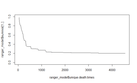
Let’s look at the variable importance plot which the random forest model calculates.
#Get the variable importance data.frame(sort(ranger_model$variable.importance,decreasing = TRUE)) sort.ranger_model.variable.importance..decreasing...TRUE. bili 0.0762338981 copper 0.0202733989 albumin 0.0165070226 age 0.0130134413 edema 0.0122113704 ascites 0.0115315711 chol 0.0092889960 protime 0.0060215073 id 0.0055867915 ast 0.0049932803 stage 0.0030225398 hepato 0.0029290675 trig 0.0028869184 platelet 0.0012958105 sex 0.0010639806 spiders 0.0005210531 alk.phos 0.0003291581 trt -0.0002020952These numbers may be different for different runs. In my example, we see that bilirubin is the most important feature.
Lessons learned: Conclusion
Though the input data for Survival package’s Kaplan – Meier estimate, Cox Model and ranger model are all different, we will compare the methodologies by plotting them on the same graph using ggplot.#Comparing models
library(ggplot2)
#Kaplan-Meier curve dataframe
#Add a row of model name
km <- rep("Kaplan Meier", length(survival_func$time))
#Create a dataframe
km_df <- data.frame(survival_func$time,survival_func$surv,km)
#Rename the columns so they are same for all dataframes
names(km_df) <- c("Time","Surv","Model")
#Cox model curve dataframe
#Add a row of model name
cox <- rep("Cox",length(Cox_curve$time))
#Create a dataframe
cox_df <- data.frame(Cox_curve$time,Cox_curve$surv,cox)
#Rename the columns so they are same for all dataframes
names(cox_df) <- c("Time","Surv","Model")
#Dataframe for ranger
#Add a row of model name
rf <- rep("Survival Forest",length(ranger_model$unique.death.times))
#Create a dataframe
rf_df <- data.frame(ranger_model$unique.death.times,sapply(data.frame(ranger_model$survival),mean),rf)
#Rename the columns so they are same for all dataframes
names(rf_df) <- c("Time","Surv","Model")
#Combine the results
plot_combo <- rbind(km_df,cox_df,rf_df)
#Make a ggplot
plot_gg <- ggplot(plot_combo, aes(x = Time, y = Surv, color = Model))
plot_gg + geom_line() + ggtitle("Comparison of Survival Curves")

We see here that the Cox model is the most volatile with the most data and features. It is higher for lower values and drops down sharply when the time increases. The survival forest is of the lowest range and resembles Kaplan-Meier curve. The difference might be because of Survival forest having less rows. The essence of the plots is that there can be different approaches to the same concept of survival analysis and one may choose the technique based on one’s comfort and situation. A better data with processed data points and treated missing values might fetch us a better R2 and more stable curves. At the same time, they will help better in finding time to event cases such as knowing the time when a promotion’s effect dies down, knowing when tumors will develop and become significant and lots of other applications with a significant chunk of them being from medical science. Survival, as the name suggests, relates to surviving objects and is thus related to event occurrence in a completely different way than machine learning. It is important to know this technique to know more and more ways data can help us in solving problems, with time involved in this particular case. Hope this article serves the purpose of giving a glimpse of survival analysis and the feature rich packages available in R.
Here is the complete code for the article:
# install.packages("survival")
# Loading the package
library("survival")
#Dataset description
?pbc
#Fitting the survival model
survival_func=survfit(Surv(pbc$time,pbc$status == 2)~1)
survival_func
#Plot the survival model
plot(survival_func)
# Fit Cox Model
Cox_model = coxph(Surv(pbc$time,pbc$status==2) ~.,data=pbc)
summary(Cox_model)
#Create a survival curve from the cox model
Cox_curve <- survfit(Cox_model)
plot(Cox_curve)
#Using the Ranger package for survival analysis
#install.packages("ranger")
library(ranger)
#Drop rows with NA values
pbc_nadrop=pbc[complete.cases(pbc), ]
#Fitting the random forest
ranger_model <- ranger(Surv(pbc_nadrop$time,pbc_nadrop$status==2) ~.,data=pbc_nadrop,num.trees = 500, importance = "permutation",seed = 1)
#Plot the death times
plot(ranger_model$unique.death.times,ranger_model$survival[1,], type = "l", ylim = c(0,1),)
#Get the variable importance
data.frame(sort(ranger_model$variable.importance,decreasing = TRUE))
#Comparing models
library(ggplot2)

#Kaplan-Meier curve dataframe
#Add a row of model name
km <- rep("Kaplan Meier", length(survival_func$time))
#Create a dataframe
km_df <- data.frame(survival_func$time,survival_func$surv,km)
#Rename the columns so they are same for all dataframes
names(km_df) <- c("Time","Surv","Model")

#Cox model curve dataframe
#Add a row of model name
cox <- rep("Cox",length(Cox_curve$time))
#Create a dataframe
cox_df <- data.frame(Cox_curve$time,Cox_curve$surv,cox)
#Rename the columns so they are same for all dataframes
names(cox_df) <- c("Time","Surv","Model")

#Dataframe for ranger
#Add a row of model name
rf <- rep("Survival Forest",length(ranger_model$unique.death.times))
#Create a dataframe
rf_df <- data.frame(ranger_model$unique.death.times,sapply(data.frame(ranger_model$survival),mean),rf)
#Rename the columns so they are same for all dataframes
names(rf_df) <- c("Time","Surv","Model")

#Combine the results
plot_combo <- rbind(km_df,cox_df,rf_df)

#Make a ggplot
plot_gg <- ggplot(plot_combo, aes(x = Time, y = Surv, color = Model))
plot_gg + geom_line() + ggtitle("Comparison of Survival Curves")
Author Bio:
This article was contributed by Perceptive Analytics. Madhur Modi, Chaitanya Sagar, Vishnu Reddy and Saneesh Veetil contributed to this article.Perceptive Analytics provides data analytics, data visualization, business intelligence and reporting services to e-commerce, retail, healthcare and pharmaceutical industries. Our client roster includes Fortune 500 and NYSE listed companies in the USA and India.
To leave a comment for the author, please follow the link and comment on their blog: R-posts.com.
R-bloggers.com offers daily e-mail updates about R news and tutorials about learning R and many other topics. Click here if you're looking to post or find an R/data-science job.
Want to share your content on R-bloggers? click here if you have a blog, or here if you don't.