
Probability of winning a best-of-7-series (part 2)
Want to share your content on R-bloggers? click here if you have a blog, or here if you don't.
In this previous post, I explored the probability that a team wins a best-of-n series, given that its win probability for any one game is some constant 

To be as general as possible, instead of giving a team just one parameter 


The random variable denoting the number of wins in a best-of-7 series will depend on whether the team starts at home or not. (We will assume our team will alternate being playing at home and playing away.) If starting at home, the number of wins has distribution  + \text{Binom}(3, p_A)")
 + \text{Binom}(4, p_A)")
We can modify the sim_fn function from the previous post easily so that it now takes in more parameters (home_p, away_p, and start indicating whether the first game is at “home” or “away”):
sim_fn <- function(simN, n, home_p, away_p, start) {
    if (n %% 2 == 0) {
        stop("n should be an odd number")
    }

    if (start == "home") {
        more_p <- home_p
        less_p <- away_p
    } else {
        more_p <- away_p
        less_p <- home_p } mean(rbinom(simN, (n+1)/2, more_p) + rbinom(simN, (n-1)/2, less_p) > n / 2)
}
The following code sets up a grid of home_p,away_p and start values, then runs 50,000 simulation runs for each combination of those values:
home_p <- seq(0, 1, length.out = 51)
away_p <- seq(0, 1, length.out = 51)
df <- expand.grid(home_p = home_p, away_p = away_p, start = c("home", "away"),
                  stringsAsFactors = FALSE)

set.seed(111)
simN <- 50000
n <- 7
df$win_prob <- apply(df, 1, function(x) sim_fn(simN, n, as.numeric(x[1]),
                                               as.numeric(x[2]), x[3]))
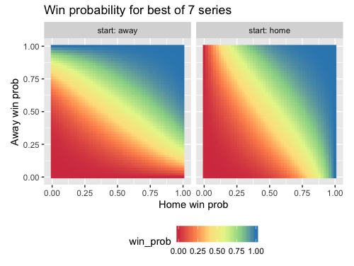
How can we plot our results? For each combination of (home_p, away_p, start) values, we want to plot the series win probability. A decent 2D representation would be a heatmap:
library(tidyverse)

ggplot(df, aes(x = home_p, y = away_p)) +
    geom_raster(aes(fill = win_prob)) +
    labs(title = paste("Win probability for best of", n, "series"),
         x = "Home win prob", y = "Away win prob") +
    scale_fill_distiller(palette = "Spectral", direction = 1) +
    facet_wrap(~ start, labeller = label_both) +
    coord_fixed() +
    theme(legend.position = "bottom")
While the colors give us a general sense of the trends, we could overlay the heatmap with contours to make comparisons between different points easier. Here is the code, the geom_text_contour function from the metR package is for labeling the contours.
library(metR)

ggplot(df, aes(x = home_p, y = away_p, z = win_prob)) +
    geom_raster(aes(fill = win_prob)) +
    geom_contour(col = "white", breaks = 1:9 / 10) +
    geom_text_contour(col = "#595959") +
    labs(title = paste("Win probability for best of", n, "series"),
         x = "Home win prob", y = "Away win prob") +
    scale_fill_distiller(palette = "Spectral", direction = 1) +
    facet_wrap(~ start, labeller = label_both) +
    coord_fixed() +
    theme(legend.position = "bottom")

For a full 3D surface plot, I like to use the plotly package. This is because it is hard to get information from a static 3D plot: I want to be able to turn the plot around the axes to see it from different angles. plotly allows you to do that, and it also gives you information about the data point that you are hovering over. The code below gives us a 3D surface plot for the start = "home" data. (Unfortunately WordPress.com does not allow me to embed the chart directly in the post, so I am just showing a screenshot to give you a sense of what is possible. Run the code in your own R environment and play with the graph!)
library(plotly)

df_home <- df %>% filter(start == "home")
win_prob_matrix <- matrix(df_home$win_prob, nrow = length(away_p), byrow = TRUE) plot_ly(x = home_p, y = away_p, z = win_prob_matrix) %>%
    add_surface(contours = list(
        z = list(
            show = TRUE,
            usecolormap = TRUE,
            highlightcolor = "#ff0000",
            project = list(z = TRUE)
            )
        )
    ) %>%
    layout(
        title = paste("Win probability for best of", n, "series (start at home)"),
        scene = list(
            xaxis = list(title = "Home win prob"),
            yaxis = list(title = "Away win prob"),
            zaxis = list(title = "Series win prob")
        )
    )

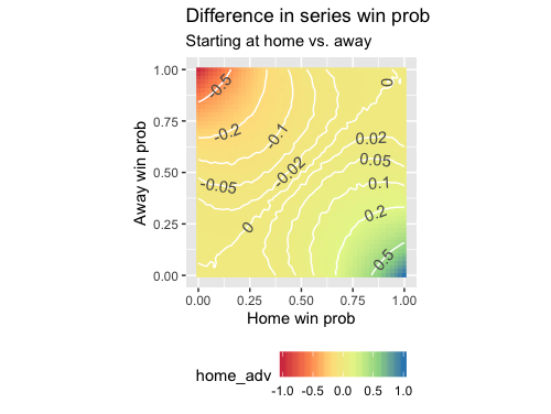
How much better is it to start at home than away?
To answer this question, we will subtract the probability of winning a series when starting away from that when starting at home. The more positive the result, the more “important” starting at home is.
# difference in starting at home vs. away
df2 <- df %>% spread(start, value = win_prob) %>%
    mutate(home_adv = home - away)

# raster plot
ggplot(df2, aes(x = home_p, y = away_p)) +
    geom_raster(aes(fill = home_adv)) +
    labs(title = "Difference in series win prob (starting at home vs. away)",
         x = "Home win prob", y = "Away win prob") +
    scale_fill_distiller(palette = "Spectral", direction = 1) +
    coord_fixed() +
    theme(legend.position = "bottom")

It looks like most of the variation is in the corners. Drawing contours at manually-defined levels helps to give the center portion of the plot more definition (note the “wigglyness” of the contours: this is an artifact of Monte Carlo simulation):
breaks <- c(-0.5, -0.2, -0.1, -0.05, -0.02, 0, 0.02, 0.05, 0.1, 0.2, 0.5)
ggplot(df2, aes(x = home_p, y = away_p, z = home_adv)) +
    geom_raster(aes(fill = home_adv)) +
    geom_contour(col = "white", breaks = breaks) +
    geom_text_contour(breaks = breaks,
                      col = "#595959", check_overlap = TRUE) +
    labs(title = "Difference in series win prob",
         subtitle = "Starting at home vs. away",
         x = "Home win prob", y = "Away win prob") +
    scale_fill_distiller(palette = "Spectral", direction = 1) +
    coord_fixed() +
    theme(legend.position = "bottom")
When does being at home tip you over (or back under) the 50% threshold?
That is, when does starting at home make you more likely to win the series than your opponent, but starting away makes your opponent the favorite? This can be answered easily by performing some data manipulation. In the plot, “Better” means that you are the favorite at home but the underdog away, while “Worse” means the opposite.
threshold <- 0.5
df2$home_impt <- ifelse(df2$home > threshold & df2$away < threshold, 1,
                        ifelse(df2$home < threshold & df2$away > threshold, -1, NA))
df2$home_impt <- factor(df2$home_impt)
df2$home_impt <- fct_recode(df2$home_impt,
                            "Better" = "1", "Worse" = "-1")
df2 %>% filter(!is.na(home_impt)) %>%
    ggplot(aes(x = home_p, y = away_p)) +
        geom_raster(aes(fill = home_impt)) +
        labs(title = paste("Does starting at home push you \nover the series win threshold", threshold, "?"),
             x = "Home win prob", y = "Away win prob") +
        scale_fill_manual(values = c("#ff0000", "#0000ff")) +
        coord_fixed() +
        theme(legend.position = "bottom")
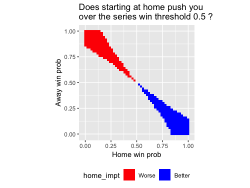
The blue area might not look very big, but sometimes teams do fall in it. The plot below is the same as the above, but overlaid with the 30 NBA teams (home/away win probabilities based on the regular season win percentages). The team squarely in the blue area? The Detroit Pistons. The two teams on the edge? The Orlando Magic and the Charlotte Hornets.

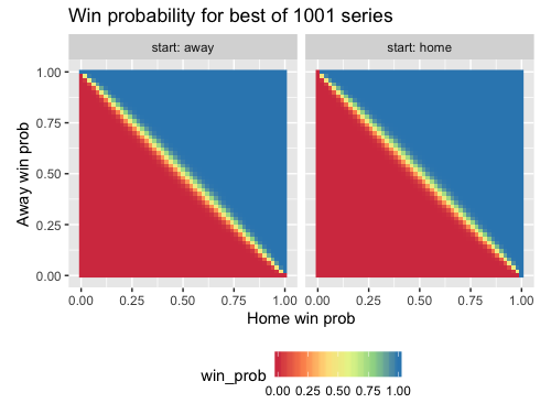
How does the length of the series affect the series win probability?
In the analysis above, we focused on best-of-seven series. What happens to the series win probabilities if we change the length of the series. Modifying the code for the first plot above slightly (and doing just 10,000 simulations for each parameter setting), we can get the following plot:

There doesn’t seem to be much difference between best-of-7 and best-of-9 series. What happens as 
Code for this post (in one file) can be found here.
R-bloggers.com offers daily e-mail updates about R news and tutorials about learning R and many other topics. Click here if you're looking to post or find an R/data-science job.
Want to share your content on R-bloggers? click here if you have a blog, or here if you don't.