
On the relationship of the sample size and the correlation
Want to share your content on R-bloggers? click here if you have a blog, or here if you don't.
This has bugged me for some time now. There is a “common knowledge” that the correlation size is dependent on the variability, i.e. higher the variability – higher the correlation. However, when you put this into practice, there seems to be a confusion on what this really means.
To analyse this I have divided this issue into two approaches – the wrong one and the right one 
The wrong approach
I have heard this too many times: “The variablility depends on the sample size”. This reasoning comes from the idea that the smaller the sample is, you will have less distinct data values (data points) and thus have smaller sensitivity and thus have smaller variability.
The error here is that the variability (variance) of the sample in reality does not depend on the sample size, but on the representativeness of the sample for the population. However, the sampling error becomes higher when the sample is smaller and because of this we have a higher probability that we will make a mistake when we try to deduce the population parameter. So theoretically if we choose the right (representative) sample, we will get the same variance as it is in the population, but if the sample is not representative the sample variance will be higher or lower than the population parameter.
Let’s go back to the beginning, the idea that as the sample gets larger the correlation gets higher is wrong. In reality what happens is that when the sample is larger the error is lower and the sample correlation converges to the population parameter.
So let’s try this out in R
To put this into perspective, I have generated two random normal variables with 1 000 000 cases and correlation ≈ 0.6 that represent the population.
library(rockchalk)
library(ggplot2)

set.seed(12345) #set seed for reproducibility

myCov=lazyCov(Rho=0.6, Sd=20, d=2) #define covariance matrix for two variables with sd=20 and correlation 0.6
myData=data.frame(mvrnorm(n=1000000, mu=c(100,100), Sigma=myCov)) #create two variables with specified covariance matrix and M=100 --> Population = 1 000 000

pop_cor=cor(myData[,1], myData[,2]) # calculate population correlation
Now I create 1000 samples that go from 5 to 5000 cases in steps by 5 (5, 10, 15…) and for each sample I write the sample size, the correlation between the two variables and the absolute deviation of the sample correlation from the population correlation.
rez=data.frame() # result data frame

for (i in (1:1000)){ #iterate through samples
  sampleData=myData[sample(nrow(myData),i*5),] #select random sample from myData with size i*5
  q=cor(sampleData$X1,sampleData$X2, method = "pearson") #calculate correlation of the sample
  rez[i,1]=i*5 #sample size - V1
  rez[i,2]=q #sample correlation - V2
  rez[i,3]=abs(q-pop_cor) #absolute deviation from the population correlation - V3
}
To present the results I have created two charts using ggplot2. The first chart presents the sample correlation in relation to the sample size.
#plot chart of correlation and sample size
ggplot(data=rez, aes(x=V1, y=V2))+
  geom_point()+
  labs(title="Correlation and sample size", x="Sample size", y="Correlation")+
  annotate("text", x = 4000, y = 0.75, label = paste("Population r = ", round(pop_cor,3)))
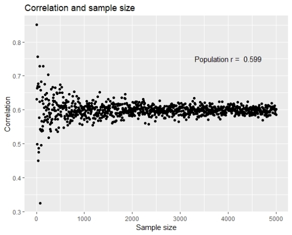
Although the stabilization of the correlation is evident, it is also visible that the correlation doesn’t get higher as the sample size gets higher, the correlations are equally higher and lower from the population parameter.
The another approach would be by showing the absolute deviation from the population correlation (abs(r_sample – r_population)).
#plot chart of absolute deviation from population r and sample size (include this correlation in annotation)
ggplot(data=rez, aes(x=V1, y=V3))+
  geom_point()+
  labs(title="Absolute deviation from population correlation and sample size", x="Sample size", y="Absolute deviation")+
  annotate("text", x = 4000, y = 0.2, label = paste("r = ", round(cor(rez$V1,rez$V3),3)))
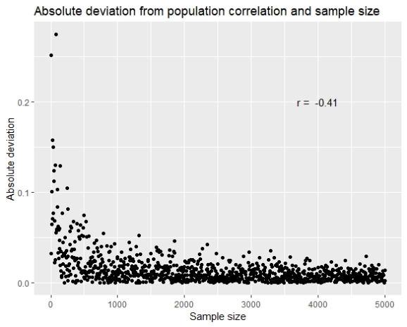
The results show that as the sample gets higher the error gets lower, and with simple correlation (although linear model is not quite appropriate), we see that the correlation between the error and the sample size is -0.41.
To conclude this, it is clearly evident both logically and from the simulation that the size of the sample correlation is not dependent on the sample size (in my example r=-0.016).
The right approach
The reasoning here is that in reality we have two variabilities. The first one is the phenomenon variability, and the second one is the measurement variability. The phenomenon variability happens in nature and it is something that we try to capture by measurement. For example if we try to measure my height using centimetres, you would think that my height is 180 cm; if you would use millimetres, it would be 1805 mm; and if you would use metres it would be 2 m. What this means is that when you use centimetres you say that all people with height of 179.5 to 180.5 have the same height and thus you ignore their natural variability.
The relationship of the correlation size and the variability comes from the measurement variability. In psychology and similar social sciences, it is quite often that to simplify things for the participants we use 1-5 scales (Likert type). It is also possible to use 1-7, 1-9 etc. scales to measure the same phenomenon. The point here is that by choosing the smaller scales (less distinct values) we directly influence the measurement variability (again not the phenomenon variability). The other scenario is when we try to organize the continuous data into “bins” (groups), such as deciles, percentages, etc. This is also the reduction of the measurement variability because you put the participants who are different into the same category.
A simulation in R
To prove a point, I have used the same dataset as in the first example. The original data is simulated with 1 million cases and since they are numeric and random, we have 1 million different data points.
For the simulation, I have divided the data from the X1 variable into bins of varying width. The first simulation has the bin width of 1 and has 184 unique data points, the second simulation has the bin width of 2 and has 97 unique data points, and so on until the bin width of 100 where all of the 1 million cases are sorted into 3 unique data points. This means that when the bin width is 1, e.g. all of the participants in the range 98.5-99.49 get the same value, when the bin width is 2, all participants with value 97.5-99.5 get the same value, etc.
For each simulation I preserve the number of data points, the standard deviation of the grouping variables and the correlation with the X2 variable (remember that the original X1-X2 correlation was 0.599).
rez2=data.frame() #result data frame

for (i in 1:100) {
  myData$Group1=as.numeric(cut_width(myData$X1,i, center=100)) #transform X1 variable by creating bins of width i
  rez2[i,1]=length(unique(myData$Group1)) #number of distinct data points in the transformed X1 variable - V1
  rez2[i,2]=sd(myData$Group1)  #standard deviation of transformed X1 variable - V2
  rez2[i,3]=cor(myData$Group1,myData$X2)  #correlaton of transformed X1 and X2 variable - V3
}
Before plotting the chart, I have calculated a linear model of predicting the number of unique data points from the standard deviation. This was necessary because I wanted to include a secondary x axis into the chart and this was possible only as the transformation formula from the standard deviation (sec_axis command works only as the transformation of the primary axis). The simplest solution was to create a linear model because the correlation between the standard deviation and the number of unique data points was 0.999.
tr_form=lm(rez2$V1~rez2$V2) #linear model for the transformation of the secondary x axis

ggplot(data=rez2, aes(x=V2, y=V3))+ #basic mapping
  geom_point()+ #adding points
  scale_x_continuous(    #definition of x axis
    name = "Standard deviation",
    trans="reverse",  #reverse the order of points on x axis
    sec.axis = sec_axis( #definition of secondary x axis
      ~ tr_form$coefficients[1] + . * tr_form$coefficients[2] , #transformation formula inherited from linear model
      name = "Number of distinct data points"))+
  labs(title="Correlation and the reduction of variability", y="Correlation")+ #title and y axis name
  geom_hline(yintercept = pop_cor, color="red")+ #add the red line for the original correlation
  annotate("text", x=15,y=pop_cor+0.015, label="Original correlation") #annotate the red line
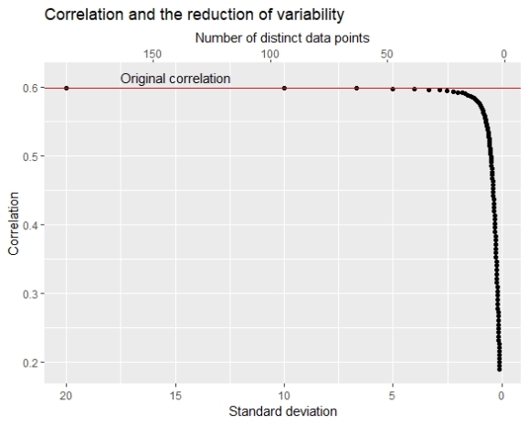
The chart here shows that as the number of unique data points becomes smaller the correlation also becomes smaller. The original SD of X1 was about 20 and we see that in the beginning (bin width=1) SD of the grouping variable is similar to the original SD and the correlation is almost equal to the original correlation. But after the number of unique data points becomes smaller than 50 the correlation decrease becomes faster and after the number of unique data points becomes smaller than 20 we see a speedy drop.
The conclusion
So to conclude, the two key points here is that it is really important to have representative samples regardless of their size (but larger are better ) and that when calculating correlations, try to restrain yourself from grouping of the values.
Happy plotting
R-bloggers.com offers daily e-mail updates about R news and tutorials about learning R and many other topics. Click here if you're looking to post or find an R/data-science job.
Want to share your content on R-bloggers? click here if you have a blog, or here if you don't.