
How to Make a Histogram with Basic R

Want to share your content on R-bloggers? click here if you have a blog, or here if you don't.
What Is A Histogram?
A histogram is a visual representation of the distribution of a dataset. As such, the shape of a histogram is its most obvious and informative characteristic: it allows you to easily see where a relatively large amount of the data is situated and where there is very little data to be found (Verzani 2004). In other words, you can see where the middle is in your data distribution, how close the data lie around this middle and where possible outliers are to be found. Exactly because of all this, histograms are a great way to get to know your data! But what does that specific shape of a histogram exactly look like? In short, the histogram consists of an x-axis, an y-axis and various bars of different heights. The y-axis shows how frequently the values on the x-axis occur in the data, while the bars group ranges of values or continuous categories on the x-axis. The latter explains why histograms don’t have gaps between the bars.Note that the bars of histograms are often called “bins” ; This tutorial will also use that name.
How to Make a Histogram with Basic R
Step One – Show Me The Data
Since histograms require some data to be plotted in the first place, you do well importing a dataset or using one that is built into R. This tutorial makes use of two datasets: the built-in R datasetAirPassengers and a dataset named chol, stored into a .txt file and available for download.
chol = read.csv("https://s3.amazonaws.com/assets.datacamp.com/blog_assets/chol.txt", sep = " ")
Step Two – Familiarize Yourself With The Hist() Function
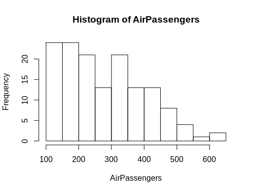
You can simply make a histogram by using thehist() function, which computes a histogram of the given data values. You put the name of your dataset in between the parentheses of this function, like this:
hist(AirPassengers)Which results in the following histogram:
 However, if you want to select only a certain column of a data frame,
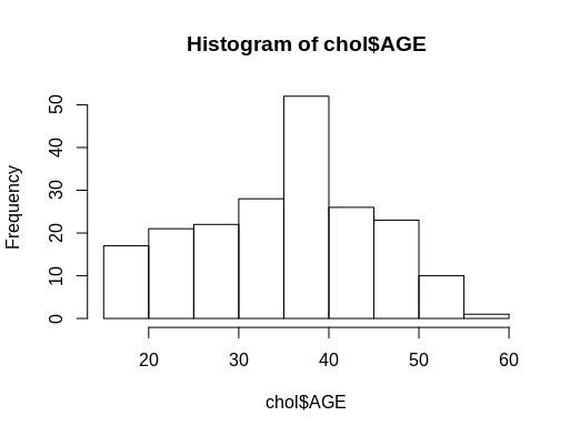
 chol for example, to make a histogram, you will have to use the hist() function with the dataset name in combination with the $ sign, followed by the column name:
hist(chol$AGE) #computes a histogram of the data values in the column AGE of the dataframe named “chol”
Step Three – Take The Hist() Function Up A Notch
The histograms of the previous section look a bit dull, don’t they? The default visualizations usually do not contribute much to the understanding of your histograms. You therefore need to take one more step to reach a better and easier understanding of your histograms. Luckily, this is not too hard: R allows for several easy and fast ways to optimize the visualization of diagrams, while still using thehist() function.
In order to adapt your histogram, you simply need to add more arguments to the hist() function, just like this:
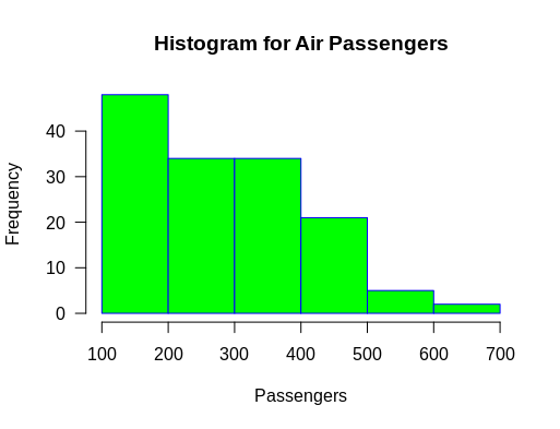
hist(AirPassengers,
     main="Histogram for Air Passengers",
     xlab="Passengers",
     border="blue",
     col="green",
     xlim=c(100,700),
     las=1,
     breaks=5)
This code computes a histogram of the data values from the dataset AirPassengers, gives it “Histogram for Air Passengers” as title, labels the x-axis as “Passengers”, gives a blue border and a green color to the bins, while limiting the x-axis from 100 to 700, rotating the values printed on the y-axis by 1 and changing the bin-width to 5.
 Overwhelmed by this large string of code? No worries! Let’s just break it down to smaller pieces to see what each argument does.
Names/colors
Change the title of the histogram by addingmain as an argument to hist() function:
hist(AirPassengers, main="Histogram for Air Passengers") #Histogram of the AirPassengers dataset with title “Histogram for Air Passengers”To adjust the label of the x-axis, add
xlab. Similarly, you can also use ylab to label the y-axis:
hist(AirPassengers, xlab="Passengers", ylab="Frequency of Passengers") #Histogram of the AirPassengers dataset with changed labels on the x-and y-axesIf you want to change the colors of the default histogram, you simply add the arguments
border or col. You can adjust, as the names itself kind of give away, the borders or the colors of your histogram.
hist(AirPassengers, border="blue", col="green") #Histogram of the AirPassengers dataset with blue-border bins with green filling
Tip do not forget to put the colors and names in between "".
X and Y Axes
Change the range of the x and y values on the axes by addingxlim and ylim as arguments to the hist() function:
hist(AirPassengers, xlim=c(100,700), ylim=c(0,30)) #Histogram of the AirPassengers dataset with the x-axis limited to values 100 to 700 and the y-axis limited to values 0 to 30
Note the c() function is used to delimit the values on the axes when you are using xlim and ylim. It takes two values: the first one is the begin value, the second is the end value
las can be 0, 1, 2 or 3.
hist(AirPassengers, las=1) #Histogram of the AirPassengers dataset with the y-values projected horizontallyAccording to whichever option you choose, the placement of the label will differ: if you choose 0, the label will always be parallel to the axis (which is the default); If you choose 1, the label will be put horizontally. Pick 2 if you want it to be perpendicular to the axis and 3 if you want it to be placed vertically.
Bins
You can change the bin width by addingbreaks as an argument, together with the number of breakpoints that you want to have:
hist(AirPassengers, breaks=5) #Histogram of the AirPassengers dataset with 5 breakpointsIf you want to have more control over the breakpoints between bins, you can enrich the
breaks argument by giving it a vector of breakpoints. You can do this by using the c() function:
hist(AirPassengers, breaks=c(100, 300, 500, 700)) #Compute a histogram for the data values in AirPassengers, and set the bins such that they run from 100 to 300, 300 to 500 and 500 to 700.However, the
c() function can make your code very messy sometimes. That is why you can instead add =seq(x, y, z). The values of x, y and z are determined by yourself and represent, in order of appearance, the begin number of the x-axis, the end number of the x-axis and the interval in which these numbers appear.
Note that you can also combine the two functions:
hist(AirPassengers, breaks=c(100, seq(200,700, 150))) #Make a histogram for the AirPassengers dataset, start at 100 on the x-axis, and from values 200 to 700, make the bins 150 wide
Tip study the changes in the y-axis thoroughly when you experiment with the numbers used in the seq argument!
Note that the different width of the bars or bins might confuse people and the most interesting parts of your data may find themselves to be not highlighted or even hidden when you apply this technique to your original histogram. So, just experiment with this and see what suits your purposes best!
Extra: Probability Density
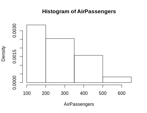
Thehist() function shows you by default the frequency of a certain bin on the y-axis. However, if you want to see how likely it is that an interval of values of the x-axis occurs, you will need a probability density rather than frequency. We thus want to ask for a histogram of proportions. You can change this by setting the freq argument to false or set the prob argument to true:
hist(AirPassengers,
     main="Histogram for Air Passengers",
     xlab="Passengers",
     border="blue",
     col="green",
     xlim=c(100,700),
     las=1,
     breaks=5,
     prob = TRUE)
#Histogram of the AirPassengers dataset with a probability density expressed through the y-axis instead of the regular frequency.
After you’ve called the hist() function to create the above probability density plot, you can subsequently add a density curve to your dataset by using the lines() function:
lines(density(AirPassengers)) #Get a density curve to go along with your AirPassengers histogram
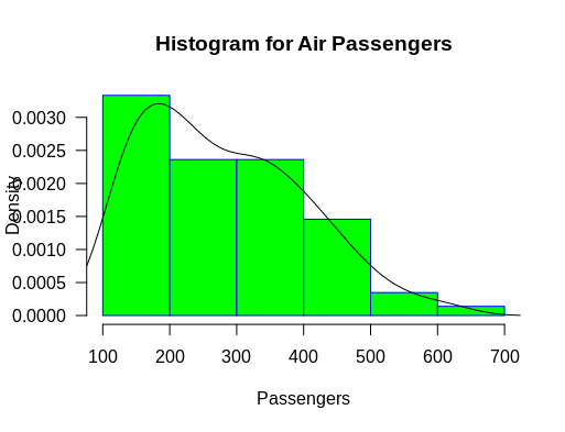
Note that this function requires you to set the prob argument of the histogram to true first!
Step Four. Want To Go Further?
For an exhaustive list of all the arguments that you can add to thehist() function, have a look at the RDocumentation article on the hist() function.
This is the first of 3 posts on creating histograms with R. The next post will cover the creation of histograms using ggplot2.
Spotted a mistake? Send us a tweet
The post How to Make a Histogram with Basic R appeared first on The DataCamp Blog .
R-bloggers.com offers daily e-mail updates about R news and tutorials about learning R and many other topics. Click here if you're looking to post or find an R/data-science job.
Want to share your content on R-bloggers? click here if you have a blog, or here if you don't.