
Handling Outliers with R
Want to share your content on R-bloggers? click here if you have a blog, or here if you don't.
Recently, I attended a presentation where the following graph was shown illustrating the response to stimulation with Thalidomide among a cohort of HIV-1 patients. The biomarker used to measure the response in this case was TNF (tumor necrosis factor) and the response was measured at four time points: time of drug administration and 3, 11 and 23 weeks after administration. This graph appears in a published article, which I won’t cite directly because except for this one statistical problem, the research is outstanding.

Part of the problem in this graph comes from the software being used. Clearly not R and clearly not ggplot. It comes from one of the highly automated programs that assumes you, the scientist, are a total jerk and incapable of specifying a graph on your own. I have highlighted the problem I saw. That very high value in week 23 seems questionable and could be distorting the summary measures that are being used in the inferences in the article. The following table of the data gives some detail to the problem:
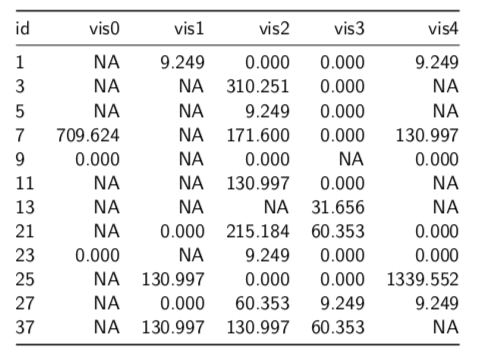
Beside the large number of missing values, we can see that the value for Patient 25 in week 23 (visit 4), 1339.552, is 10 times higher than the next value (130.997). The fact that there a number of similar digits between it and the next lower value also raises suspicion that this could simply be a data entry error or an error translating the data from its original home in a spreadsheet to the statistical program used. (I will also not mention the name of the program used, since I try to follow the English comedian Frankie Howerd’s advice: “Don’t mock the afflicted”.)
Is such a high value reasonable? And, if it it is simply a data error, could the use of this value lead to the wrong treatment recommendation based on this cohort.
First Question — Is It an Outlier?
The first question that we need to address is whether this value, 1339.552, is really an outlier that needs attention and, if so, how should we modify it?
What’s an outlier? The most common definition is that it is a value that lies far away from the main body of observations for a variable and could distort summaries of the distribution of values. In practice this translates to a value that is 1.5 times the IQR (interquartile range) more extreme than the quartiles of the distribution.
The most effective way to see an outlier is to use a boxplot. The following figure relates the parts of a boxplot to a distribution and its histogram. I have taken it from the excellent book on R by Hadley Wickham and Garrett Grolemund, R for Data Science, which is available for reading here.

Boxplots are an excellent way to identify outliers and other data anomalies. We can draw them either with the base R function boxplot() or the ggplot2 geometry geom_boxplot(). Here, I am going to use the ggboxplot() function from the ggpubr package. I find that the functions from ggpubr keep me from making many mistakes in specifying parameters for the equivalent ggplot2 functions. It makes life a little simpler.
Here is the code that read in the original data and tidied the data to facilitate the graphing and subsequent analysis.
library(tidyverse)
library(DescTools)
library(ggpubr)
tnf <- readRDS("../tnf.rds")
tnf_long <- tnf %>%
 gather(vis0:vis4, key = "visit", value = "value") %>%
 group_by(visit)
The next step is to look at the boxplot, which I have created with the following code:
gr_tnf_vis2 <- tnf_long %>%
 filter(!is.na(visit) & !is.na(value)) %>%
 ggboxplot(x = "visit", y = "value",
 palette = "aaas",
 title = "TNF Levels by Visit - Thalidomide Group",
 xlab = "Visit",
 ylab = "TNF level",
 ggtheme = theme_gray())
suppressMessages(gr_tnf_vis2)

While the graph shows three other outliers, they are not well away from the quartile boxes. However, the value at 1339.552 really stands out as an outlier.
So, what are we going to do about it?
What to Do about Outliers
Clearly, if a value has a reasonable scientific basis, it should not be modified even if it lies well outside the range of the other values for the sample or cohort. I normally refer to this as needing to pass the “compelling reason” test. There should be a compelling biological or medical reason to retain the data point.
If not, there are three commonly accepted ways of modifying outlier values.
- Remove the case. If you have many cases and there does not appear to be an explanation for the appearance of this value, or if the explanation is that it is in error, you can simply get rid of it.
- Assign the next value nearer to the median in place of the outlier value. Here that would be 130.997, the next lower value. You will find that this approach leaves the distribution close to what it would be without the value. You can use this approach if you have few cases and are trying to maintain the number of observations you do have.
- Calculate the mean of the remaining values without the outlier and assign that to the outlier case. While I have seen this frequently, I don’t really understand its justification and I think it distorts the distribution more than the previous solution.
Because we want to keep as many of the few values that we have (a commonplace concern in medical studies), I would choose the second option in this case and assign the value 130.997 to the outlier case. Here is the code that would do that. Patient 7 was the person who represented the value we seek and we are putting the value of that case into the slot for case 25.
# substitute
tnf2 <- tnf_long
# case no. of next case
tnf2$value[tnf2$id == "25" & tnf2$visit == "vis4"] <-
 tnf2$value[tnf$id == "7" & tnf2$visit == "vis4"]
The boxplot now shows that the extreme outlier has been controlled.

Problem Resolved?
Yes and No. We now have values for tnf that fit in the distribution more comfortably. However, we needed to manipulate a value to cause that to happen.
There are three conclusions I would suggest from this type of analysis:
- Data always needs to be checked for outliers. Without doing this, you are likely to introduce a bias that could distort the results of your study.
- Conduct your analysis on the data both with and without the outlier. If the results are very close, you can use the original data without too many qualms. If not, you need to follow the next recommendation even more closely.
- When you find an outlier, you should report it in your findings and everything you have done to correct for it including differences between analyses that you conducted with and without the outlier value.
A last note is that canned statistical or data analysis software tends not to alert you to the presence and danger of outliers. You need to be especially vigilant when using these programs to avoid getting lulled into believing that everything is ok when it’s not. By forcing you to write your program, R avoids this problem but does not totally eliminate. You still need to take responsibility to going on an outlier hunt as you move through the data cleaning process.
R-bloggers.com offers daily e-mail updates about R news and tutorials about learning R and many other topics. Click here if you're looking to post or find an R/data-science job.
Want to share your content on R-bloggers? click here if you have a blog, or here if you don't.