
Getting data from an image (introductory post)
Want to share your content on R-bloggers? click here if you have a blog, or here if you don't.
Hi there!
This blog will be dedicated to data visualization in R. Why? Two reasons. First, when it comes to statistics, I am always starting by some exploratory analyses, mostly with plots. And when I handle large quantities of data, it’s nice to make some graphs to get a grasp about what is going on. Second, I have been a teacher as part of my PhD, and I was quite appaled to see that even Masters students have very bad visualization practices.
My goal with this blog is to share ideas/code with the R community, and more broadly, with anybody with an interest in data visualization. Updates will not be regular. This first post will be dedicated to the building of a plot digitizer in R, i.e. a small function to get the data from a plot in graphic format.
I have recently been using programs such as GraphClick and PlotDigitizer to gather data from graphs, in order to include them in future analyses (in R). While both programs are truly excellent and highly intuitive (with a special mention to GraphClick), I found myself wondering if it was not possible to digitize a plot directly in R.
And yes, we can. Let’s think about the steps to digitize a plot. The first step is obviously to load the image in the background of the plot. The second is to set calibration points. The third step is boring as hell, as we need to click the points we cant to get the data from. Finally, we just need to transform the coordinates in values, with the help of very simple maths. And this is it!
OK, let’s get this started. We will try to get the data from this graph:
Setting the plot
First, we will be needign the ReadImages library, that we can install by typing :
install.packages('ReadImages')
This packages provides the read.jpeg function, that we will use to read a jpeg file containing our graph :
mygraph <- read.jpeg('plot.jpg')
plot(mygraph)
I strongly recommend that before that step, you start by creating a new window (dev.new()), and expand it to full size, as it will be far easier to click the points later on.
Calibration
So far, so good. The next step is to calibrate the graphic, by adding four calibration points of known coordinates. Because it is not always easy to know both coordinates of a point, we will use four calibration points. For the first pair, we will know the x position, and for the second pair, the y position. That allows us to place the points directly on the axis.
calpoints <- locator(n=4,type='p',pch=4,col='blue',lwd=2)
We can see the current value of the calibration points :
as.data.frame(calpoints)
          x        y
1 139.66429  73.8975
2 336.38388  73.8975
3  58.72237 167.0254
4  58.72237 328.1680
Point’n'click
The third step is to click each point, individually, in order to get the data.
data <- locator(type='p',pch=1,col='red',lwd=1.2,cex=1.2)
After clicking all the points, you should have the following graph :

Our data are, so far :
as.data.frame(data)
          x         y
1  104.8285  78.08303
2  138.6397 114.70636
3  171.4263 119.93826
4  205.2375 266.43158
5  238.0241 267.47796
6  270.8107 275.84901
7  302.5727 282.12729
8  336.3839 298.86939
9  370.1951 306.19405
10 401.9571 352.23481
OK, this is nearly what we want. What is left is just to write a function that will convert our data into the true coordinates.
Conversion
It seems straightforward that the relationship between the actual scale and the scale measured on the graphic is linear, so that

and as such, both a and b can be simply obtained by a linear regression.
We can write the very simple function calibrate :
calibrate = function(calpoints,data,x1,x2,y1,y2)
{
	x  <- calpoints$x[c(1,2)]
	y  <- calpoints$y[c(3,4)]
	cx <- lm(formula = c(x1,x2) ~ c(x))$coeff
	cy <- lm(formula = c(y1,y2) ~ c(y))$coeff
	data$x <- data$x*cx[2]+cx[1]
	data$y <- data$y*cy[2]+cy[1]
	return(as.data.frame(data))
}
And apply it to our data :
true.data <- calibrate(calpoints,data,2,8,-1,1)
Which give us :
 true.data
          x          y
1  1.010309 -2.0909091
2  2.000000 -1.6363636
3  3.051546 -1.5714286
4  3.979381  0.2337662
5  5.000000  0.2467532
6  5.958763  0.3506494
7  6.979381  0.4285714
8  8.000000  0.6493506
9  8.989691  0.7272727
10 9.979381  1.3116883
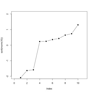
And we can plot the data :
plot(true.data,type='b',pch=1,col='blue',lwd=1.1,bty='l')

Not so bad!
Conclusion
With the simple use of R, we were able to construct a “poor man’s data extraction system” (PMDES, ©), based on the incorporation of graphics in the plot zone, and the locator capacity of R.
We can wrap-up everything in functions for better usability :
library(ReadImages)

ReadAndCal = function(fname)
{
	img <- read.jpeg(fname)
	plot(img)
	calpoints <- locator(n=4,type='p',pch=4,col='blue',lwd=2)
	return(calpoints)
}

DigitData = function(color='red') locator(type='p',pch=1,col=color,lwd=1.2,cex=1.2)

Calibrate = function(calpoints,data,x1,x2,y1,y2)
{
	x  <- calpoints$x[c(1,2)]
	y  <- calpoints$y[c(3,4)]
	cx <- lm(formula = c(x1,x2) ~ c(x))$coeff
	cy <- lm(formula = c(y1,y2) ~ c(y))$coeff
	data$x <- data$x*cx[2]+cx[1]
	data$y <- data$y*cy[2]+cy[1]

	return(as.data.frame(data))
}
Do you have any ideas to improve these functions? Let’s discuss them in the comments!

R-bloggers.com offers daily e-mail updates about R news and tutorials about learning R and many other topics. Click here if you're looking to post or find an R/data-science job.
Want to share your content on R-bloggers? click here if you have a blog, or here if you don't.