
Data Day Texas 2018 in Review
Want to share your content on R-bloggers? click here if you have a blog, or here if you don't.
As the hubbub from Data Day Texas winds down, I thought I would take some time to share a few thoughts on the conference. Being a relatively new Austinite (imported from Canada), this is only my second Data Day. And while I’m still getting a feel for the typical Data Day vibe, there was a noticeable shift this year to to support new members in the data field and include a more even distribution of data science or analytically focused content. Don’t get me wrong, I loved last years session too. There were many interesting talks about a diverse set of topics and a lot of exciting people to interact with. While there was content on R, Python and analytical theory, a lot of the main content was around graph databases and big data platforms. And though this content is important, it’s typically less approachable to a newcomer. It can be hard to jump in and understand the need for these technologies. Also, the platforms themselves can be less accessible to someone without the skills or resources to get their hands on the tech. It’s typically easier for a new data person to download on a csv file, R-Studio and start playing.
Well, this year they certainly rolled out the red carpet to welcome beginners to the field. They expanded their content to include so many R sessions that they ended up hosting a mini R User Day within the conference. Their line up of speakers for R User Day was basically the first string of R-Stars. Further to that, a variety of the sessions were geared towards having experts encourage newbies to actively contribute to the R community. And when an R-Star tags a novice into the game, that has a pretty profound effect.
Overall, I loved the content this year and the all inclusive and supportive vibe. I think I’m not alone in this as their success speaks for itself. This year Data Day TX had 1000 attendees, 75+ sessions, 80+ speakers from 12 countries.
Given the large and diverse set of content, I’m sure everyone experienced a different type of day. However, I can just say mine was great. I’ll share a brief overview of some of the sessions I attended below.
Sessions

Image classification errors
Lukas Biewald – Keynote: Deep Learning in the Real World
The conference was kicked off with Lukas Biewald as the keynote speaker. Lukas is the founder of Crowdflower, and he gave a very entertaining and engaging talk about where we sit today with the use of deep learning in the real world.
He showed some funny examples of the difficulties of real-world deep learning applications. For example, a human would have no problem differentiating between a chihuahua and a muffin. But, given their likeness in the image frame, you can see how an algorithm may struggle. I also liked how he broke down the progress of some of the industry’s biggest success cases such as voice recognition to show how progress was made gradually over time. This brings a much more reasonable “keep on keeping on” type of approach to the development of ML vs the haphazard “striking gold” concept it’s often associated with.

Human in the loop active learning (sourced from cloudflower.com)
I really liked his take on how to make some of your algorithms higher performing while you are chipping away. Basically, the answer is to keep on trucking; bring more information, try harder and spend more time working with your data set. He suggests that two of the biggest ways that you can make an impact are by simply adding more data and by cleaning your data. Finally, he touches on the “human in the loop” approach to help bring algorithms to production faster. Human in the loop allows humans to manually classify objects that are not easily handled and then feed that classification as training data back into the algorithm.
Gabriela de Queiroz : Statistics for Data Science: what you should know and why
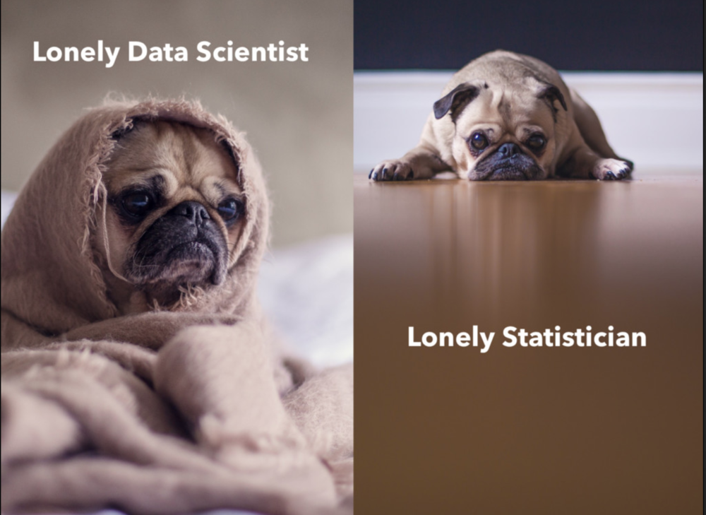
Gabriel is the founder of R-Ladies. She talks about the importance of being able to communicate and educate on statistical topics as a data scientist. She starts out the talk relating to any person who has ever been the siloed data scientist/statistician/analyst etc. When she started the talk with this picture almost everyone in the room laughed. While there are larger data groups emerging in almost every medium-large company today, this was not typical even 5 years ago. If anyone has worked as a single data person on a team of non-data people you know what she means. I have played this role in a few different positions and I often likened it to being the one-person IT department. People come to you with all variety of data related inquiries and you are expected to be the jack of all trades. You do your best and often wish you had a second pair of eyes on the project.
Among many other pearls of wisdom, Gabriela starts her talk with the first rule of thumb “Know your data”. Obvious right? I mean out of a set of slides with 5 points, why is this number one? Because it’s so important! Knowing your data does not take days, it usually takes a deep understanding of everything from the space, to the data collection to the data exploration itself. I can deeply identify with this one. In my most recent role, I started out with the intent of simply doing analysis. However, I ended up becoming so entrenched in the quality of the data that I currently spend easily half of my time today working with the dev team to define, build and QA the data pipeline with the necessary flexibility, quality and usability. Gabriela’s Slides
Mara Averick : Pilgrim’s Progress: a journey from confusion to contribution

Mara is a developer advocate at R Studio. She gave a talk on how to participate and contribute to the data science community. Her talk kept the audience in stitches with her zingers, but she also drove the point home. Everyone can try their hand at learning R and data science. Further, you have a community to support you out there and it’s OK to “learn out loud”.

I liked her talk because it was approachable, motivational but also PRACTICAL. I mean how many of us have been to the “You can do it” type of talks? They get you all spun up and then you think “.. um.. yeah but how?”. Mara doesn’t ditch the audience after they get invested. She guides them with a variety of tactical getting started steps and tips.
One of the suggestions I liked best was having newcomers contribute to the documentation. She shared the quote by Donald Norman explaining that once innocence is lost, it is not easily regained. Meaning, that once you gain a skill, it is hard to remember what it was like when you were first learning that skill. Therefore, it can be hard to relate to what a new person may need to know or the hurdles they feel. This is a very humbling fact that we need to remember as we get farther in our prospective fields.
Lucy D’Agostino McGowan – Making Causal Claims as a Data Scientist: Tips and Tricks Using R

Next up we have Lucy D’Agostino McGowan who is a Vanderbilt Biostatistics PhD Student. Lucy gets to the point straight away and takes on the age old “Correlation does not equal causation” warning that every stats 101 student is given.
Her hilarious take is that statisticians are too focused on the “abstinence only” method and the field needs to practice safe causality. Basically she is stating that we don’t need to throw the baby out with the bathwater. We CAN make conclusions when working with imperfect scenarios if we put some safeguards in place.
And how do we do this? Whew boy, it is a simple concept as a whole, but to explain in detail (including mathematical formulas) to a room full of people? Now that is a bit trickier. Lucky we have Lucy handling this one. Because she talks through the advanced statistical concepts to a large room full of strangers with the ease of someone discussing her weekend with close friends. And I think most everyone followed!

One of the main issues with correlation asserting causation is the concept of a confounder variables. Confounders can be variables which have an impact on both the exposure (dependant variable) and outcome (independant variable). For example I could want to see how my weight fluctuates with the average temperature outside. If my weight went up as we approached spring and then continued to rise with summer it would look like temperature had a causal effect on my weight. If I wanted to loose weight I may want to move somewhere cold. However, the real issue could be that I go on vacation in the summer. And who doesn’t love eating and drinking on vacation? So in this example, my vacation schedule could be a confounding variable.
Lucy proposes a technique to allow for a re-balancing of confounder variables across the exposure groups. She gives a step by step of the process and she ends with showing us a real kick ass way of visualizing the impact the rebalancing had. When looking at a love plot you can see the standardized mean difference between the groups by variable for pre and post rebalancing.
Hilary Parker – Opinionated Analysis Development

Following Lucy, I attended Hilary Parker’s discussion on opinionated analysis development. Hilary Parker is a data scientist at Stitch Fix and co-host of @NSSDeviations. She also appears to be a generally a very rad person.
Somehow Hilary managed to weave together intense details about her CD content management obsession as a young adult and the need for analytic process. Trust me, it made sense at the time. Hilary discussed the pitfalls of not having a supportive environment and an analytic process. She explains how process can help to drive a culture of openness where people feel safe to explore new things and make mistakes.
I personally loved hearing this one as my analytical team is in the midst of investing in our analysis processes with reviews, code repos, template sharing etc. When protectionism over analysis techniques is allowed and encouraged we all loose. The person doing the protecting never gets better and the audience never fully trusts or understands their analysis.
Albert Y. Kim (Amherst College) : Something old, something new, something borrowed, something blue: Ways to teach data science (and learn it too!)
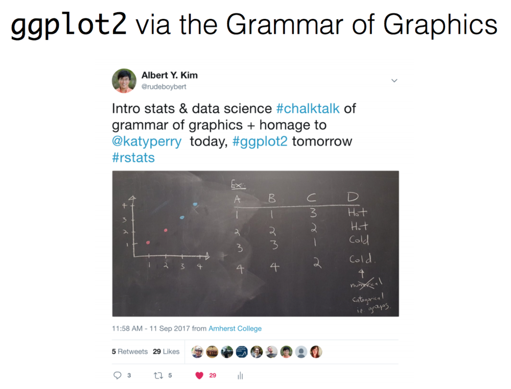
Albert Y Kim is a lecturer in statistics in the mathematics & statistics department at Amherst College in Amherst, MA. Albert has taught statistics and data science to students with a wide range of backgrounds. Often the students in his class have no computer programming experience. In his discussion he takes us through the innovative ways that he explains the concepts to beginners from scratch.
In listening to his talk we are reminded of how much knowledge we take for granted that people outside of the computer field may not know. For example: variables need to have the same case, programs are linear and so on. I loved the way that Albert looked at the stats concepts or the code and translated it to a non technical audience. I mean he’s right ggplot2 IS the gramar of graphics.
Albert Kim and Chester Ismay wrote a book called ModernDive: An Introduction to Statistical and Data Sciences via R. It’s free online and I have no doubt it will be a great resource to everyone from beginners to more mature users looking for a refresher on the basics.
Julia Silge (Stack Overflow) : Text Mining Using Tidy Data Principles

Julia is a Data Scientist at Stack Overflow and she gave a presentation about how to perform text mining with the tidytext package. And yes, her talk was technical and full of code. But, she was teaching us with such interesting use cases that it felt like I just wanted to hear more about the work she’s doing!
I mean, this “She giggles, he gallops” slide.. it’s too good! In this project, she analyzed manuscripts. She removed all of the actor lines and kept only the set directives. For example: “She closed the door”, “He leaned in for a kiss”, “She sighed etc”. She then identified all verbs and their association with male or female characters and explored for patterns.
I loved the presentation and will absolutely be trying out the tidytext package. I might even do it via her datacamp tutorial. My only ask of Julia is that she consider pairing up with Reese Witherspoon to further Reese’s cause to get more female directors, females in strong character roles, equal compensation in the film industry and more. If you haven’t seen Reese’s “What do we do now?” talk, check it out and you will see how they could be a perfect match.
Honorable Mentions
Well after these sessions I ended up getting side tracked in discussions and didn’t get to see my full roster. But I have confirmed testimony that these sessions were stellar:
- Jasmine Dumas : R, What is it good for? Absolutely Everything
- Emily Robinson – The Lesser Known Stars of the Tidyverse
- DataCamp – I didn’t see an explicit DataCamp presentation, but did feel like they were everywhere. It seems that most of the R-Stars have their own courses to check out. DataCamp is a great interactive learning platform for data science and I would definitely recommend it to someone looking to further their skills.
- Caitlin Hudon – Caitlin didn’t have a presentation at Data Day TX but she played a vital role in the day for some of us. She is a data scientist at web.com and the co-founder of the R Ladies Austin group. As a new member to the group I’m thankful for Caitlin’s openness to share knowledge and experiences. Caitlin is also speaking at Dallas Data Science Conference 2018
R-bloggers.com offers daily e-mail updates about R news and tutorials about learning R and many other topics. Click here if you're looking to post or find an R/data-science job.
Want to share your content on R-bloggers? click here if you have a blog, or here if you don't.