
Creating color palettes in R
Want to share your content on R-bloggers? click here if you have a blog, or here if you don't.
There are several color palettes available in R such as rainbow(), heat.colors(), terrain.colors(), and topo.colors(). We can visualize these as 3D pie charts using the plotrix R package.
# Let's create a pie chart with n=7 colors using each palette
library(plotrix)
sliceValues <- rep(10, 7) # each slice value=10 for proportionate slices
pie3D(sliceValues,explode=0, theta=1.2, col=rainbow(n=7), main="rainbow()")

# Let's create a figure with all 4 base color palettes
par(mfrow=c(1, 4))
pie3D(sliceValues,explode=0, theta=1.2, col=rainbow(n=7), main="rainbow()")
pie3D(sliceValues,explode=0, theta=1.2, col=heat.colors(n=7), main="heat.colors()")
pie3D(sliceValues,explode=0, theta=1.2, col=terrain.colors(n=7), main="terrain.colors()")
pie3D(sliceValues,explode=0, theta=1.2, col=topo.colors(n=7), main="topo.colors()")

Other popular color palettes include the RColorBrewer package that has a variety of sequential, divergent and qualitative palettes and the wesanderson package that has color palettes derived from his films.
library(RColorBrewer)

# To see all palettes available in this package
par(mfrow=c(1, 1))
display.brewer.all()

# To create pie charts from a sequential, divergent and qualitative RColorBrewer palette
par(mfrow=c(1, 4))
pie3D(sliceValues,explode=0, theta=1.2, col=brewer.pal(7, "RdPu"), main="Sequential RdPu")
pie3D(sliceValues,explode=0, theta=1.2, col=brewer.pal(7, "RdGy"), main="Divergent RdGy")
pie3D(sliceValues,explode=0, theta=1.2, col=brewer.pal(7, "Set1"), main="Qualitative Set1")


# And add pie chart with a wes_anderson palette
# we will only use 5 slices in the example since the Darjeeling palette only has 5 colors
library(wesanderson)
pie3D(sliceValues[1:5],explode=0, theta=1.2, col=wes_palette("Darjeeling2"), main="Darjeeling2")
 You can also create your own color palettes in R with your colors of choice with the colors() function or creating a vector with the color names. A great review and cheat sheet for R colors can be found at http://research.stowers-institute.org/efg/R/Color/Chart/.
# To get an idea of the colors available
head(colors())
length(colors()) # 657

# To see all 657 colors as a color chart you can source the R script to generate a pdf version in your working directory

# We can create choose a palette based on the R chart as follow:
mycols <- colors()[c(8, 5, 30, 53, 118, 72)] #
# or you could enter the color names directly
# mycols <- c("aquamarine", "antiquewhite2", "blue4", "chocolate1", "deeppink2", "cyan4")

# You could also get and store all distinct colors in the cl object and use the sample function to select colors at random
cl <- colors(distinct = TRUE)
set.seed(15887) # to set random generator seed
mycols2 <- sample(cl, 7)
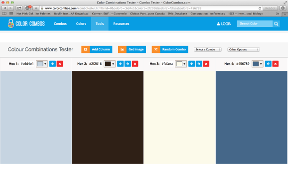
You can also create color palettes with hex color codes. A great example of this is to work with popular color palettes available on the http://www.colorcombos.com website. This website has various palettes you can choose from and even derive color palettes from your favorite websites. For example, let’s grab the color palette from the rjbioinformatics.com website at http://www.colorcombos.com/grabcolors.html .

After entering the URL of our website, we will receive the hex codes for the color scheme used on the website.
We can even export the colors as little pencils![]()

You can also choose from hundred of color schemes based on your color of choice. For example, we will also create a color palette based on the color olive – ColorCombo382.

# For the rjbioinformatics.com color palette
mycols3 <- c("#c6d4e1", "#2f2016", "#fcfaea", "#456789")
# For ColorCombos382 palette
mycols4 <- c("#C3D938", "#772877", "#7C821E", "#D8B98B", "#7A4012")
# Now to get the pie charts for the last four palettes
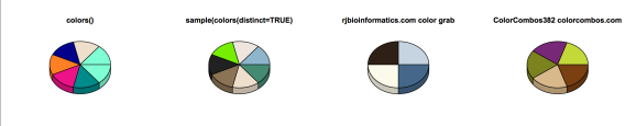
pie3D(sliceValues,explode=0, theta=1.2, col=mycols, main="colors()")
pie3D(sliceValues,explode=0, theta=1.2, col=mycols2, main="sample(colors(distinct=TRUE)")
pie3D(sliceValues[1:4],explode=0, theta=1.2, col=mycols3, main="rjbioinformatics.com color grab")
pie3D(sliceValues[1:5],explode=0, theta=1.2, col=mycols4, main="ColorCombos382 colorcombos.com")
We can also create a color palette with the colorRampPalette() to use for heatmaps and other plots. For this example, we will use the leukemia dataset available in the GSVAdata package, which corresponds to microarray data from 37 human acute leukemias where 20 of these cases are Acute lymphoblastic leukemia (ALL) and the other 17 are ALL’s with Mixed leukemia gene rearrangements. For more information on the study please see Armstrong et al. Nat Genet 30:41-47, 2002.
library(GSVAdata)
data(leukemia) # loads leukemia_eset

# Create a matrix from the gene expression eset object
M1 <- exprs(leukemia_eset)

# Get a matrix of the top 50 most variable probes accros the samples
library(genefilter)
topVarGenes <- head(order(-rowVars(M1)), 50)
mat <- M1[ topVarGenes, ]
mat <- mat - rowMeans(mat)

# For sample annotation information
head(pData(leukemia_eset))
table(leukemia_eset$subtype)

# Get sample group as a factor the ColSideColors
ALLgroup <- as.factor(pData(leukemia_eset)[colnames(M1), 1])

# Get the colors for the ALL subtype
sidecols <- c("#4FD5D6", "#FF0000")

# Here is a fancy color palette inspired by http://www.colbyimaging.com/wiki/statistics/color-bars
cool = rainbow(50, start=rgb2hsv(col2rgb('cyan'))[1], end=rgb2hsv(col2rgb('blue'))[1])
warm = rainbow(50, start=rgb2hsv(col2rgb('red'))[1], end=rgb2hsv(col2rgb('yellow'))[1])
cols = c(rev(cool), rev(warm))
mypalette <- colorRampPalette(cols)(255)

library("gplots") # for the heatmap.2 function
par(mfrow=c(1,1))

png(filename="Heatmap_Example.png", width=12, height=10, units = 'in', res = 300)
heatmap.2(mat, trace="none", col=mypalette, ColSideColors=sidecols[ALLgroup],
labRow=FALSE, labCol=FALSE, mar=c(6,12), scale="row", key.title="")
legend("topright", legend=levels(ALLgroup), fill=sidecols, title="", cex=1.2)
graphics.off()

Now you are all set to work with and create your own awesome color palettes! Happy R programing![]()

R-bloggers.com offers daily e-mail updates about R news and tutorials about learning R and many other topics. Click here if you're looking to post or find an R/data-science job.
Want to share your content on R-bloggers? click here if you have a blog, or here if you don't.