Articles by klr

All My Roads Lead Back to Finance–PIMCO Sankey

July 17, 2013 | klr

Even though the route might be circuitous, my seemingly random journeys all seem to lead back to finance.  My fun with rCharts sankey diagrams (Exploring Networks with Sankey) has led me into an exploration of the PIMCO network.  Although PIMCO is best known for its fixed income products, PIMCO has ... [Read more...]

Exploring Networks with Sankey

July 16, 2013 | klr

Motivated by a tweet from Tony Hirst (http://blog.ouseful.info/), I started experimenting with an rCharts implementation of the d3 sankey plugin.  While I was putting together examples, I found lots of gaps in my knowledge of sankeys and network a... [Read more...]

rCharts version of d3 horizon

July 10, 2013 | klr

I love horizon plots.  My love shows up throughout my blog, and I have plotted horizon charts in base graphics, xtsExtra, lattice, and ggplot2.  Now with rCharts, we can implement Jason Davies d3.js horizon chart plugin to plot R data in... [Read more...]

rCharts Remake of NYT

June 28, 2013 | klr

For those wondering if I have forsaken finance, the answer is no.  I just don’t think there is much to do in here besides watch and wait.  So more d3 and R as I try to distract myself from doing something dumb in the markets. This time I used ... [Read more...]

dimple d3 and rCharts

June 27, 2013 | klr

I put together a quick tutorial combining my two favorite things: finance and interactive visualizations.  I show how to use the new dimplejs d3 library with rCharts to create some nice interactive plots of US Treasury yield data.  ... [Read more...]

R Plotting Financial Time Series

June 19, 2013 | klr

In my little world of finance, data almost always is a time series.  Through both quiet iteration and significant revolutions, the volunteers of R have made analyzing and charting time series pleasant.  As a mini-tribute to all those who have... [Read more...]

Rickshaw d3.js from R with rCharts

June 11, 2013 | klr

Shutterstock’s open source Rickshaw provides a very nice tutorial to get started building interactive time series d3.js charts with Rickshaw.  I just could not resist rebuilding the tutorial but this time ENTIRELY in R with the amazing packages slidify and rCharts.  I have embedded the tutorial below, but ... [Read more...]

If…then in Japan

May 30, 2013 | klr

If Japan starts to spiral out of control, then what do they do? A spiral would be a sudden move higher in JGB rates with a simultaneous crash in the Japanese Yen. Their response would be to try to slow the positive feedback loop through external interv...
[Read more...]

Even More JGB Yield Charts with R lattice

May 15, 2013 | klr

See the last post for all the details. I just could not help creating a couple more. Variations on Favorite Plot - Time Series Line of JGB Yields by Maturity
p2 <- xyplot(value ~ date | indexname, data = jgb.melt, <br>    type = "l", layout = c(length(unique(jgb.melt$indexname)), <br>        1), panel = function(x, y, ...) {<br>        panel.abline(h = c(min(y), max(y)))<br>        panel.xyplot(x = x, y = y, ...)<br>        panel.text(x = x[length(x)/2], y = max(y), <br>            labels = levels(jgb.melt$indexname)[panel.number()], <br>            cex = 0.7, pos = 3)<br>    }, scales = list(x = list(tck = c(1, 0), alternating = 1), <br>        y = list(tck = c(1, 0), lwd = c(0, 1))), strip = FALSE, <br>    par.settings = list(axis.line = list(col = 0)), <br>    xlab = NULL, ylab = "Yield", main = "JGB Yields by Maturity Since Jan 2012")<br>p2 <- p2 + layer(panel.abline(h = pretty(jgb.melt$value), <br>    lty = 3))<br>p2<br>
From TimelyPortfolio
<br>jgb.xts.diff <- jgb.xts["2012::", ] - matrix(rep(jgb.xts["2012::", <br>    ][1, ], NROW(jgb.xts["2012::", ])), ncol = NCOL(jgb.xts), <br>    byrow = TRUE)<br>jgb.diff.melt <- xtsMelt(jgb.xts.diff)<br>jgb.diff.melt$date <- as.Date(jgb.diff.melt$date)<br>jgb.diff.melt$value <- as.numeric(jgb.diff.melt$value)<br>jgb.diff.melt$indexname <- factor(jgb.diff.melt$indexname, <br>    levels = colnames(jgb.xts))<br><br>p4 <- xyplot(value ~ date | indexname, data = jgb.diff.melt, <br>    type = "h")<br><br>update(p2, ylim = c(min(jgb.diff.melt$value), max(jgb.melt$value) + <br>    0.5)) + p4<br>
From TimelyPortfolio
<br>update(p2, ylim = c(min(jgb.diff.melt$value), max(jgb.melt$value) + <br>    0.5), par.settings = list(axis.line = list(col = "gray70"))) + <br>    update(p4, panel = function(x, y, col, ...) {<br>        # do color scale from red(negative) to<br>        # blue(positive)<br>        cc.palette <- colorRampPalette(c(brewer.pal("Reds", <br>            n = 9)[7], "white", brewer.pal("Blues", <br>            n = 9)[7]))<br>        cc.levpalette <- cc.palette(20)<br>        cc.levels <- level.colors(y, at = do.breaks(c(-0.3, <br>            0.3), 20), col.regions = cc.levpalette)<br>        panel.xyplot(x = x, y = y, col = cc.levels, <br>            ...)<br>    })<br>
From TimelyPortfolio
<br><br>p5 <- horizonplot(value ~ date | indexname, data = jgb.diff.melt, <br>    layout = c(1, length(unique(jgb.diff.melt$indexname))), <br>    scales = list(x = list(tck = c(1, 0))), xlab = NULL, <br>    ylab = NULL)<br><br>p5<br>
From TimelyPortfolio
<br>update(p2, ylim = c(0, max(jgb.melt$value) + 0.5), <br>    panel = panel.xyplot) + p5 + update(p2, ylim = c(0, <br>    max(jgb.melt$value)))<br>
From TimelyPortfolio 
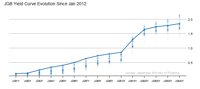
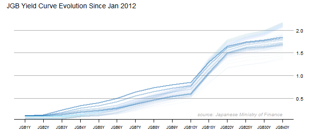
Variations on Yield Curve Evolution ...
[Read more...]

Japan – JGB Yields–More Lattice Charts

May 15, 2013 | klr

This blog is littered with posts about Japan. In one sentence, I think Japan presents opportunity and is a very interesting real-time test of much of my macro thinking. Proper visualization is absolutely essential for me to understand all of the dynami...
[Read more...]

d3 <- R with rCharts and slidify

April 29, 2013 | klr

I believe that the NY Times interactive feature 512 Paths to the White House is one of the best visualizations of all time.  It is even better when we have details on the process of creating this marvel.   Although the graphic is not suited for other data sources (please tell me ... [Read more...]

Banging on the JGBs

April 17, 2013 | klr

Since I have not posted in quite a while, I wanted to let everyone know that I am still alive and kicking.  The resurrection of excitement (opportunity) in the markets, quarterly reporting cycle, and the overwhelming number of unbelievable R/javascript releases have kept me from writing something good enough ... [Read more...]

d3 Lifeline from vega and clickme

April 4, 2013 | klr

This has been an exciting week for d3.js and R with the release of vega by the data vis powerhouses at Trifacta launch of clickme and already significant rewrite to accommodate vega inception of a very promising d3 templates DexCharts described in multiple posts. I am glad to have ... [Read more...]

Tables Are Like Cockroaches

April 3, 2013 | klr

As much as I would like to completely replace all tables with beautiful, intuitive, and interactive charts, tables like cockroaches cannot be eliminated. Based on this very interesting discussion on the Perceptual Edge forum with source Exploring the Origins of Tables for Information Visualization, tables date back to 1850 BCE. The ...
[Read more...]

Old Price Tables in Modern d3 Visualization

April 1, 2013 | klr

In my post Dust off 130 Year Old Gold Books on Google Bookshelf, I reproduced some of the old and way out of copyright price tables from the appendices in Gold and Prices Since 1873 by James Laurence Laughlin using latticeExtra xyplot. Now, with the clickme multiline d3 ractive built in my ... [Read more...]
1 3 4 5 6 7 15

Never miss an update!
Subscribe to R-bloggers to receive
e-mails with the latest R posts.
(You will not see this message again.)

Click here to close (This popup will not appear again)