
An idiot learns Bayesian analysis: Part 1
Want to share your content on R-bloggers? click here if you have a blog, or here if you don't.
I've done a dreadful job of reading The Theory That Would Not Die, but several weeks ago I somehow managed to read the appendix. Here the author gives a short explanation of Bayes' theorem using statistics related to breast cancer and mammogram results. This is the same real world example (one of several) used by Nate Silver. It's profound in its simplicity and- for an idiot like me- a powerful gateway drug. Possibly related to this is my recent epiphany that when we're talking about Bayesian analysis, we're really talking about multivariate probability. The breast cancer/mammogram example is the simplest form of multivariate analysis available. What does it all mean, how can we extend it and what does it have to do with an underlying philosophy of Bayesian analysis (if such a thing exists)?
The Theory That Would Not Die is sitting at my desk at work, so I'm going to refer to the figures quoted by Nate Silver on page 246. Odds for cancer are read across the columns, odds for a positive mammogram are read down the rows.
Before I go any further, I have to point out that the positioning of the tables is dreadful. WordPress experts are invited to help me sort this out.
probs = matrix(c(11, 99, 3, 887), 2, 2, byrow = TRUE, dimnames = list(c("M-True",
    "M-False"), c("C-True", "C-False")))
| C-True | C-False | |
|---|---|---|
| M-True | 11 | 99 |
| M-False | 3 | 887 |
From this table, the joint probabilities are easy to read. What is the chance that a person has breast cancer and received a negative mammogram? 3 in 1000. What is the chance that a person does not have cancer, but received a positive mammogram? 99 in 1000, or roughly 10%. It's a trivial thing to determine the marginal probabilities.
probs = cbind(probs, rowSums(probs))
probs = rbind(probs, colSums(probs))
colnames(probs)[3] = "M"
rownames(probs)[3] = "C"
| C-True | C-False | M | |
|---|---|---|---|
| M-True | 11 | 99 | 110 |
| M-False | 3 | 887 | 890 |
| C | 14 | 986 | 1000 |
The context of this information is what matters to the authors. Each presents the result that the likelihood that a patient has cancer- even with a positive mammogram- is still rather low (10% in this case). This is consistent with advice from some areas of the medical establishment that women not get routine mammograms before a particular age. This (slightly) surprising result is driven by the fact that the positive predictive value (number of true positives divided by the number of predicted positives) is very low as is the likelihood of a positive. Put differently, a mammogram does not appear to have a good success rate at predicting cancer (for this data) and the overall rate of cancer is quite low. How would things look if the numbers changed?
How do we do that? In order to hold the cancer probability fixed, we can't change the marginal totals. So, we can move numbers in the same column from one row to another. Or, if we move from one column to another, we must offset that in the other row. As an extreme, we could assume that the test is perfectly predictive. This would move the 3 false negatives into the true positive cell and the 99 false positives to the true negative cell. In this case, there is no probability in the upper right or lower left corner of the matrix. From another perspective, it is impossible to distinguish the two marginal distributions.
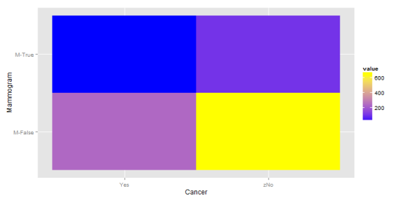
But that's a bit boring, so let's create something more interesting. We'll not alter the number of false negatives, but reduce the false positives so that the positive predictive value is close to 80%.
falsePositive = round(probs[1, 1]/0.8)
probs2 = probs
probs2[1, 2] = falsePositive
probs2[2, 2] = probs2[3, 2] - falsePositive
probs2[1, 3] = sum(probs2[1, 1:2])
probs2[2, 3] = sum(probs2[2, 1:2])
| C-True | C-False | M | |
|---|---|---|---|
| M-True | 11 | 14 | 25 |
| M-False | 3 | 972 | 975 |
| C | 14 | 986 | 1000 |
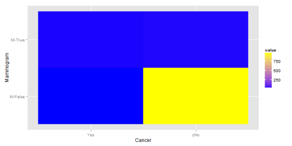
The chance that a person has cancer, conditional on a positive mammogram is now 44.0%. Before I look at another scenario, I'm going to scrap the tables in favor of something graphical. Here's what the first matrix looks like:
library(ggplot2)
library(reshape2)
mdf = melt(probs[1:2, 1:2], varnames = c("Mammogram", "Cancer"))
mdf$Cancer = ifelse(mdf$Cancer == "C-True", "Yes", "zNo")
p = ggplot(mdf, aes(x = Cancer, y = Mammogram)) + geom_tile(aes(fill = value)) +
    scale_fill_gradient(low = "blue", high = "yellow")
p

And the second matrix:
In the second plot, we continue to have a large concentration of the probability in the bottom right corner, but the the top half is now more balanced. This balance comes from a shift away from top right corner. All of this means that the information about a mammogram becomes more predictive.
What happens when we increase the likelihood of cancer? In graphical terms, this would mean giving the left side a more yellow color. We'll hold the original positive predictive value (roughly 10%) fixed, but raise the likelihood of cancer to 25%.
PPV = probs[1, 1]/probs[1, 3]
probs3 = probs
probs3[2, 1] = 250 - probs3[1, 1]
probs3[2, 2] = probs3[2, 3] - probs3[2, 1]
probs3[3, 1] = 250
probs3[3, 2] = 750
| C-True | C-False | M | |
|---|---|---|---|
| M-True | 11 | 99 | 110 |
| M-False | 239 | 651 | 890 |
| C | 250 | 750 | 1000 |
This is interesting. The highest probability remains at the lower right hand corner (no cancer, clean mammogram) but there is now a greater concentration at the upper right and lower left corner. So, if one has a positive mammogram result, what is the posterior probability that they have cancer? The same 10% as before. And if the test showed negative? It's now 27%. This is higher than the probability if one got a positive result. Of course, this is because we've held the positive predictive value fixed, while raising the probability of the event. The efficacy of the test and the prevalence of the disease are now anti-correlated. Not the sort of thing one wants in a diagnostic tool. How would things look if the PPV were 50%?
probs4 = probs3
probs4[1, 1] = 55
probs4[2, 1] = 250 - 55
probs4[1, 2] = 55
probs4[2, 2] = 750 - 55
| C-True | C-False | M | |
|---|---|---|---|
| M-True | 55 | 55 | 110 |
| M-False | 195 | 695 | 890 |
| C | 250 | 750 | 1000 |

So what makes this Bayesian? The simple answer is that I don't know. I have trouble reconciling Silver and McGrayne's simple (though very accessible) examples of Bayesian inference with what I read in Gelman and Albert. Untangling the math takes me away from the philosophy, so I'll list three quick notions about what Bayesian analysis means to me:
- In the presence of new information, our prior understanding may be modified. This is the one that feels like a one-off exercise as it is presented in the mammography
examples. If I don't know anything at all about a person, I assume that the chance they have cancer is about 1.4%. If I know they've had a mammogram, I adjust my result up or down. This is a slightly static view of the world - Similar to the above, but subtly different: the process of gathering information means that our understanding continually evolves. This is the view which Silver seems to push. This allows both for continual improvement of knowledge, but also the opportunity to respond as underlying probabilities change. One critical element that's not addressed in the cancer/mammogram example is that there is presumed- and unearned- certainty in the underlying probabilities. Silver and McGrayne use two different sets
of figures. Either the parameters are uncertain or they're drawing from samples which vary in some other way (which is another way of saying that the parameters possess some stochasticity). - The third interpretation is what I think of as the “actuarial” view. I can't point to a specific paper (though Bailey comes close) but it's more a feeling I get from those rare references to Bayes (explicit and otherwise) in the actuarial literature. The world is divided into sets, though you can't know to which set a particular item belongs. You may only refine the likelihood that an item belongs to a specific set in the presence of information. For example, there are three sets of drivers: very good, average and bad. If a driver has had one accident in the past 12 months, to which set do they belong? The chance that they belong to the set of very good drivers is low, but neither are they incontrovertible members of the bad drivers set.
In this example, I look at altering the joint probability distribution. I'm free to do that, if evidence warrants it. If mammography improves- or there is a provable difference in physicians' interpretations of the results- then I may alter the probabilities. If environment and lifestyle changes yield an alteration in disease prevalence, that also affects the joint distribution. It's a great toy example to begin to explore more varied problems. That's what I'll do next as I expand the example from a very simple 2×2 matrix to something more complicated.
Before I forget, my understanding of the definition of positive predictive value is taken from An Introduction to Statistical Learning, which is a great book. That value is one component of the fascinating subject of binary classification. I first heard about this in a great talk given by Dan Kelly at a meeting of the Research Triangle Analysts
Session info:
## R version 3.0.2 (2013-09-25)
## Platform: x86_64-w64-mingw32/x64 (64-bit)
##
## locale:
## [1] LC_COLLATE=English_United States.1252
## [2] LC_CTYPE=English_United States.1252
## [3] LC_MONETARY=English_United States.1252
## [4] LC_NUMERIC=C
## [5] LC_TIME=English_United States.1252
##
## attached base packages:
## [1] stats     graphics  grDevices utils     datasets  methods   base
##
## other attached packages:
## [1] RWordPress_0.2-3 knitr_1.5        reshape2_1.2.2   ggplot2_0.9.3.1
## [5] xtable_1.7-1
##
## loaded via a namespace (and not attached):
##  [1] colorspace_1.2-4   dichromat_2.0-0    digest_0.6.4
##  [4] evaluate_0.5.1     formatR_0.10       grid_3.0.2
##  [7] gtable_0.1.2       labeling_0.2       MASS_7.3-29
## [10] munsell_0.4.2      plyr_1.8           proto_0.3-10
## [13] RColorBrewer_1.0-5 RCurl_1.95-4.1     scales_0.2.3
## [16] stringr_0.6.2      tools_3.0.2        XML_3.98-1.1
## [19] XMLRPC_0.3-0

R-bloggers.com offers daily e-mail updates about R news and tutorials about learning R and many other topics. Click here if you're looking to post or find an R/data-science job.
Want to share your content on R-bloggers? click here if you have a blog, or here if you don't.